Context before form
Proposition, audience, content and objectives are organised before a visual direction is set.
Freelance graphic designer in Barcelona: brand identities and pieces that stay recognisable, usable and durable outside a presentation deck.
Graphic design
The approach is defined before it becomes a set of screens.
The project starts with the decision the digital presence needs to support, the information behind it and the operations the team needs to sustain. This way, design and technology respond to a specific need.
Proposition, audience, content and objectives are organised before a visual direction is set.
Navigation, content and actions are shaped around the questions that arise throughout the journey.
The system is prepared so the team can maintain and extend it with sound judgement.
Strategy, content, design and implementation are organised around the organisation’s context. Decisions are documented so the team has a clear foundation for launch, maintenance and future development.
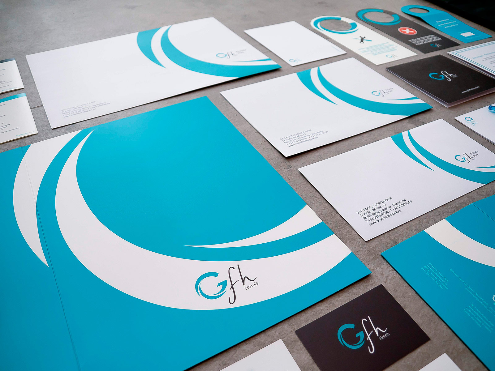
A piece of graphic design is judged by where it ends up: a catalogue a salesperson leaves on a table, a label on a shelf at a metre and a half, an identity applied by someone who was not in the meeting. Designing with that destination in view changes concrete decisions — minimum sizes, number of inks, behaviour over photography — and produces work that survives outside the presentation. A good share of the graphic design coming out of Barcelona is resolved for the screen it is shown on rather than the place it will be used.
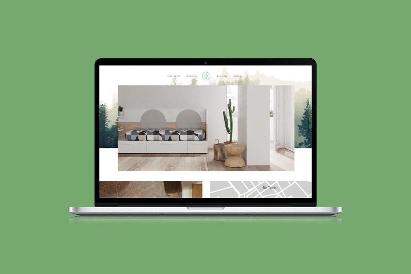
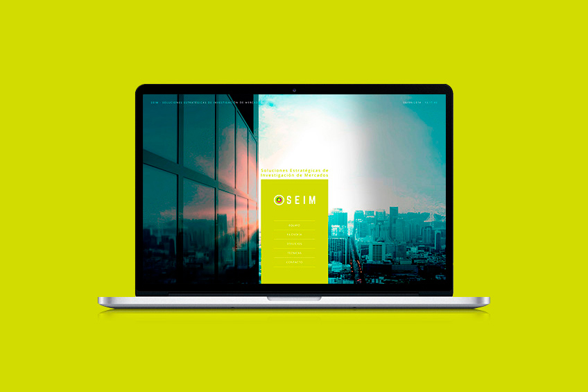
Splitting brand and website across two suppliers has a cost that always surfaces: the identity is designed without thinking about screens, and the website ends up interpreting it as best it can. Working on both together allows the typeface that works in print and at small sizes, the palette that meets contrast requirements, and the behaviour of the logo at thirty pixels tall to be decided at once. This is not a matter of taste: it is stopping the brand from meaning two different things depending on the medium.
Not much material and one honest conversation. Whatever already exists even if you dislike it, where the brand is applied today, which pieces have to be produced this year regardless, and who you want to look different from. With that, a realistic scope can be proposed. Without it, any quote is a guess that will be revised upwards mid-project, which is exactly what nobody wants.
To know who you want to look different from, and why. It helps to gather what already exists (even if you dislike it), where the brand is applied today and which pieces have to be produced this year regardless.
By applications, not by number of proposals. We agree where the identity has to work — formats, sizes, materials, who will apply it — and that determines what gets designed and what gets documented.
Few, and argued. Presenting six directions without a point of view hands the decision to the client without giving them the tools. One defended direction, plus the variants that were genuinely in play.
By testing it where it will be used: small, in a single ink, over photography, on a screen and across the material that already exists. A brand that only works in the deck is not finished.
By whether the organisation can apply it without asking, and whether it is recognised before the name is read. Both show up in the months after, not in the handover meeting.
Open and closed files, a manual proportionate to the size of the company, and templates for what gets used every week. A hundred-page PDF nobody opens is not a delivery.
A selection of work showing context, decisions and outcomes.
Tell us where things stand and we can assess the most useful approach for the project.