Technology moves in leaps and bounds, and without realising it many users look for web experiences that are far more considered, adapted and designed to make browsing easier and, ultimately, to reach their goal in as little time as possible, whether that’s buying a product, reading a news item or finding out about a company or service they’re interested in hiring.
There’s no doubt that with the arrival of smartphones and tablets, and the explosive way these devices have spread, a whole front of possibilities has opened up. In most developed countries roughly half the population now uses these devices, which is certainly not something you can overlook.
That’s why web experiences have been forced to adapt: first by offering separate versions of the same website, and later, with the arrival of CSS3’s famous media queries, by using responsive web design.
Why you need to adapt and implement responsive web design
If you’re thinking of building or redesigning your business website, there are plenty of reasons to implement responsive web design:
- Your brand’s corporate image is reinforced, since it shows you’re ready to embrace new technology and see being a first mover as necessary.
- Today, in most developed countries, roughly half the population uses smartphones and tablets, and that figure keeps rising.
- It’s obvious that many users look for content on their phones or tablets. If they visit your business website and it isn’t responsive, they’ll have to be very interested indeed to have the patience it takes to keep zooming in to read the content. If that customer then visits your competitor’s website and it has a responsive design, it’s very likely they’ll win them over. The final choice is yours: if your competitors don’t have adapted experiences, all the better — look ahead and be first.
- Google has spoken: websites with responsive implemented are viewed favourably by its ranking algorithm, and it recommends using it.
- The website and its code become far easier to maintain and to keep updated, since the same foundation is used for everything. Changes affect every version.
- If the responsive work has been well thought through and designed, it gives the user an experience very close to an app, which makes browsing much easier.
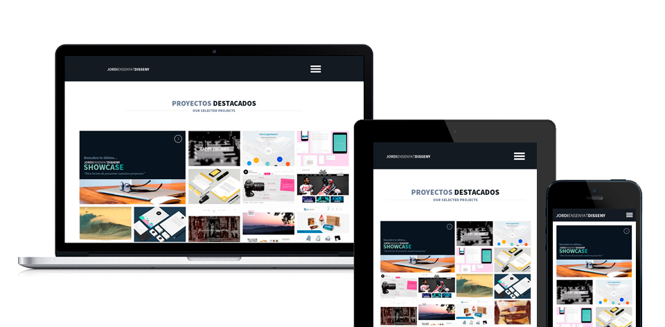
In the image above we show an example of the responsive design implemented on our own website:
- In the desktop version we can see the website in full.
- On tablets, part of the content has been restructured and the widths of the elements have changed.
- On a phone, the menu is displayed one item below another once the three bar icon is tapped. Redundant elements such as the latest blog posts have been removed, and the type sizes have changed.
Related work
Today this is no longer a separate concern: it is part of any project from day one.