It’s Monday, and fresh from the weekend we bring you a small selection of typefaces for your use and enjoyment.
We won’t be getting into whether they’re free or paid; I’ll leave that to you. The point, and the important part, is that they might come in useful when designing a logo, or when solving that headache of choosing a typeface that defines you and becomes part of your new branding.
You might fall in love with one of them, and that magic might make you forget it comes with a price tag.
In our endless appetite, every year sees a huge number of new typefaces appear. Not all of them good, not all of them suitable, but among the new releases you can usually find one that fits your project without much difficulty.
Graphic design studios always keep an eye on typography and give it the value it deserves.
So not only do we take it seriously behind closed doors, we also use this post to tell you what’s new.
01. FF Din
This typeface was added to MoMA’s digital typeface collection within its architecture and design collection in 2011.
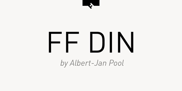
This typeface is already a classic among the choices of graphic designers and digital studios.
Created by the German type designer Albert-Jan Pool between 1995 and 2009, this sans serif is ideal and sits perfectly in advertising, campaigns and packaging, as well as in branding and logo projects.
02. Oswald
Here’s another of the most popular choices among graphic designers, especially those of us who, like JordiEnsenyatDisseny, also work on the web.
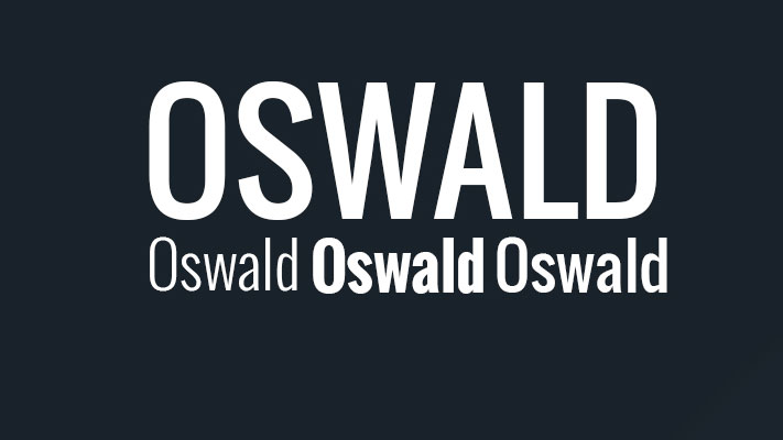
It’s a remake of the historically classic «Alternate Gothic» sans serif. This old glory has been redrawn and reworked to sit better on the web, taking the pixel grid of digital screens into account.
Its creator is Vernon Adams, who has a long career as a type designer.
03. Brandon Grotesque
Designed in 2009 by Hannes von Döhren, this typeface is influenced by the sans serifs of the early twentieth century, the 1920s and 1930s.
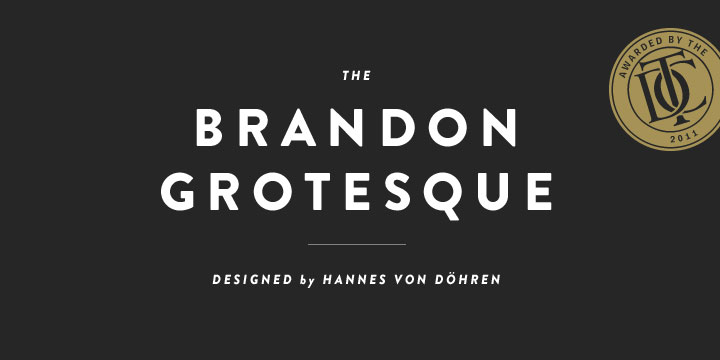
Its geometric style carries us back to the era of the charleston and feather boas.
This typeface won the Type Directors Club Award in 2011, awards we’ll be covering in later posts.
That’s been our small contribution to this Monday in late September.