This time we’re talking about Sónar 2016, though not to revel in the DJs, the concerts and the trends in audiovisual creativity.
If your interest lies with the music, you can follow this link Sónar’16
The graphic design studio JordiEnsenyatDisseny is turning its attention to the graphic identity they’ve chosen.
I won’t be telling anything new to those of you already familiar with the imagery Sónar picks each year and changes from edition to edition.
For newcomers, we’ll bring you up to speed before moving on to this year’s identity.
Every year Sónar chooses a theme very carefully to define the current edition.
Around that theme they produce videos, create imagery, run advertising in print magazines, flyers and so on.
Below are a few of the themes Sónar has chosen across its 23 years of existence.
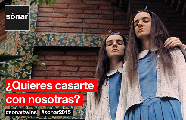
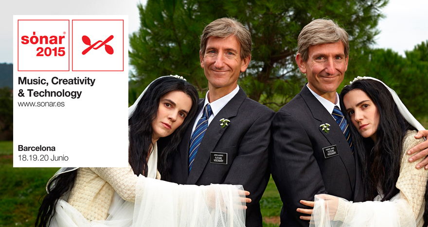
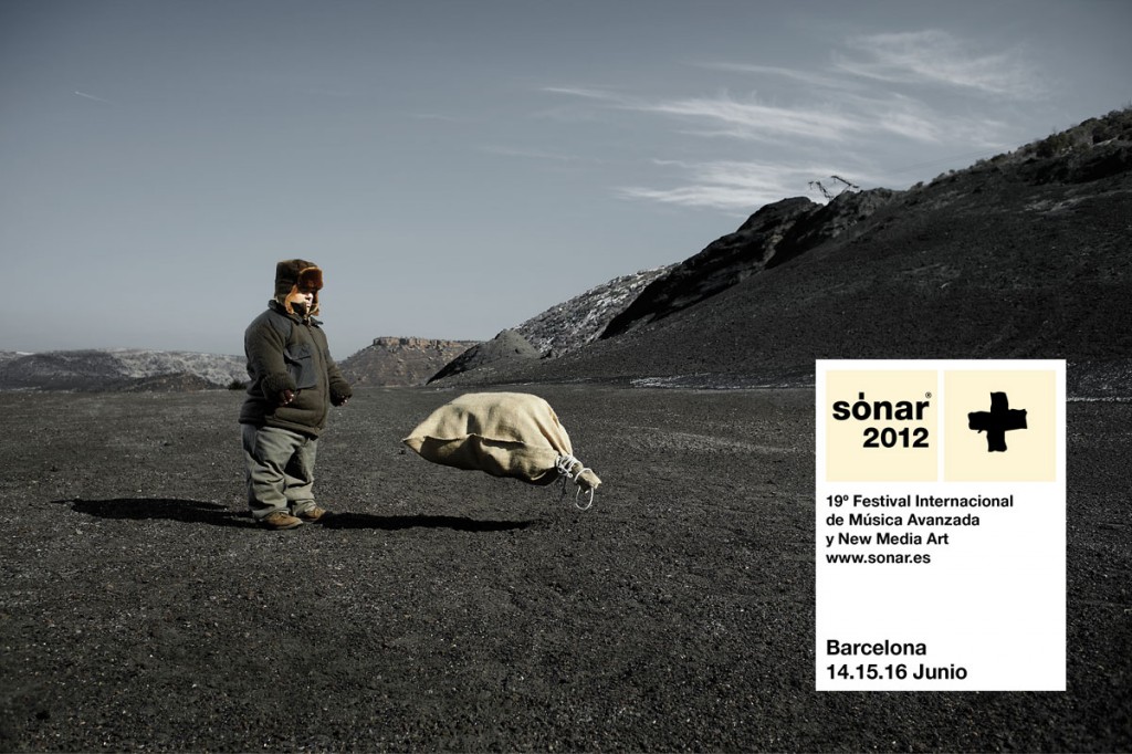
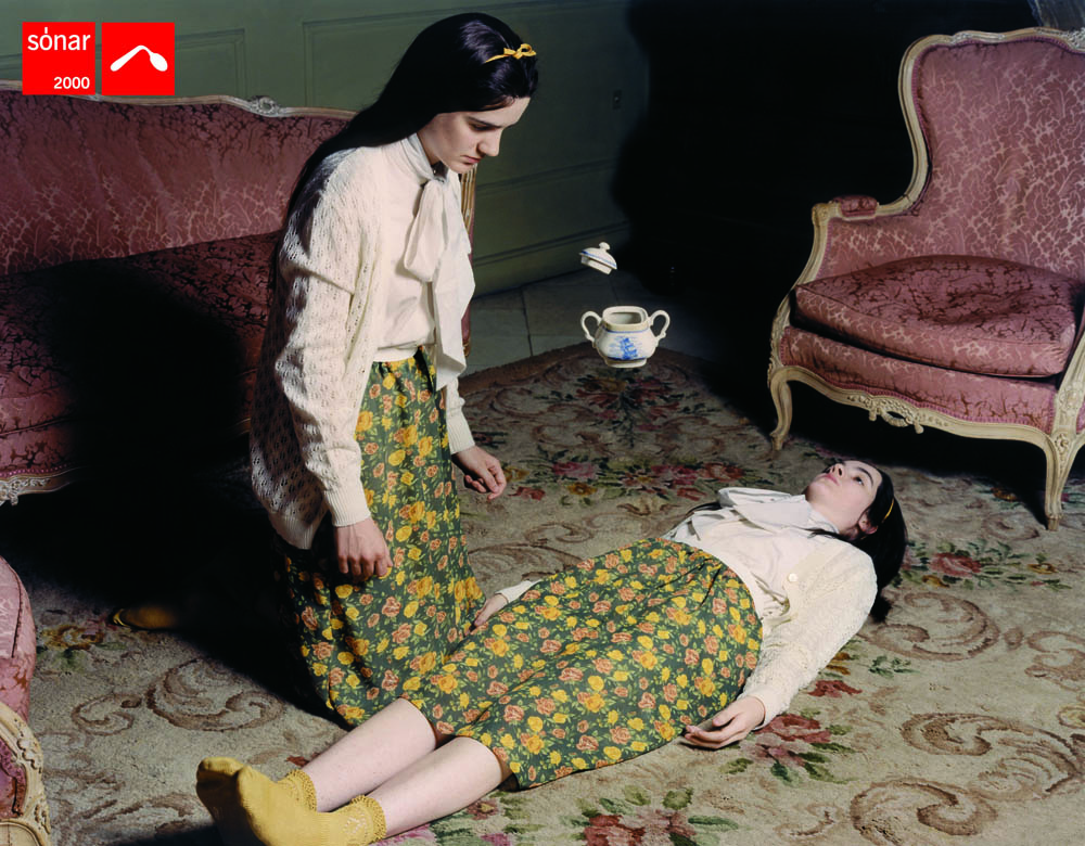
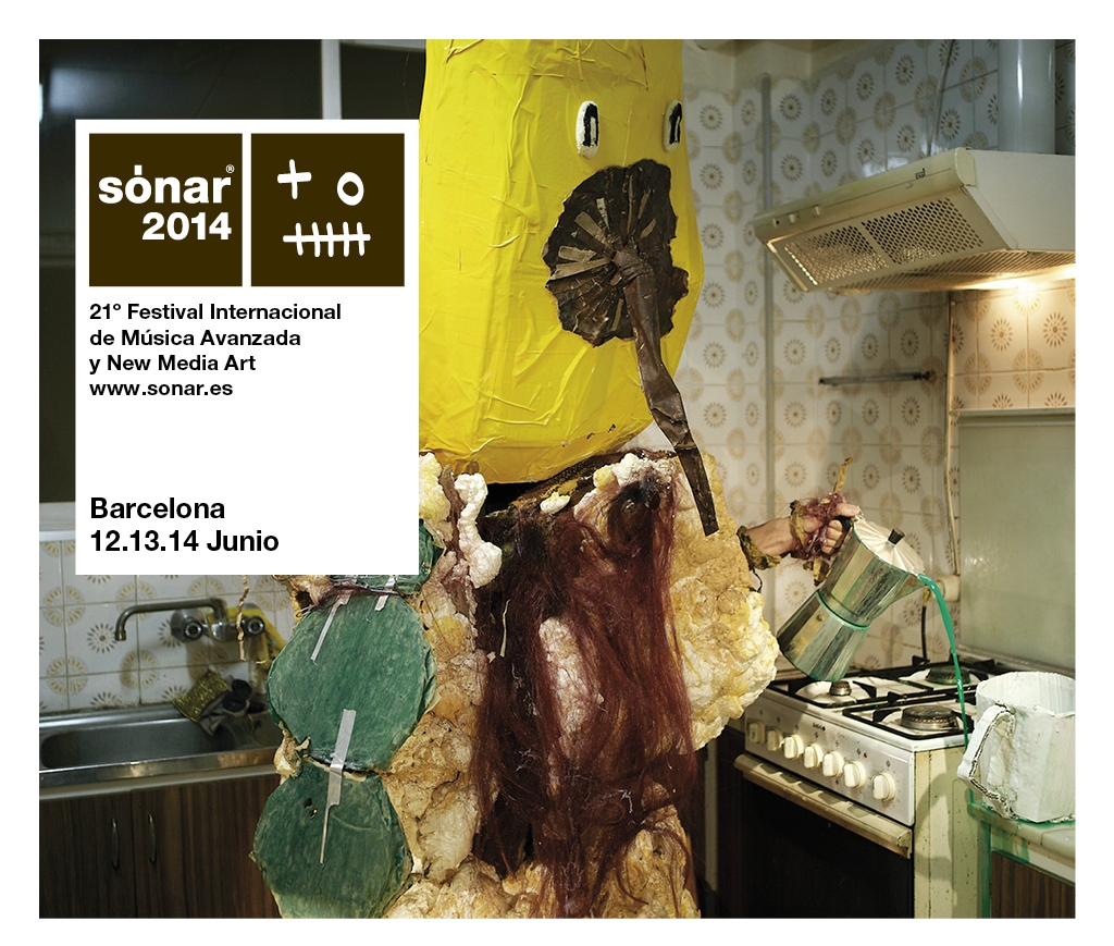
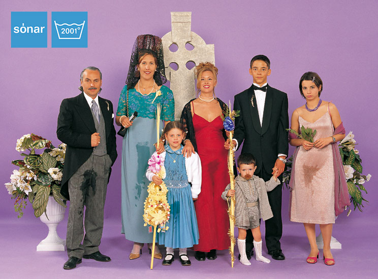
Sónar is a festival born in Barcelona in 1994, a festival of electronic and experimental music in its early days, but one that backed new technology from the very start. So we can say Sónar splits into two halves.
Sónar by night: music, music and more music.
Sónar by day: a showcase of new technology, video work and audiovisual pieces.
The festival was created by Ricard Robles, Enric Palau and Sergi Caballero.
As I was saying, Sónar’s identity is one of the festival’s attractions. Every year they surprise us with a theme and imagery among the most transgressive and original around.
Below is the festival’s promotional poster, so you can judge for yourselves and we can then pull it apart together, in the best sense of the phrase.
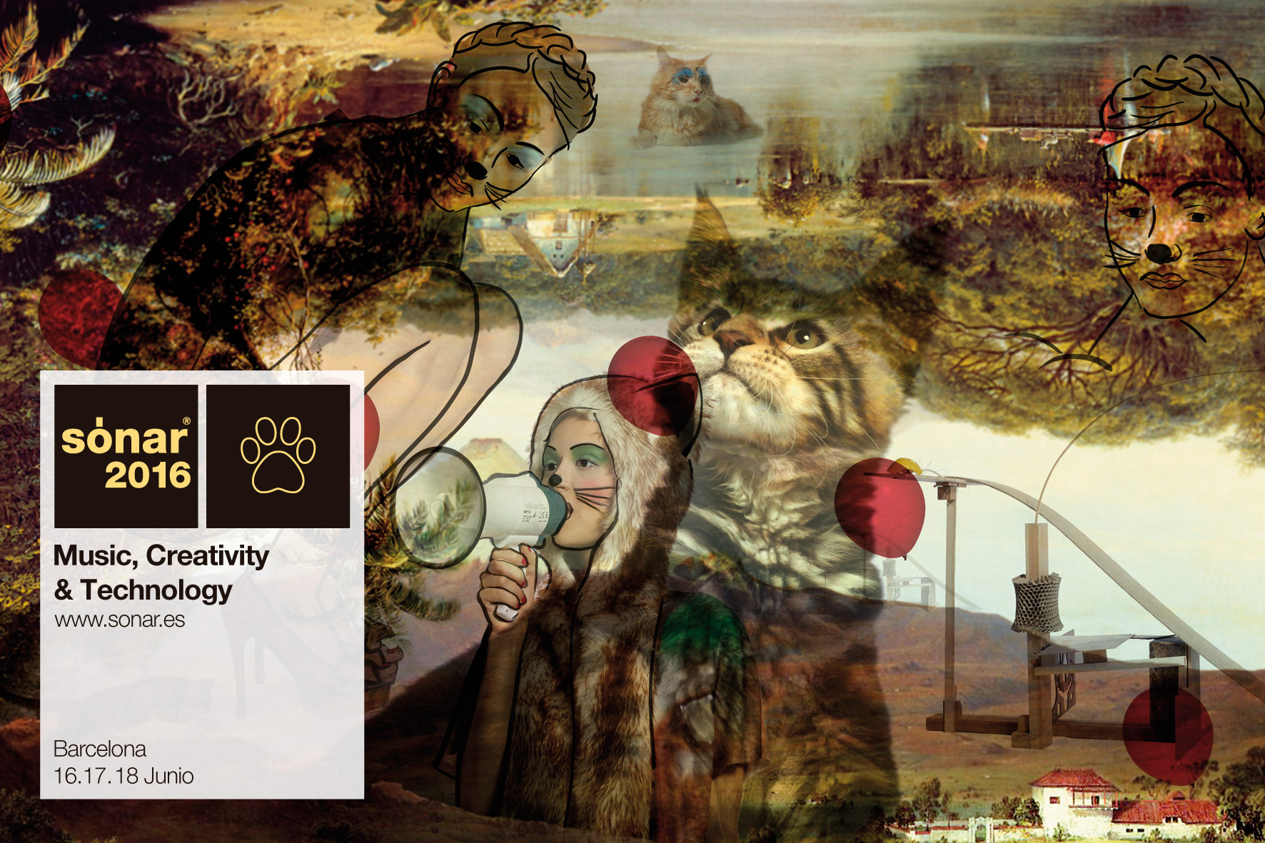
We’re certain it holds an ironic critique of today’s society, setting our love of animals against how little they need us in return.
The choice of cats for the main advert is no accident: the cat is the pet that cares least about our company.
Despite forming an early opinion, we’ll be watching for what the organisers have to say on this, since we know that we creators have a very deep inner world and sometimes find it hard to make ourselves understood.