Here’s a graphic design project we produced for a client in Barcelona.
About the web design project
The project covers the graphic design of a website that went live in April, a website about nutrition that the nutritionist Álvaro Vargas commissioned from us at the end of March and needed online by April.
After talking with the client and getting to know his personality and his vision for the project in depth, our graphic design team set to work creating a design that would live up to his expectations and to the market’s.
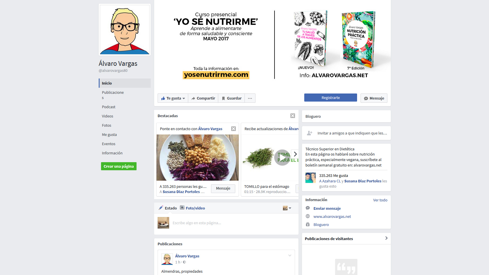
Álvaro, the client, already had a strong social media presence, regularly feeding his Facebook, his Instagram, his YouTube channel and even iVoox.
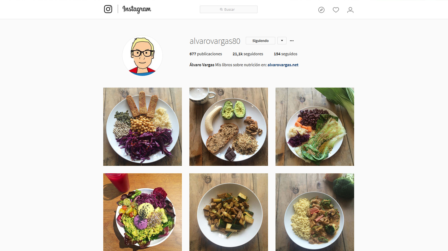
Across those channels he already had a distinct personality closely tied to who he is and what he does, so with all that in hand the job began simply enough, though we set ourselves the personal challenge of going a step further and adding real value to the website design.
So we wanted to give the site a strong organic quality, and not only in the general sense that the site’s content already carries.
We also wanted the website design to have a life of its own: the user had to sense everything Álvaro places the emphasis on.
Healthy plates and health, life and vitality.
As you’ll see, the landing bases its look on a forward looking idea where graphic design takes on a vital role in pulling the website out of the static feel other website designs have.
At our graphic design studio in Barcelona we always work to that premise, but on this occasion, thanks to Álvaro’s willingness and daring, we were given free rein.
The result of the web project
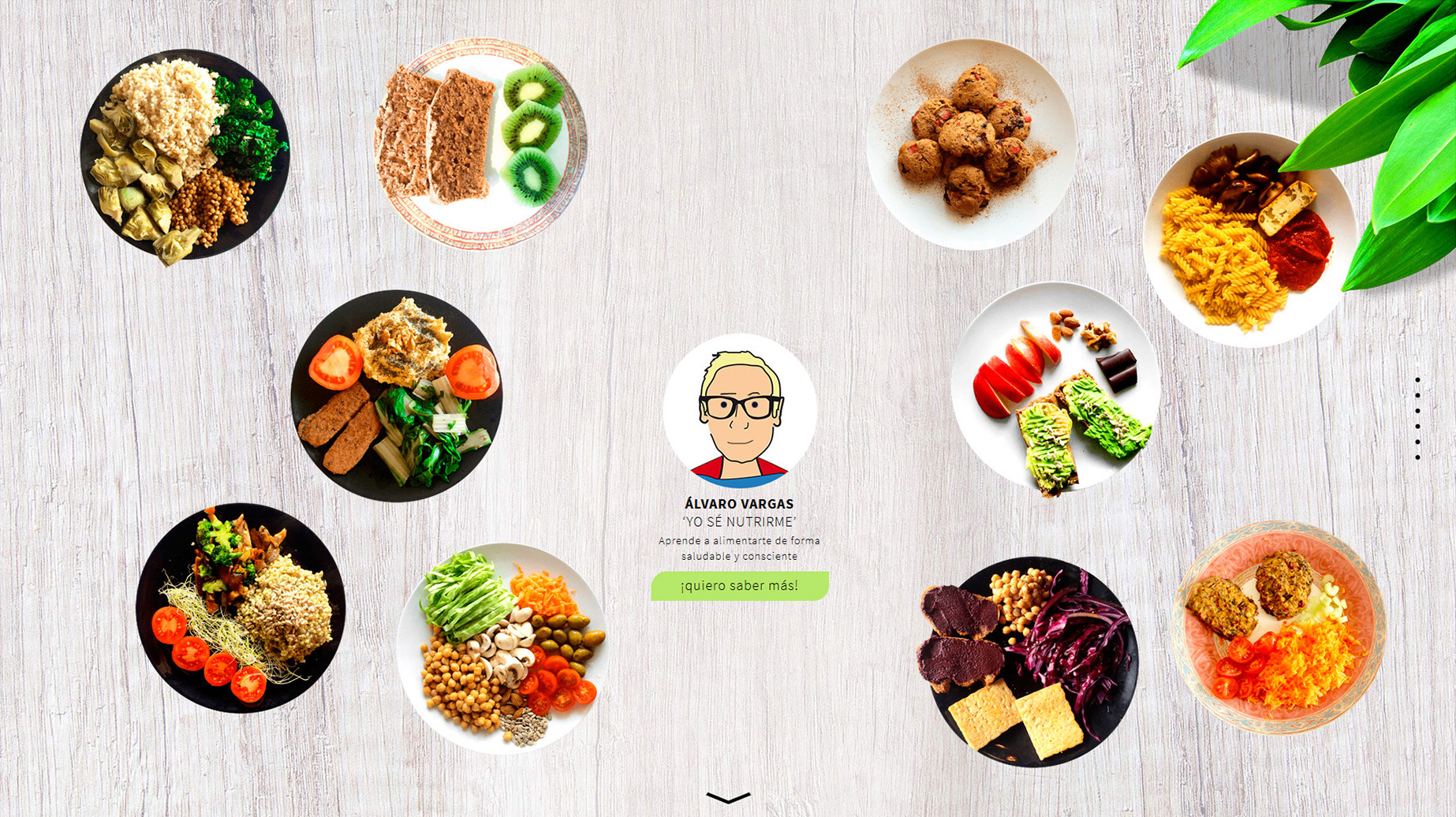
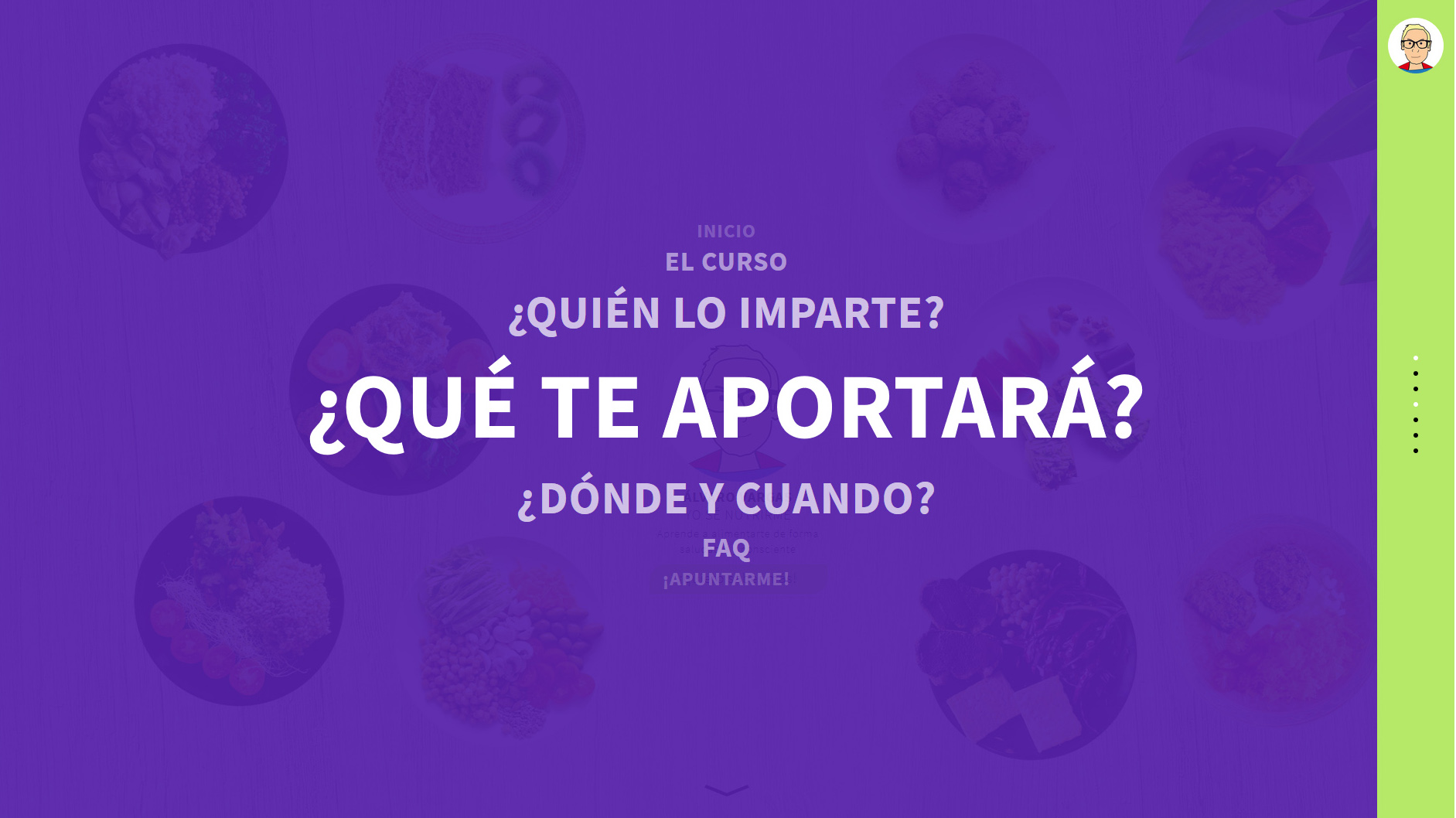
The result on the landing is brilliant: plates of food appearing at random with a certain movement at a low frame rate, giving the graphic design a contemporary feel. Álvaro, meanwhile, has a central place in the website design, as he should on a site where he’s the protagonist; Álvaro, drawn at the centre, also has a random animation that supports the whole visual, organic idea of the site.
The style we chose for the website’s graphic design is a one page model with vertical scrolling where all the information can be reached with a single button.
Even so, we also designed a fresh, easy to use side menu so you can move directly between the sections of the vertical scroll.
Throughout the site the animations recur, placing emphasis on the main points we wanted to get across.
It’s a straightforward site with exceptional results in terms of graphic design and usability.
The colour palette was also chosen so the user never loses interest.
By using colours diametrically opposed on the colour wheel, the contrast carries us from section to section without our noticing.
The website’s graphic design is built so the user gets all the information in the shortest possible time, while the visual journey had to give the whole site that sense of movement.
You can see the finished work at www.yosenutrirme.com