We’ve successfully wrapped up the design of a new logo and this post is devoted to its story and development.
In this entry we’re going to cover the logo design itself.
1. First contact with Sergio
Sergio called us a while back and commissioned a big end-to-end project: designing the business’s corporate identity and handling the website design and the website development.
The first thing we did was meet up and go over every aspect of the logo design project, their business plan, their vision and their philosophy.
From that first meeting, and with the information provided, we were able to form a much clearer picture of the kind of logo being asked for, and we also advised on the brand design that best suited their future business activity.
2. Where the project stood and comparing notes
Sergio is about to open a furniture shop in Barcelona, in a good area and with a reasonably good location.
From the meeting with Sergio we put together a short brief for the creative team at our Barcelona graphic design studio.
In that brief we defined the most relevant and important qualities the logo design had to convey.
On a personal level we found Sergio to be a positive, hard-working person with a keen eye for detail and a competitive streak that works very well in business.
On top of that, the business plan showed us they wanted to convey a business profile that was elegant, considered and detail-oriented while still being personal, natural and approachable without tipping into low-cost.
They more or less had the name in mind already and, with a nudge from us, we settled on Shido Hàbitat as the best of the options on the table.
Several concepts flowed from the company name: natural, growth, root, strength.
3. Goals and target audience
All that was left was to tie all these concepts to the business’s target audience; the logo design had to take this into account too so that it would land easily with the right people.
Without closing the door on anyone, the target was people of all kinds, setting aside low-cost shoppers who wouldn’t appreciate the value of the service and the quality — something Sergio cared a great deal about, since it was what set the business apart from the competition.
Once every aspect of the logo design had been analysed, the creative team got to work on designing a logo that met all of it and lived up to the project’s needs.
4. The final result
After a few approaches that didn’t quite convince us, we finally found the perfect balance for this logo.
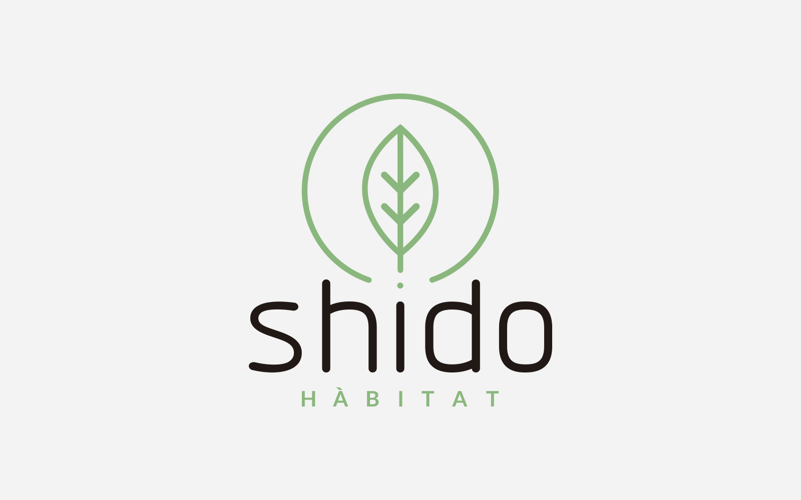
It’s a logo that conveys calm and flow; the choice of graphic elements together with the typefaces makes the eye glide across a still lake.
5. Meaning
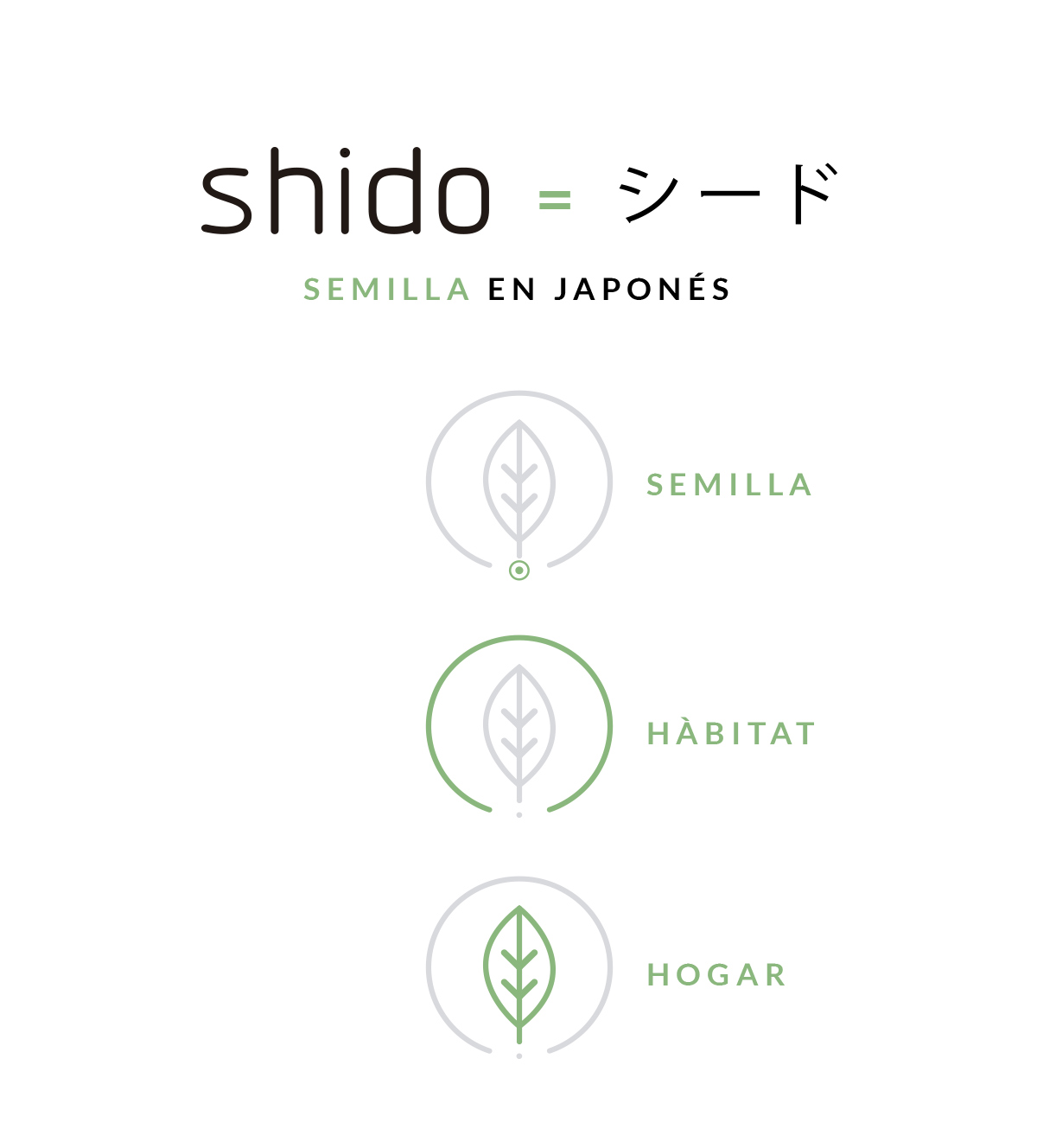
We chose these graphic elements based on what we’d learned: the dot on the i is a seed at its most reduced.
From the «shido» seed the fruit grows, with the fruit standing for our business goal and for the product we deliver.
All of it held and wrapped by the surroundings, in the form of a circle that encloses and unites everything: «hàbitat».
6. Typeface choice
The typefaces chosen are:
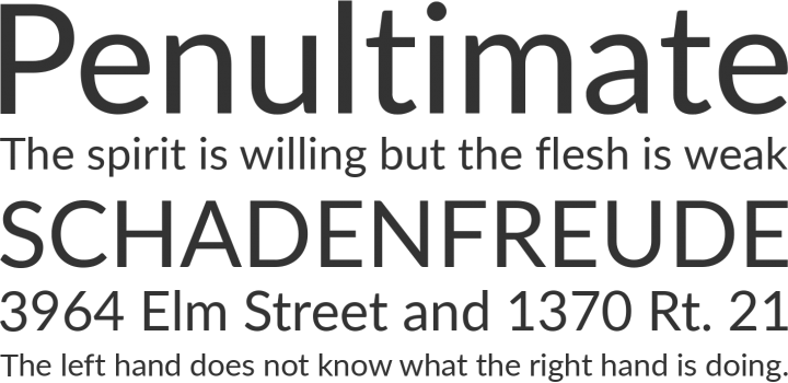
Lato for «habitat»
Designio for «shido». Designed by Rodrigo Typo.
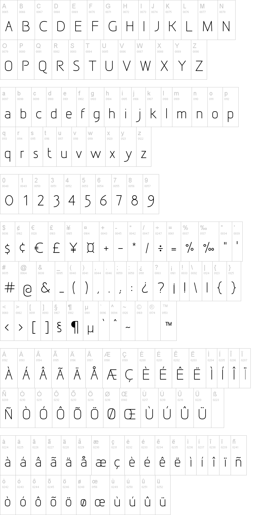
The symmetry at play in the word shido, together with the base and column formed by its two tall consonants, reflects the strength of the company and its product; for all the flow of its movement, it also shows us an idea that is strong and confident.
The Hàbitat typeface is strong and assured, but at the same time it behaves serenely, as our surroundings should: a place of calm and safety where we can make things and feel at ease.
7. Colours
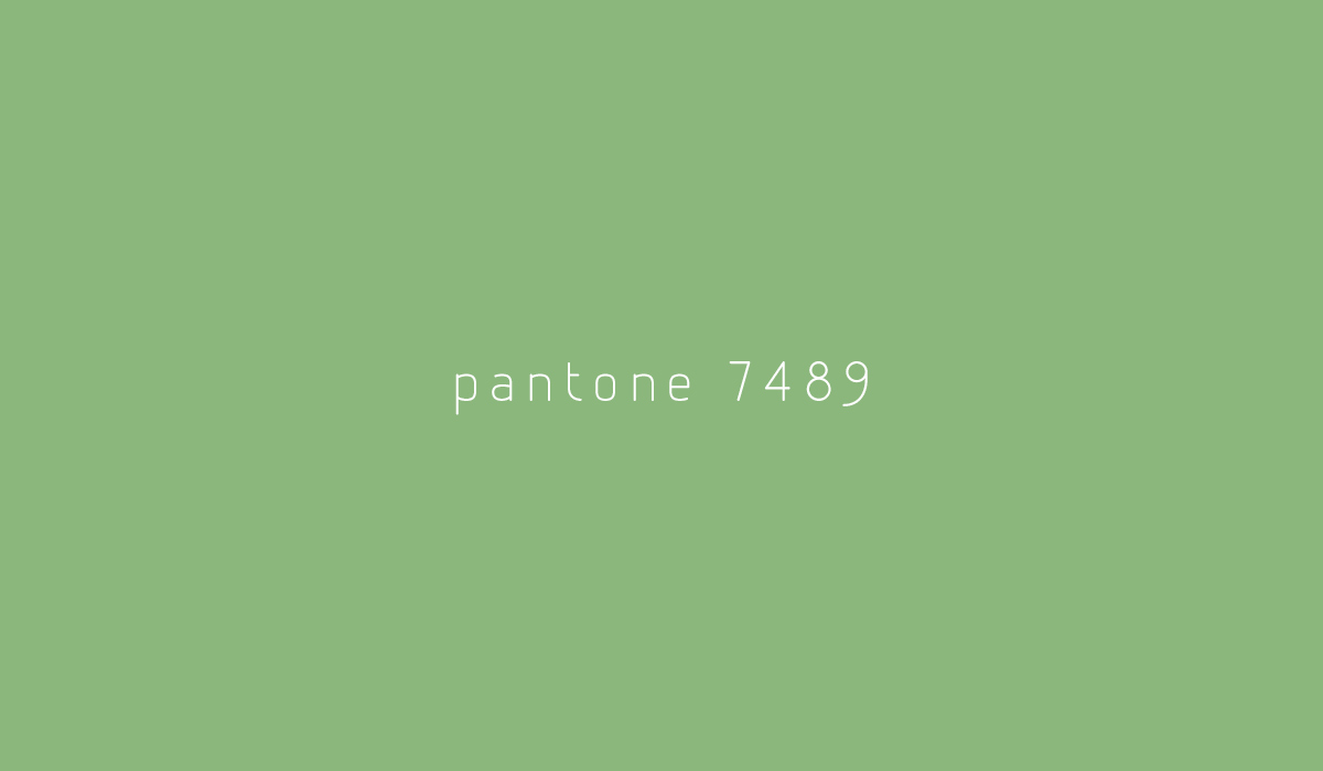
For colour we chose Pantone 7489 which, as a general rule across the corporate material, will be printed on uncoated paper with a very organic texture.
If you’d like to know what the process of making a logo is like, follow this link.