Thinking about commissioning a logo design of your own?
It’s certainly a good idea.
Do you want that logo to stay with you for the whole life of your project?
Well thought.
Here are a few very important points to bear in mind when commissioning a logo design that will hold up over time.
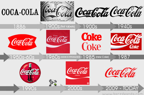
The evolution of the Coca-Cola logo through history is a clear example of staying power.
Contrary to reality, we often think a simple design is an easy one; it’s a very common mistake.
Yet its complexity lies precisely in its simplicity. A good logo isn’t just nice type plus cool colours plus neat lines, all thrown in a cocktail shaker and served.
Designing a logo is creating a brand identity, and brand identity matters far more than the name itself, so it needs a whole process behind it.
A systematic process where all our talent has to show.
Here’s a list of things to keep in mind when taking on a logo design.
Simple
Simple is one of those words with a direct meaning and a hidden one, since complexity lies within simplicity, rather like the cure lying within the poison.
Designing a logo isn’t just a measure of your ability to marry type and illustration; quite contrary to how it’s usually perceived, there’s a whole body of graphic design work behind it.
Geometric, graphic and proportional formulas go into a logo design, subtly, elegantly and imperceptibly.
We can easily identify the best logos at a glance, without needing to read the name; we’ll see the logo on flyers, adverts, cards, anywhere, and know who it belongs to. That’s simplicity.
A complicated logo is hard to identify and means potential clients don’t take it in and drift away.
Versatile
Versatility is one of the crucial factors in a logo lasting over time, so a logo design has to look right across different formats.
It’s no use at all if our logo looks great on envelopes and cards and then we can’t get the same results on mugs and t-shirts.
Nor is it good if our logo doesn’t hold up in greyscale, in black and white, or even with the original colours changed.
The logo has to keep its identity, just as we keep ours when we change from casual clothes into a suit and tie.
Singularity
Singularity is what makes our logo unique, plainly and simply unique. It doesn’t matter whether our logo is an apple or a box: it has to be our box and our apple.
So those elements will have to be singular, with something that sets them sufficiently apart from all the other boxes and apples.
Dynamic
Whether it’s a purely typographic logo or a bespoke logo design, adaptability and flexibility will help enormously in making your logo endure.
Nothing static: dynamism is what keeps pace with innovation and improvement.
That said, dynamism doesn’t mean changing the design every week or every month, but it does mean evolving with the times we live in.
With meaning
Every logo should have a story behind its creation, the background that made the brand and the company possible.
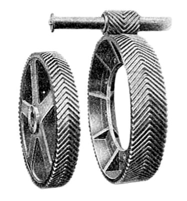
On a trip to Poland in 1900, André Citroën came across a relative who cut wooden gear wheels for mills, and noticed how their teeth formed a herringbone. That geometry increases the surface area and spreads the load better, so he took the idea for his own steel industrial gears, rather than wooden ones.
It isn’t about making a nice little drawing the client likes: you have to go looking for meaning.
Very often we’re asked for a logo that will blow people’s minds. Fine, but we have to find the story that does it.