This time we’re walking you through the logo design project Carles commissioned from us a while back.
After calling us and talking things through, it was clear on their side that we were the right people to take on the project, and on ours that it was an interesting piece of work for us.
We had a shared interest: designing a logo.
Carles was starting a business venture: they had just opened a climbing gym in Sant Quirze del Vallès, Barcelona, and at that point realised that, although they were very clear about the name they wanted, they had no idea at all how to approach designing something like a logo. It’s true that at first, to people outside design and creative work, making a logo that conveys a company’s spirit and philosophy looks very simple; I think that’s down to the undeniable fact that nobody understands that spirit and philosophy better, at the outset, than the person behind the idea. The problem comes when we try to put it into graphic form. That’s a task that takes rather more than heart and enthusiasm: we also need some ability and creative aptitude, and the knack of capturing a feeling.
So Carles explained a little about the company’s philosophy and the spirit behind it; they were clear the name would be Batec (heartbeat in Catalan), Batec Climbing Gym — a name they had arrived at thinking about the beat of your heart when you’re climbing at height.
Despite the name, which at first carried connotations of risk, they were also clear they didn’t want us to aim the logo solely at a professional audience: they wanted to reach everyone, from experienced climbers to complete beginners, families and people of all ages, with the aim of making climbing accessible to all.
Another point they very shrewdly raised was that they didn’t want an overly busy logo design, so it could be used anywhere.
With that information we had more than enough to go on to create and design a logo that would live up to their expectations and to the market.
On our side we worked on several logo versions that we showed Carles until we reached the concept both parties felt most comfortable with: them because they identified with a logo that would stay with them for as long as they wanted, and us because we were giving Carles a logo that could stand up for their brand.
The result is a strong logo with real presence, one that perfectly conveys everything Carles asked us for and that we’ve delivered with a great deal of pride.
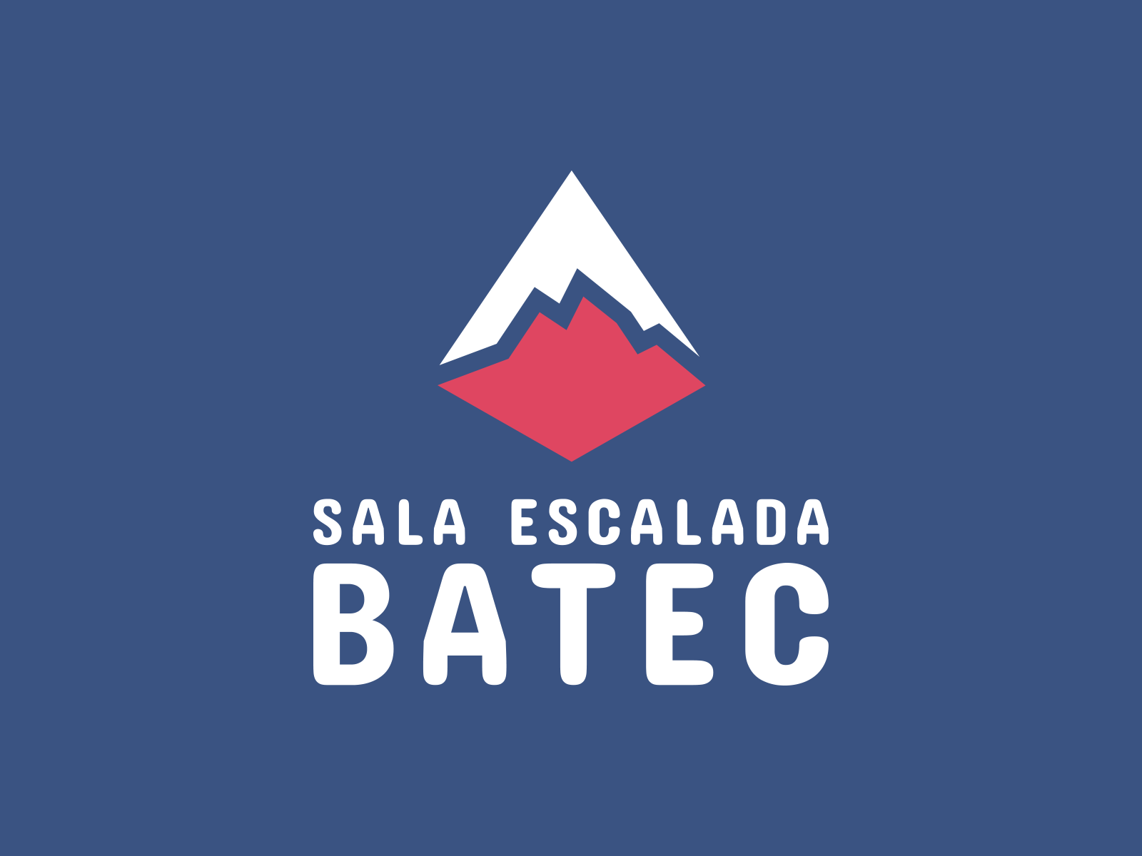
The colour choice for this logo is a combination that signals the breadth of audience the business is aimed at, being two colours far apart on the colour wheel; on top of that, the tone is handled so it doesn’t convey too much risk.
The shapes in the logo are built around the Pedraforca mountain, a classic of Catalan climbing, and it’s divided by a silhouette that can be read two ways: as a heartbeat or as the outline of a mountain range.

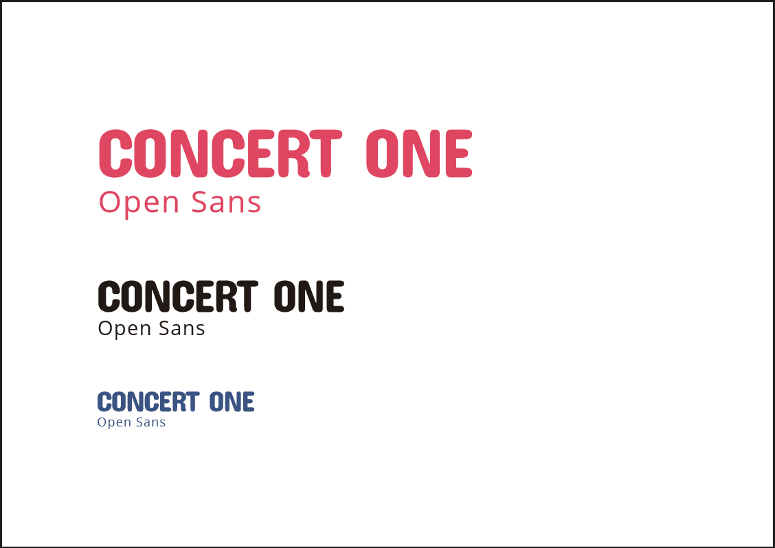
As for the typefaces for the logo design, they too were chosen with care, conveying the idea of a plural audience with room for everyone.
You can judge the result for yourselves; personally we’re very proud of our work and of the excellent outcome of the relationship between Carles and JordiEnsenyatDisseny.
If you’d like to know more about how we work when making a logo, I suggest you follow the link below, where I explain the logo creation process in detail.
See you soon.
Related work
The full approach I take to brand work: