After the post where we talked about architecture logos we thought were worth showing and taking a look at, here’s a new round-up of logos. This time it’s a much broader post about company logos we’ve fallen for, whether for their overall visual look, for the ingenuity of the graphic designers when creating the logo, or for the good use of typefaces and shapes when designing the logo.
When it comes to the process of creating a logo, there are many factors to weigh up, because the first impression potential clients take away depends entirely on it; what’s more, it can sometimes be one of the tipping points between choosing one company over another.
It’s obvious that the corporate identity is the first «face» clients see of a company, and just as we wouldn’t turn up to a meeting scruffy, it goes without saying how important it is to look after your corporate identity — and that starts with the design of a good logo, which means: good use of shapes, typefaces, creativity and ingenuity.
We hope you like all the logos we’ve picked!
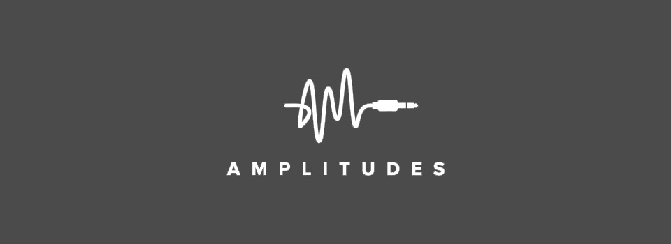
A fantastic logo for a company working in sound: through the illustration of the cable inside the symbol you can clearly make out the shape of the A and the M from the name «AMplitudes». On top of that, the overall shape of the cable brings a sound wave to mind.
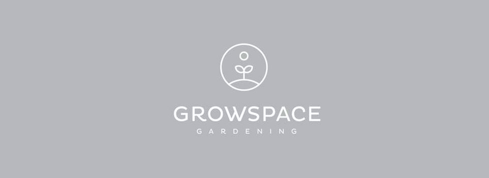
We found this logo for a gardening company especially lovely for its minimalism and the simplicity of the symbol, as well as the typeface used. The whole thing has its weight very well distributed.

A stunning logo: as you can probably work out, the symbol as a whole depicts a house and also recalls the shape of a paper clip, nodding to the company name «houseclip».

We really liked the illustration in this logo for all the detail it packs in without the «visual legibility» suffering for it.

We’re looking at another masterpiece here; it hardly needs explaining. It’s clear this logo is aimed at a sound company. The u forms the pause symbol, which is the company name itself.

We liked this logo for the visual and graphic whole it delivers. Very balanced and a pleasure to look at.

We don’t know whether it’s a logo for an existing company or a concept piece. Either way it’s very cleverly worked out: as you can see, the infinity symbol wraps around the logo.
Did you like the logos we picked?
In that case, take a look through our portfolio, where you’ll find more logos, these ones designed at our graphic design studio in Barcelona!
See portfolio
Related:
Architecture logos