Stefan Sagmeister
«Design needs guts»
Let me tell you about a very important figure in graphic design, one of those graphic designers you absolutely have to know: Stefan Sagmeister.
Who is Stefan Sagmeister?
The first thing I’ll tell you is what Stefan Sagmeister is not: he’s no unknown, nor a future prospect in graphic design.
Mr Sagmeister already has a name and a reputation built on hard work and good work.
Born in 1962 and Austrian by origin, he studied graphic design at the University of Applied Arts and later, thanks to a scholarship, studied at the Pratt Institute in New York.
A few years later he moved to Hong Kong, where he worked for the agency Leo Burnett.
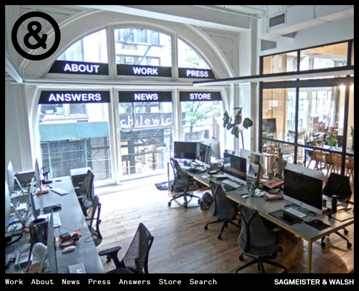
Today he has his own graphic design studio.
What stands out in his work
One thing is clear when it comes to defining Stefan Sagmeister’s work: he is one of the most controversial and boldest graphic designers of all time, at least so far.
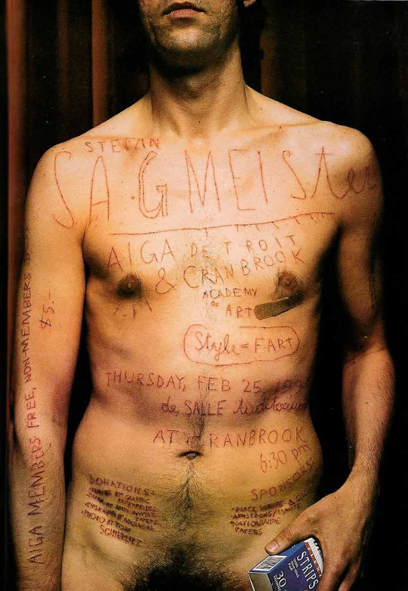
He shot to fame in 1999 when he used his own body as a creative and typographic canvas, cutting into his torso with a razor blade to announce a talk for the AIGA, the American Institute of Graphic Arts.
Beyond the anecdote, Stefan Sagmeister has built his professional career around experimenting with type; he’s also known for his work designing album covers for bands.
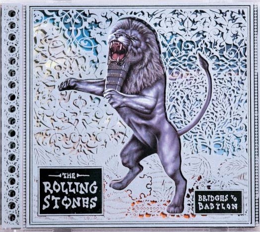
Broadly speaking we can describe his work as ironic, full of double meanings and visual games; it’s easy, then, to understand the personality on the edge, the provocation, the dialogue with the viewer that Stefan is after — a dialogue rooted in social criticism and in questioning the established order.
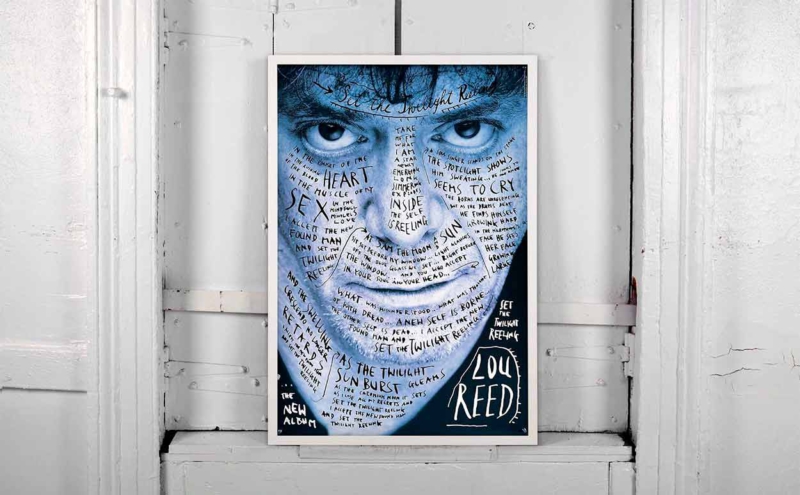
While most designers pay special attention to paring down the idea and abstracting form, Sagmeister is direct and daring, even raw and violent.
To go deeper into his work there’s no better option than browsing his website, where the projects section lets us enjoy his work. That said, for those of you whose clicking finger is feeling lazy, here are a few projects that caught our eye for one reason or another.
1. NY Times Magazine – Resist
The cover of the New York Times magazine, a bold cover where type has an overwhelming presence. A very daring choice that certainly left nobody indifferent.
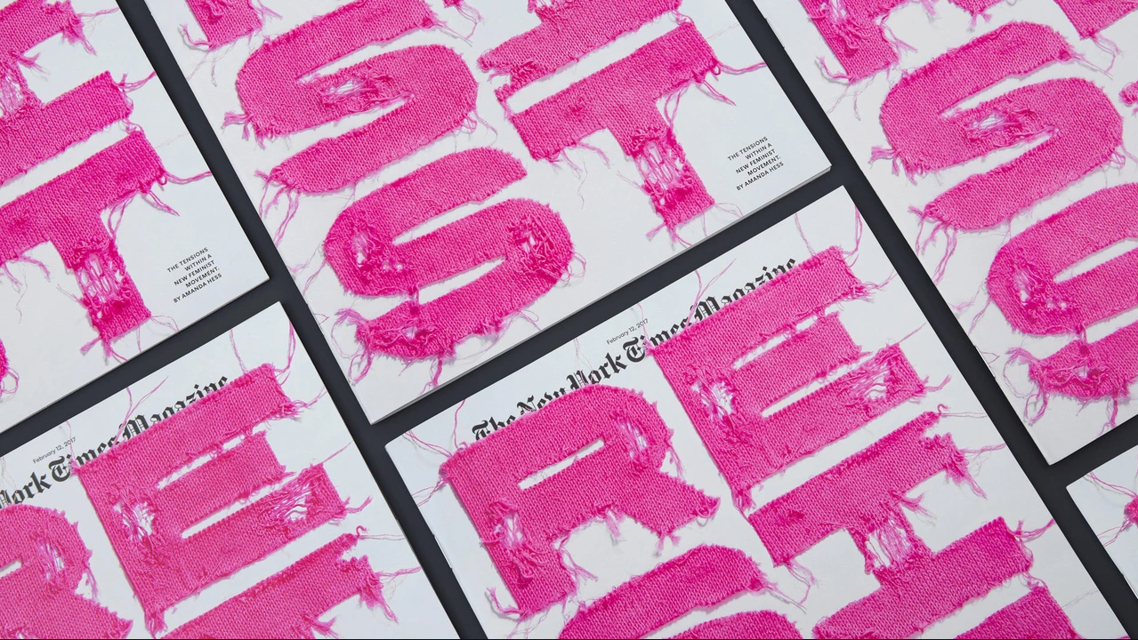
Strong, worn type that, together with the message it carries — «Resist» — reinforces the whole thing.
2. SWA Identity
Creating the visual identity for SWA, a leading company in landscape architecture, planning and urban design.
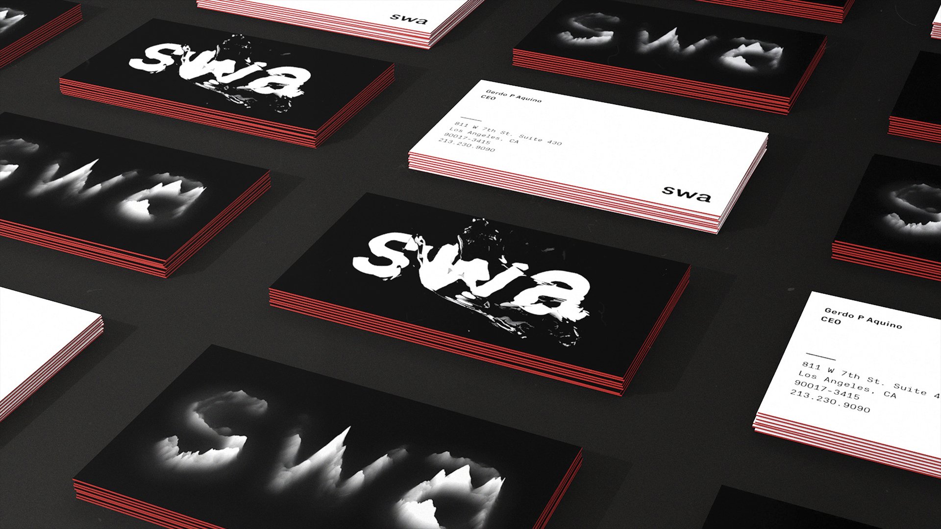
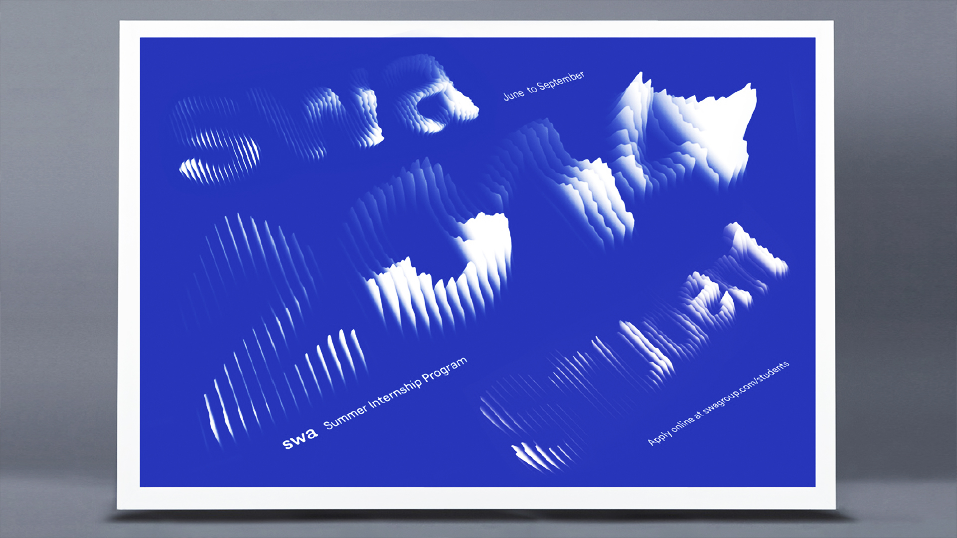
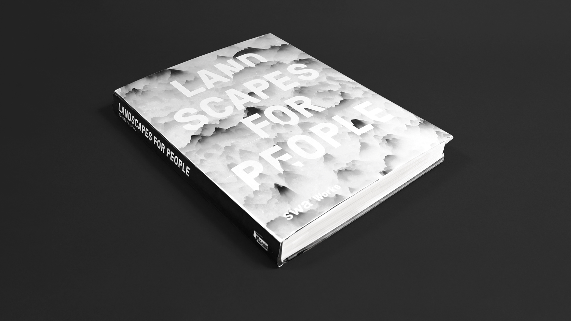
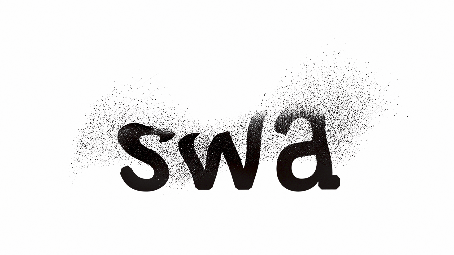
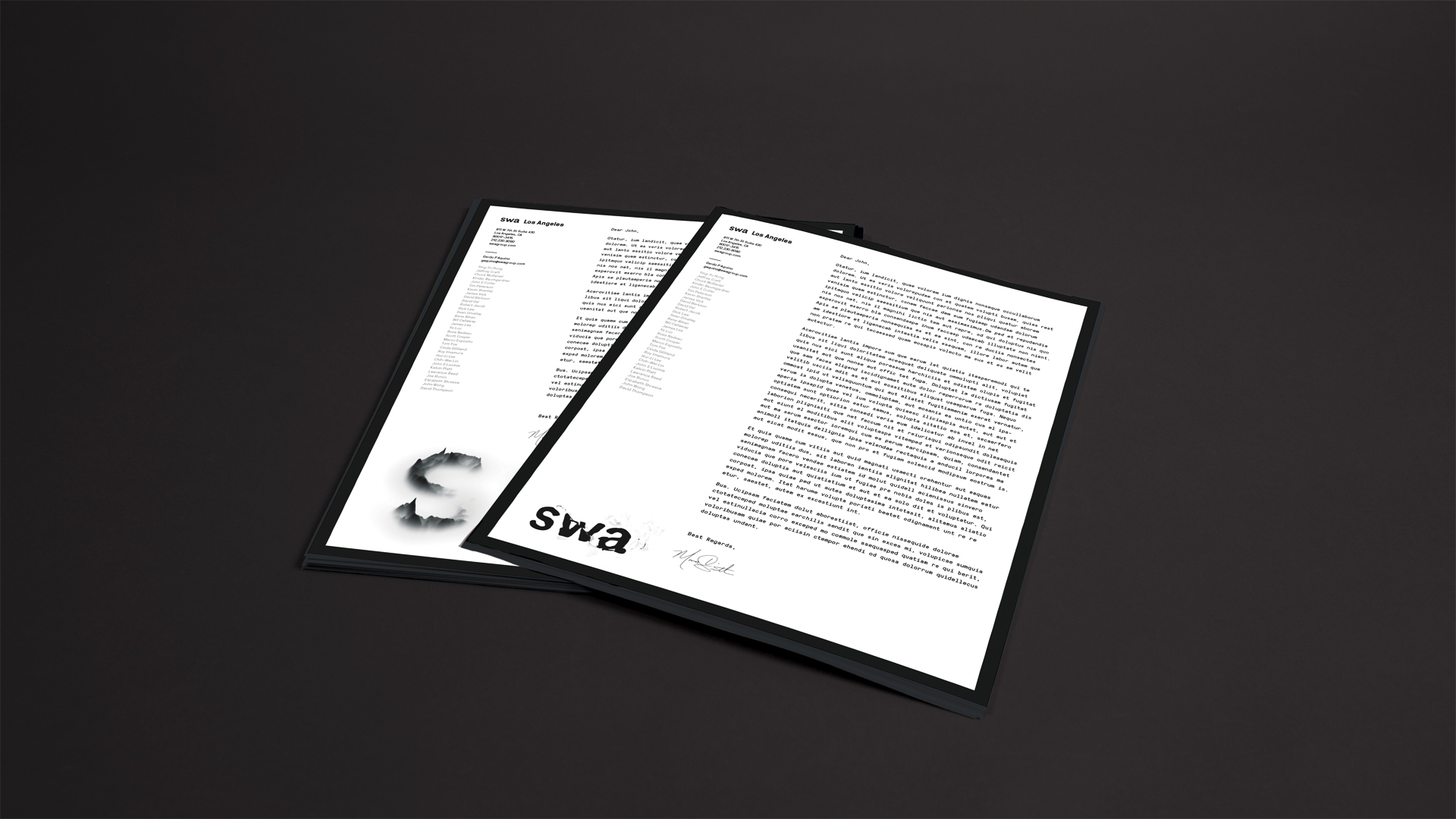
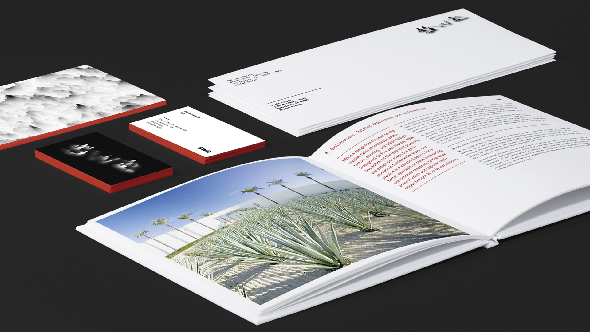
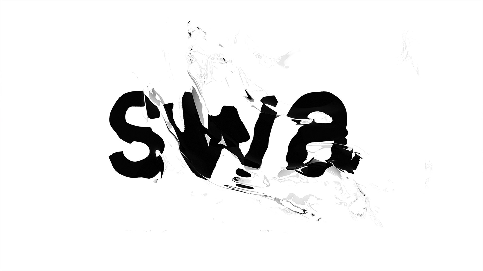
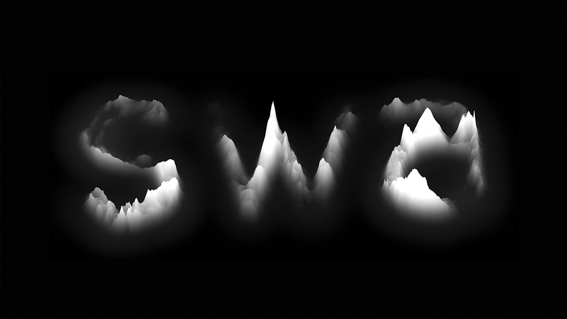
The work is built on research, experimentation and taking risks.
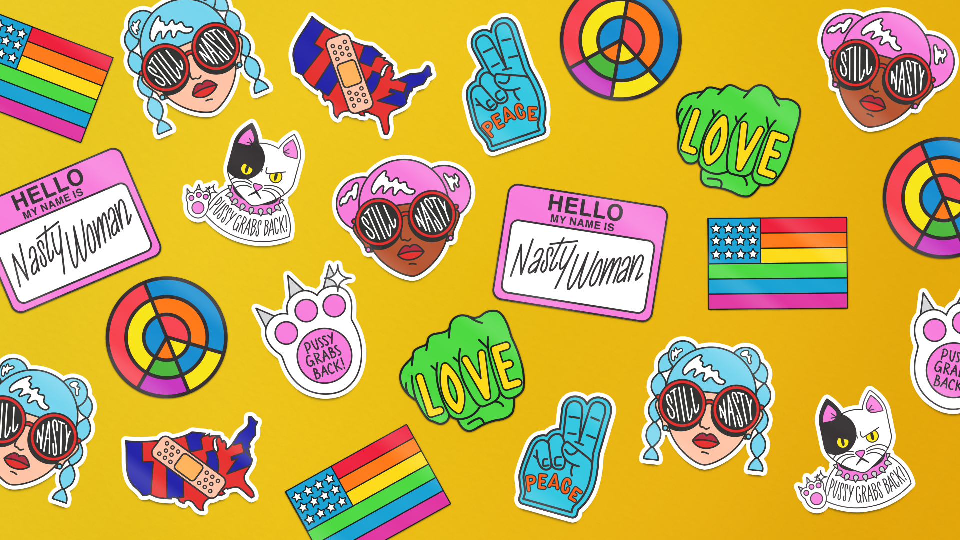
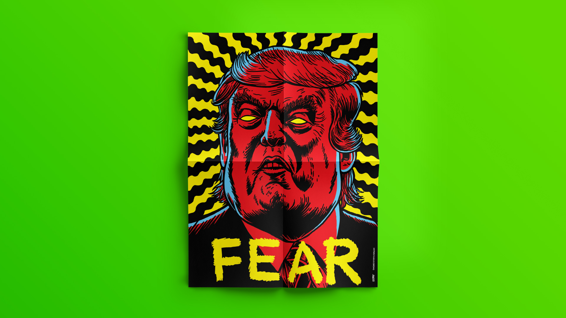
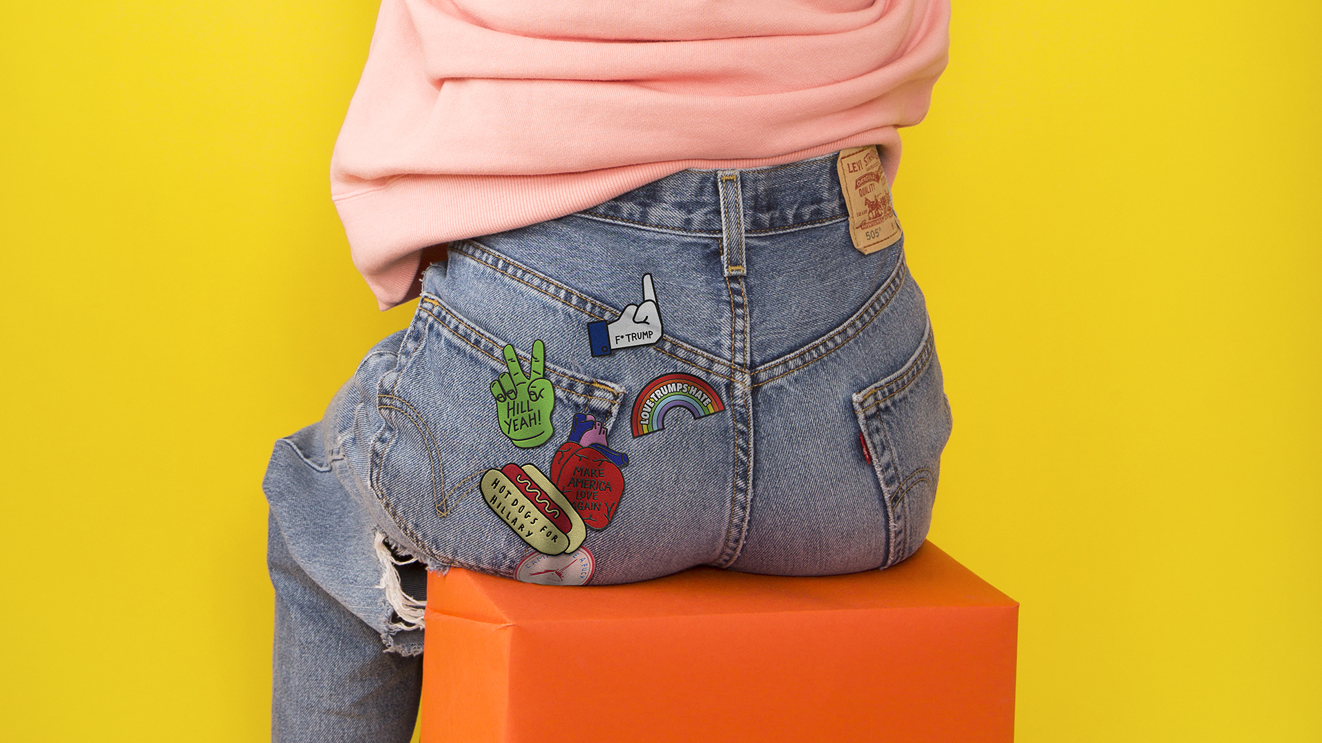
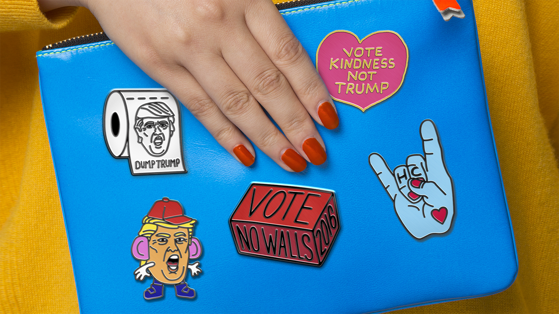
3.Pins Won’t Save The World
A committed project in which a series of pins were created carrying clear social criticism, to be understood against the current American backdrop, with Trump having been declared president.
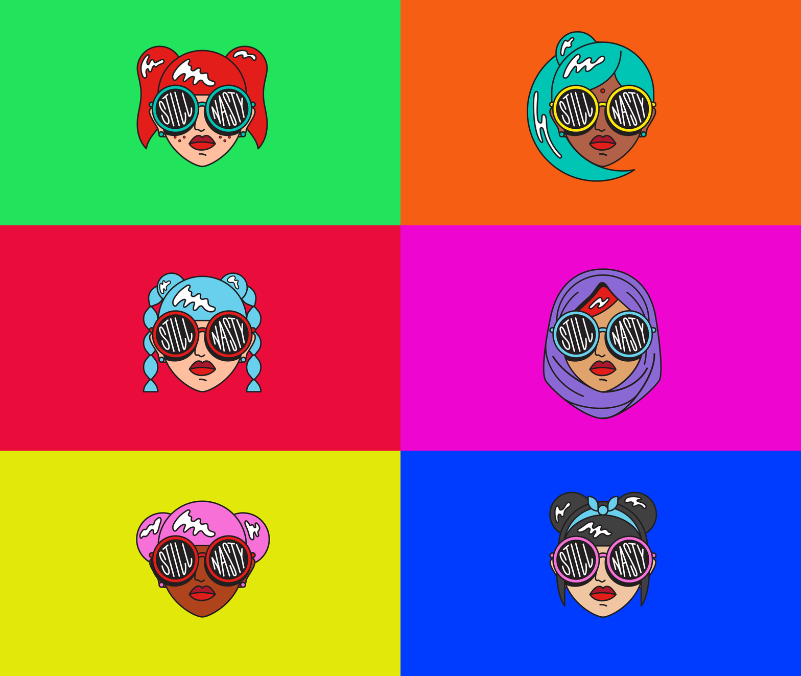
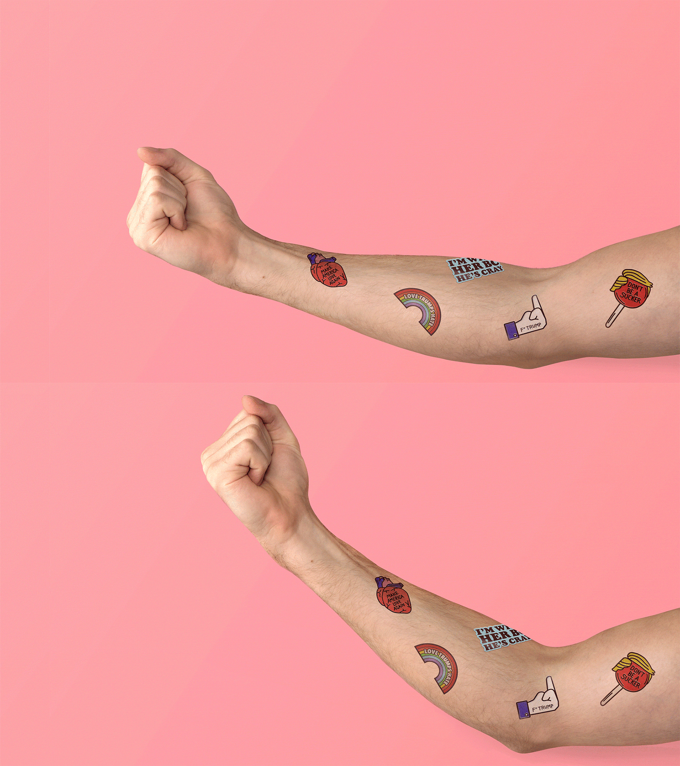
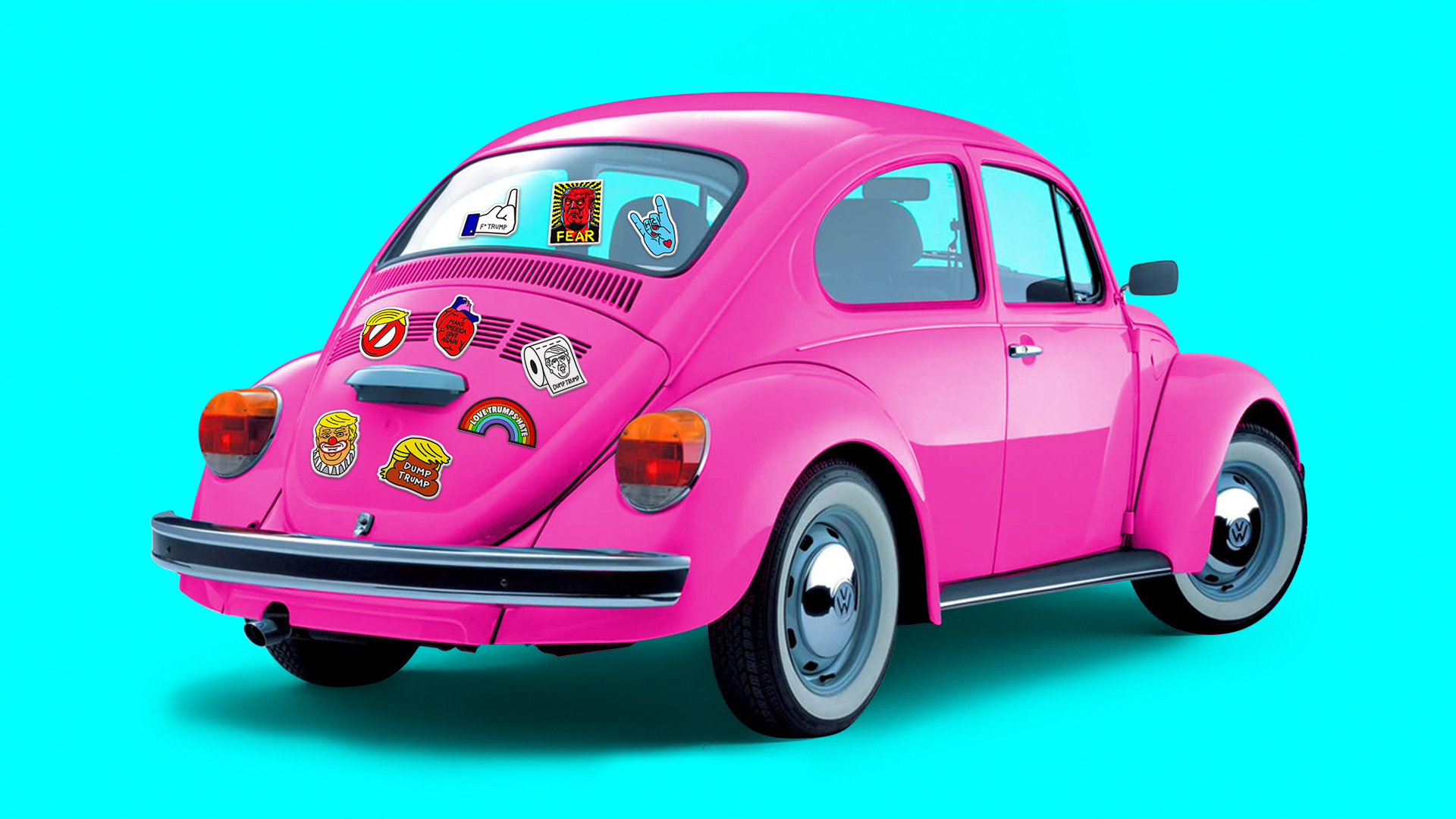
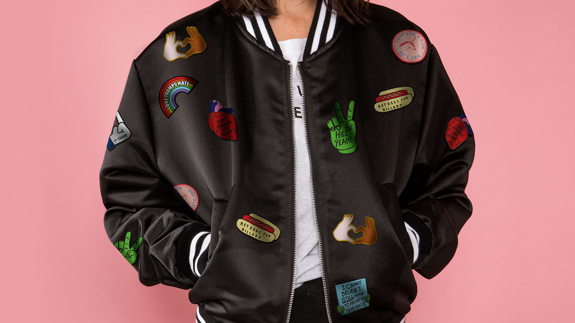
From here on, if none of this grabbed you, close the lid of your coffin and go back to sleep for a bit; for everyone else, there’s more information straight from his website.