The most creative and original logos
Let’s talk a little about the most creative and original logos of the year, a carefully curated selection featuring the best logo designs.
The things we’ll be paying close attention to are their creativity and originality.
As we all know, there’s nothing better than looking after our corporate identity, and choosing a good logo is one of the first decisions we’ll have to make.
So without further ado, here’s the top 10 of the best creative and original logos.
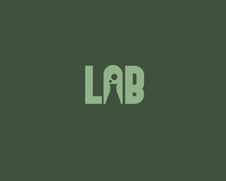
1.Lab
A logo that’s restrained and minimalist at once, with a strong conceptual core; the Lab logo is a small stroke of genius that ticks nearly every box you need for a good logo.
- That it lasts
- That it has presence
- That it’s easy to read
- That it’s easy to remember
- That it conveys the most information with the fewest means
The choice of typeface is spot on: a strong sans serif in bold that perfectly conveys a contemporary view of a laboratory.
The colour choice is likewise perfect: a colour strongly associated with medical settings and lab environments.
Finally, the shape is a small stroke of genius, a fusion of letter and form.
For these reasons we think we can give this logo a score of:
- 75 for creativity
- 80 for originality
2.Fish Food.
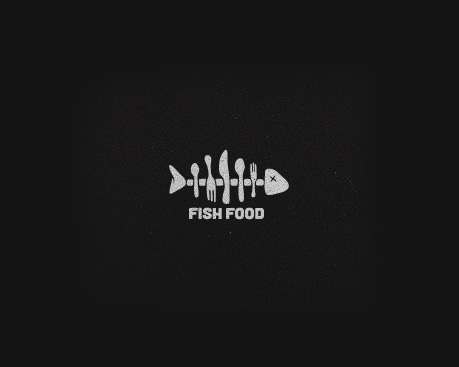
We found the FishFood logo very interesting and worth including in this list of the most creative and original logos.
Obviously the company’s naming does a lot for the logo design and helps us understand its business very clearly.
Even so, what I’d most like to highlight in this logo is the graphic element — the shape without the type.
Without being anything exceptional, I think the two ideas have been brought together with great finesse.
At the same time, the logo breathes a kind of retro-contemporary air, sitting somewhere between early-60s illustration and 2017.
These are the things that make it a good logo to consider in this list of the most original and creative logos.
- 70 for creativity
- 75 for originality
3. Killed.
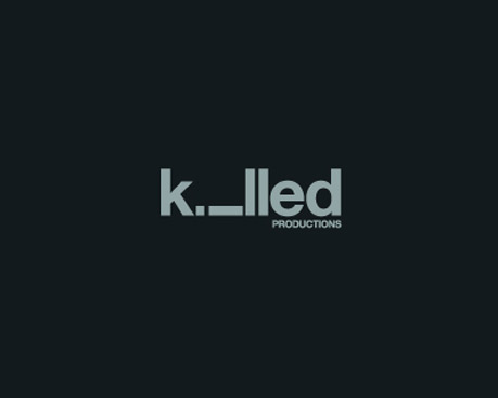
This is one of my favourites for creativity and originality.
Its combination of text and form has been a breath of fresh air in the very well-worn world of logo design.
Personally I’m delighted with the choice of typeface and the colour palette.
The way all the factors at play in logo design come together is magnificent: type, colour, form and content unite to give birth to another small gem that belongs in this list of the most creative and original logos.
- 85 for creativity
- 80 for originality
4. Up
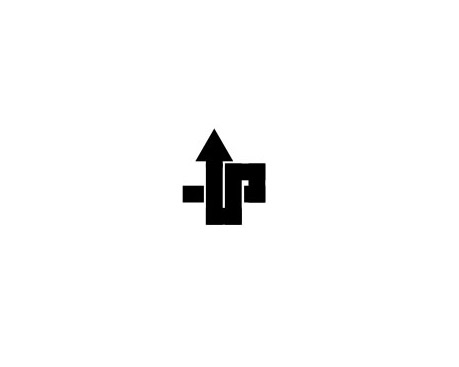
The Up logo design has me hooked; you can really feel the hand of a graphic design expert here.
I think the simplicity of the Up logo is inversely proportional to the conceptual work behind it.
I can only take my hat off to a logo where form has taken charge.
The colour palette has maximum simplicity and contrast; that’s essential for emphasising the logo’s meaning. From bottom to top and from white to black, 100% contrast with maximum effect.
- 90 for creativity
- 85 for originality
5. Turn
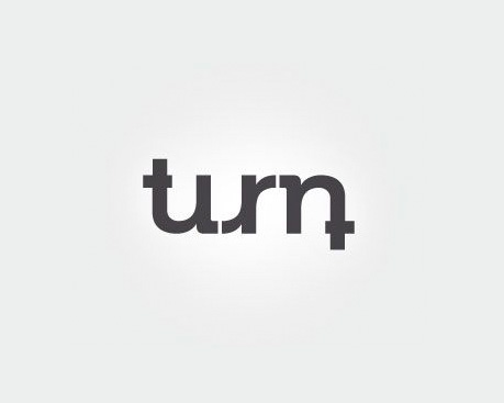
This is undoubtedly a very bold move, and that’s why I think it deserves a place in this list of the most creative and original logos.
Personally, this logo speaks to the nerve of both the designer and the client in making a strong commitment around a very clear idea.
Type turned into form, twisting until it lives up to its name: «turn».
- 85 for creativity
- 85 for originality
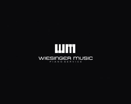
6.Wesinger Music
A very classical logo design that perfectly matches mission and vision.
A very classical approach to form, playing with the initials and a typeface that’s also very classical but not baroque.
Basic colours at 100% contrast that create the figure and form of a piano keyboard.
A good logo to consider in this list of the most creative and original logos.
- 85 for creativity
- 75 for originality
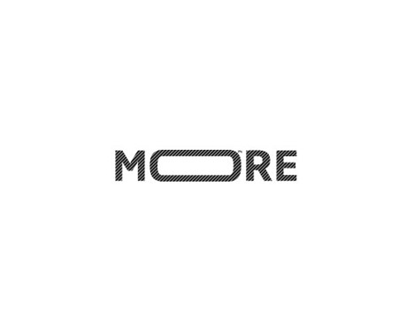
7. More
This logo design is another small creative treat that deserves a place in this list of the most creative and original logos.
A design that’s 100% minimalist.
A simple shape in the «o» of the type.
A sans serif typeface that leaves no room for doubt and a very well-judged colour palette, restrained and never distracting from the real message: «more», I want more.
- 80 for creativity
- 70 for originality
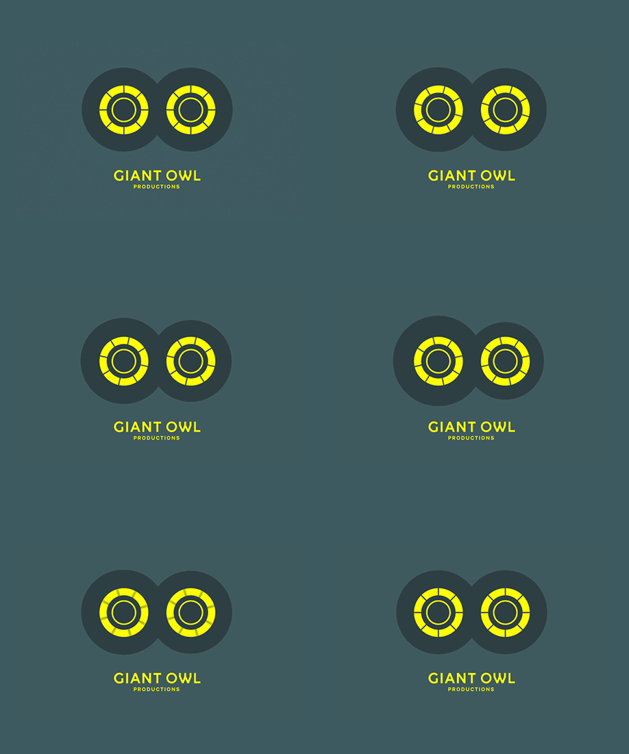
8. Giant Owl
This logo design really caught our eye because it’s one of the few that has dared to go with an animated logo.
Beyond being animated, it works perfectly both ways: static or animated, form and type go hand in hand to give us a very appealing logo.
- 75 for creativity
- 90 for originality
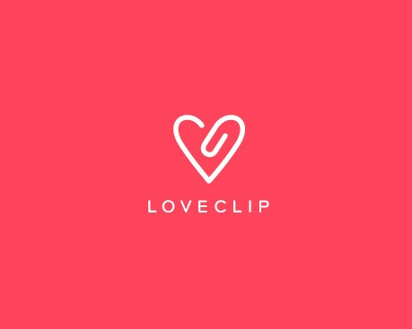
9. LoveClip
A design that isn’t exactly the most original on the list, but it does give us something important: a very simple design that takes us back to a post-millennial childhood.
Playing with both shapes at once and with a very well-judged palette in negative.
- 65 for creativity
- 70 for originality
10. Fubiz
This logo also holds a place of honour in our list of the most creative and original logos.
The animated gif design sits squarely within one of the logo design trends of 2018.
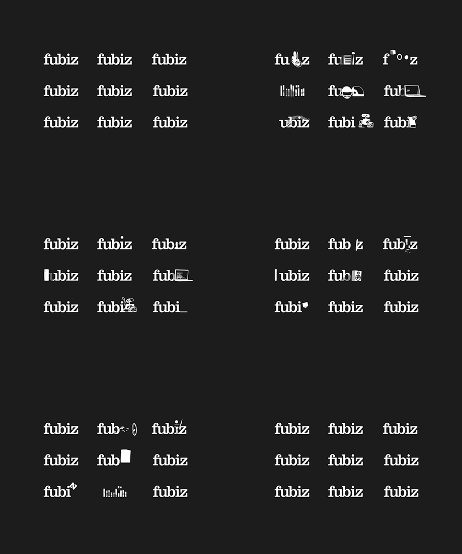
- 95 for creativity
- 95 for originality