Paul Rand (1914-1996)
«There’s a great difference between abstract design without content and abstract design with content. You can be a great manipulator of form, but if the solution isn’t the most fitting one, it makes no sense.»
We’re turning to a figure at the very top of graphic design, whose name and work already belong to the pantheon of brand design: none other than Paul Rand.

Who is Paul Rand?
As always, one thing needs to be clear: Paul Rand is neither an unknown nor a rising star of graphic design.
Born in the United States in 1914 (15 August 1914), he’s widely known for his work designing institutional brands.
His training in graphic design includes the Pratt Institute, the Parsons School of Design and the Art Students League.
«[The designer] must discover a means of communication, or a point of contact, between himself and the viewer.»

Who is Paul Rand?
In his teens his work carried an innovative, avant garde force that was impossible to ignore, with a style considered jarring and objectionable at the time.
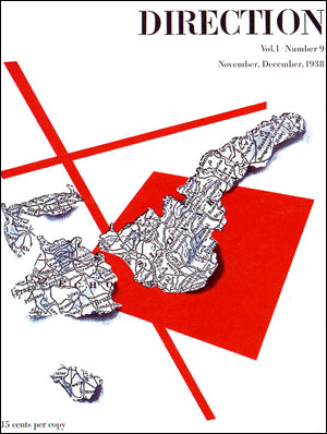
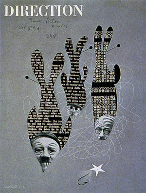
He was art director of the well known magazine Esquire and of Apparel Arts, and produced covers for the Direction cultural journal.
Among other things, his broad artistic practice takes in painting, industrial design, lecturing and advertising art.
«Think in terms of need and function.»
His ability to pour his knowledge and his limitless creativity into his work is well known.
Aspects of his work worth highlighting
His work stands out above all in graphic design for brand creation.
You can see the use of modernist simplicity and the clean geometric handling of white space.
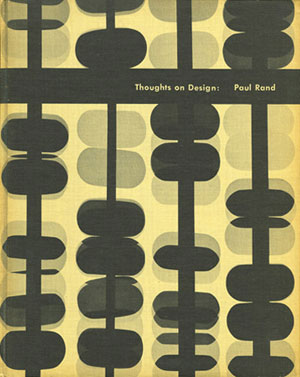
He’s a key figure in American commercial art, and his commercial training meant he offered better solutions than the deeply unfunctional «standard aesthetic» of his time.
Specifically:
Typography: Paul Rand had a distinctive style, the product of his talent and his long design training.
His success lay in mixing nineteenth century engravings with modern typefaces.
Typography was one of his strongest areas, and can be summed up as compositional balance: uniformity and balance of spacing.
Simplicity: this is key to Paul Rand’s work; whatever project he was occupied with, everything was simplicity.
Rebellion: from 1940 onwards Paul Rand broke with the established conventions of typography and design and began bringing the Swiss style into his work.
He fused American visual culture with the European avant garde (modern art) of design, folding in Cubism, Constructivism, the Bauhaus and De Stijl.
Paul Rand’s seven step test for whether your logo works
1. Is it distinctive?
2. Is it visible?
3. Is it adaptable?
4. Is it memorable?
5. Is it universal?
6. Is it timeless?
7. Is it simple?
We’ll devote a whole article to this test in a later post.