In this post I’ve put together the most visual collection I can of what struck me as very good examples of websites for architects.
Whether you’re looking for inspiration as a web designer or you’re an architect after examples to help picture your practice’s website, this post is meant to be a collection of the best in web design as far as an architect might hope for.
Examples of websites for architects, the very best
Humbert & Poyet
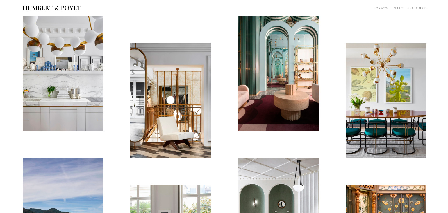
This site, designed by Oui Will, has a very clean feel. With a masonry style portfolio (a Pinterest style gallery), it struck me as an example that deserves a place in this round up of websites for architects.
Ark-Shelter

Designed by Ollie, from Belgium. This site has full screen video and some very well handled opening animations.
Archi Site Mobius
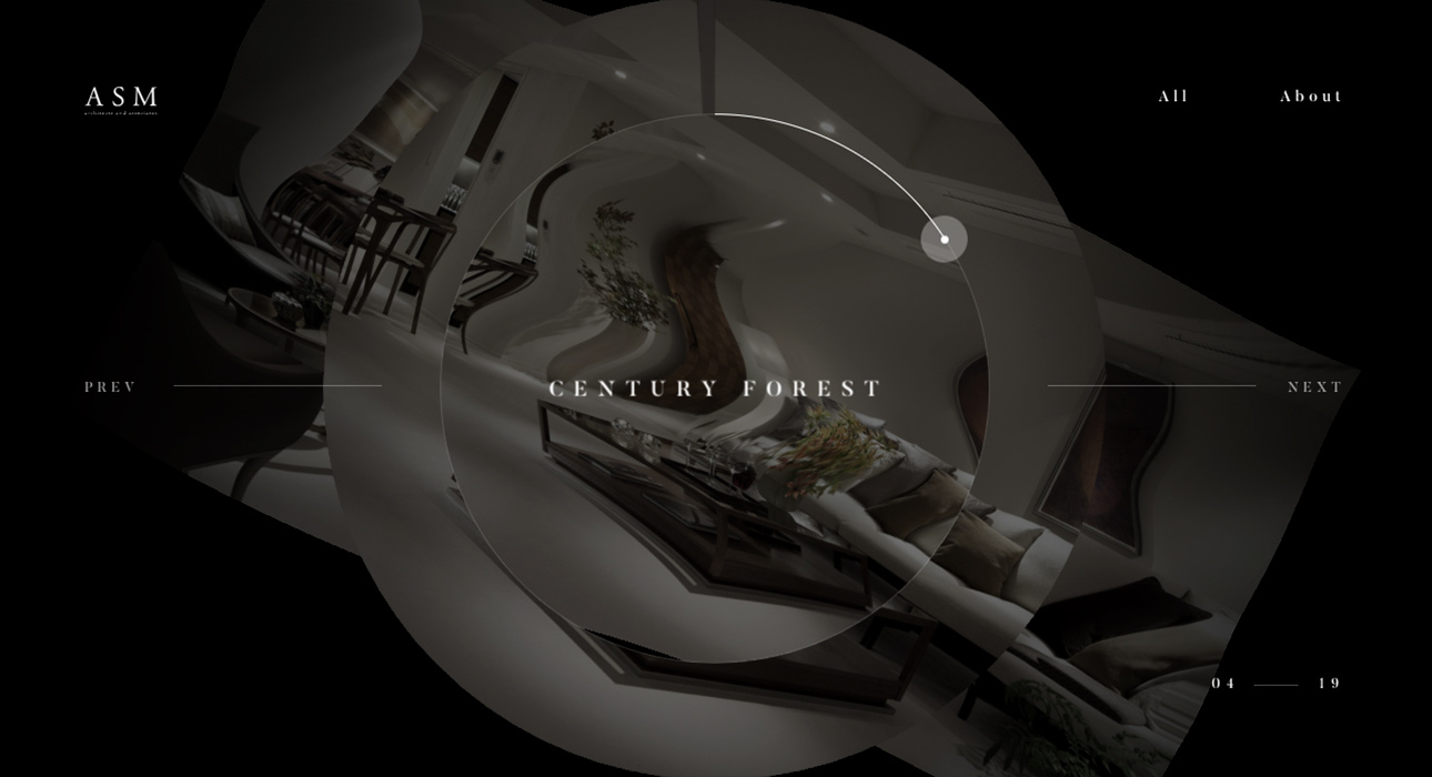
Using canvas for the slider transitions, we find a gem of web design. I won’t give away much more, since it’s hard to put something this visually striking into words. The website itself is an experience from start to finish.
Zikzak
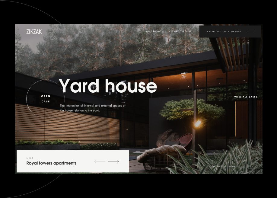
Designed by Ribs, from Ukraine. As well as having a very clean, well executed design, I’d single out the effect as you move between slides on the main slider. The transitions between sections are also very well handled.
The Urban Village Project
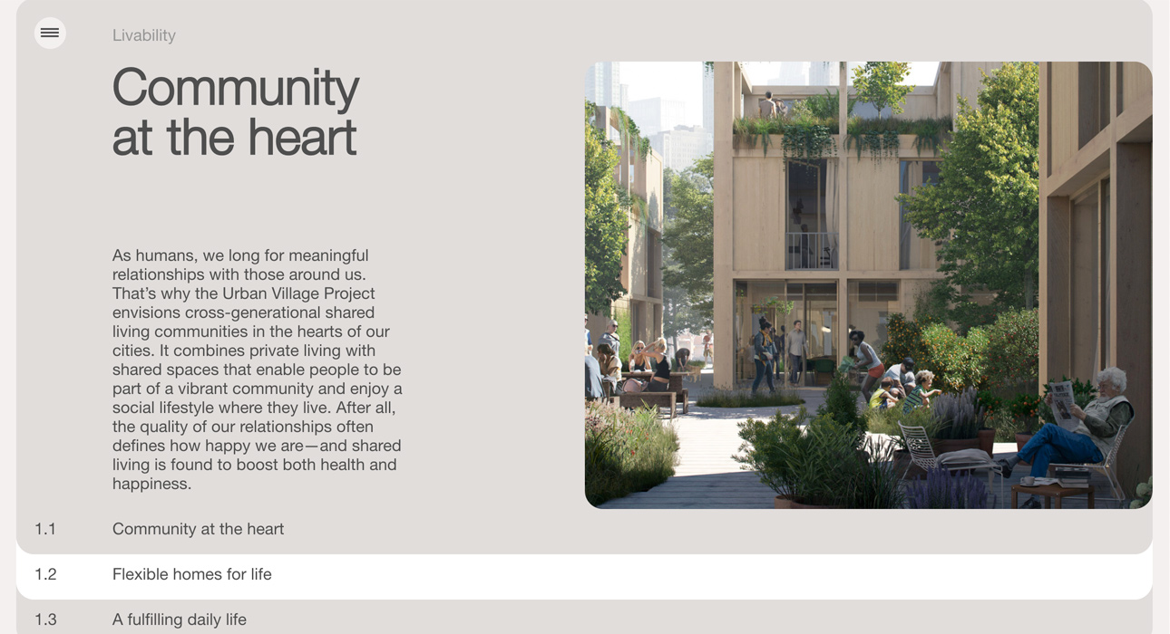
Designed by Space10, from Denmark. If I’m honest, the design itself didn’t bowl me over. What I did like a great deal, and this is why it’s in this list of examples of websites for architects, is the way it presents information in a «card/slide» format.
Archi Graphi
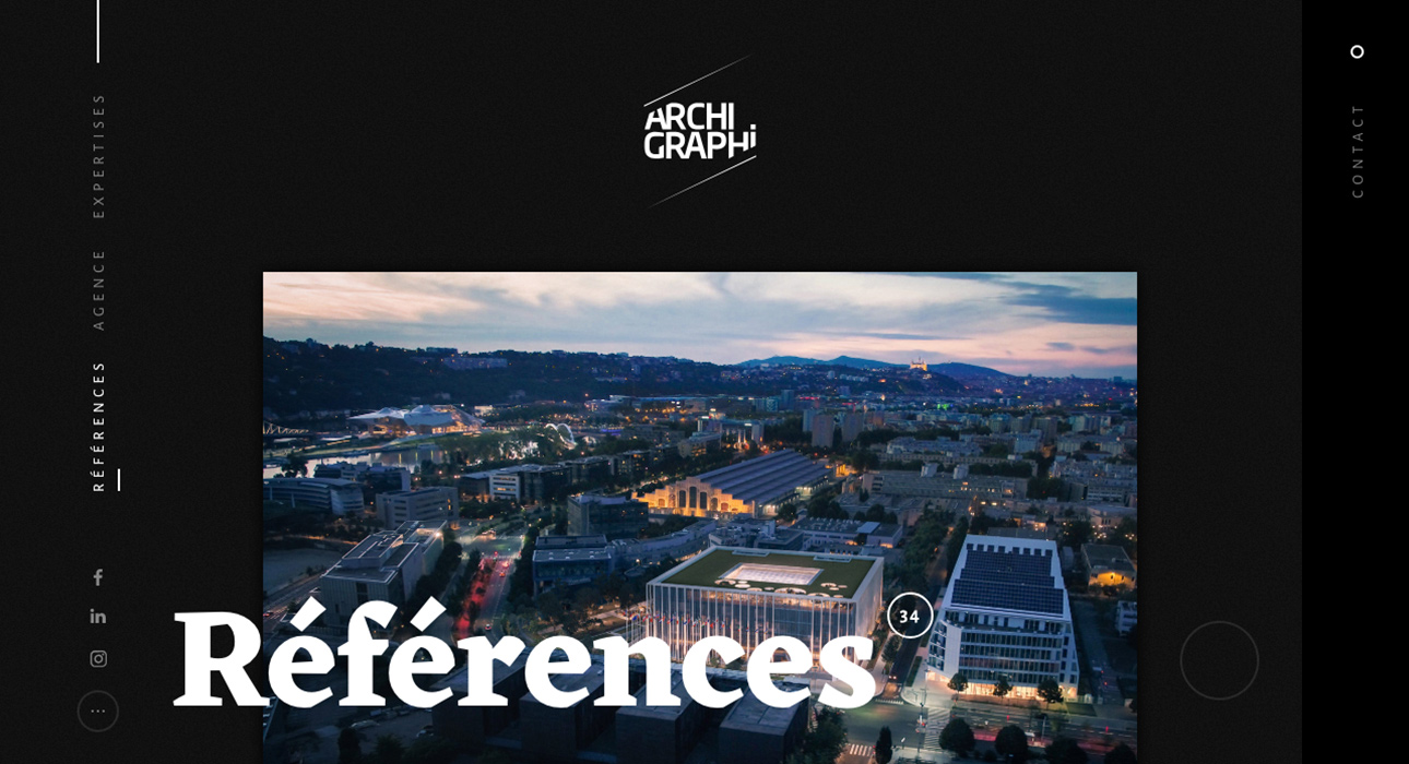
This site was designed by Les Animals, from France. The dark tone offers a perfect contrast with the kind of photography they work with. The transitions are also worth noting.
Tennent Brown Architects
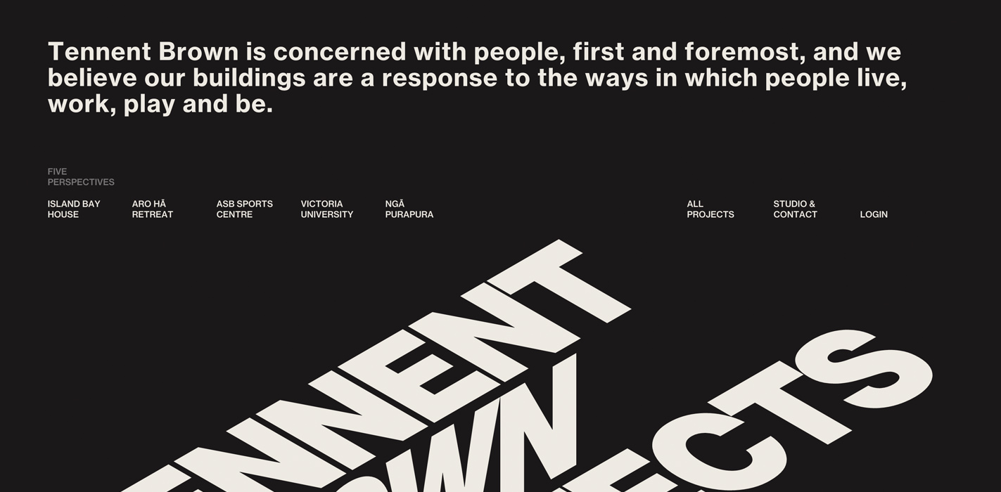
By Sons & Co., from New Zealand. Far from the usual homepages built on architectural photography, this site takes a risk and opens with a very well chosen piece of typography. As you scroll down, the type below moves to create a 3D effect, as though climbing a staircase. A serious piece of visual craft.
Leviev Group
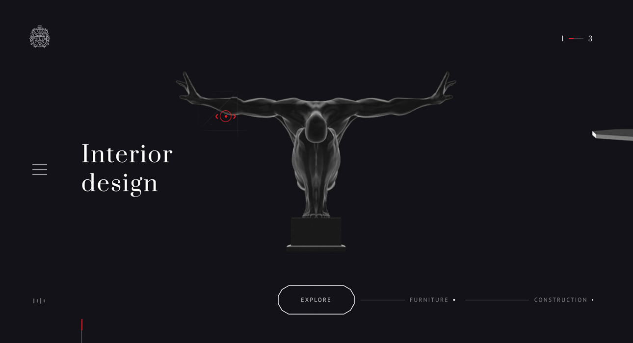
Designed by the brilliant Red Collar, from Russia, this site deserves a place of its own on the winners’ podium. Spectacular effects that will leave you open mouthed, without a doubt.