The moment you’ve all been waiting for has arrived — here come…. the best graphic designs of 2020 2021.
After a whole year of intense work and social uncertainty, let’s see what the year’s best graphic design has been.
We’ve looked at hundreds of projects from the best graphic design studios on the planet, we’ve been through the winners of the most prestigious design and creativity awards, and I think we’ve earned the right to recommend this set of projects as a source of inspiration and an example for your own work.
Don’t miss this list of the best references across different fields of graphic design.
Here you’ll find projects in pure graphic design, corporate identity design, advertising campaign creation, poster design and countless other examples.
Best graphic designs of 2020 2021
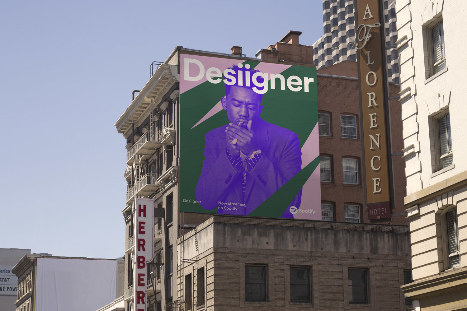
Spotify by Ben J. Crick
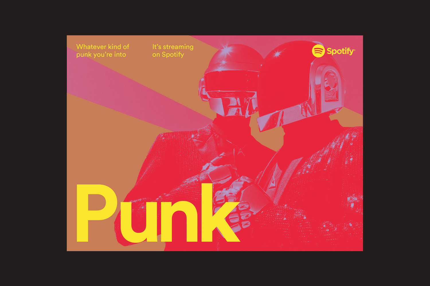
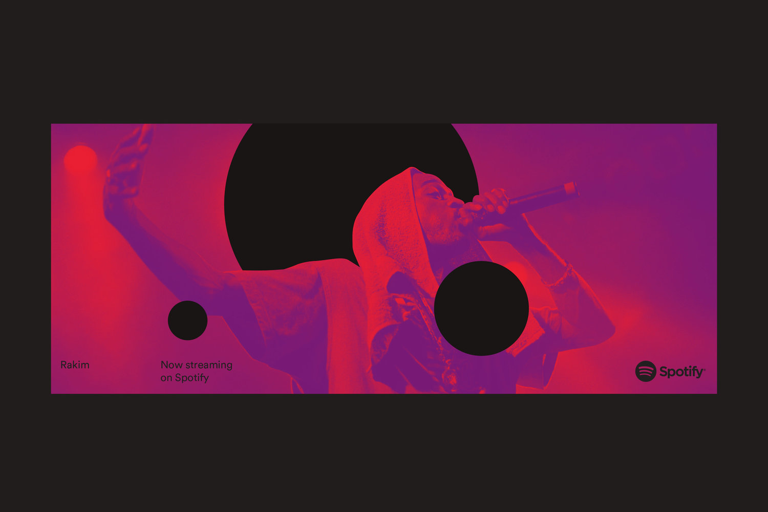
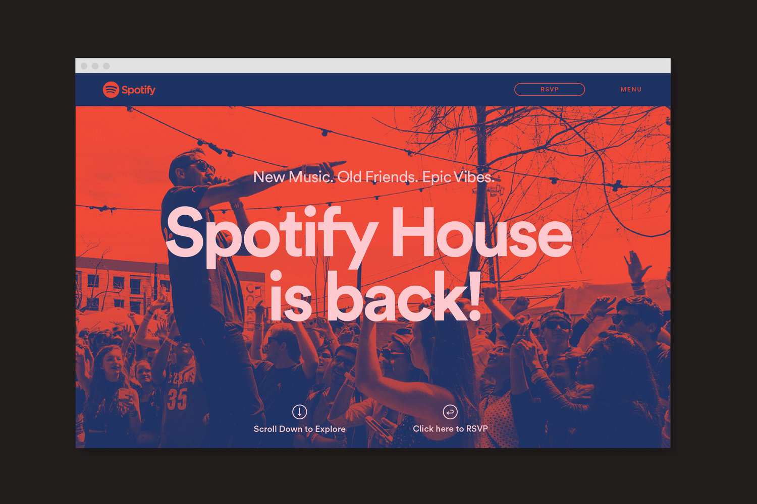
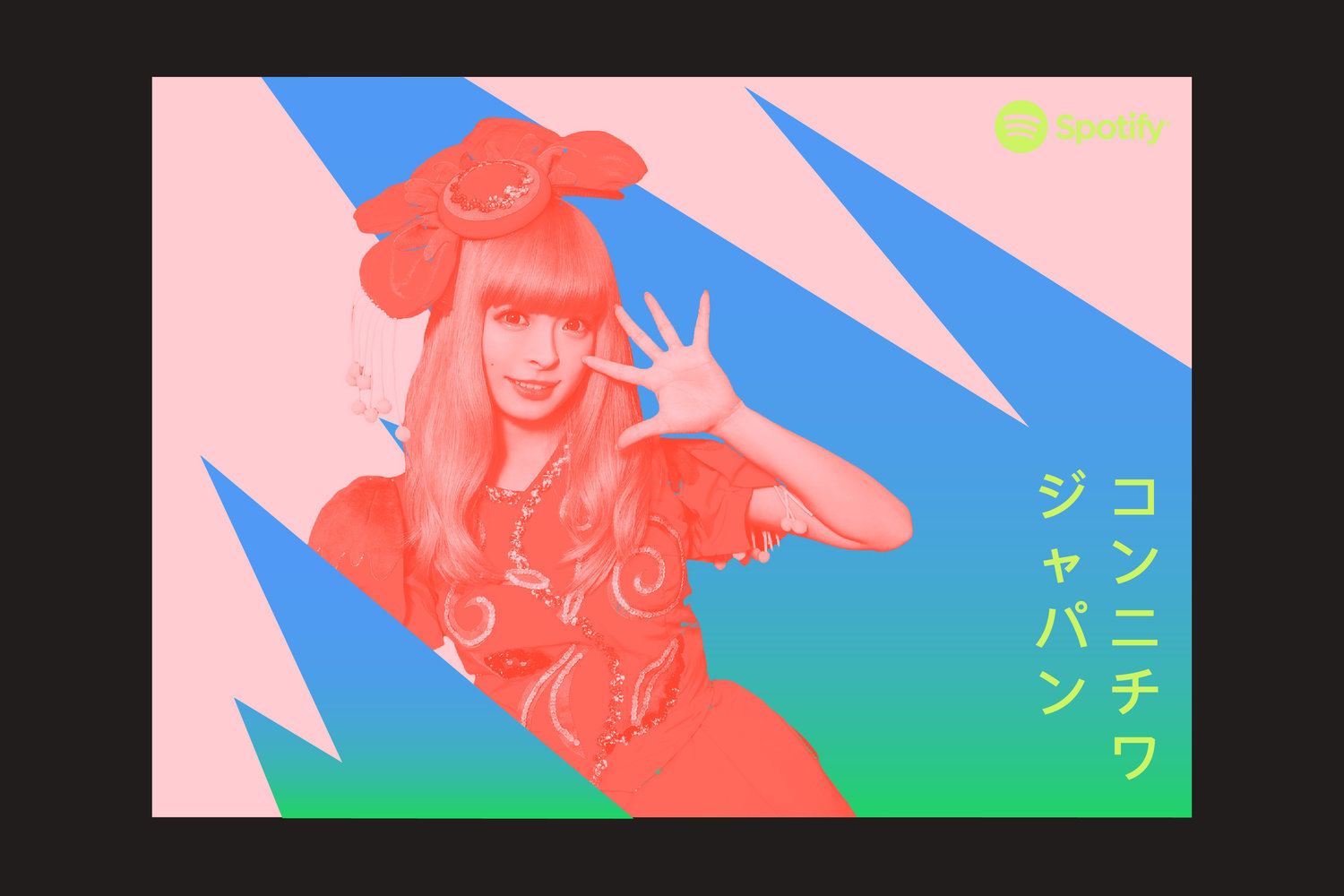
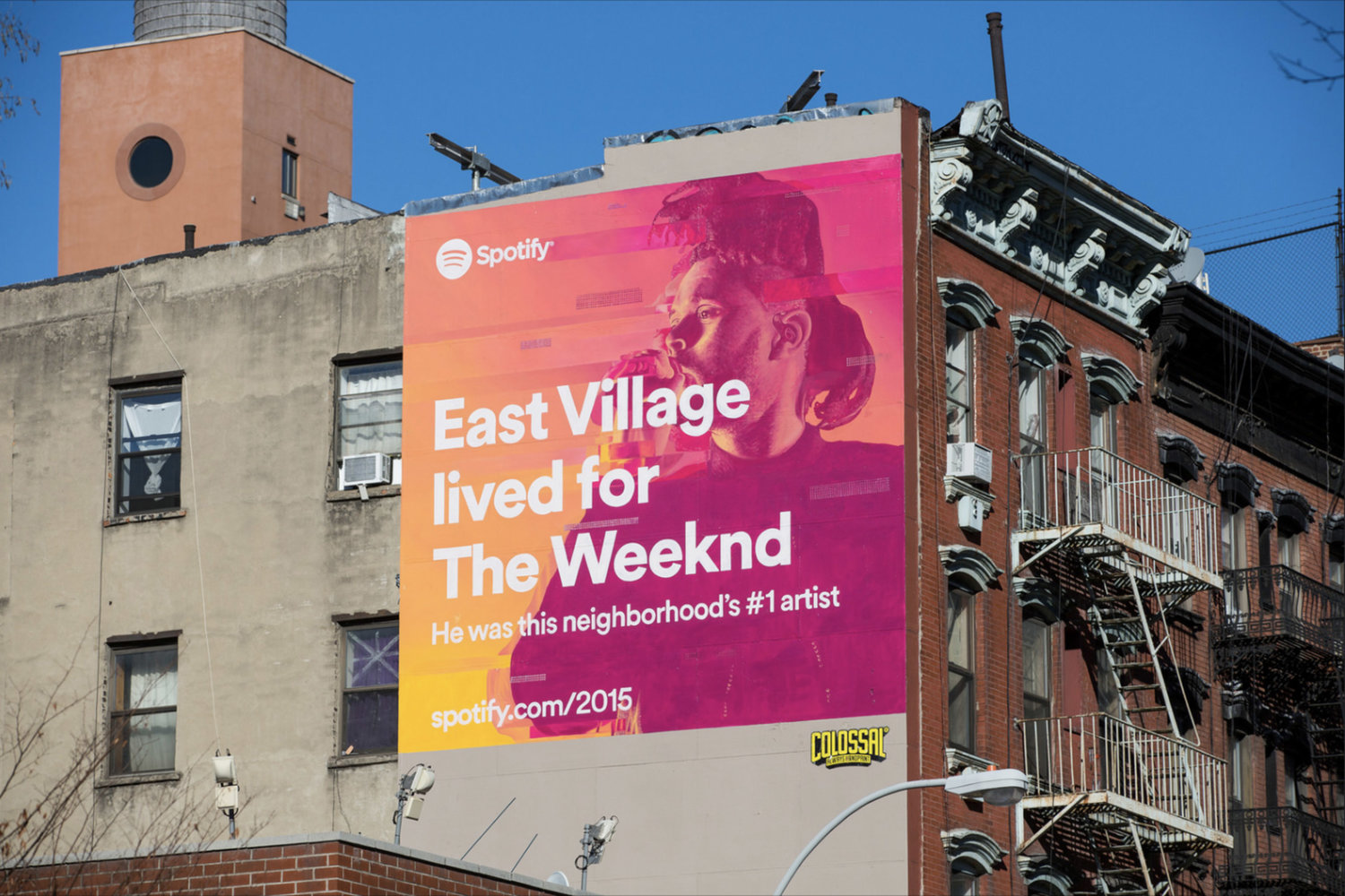
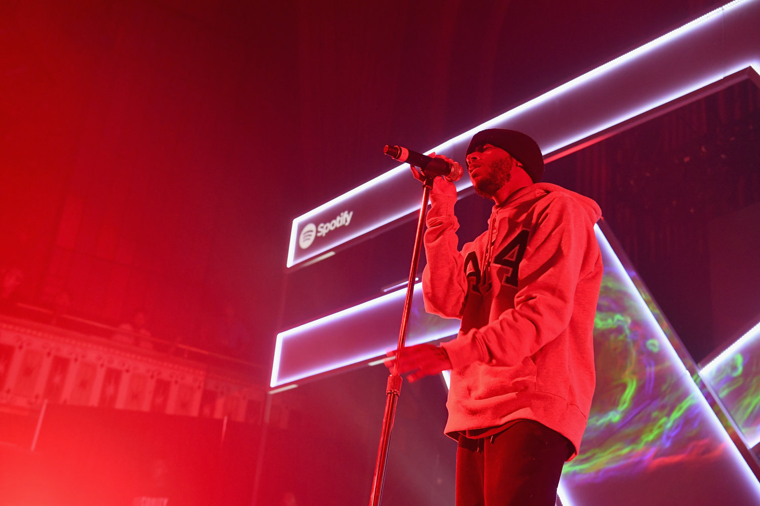
We begin our search for the best graphic designs of 2020 and 2021 with the work graphic designer Ben J. Crick did on Spotify’s annual image campaign.
The devices used are exceptional and show a deep command of the craft and of the communicative medium the project moves in.
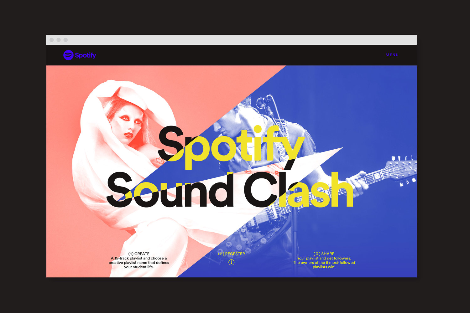
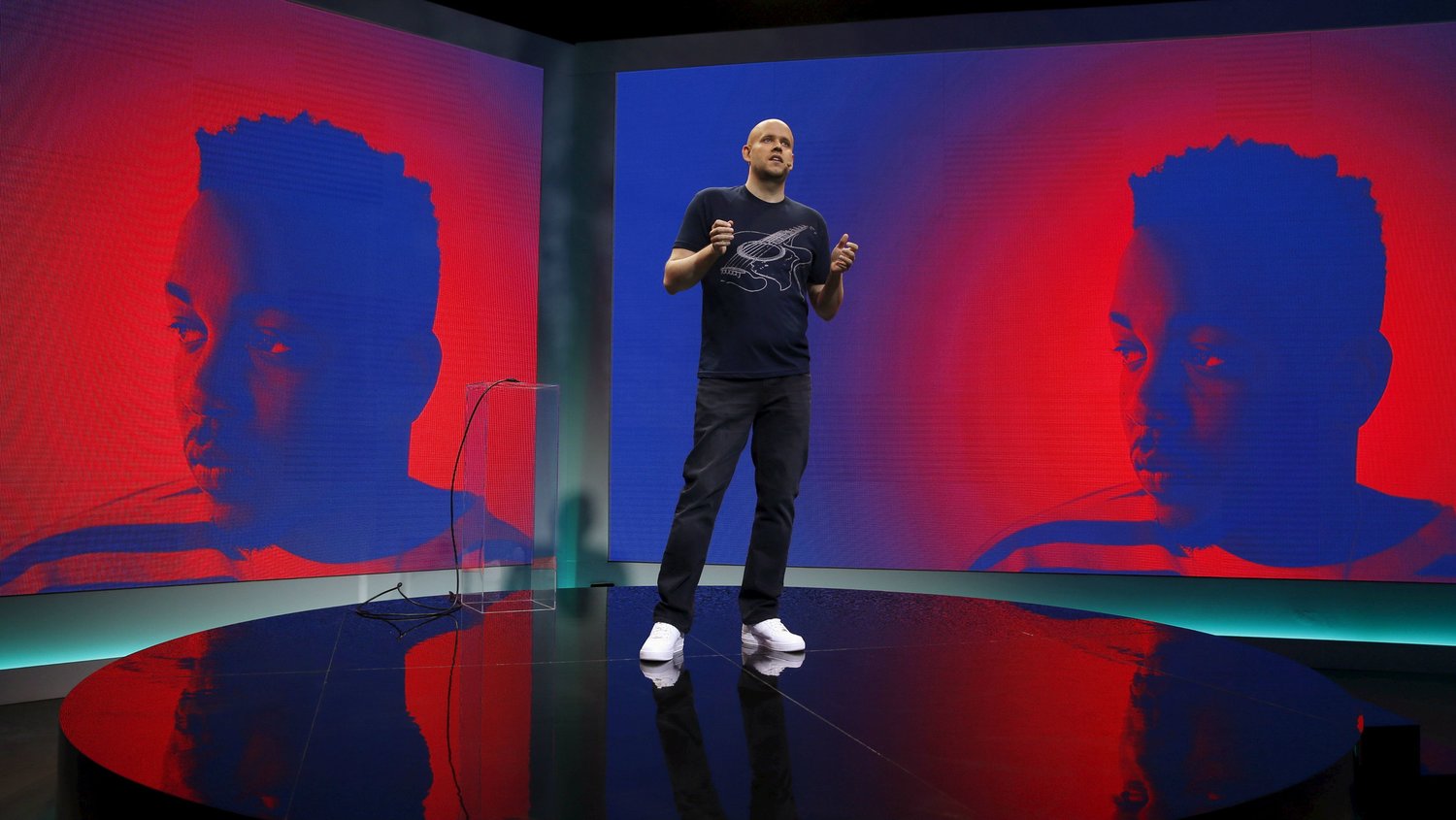
A series of very powerful, evocative images handled superbly in post-production. These in turn are combined in the graphic design with geometric shapes and overlaid elements and graphic devices.
As if that weren’t enough, large type has been used along with a very bold, dynamic, electric colour palette that produces very strong contrast between graphic elements.
Why?
- Vivid, high-contrast colours
- Geometric shapes
- How the project was conceived
- The look and feel
- The large type
- The evocative, powerful images
- The overlaid elements
- The photo retouching
- The presentation
Srisangdao Rice by Prompt Design
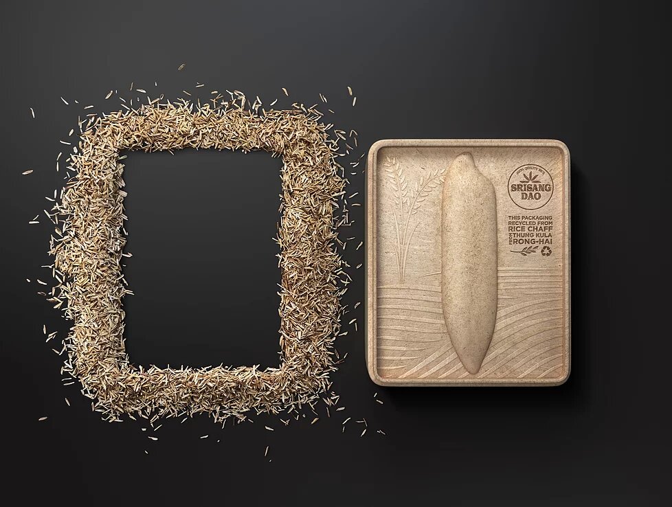
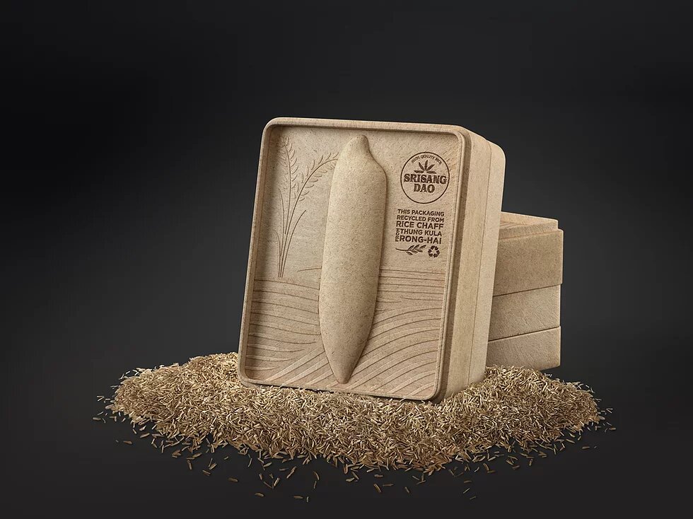
Another area of graphic design is commercial product packaging, and that’s where our next pick comes from — one we think belongs in our search for the year’s best graphic design.
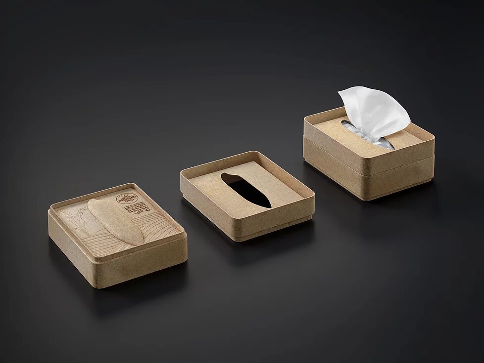
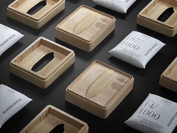
This graphic design and branding studio took on the graphic and packaging design for Srisangdao Rice.
The brand is well known in Thailand for offering a high-quality product and for taking respectful, sustainable production seriously.
Every element of the design is made sustainably and ecologically, and the box and sack design stands out as very organic and personal.
This project has been awarded, among others:
- Good Design Australia in the Best in Class Communication Packaging category
- Good Design Award in the Best Packaging category
- Muse Design Award, Platinum Award in Packaging Design
- Golden Pin Design Award in the Communication Design category
Why?
- For how completely it was conceived
- For the use of organic, sustainable materials
- For its personal design
- For its tone of voice
- For the packaging design
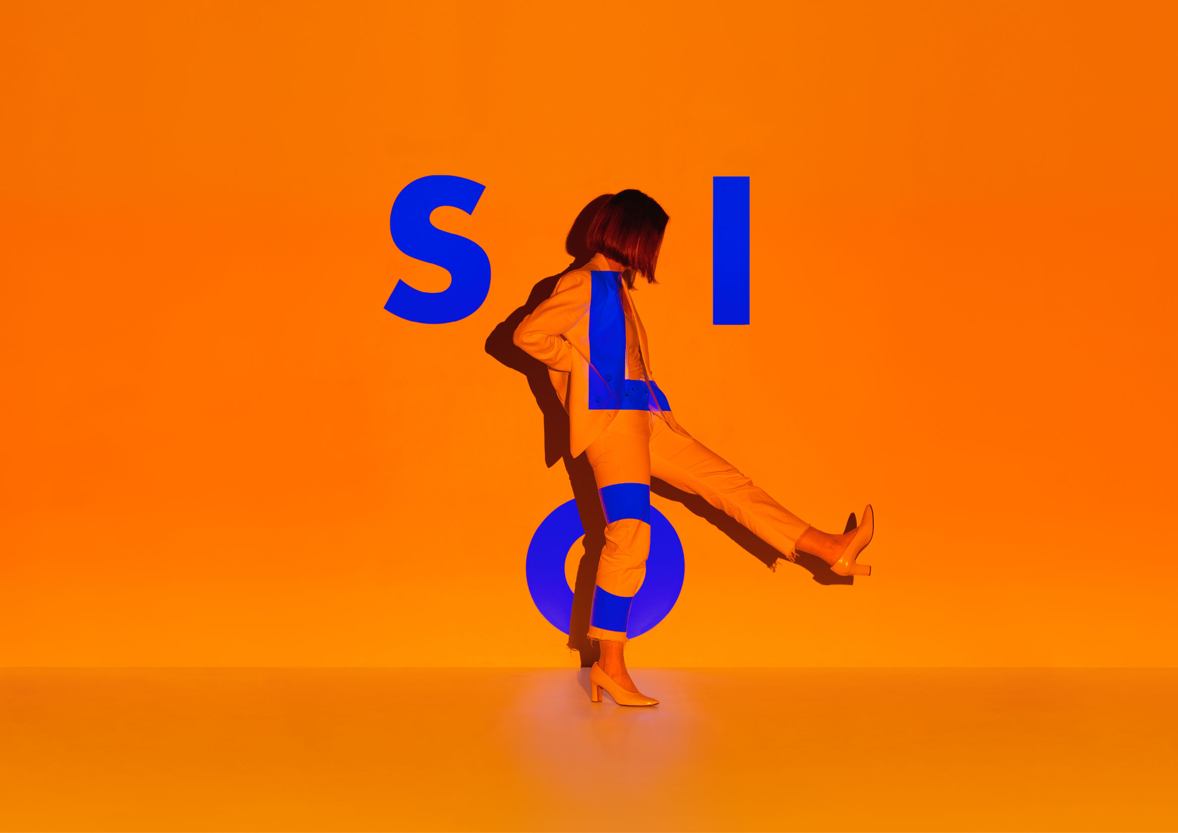
Silo Theater 2020 Season Campaign by Seachange Studio
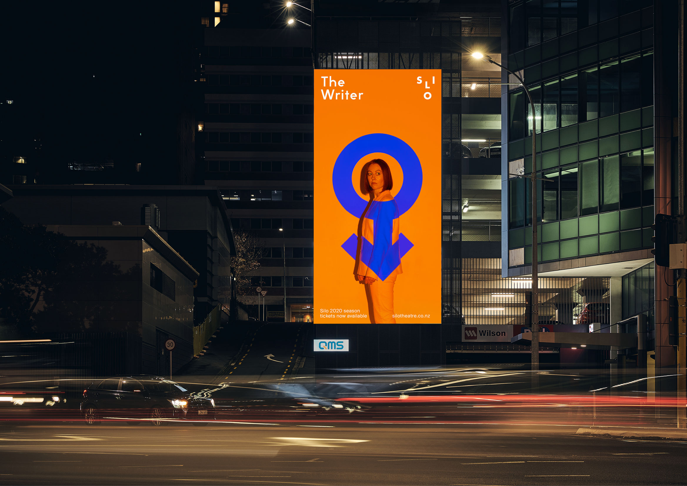
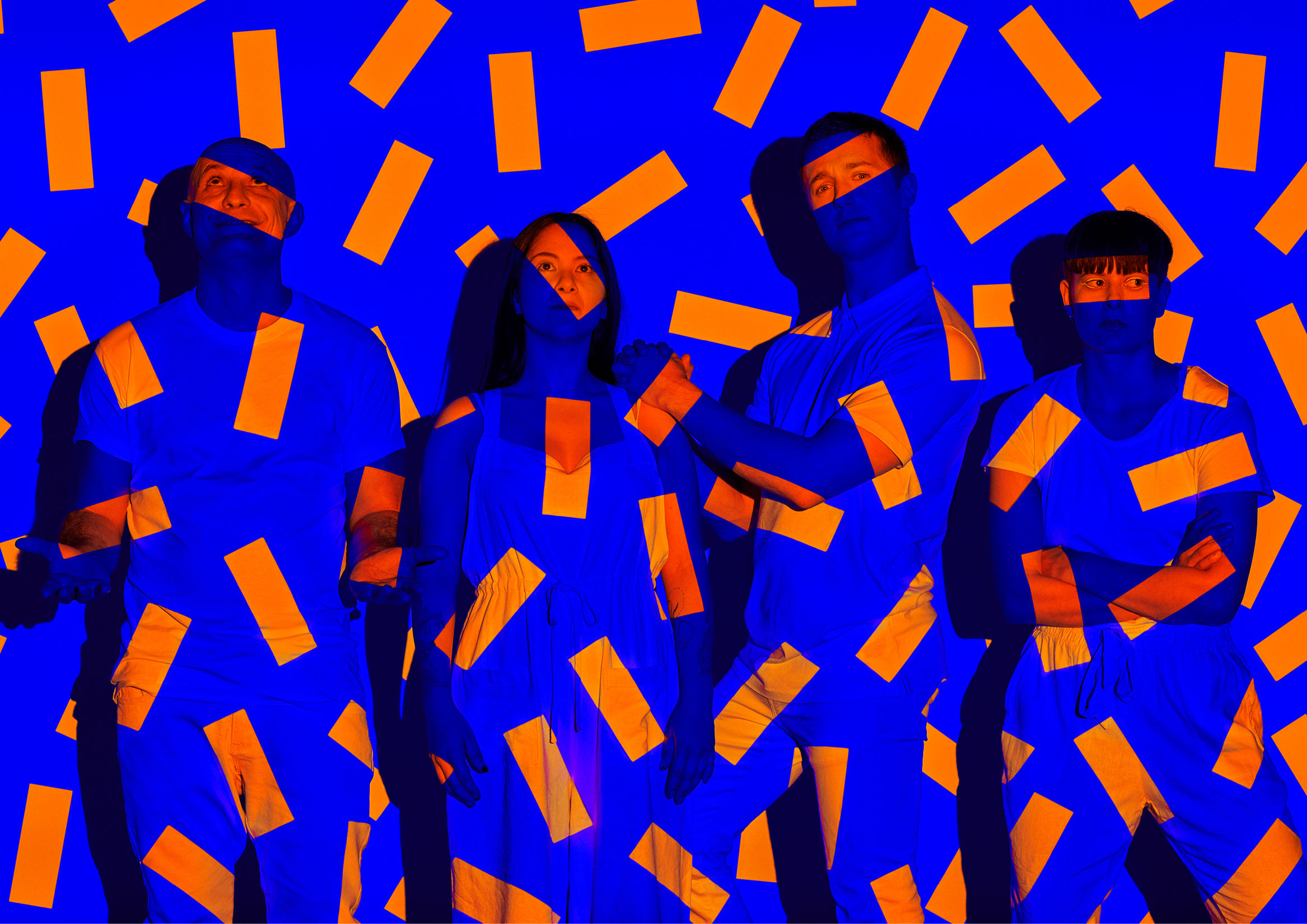
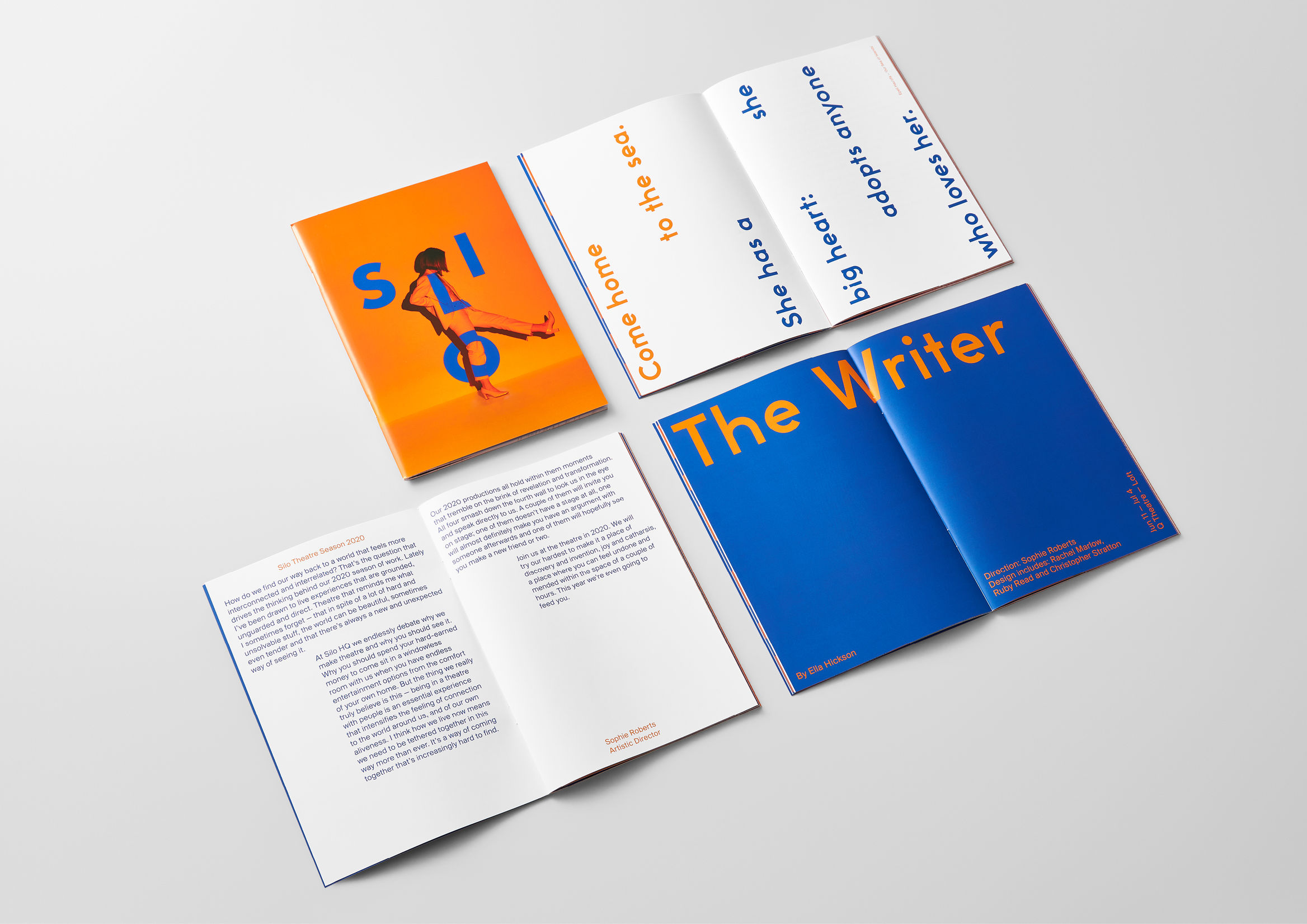
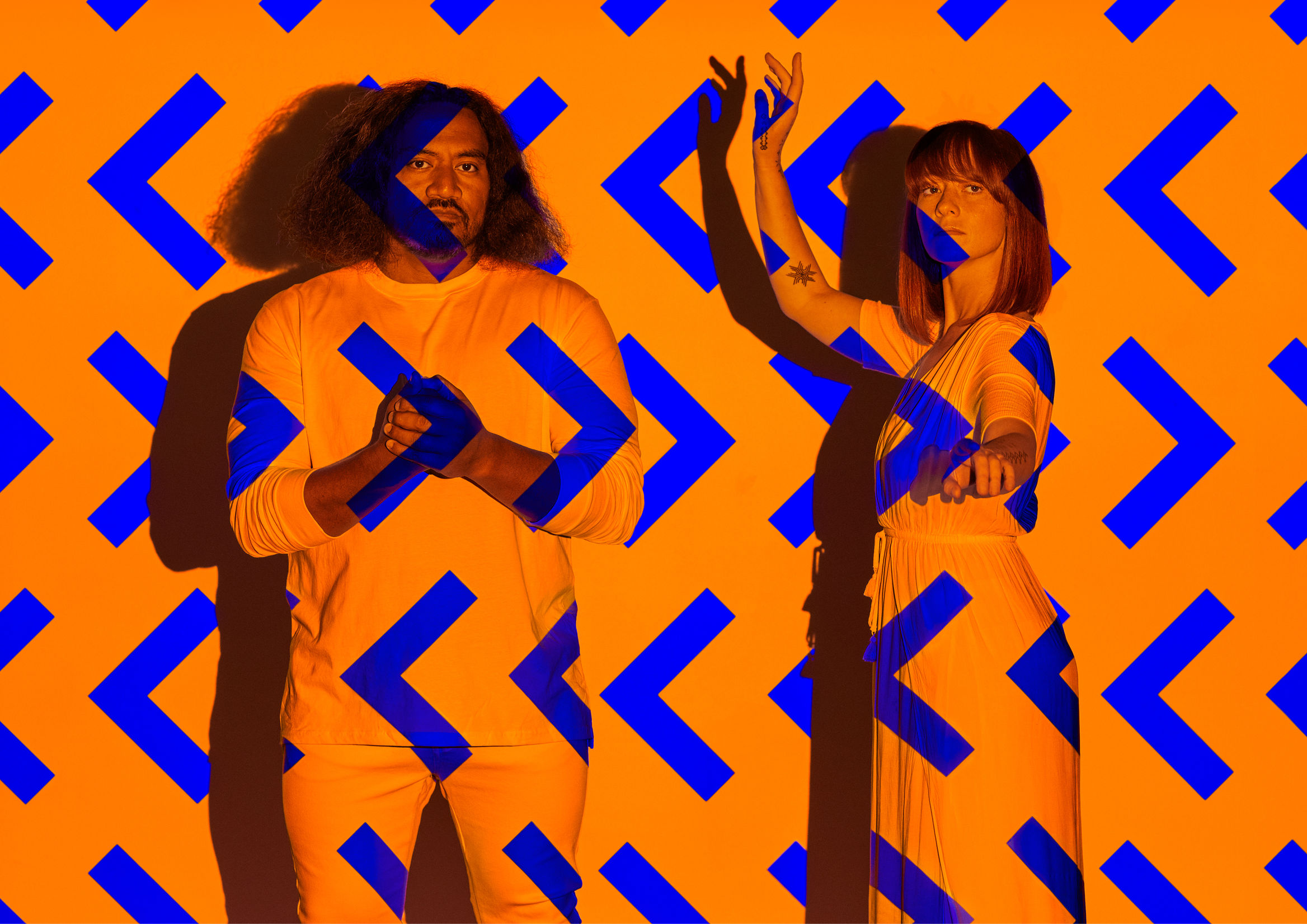
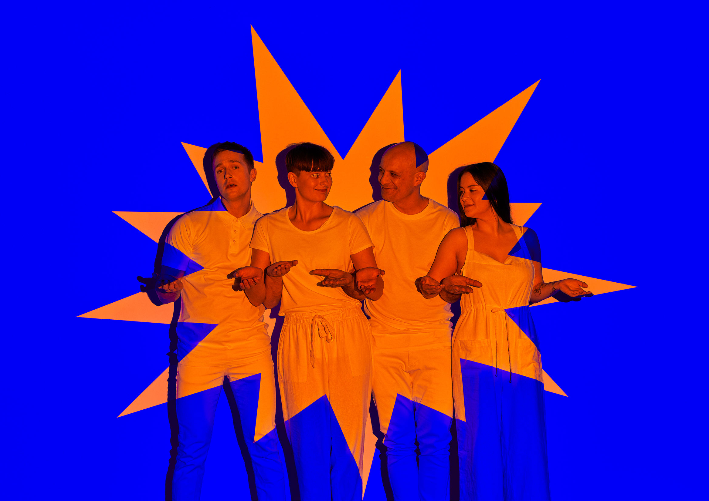
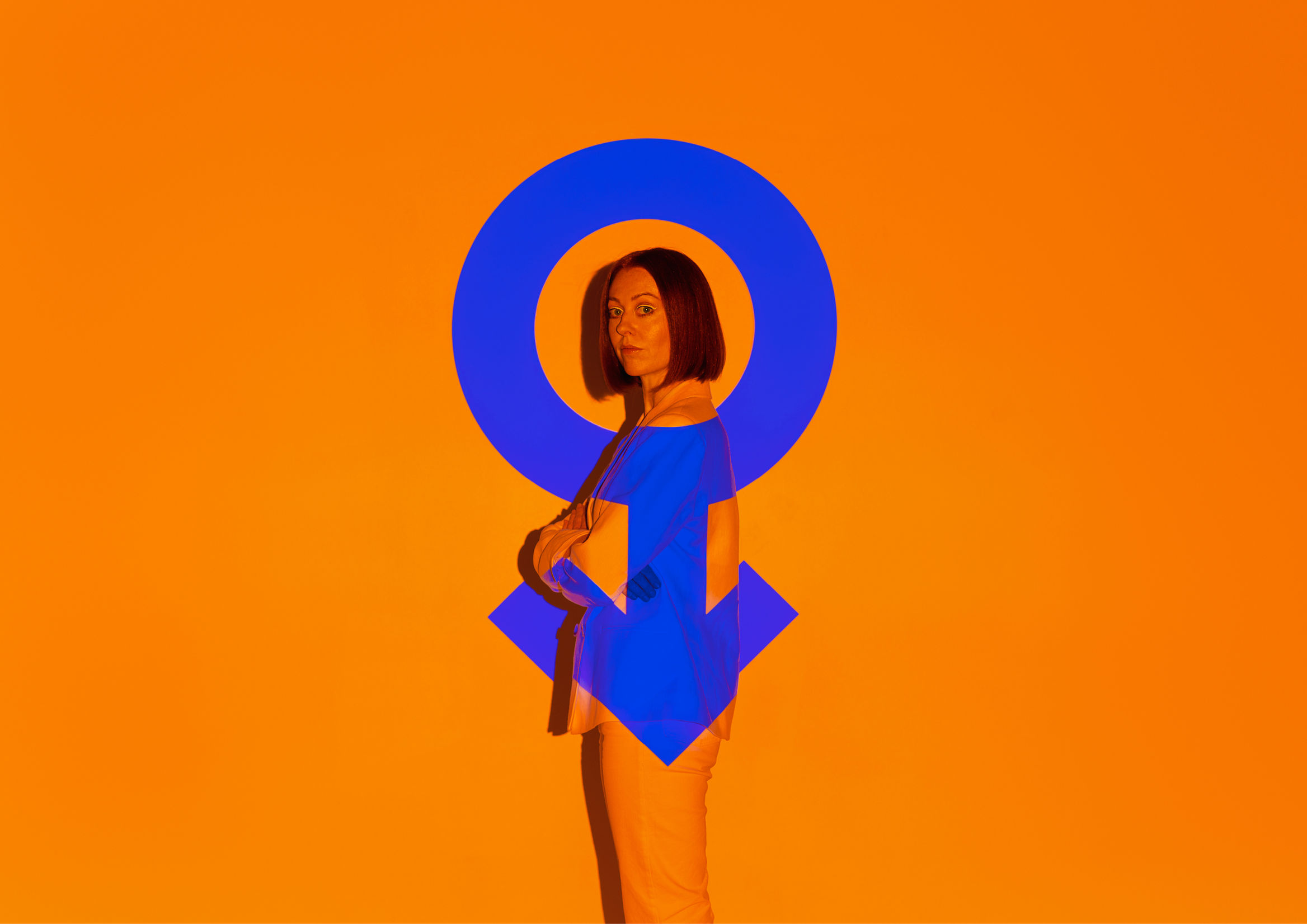
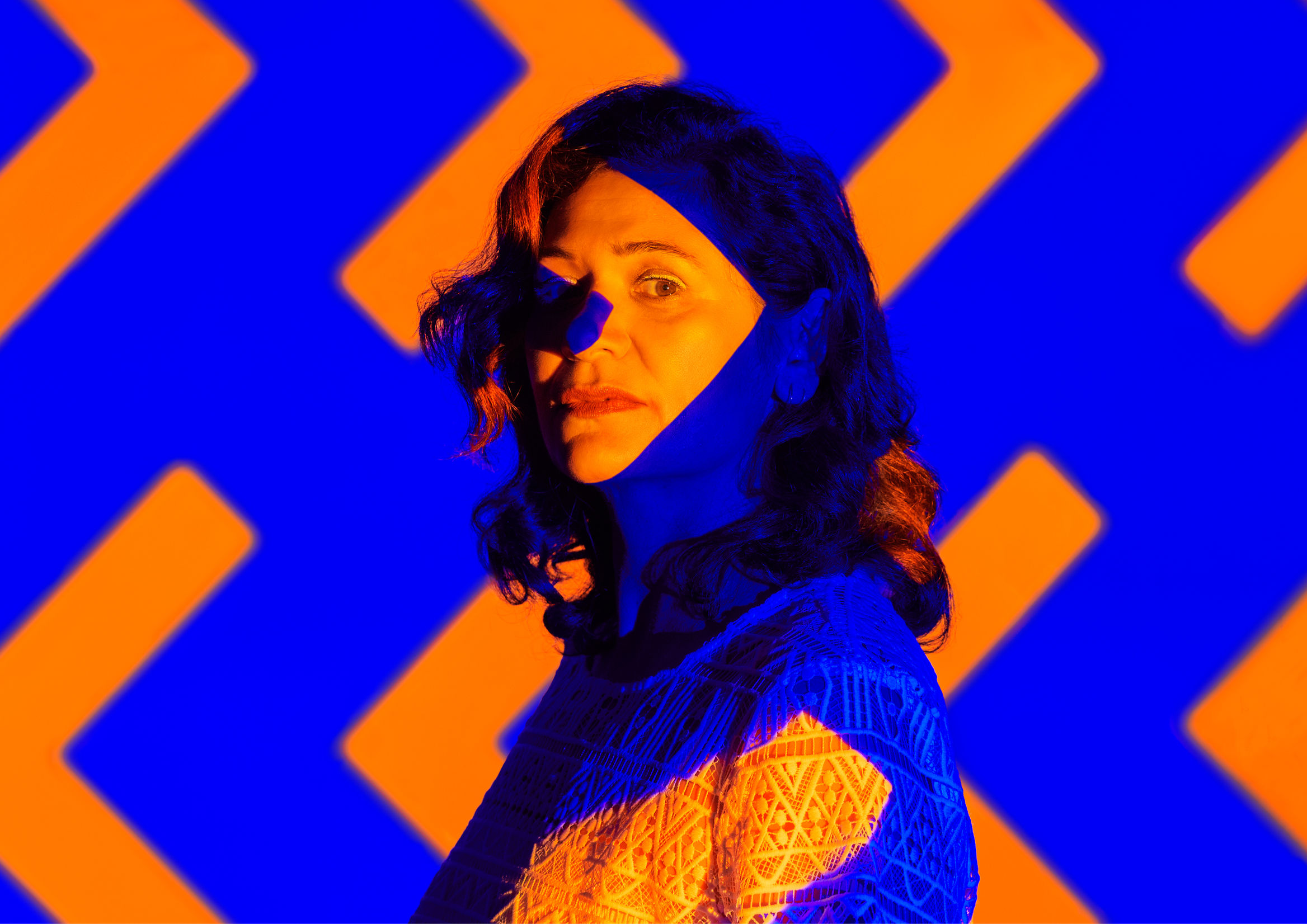
The third pick we come to in our search for the best graphic designs of 2020 and 2021 is the work done by graphic design and creative studio Seachange Studio for Silo Theatre.
Knowing that Silo Theatre is a benchmark for theatre and contemporary art in its region helps us appreciate this one all the more.
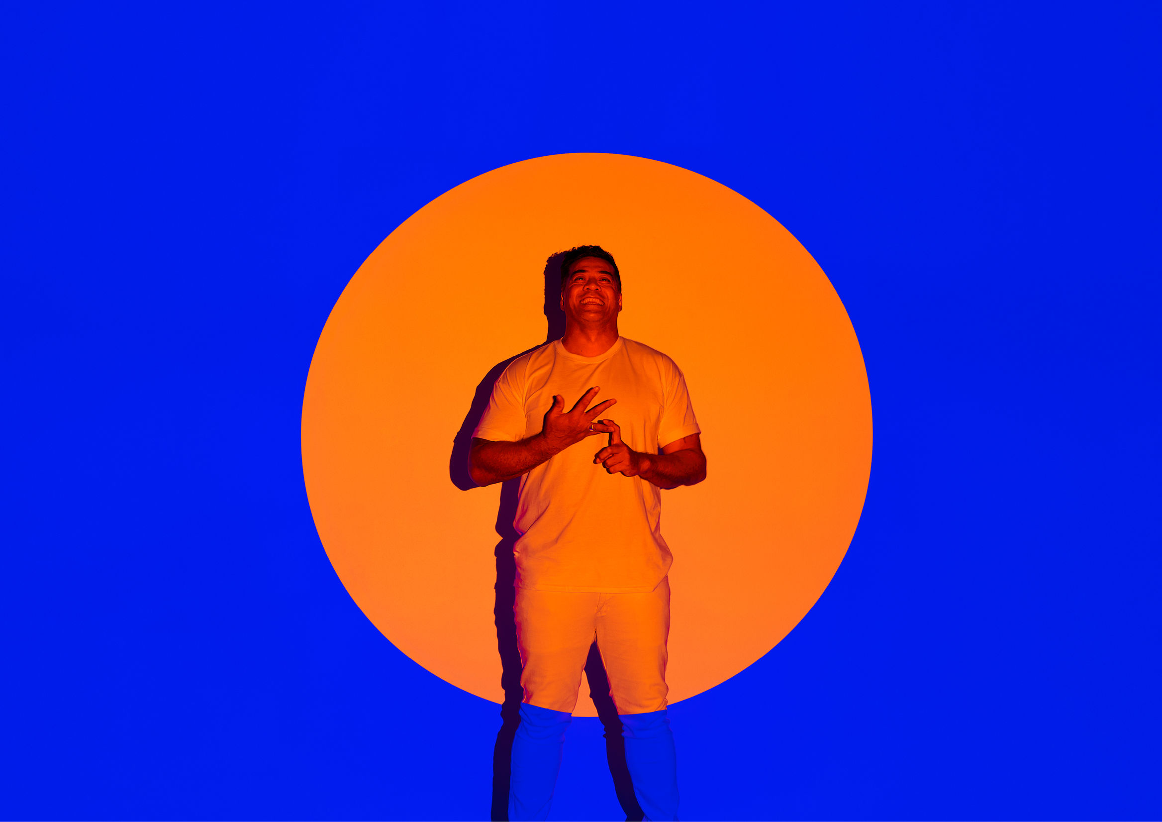
The design stands out for its use of very vivid, high-contrast colours applied to very fresh imagery through overlaid light and colour.
The project has been awarded:
- Best in Colour Award Graphics
- Best in Design Craft
- Best in Design Communication
Why?
- For the use of vivid colour
- For the overlaid elements
- For the high contrast
- For its tone of voice
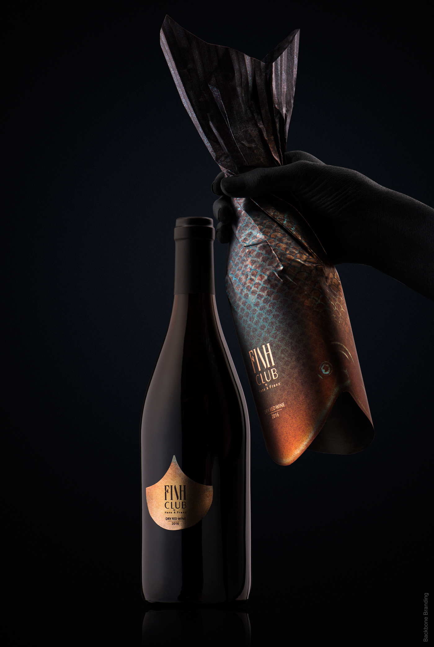
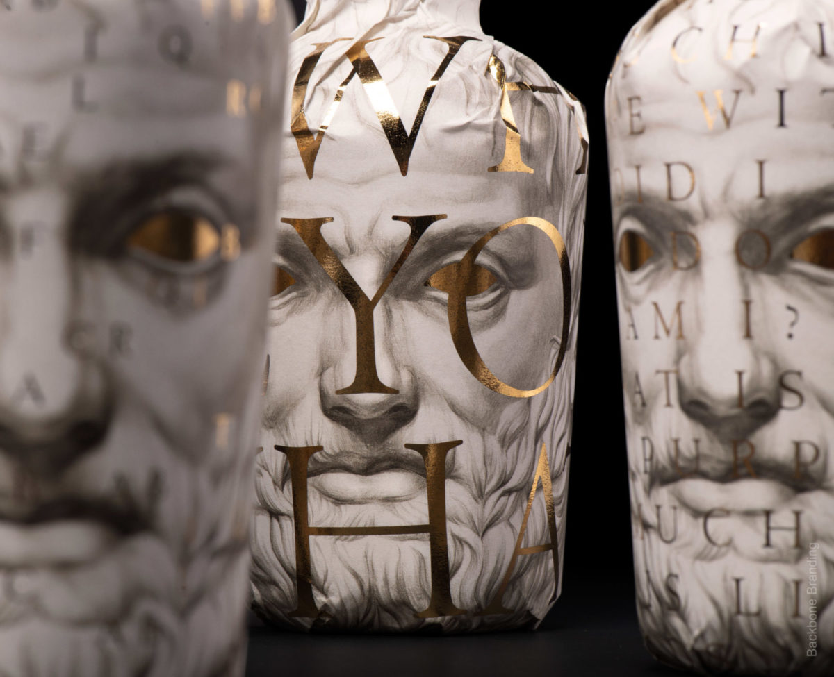
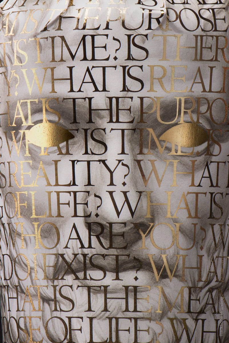
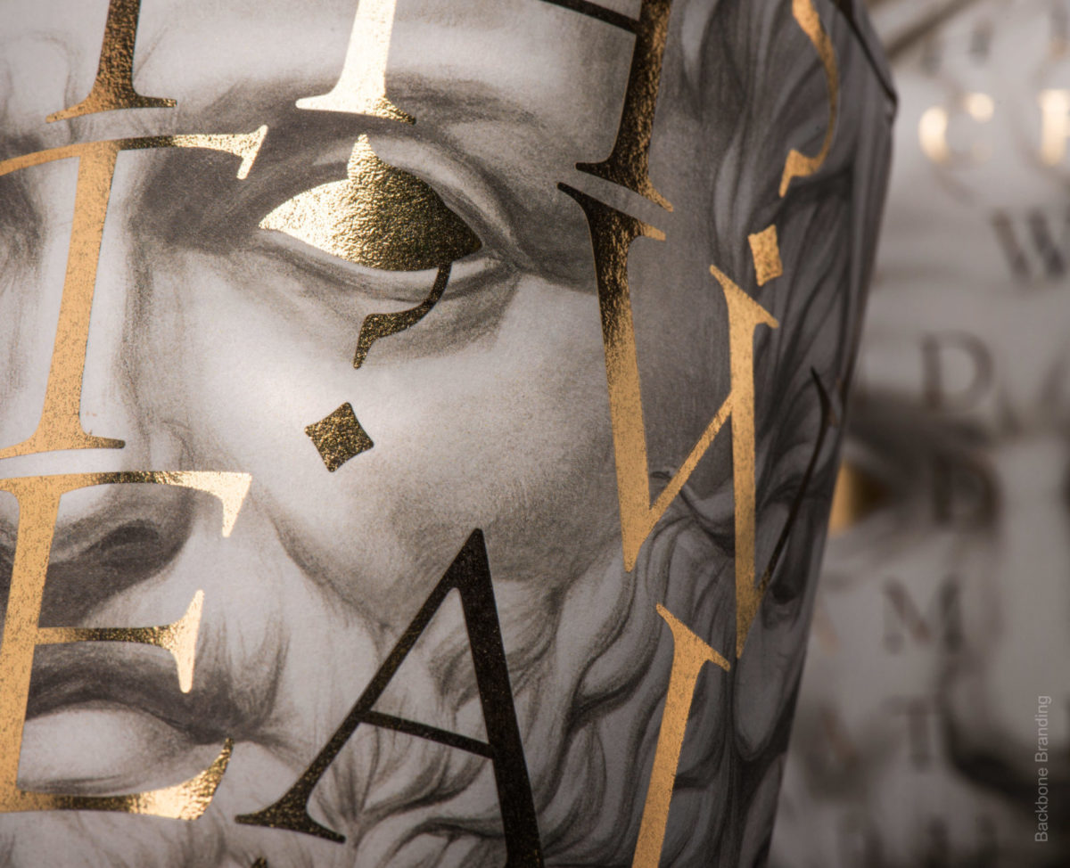
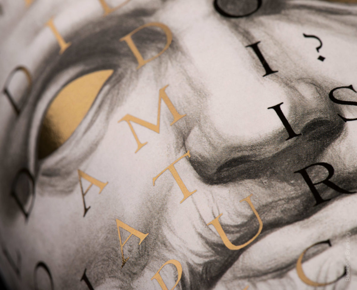
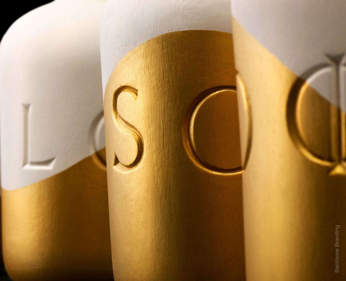
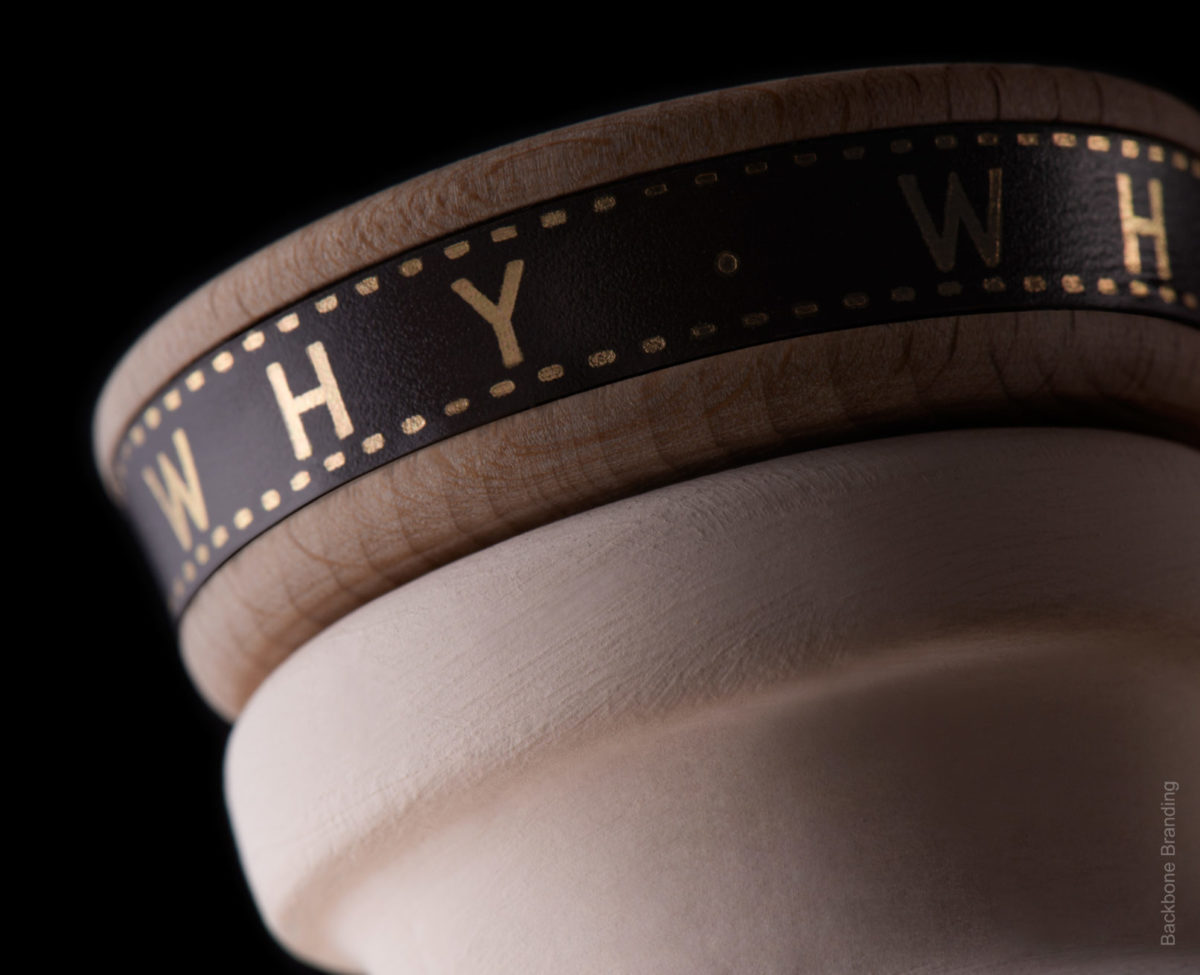
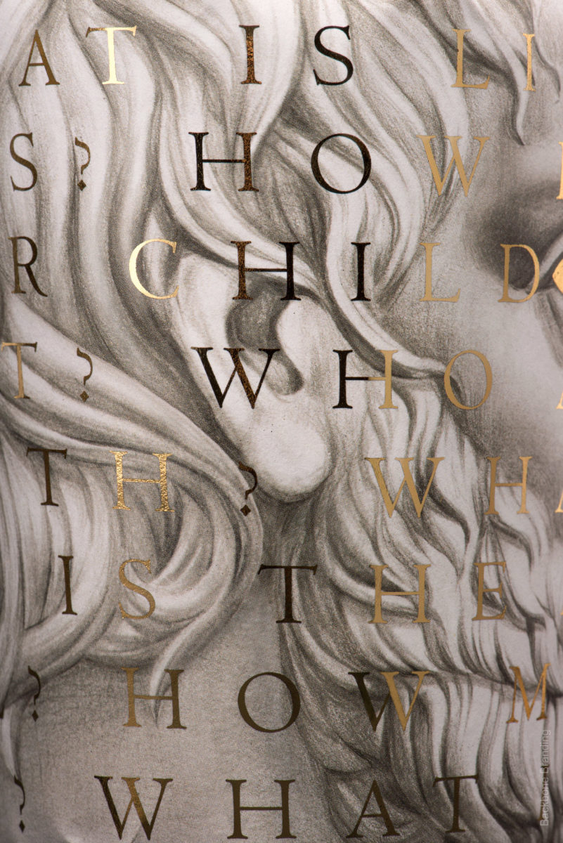
Oilosoo Wine Packaging by Backbone Branding Studio
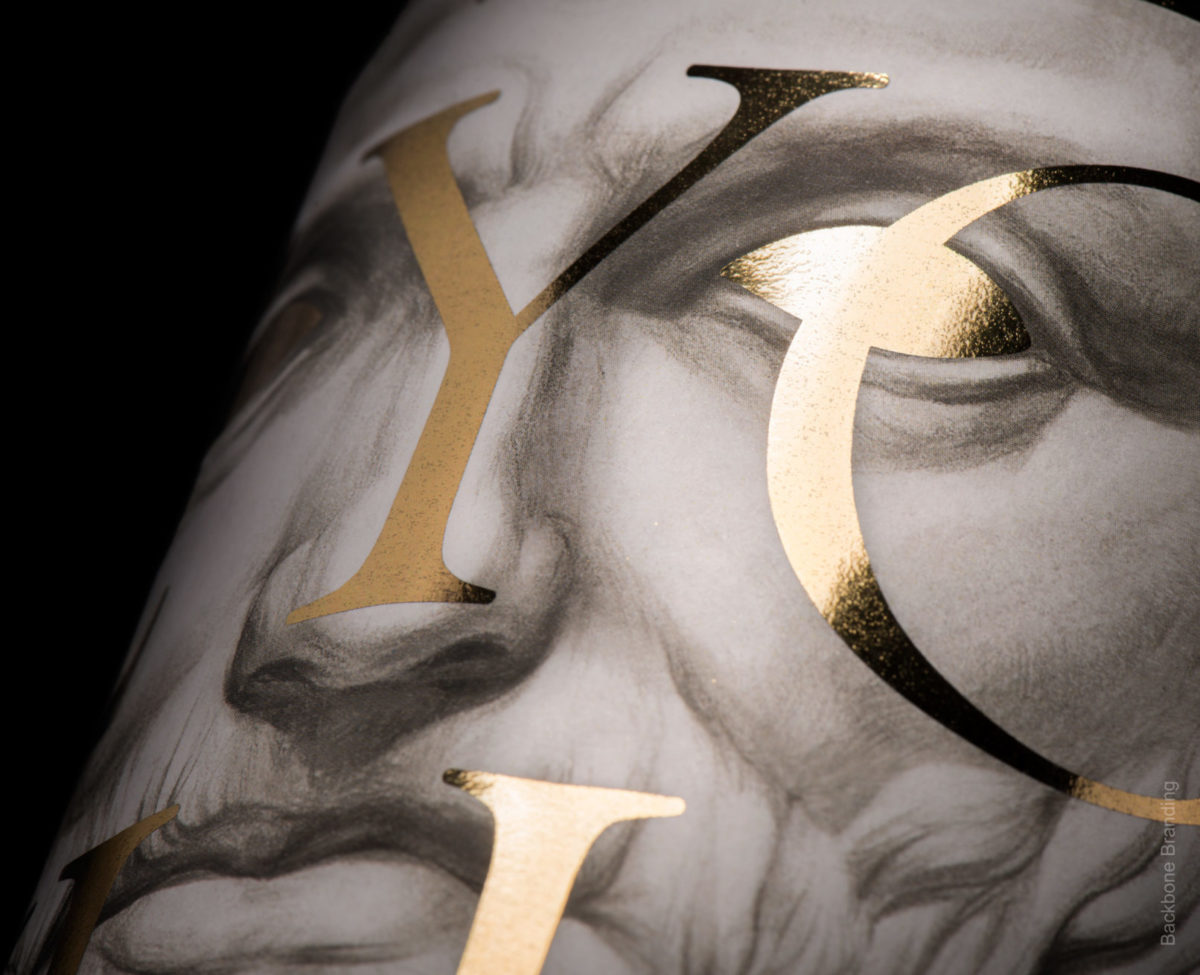
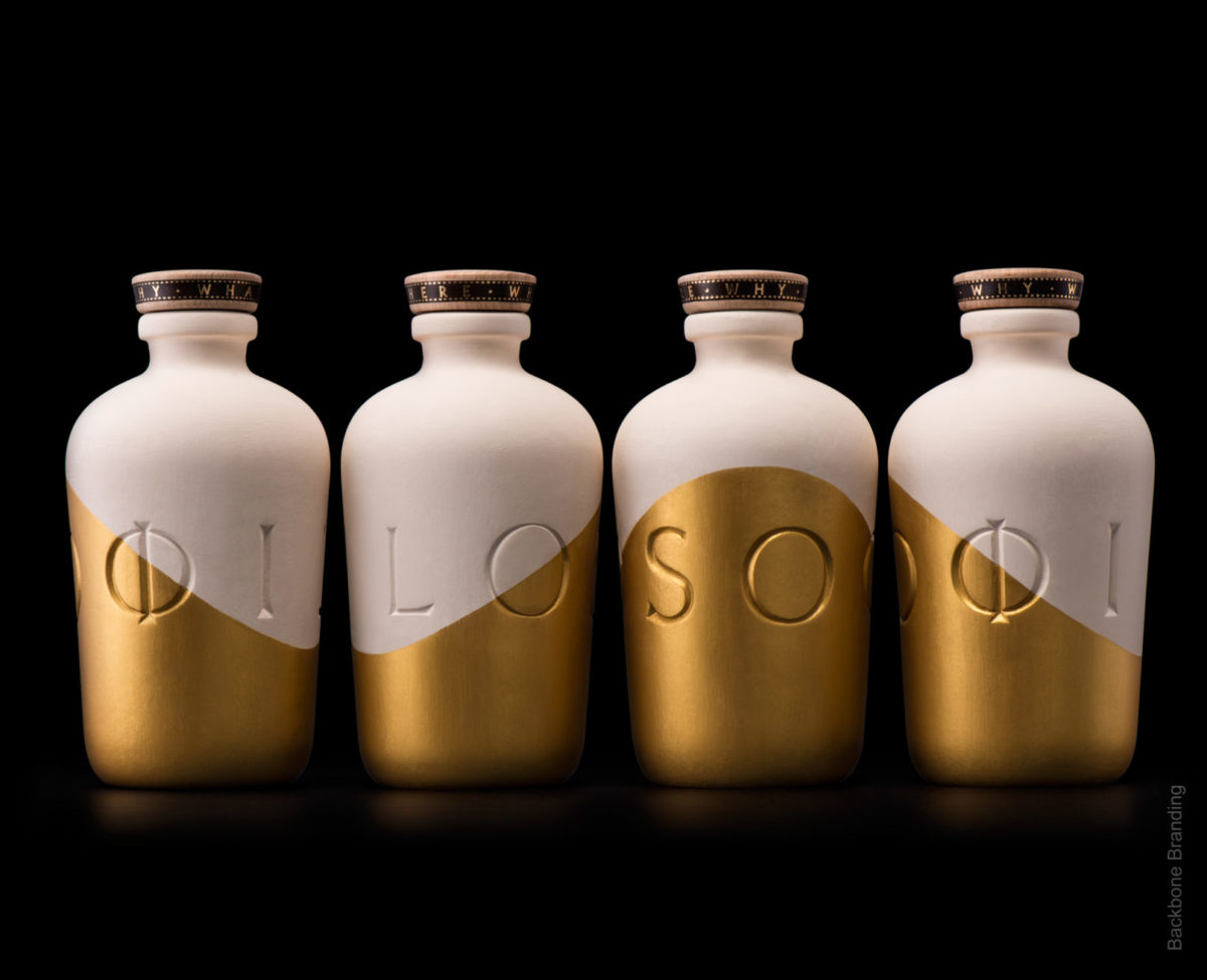
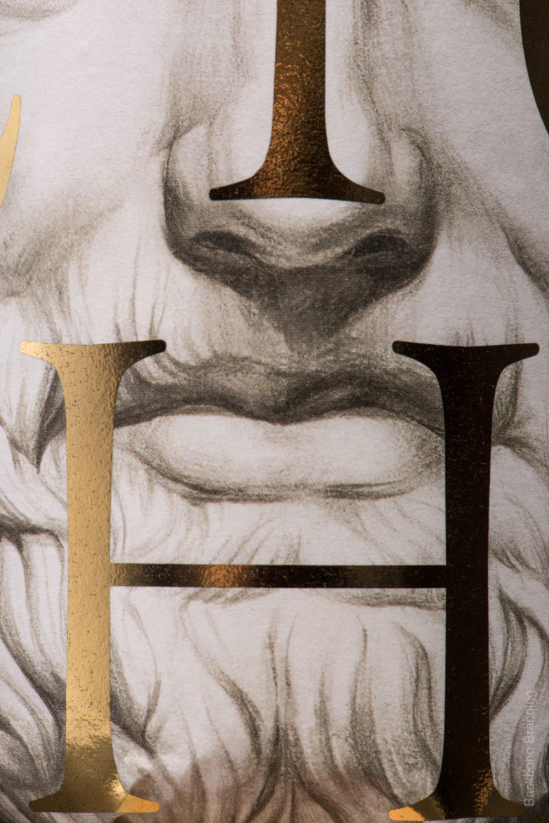
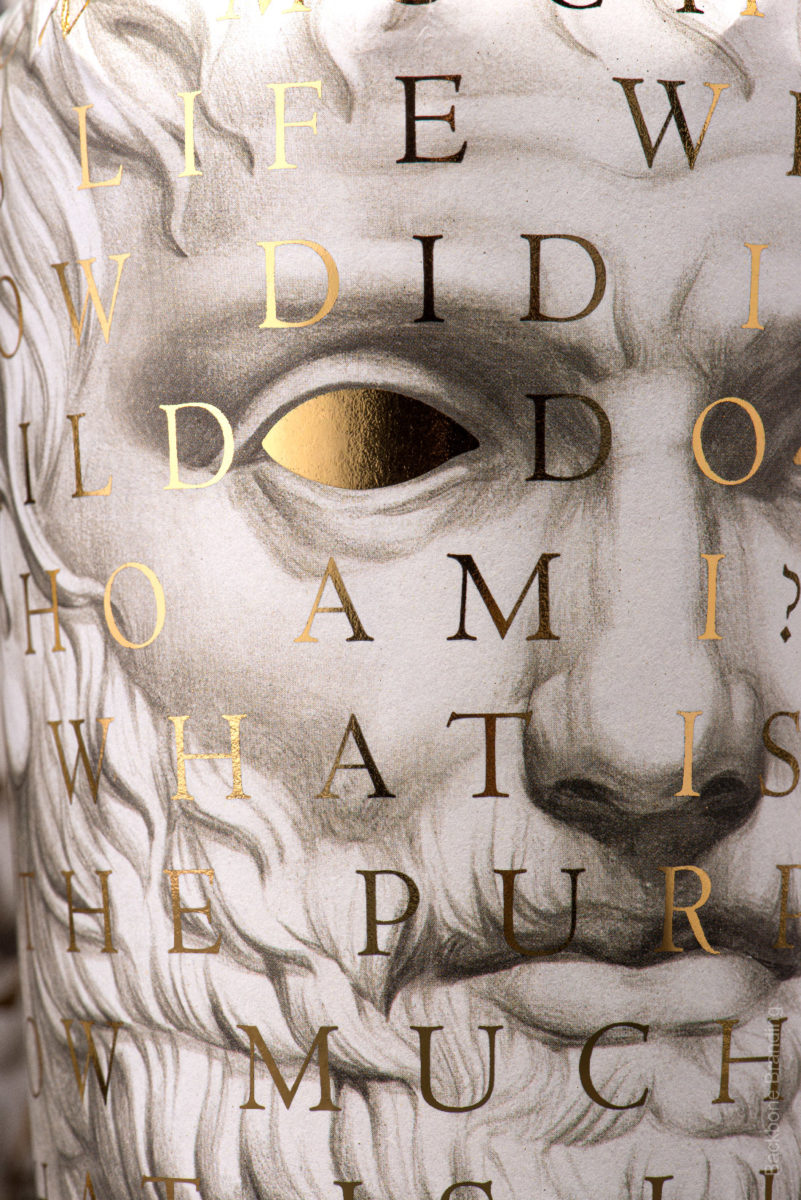
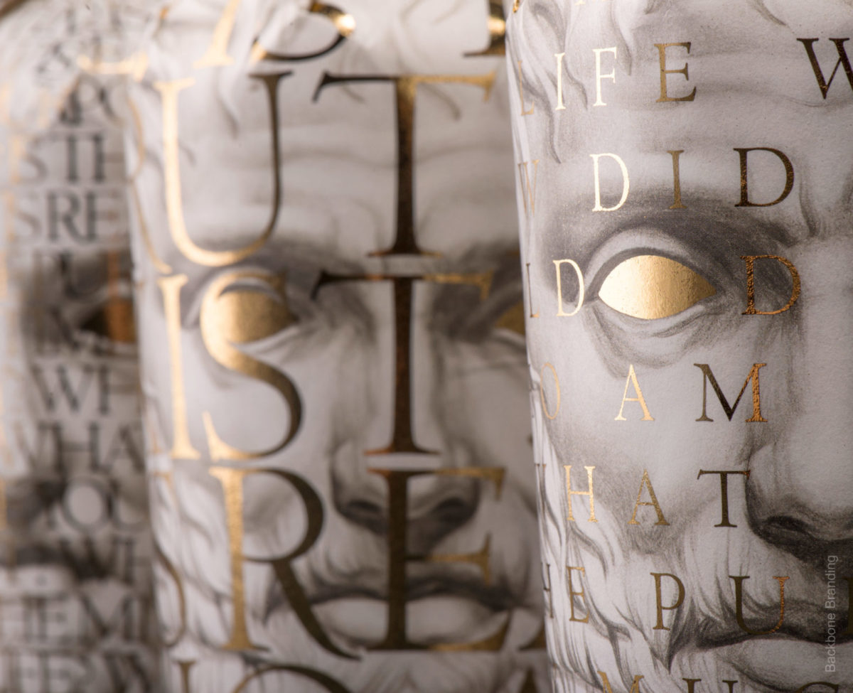
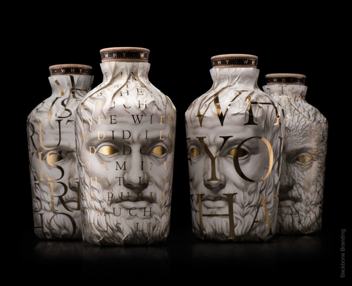
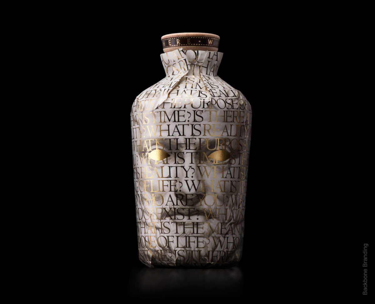
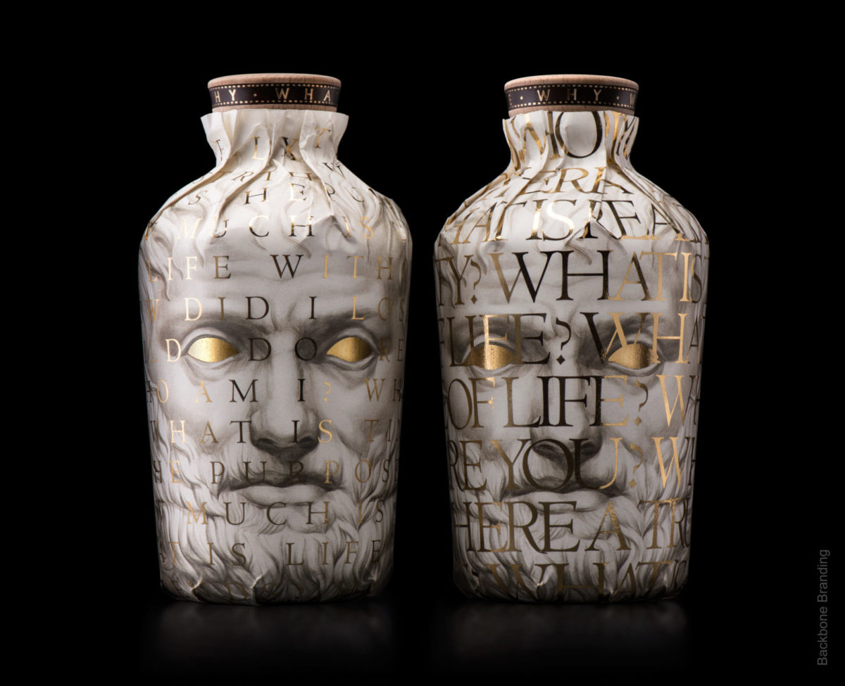
The fourth pick I found very interesting is the packaging and commercial product design for Oilosoo Wine by this graphic design and corporate identity studio.
The main approach is thoroughly classical, drawing on wine’s reputation as a travelling companion for history’s great thinkers. An era when wine was bottled in traditional amphorae and wrapped in a paper shroud carrying a classical, close, personal rendering of a Greek statue.
Why?
- For its classical conception
- For its contemporary execution
- For the use of large type
- For the high-contrast colour treatment
- For the use of materials
Without question a graphic design that will inspire future work.
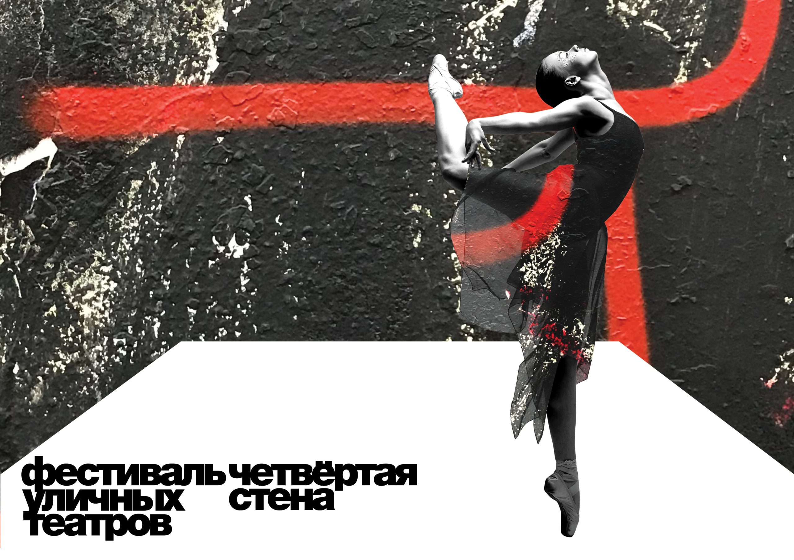
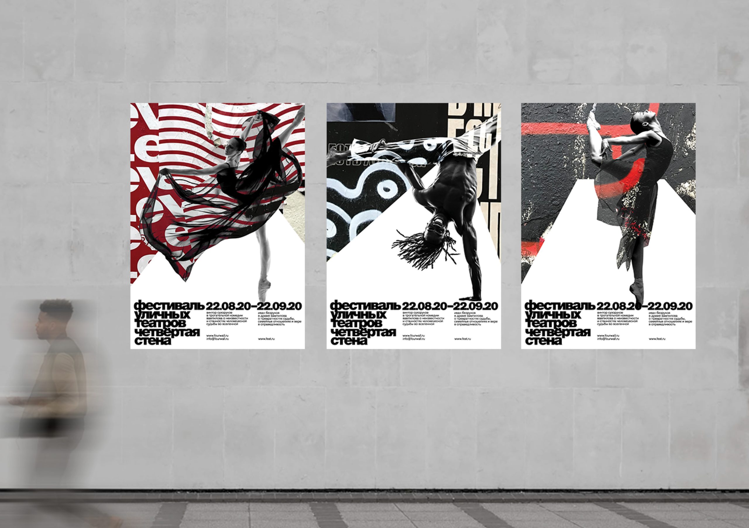
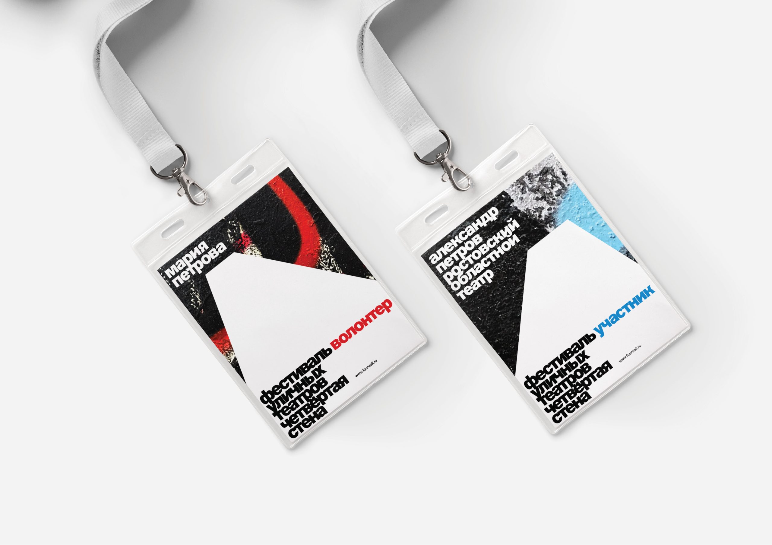
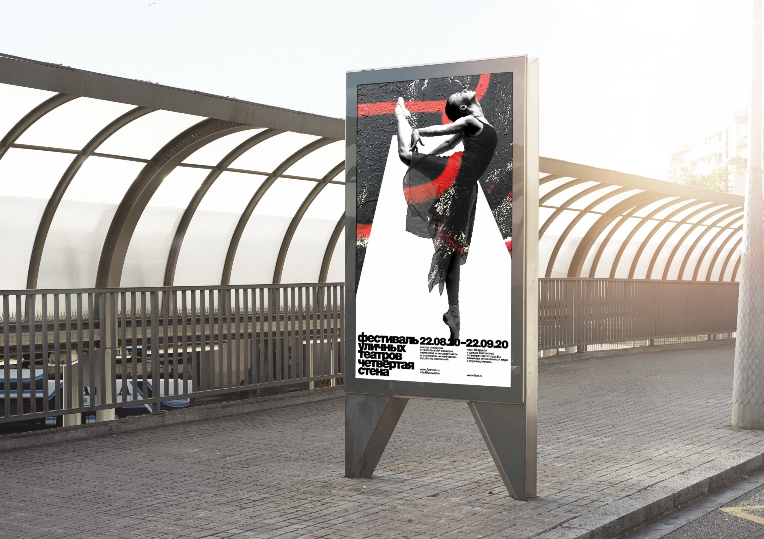
Street Theatre Student Design Concept by Tanya Dunaeva
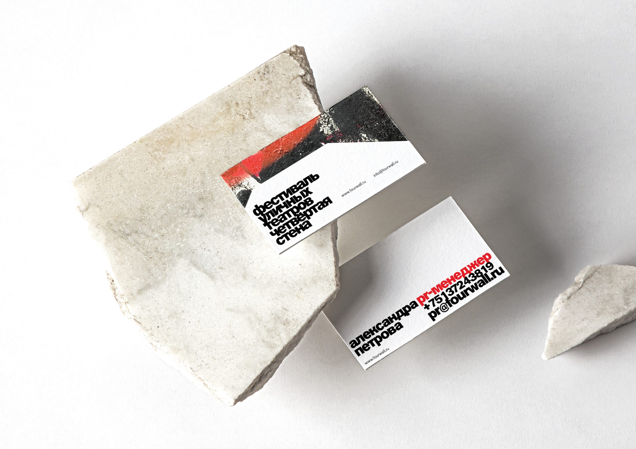
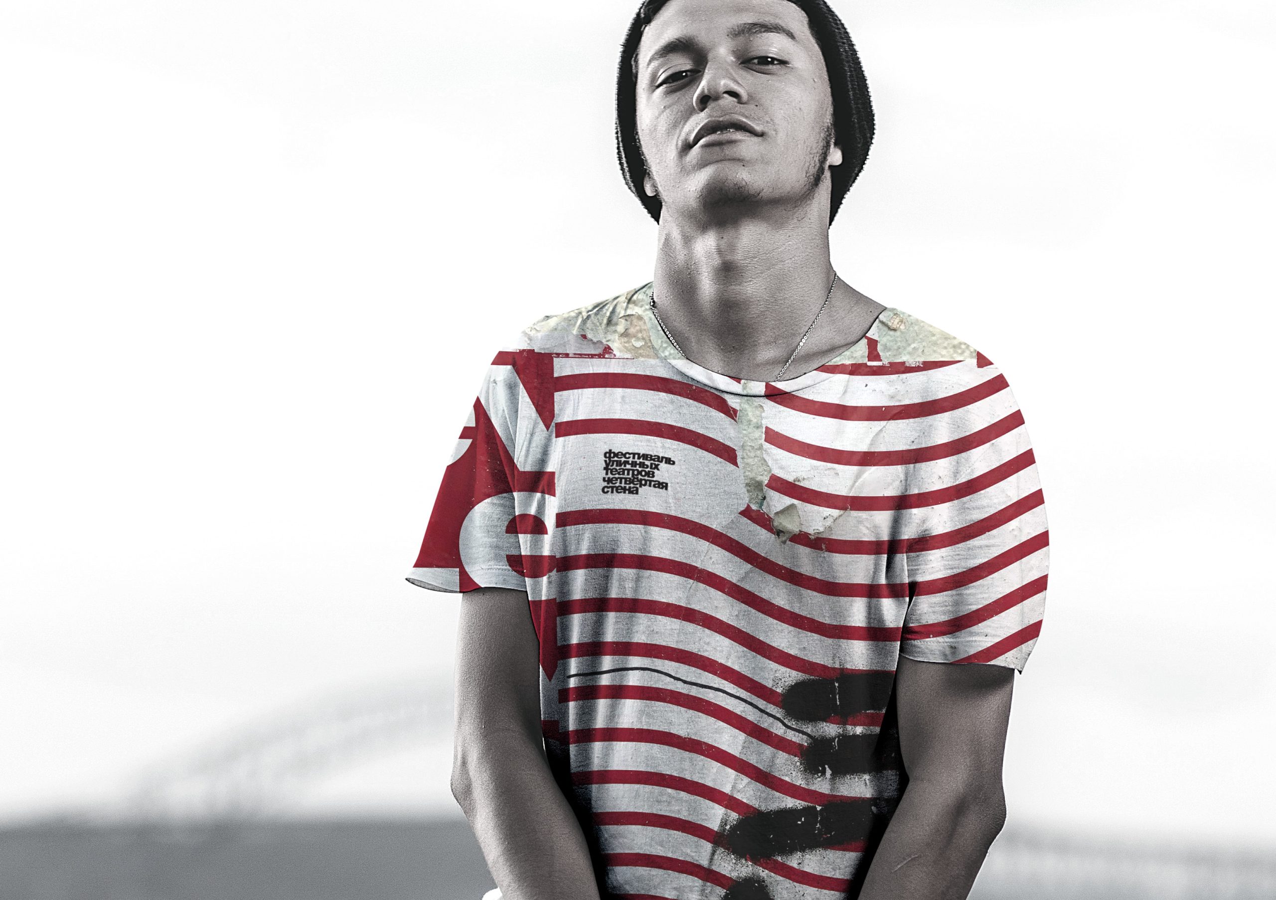
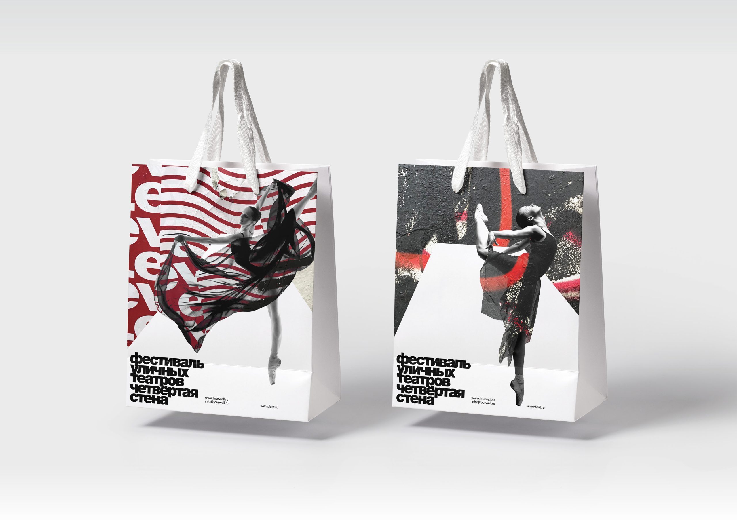
The fifth pick we’re looking at now is especially interesting on several counts, but perhaps what struck us most is the drive to break the fourth wall and take it onto the street.
Figuratively and practically, that’s exactly what this advertising campaign design for a student street theatre festival achieves.
The style is dynamic, cutting-edge, contemporary and youthful. It stands out for its use of images of dancers with overlaid shapes and a very street-level graphic treatment.
Note that some elements of the design change shape depending on your viewpoint, opening a dialogue with the passer-by through the graphics themselves.
Why?
- For how the project was conceived
- For the use of high-contrast tones
- For the combination of black and white with colour
- For the overlaid elements
- For the dialogue with the viewer
Take a look at the images below and study them closely.
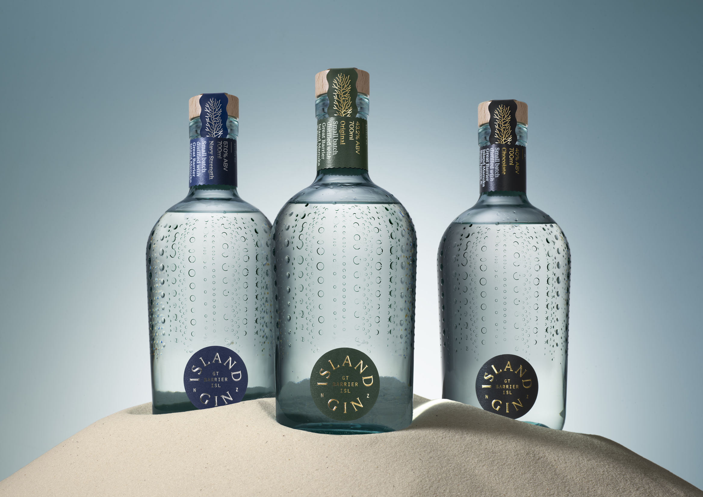
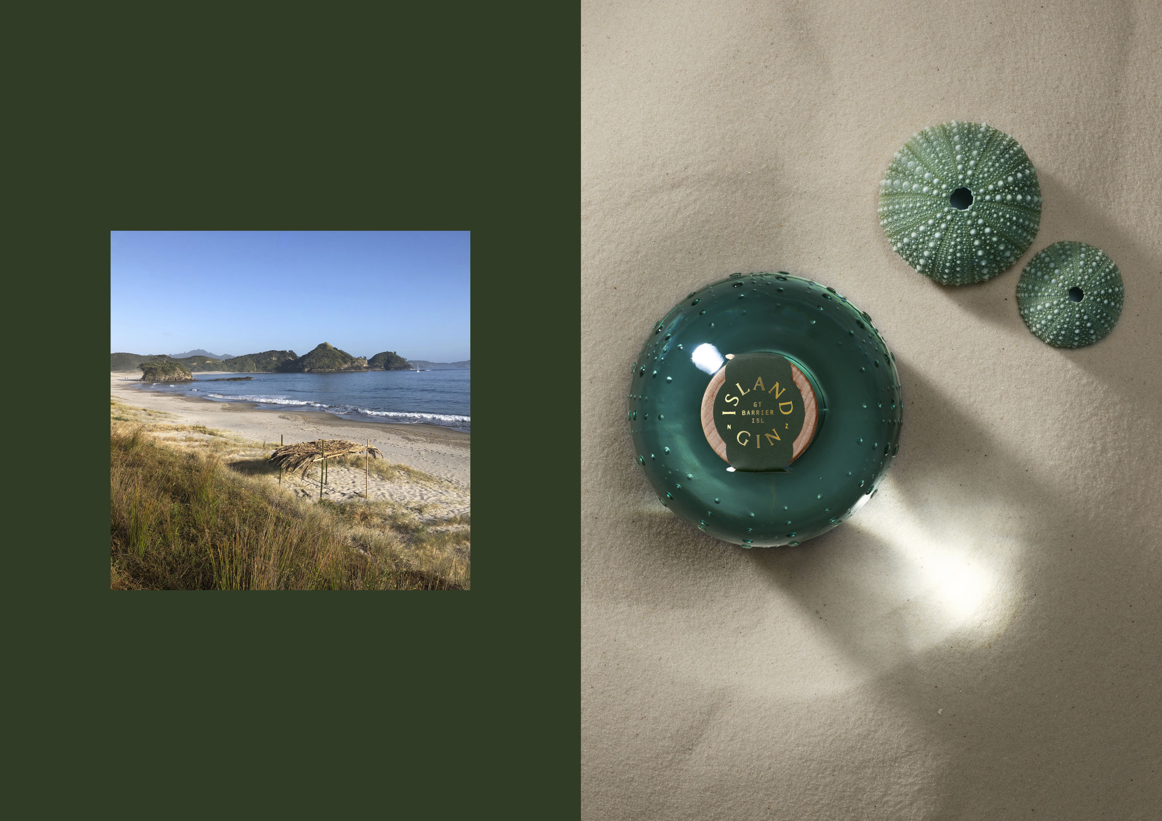
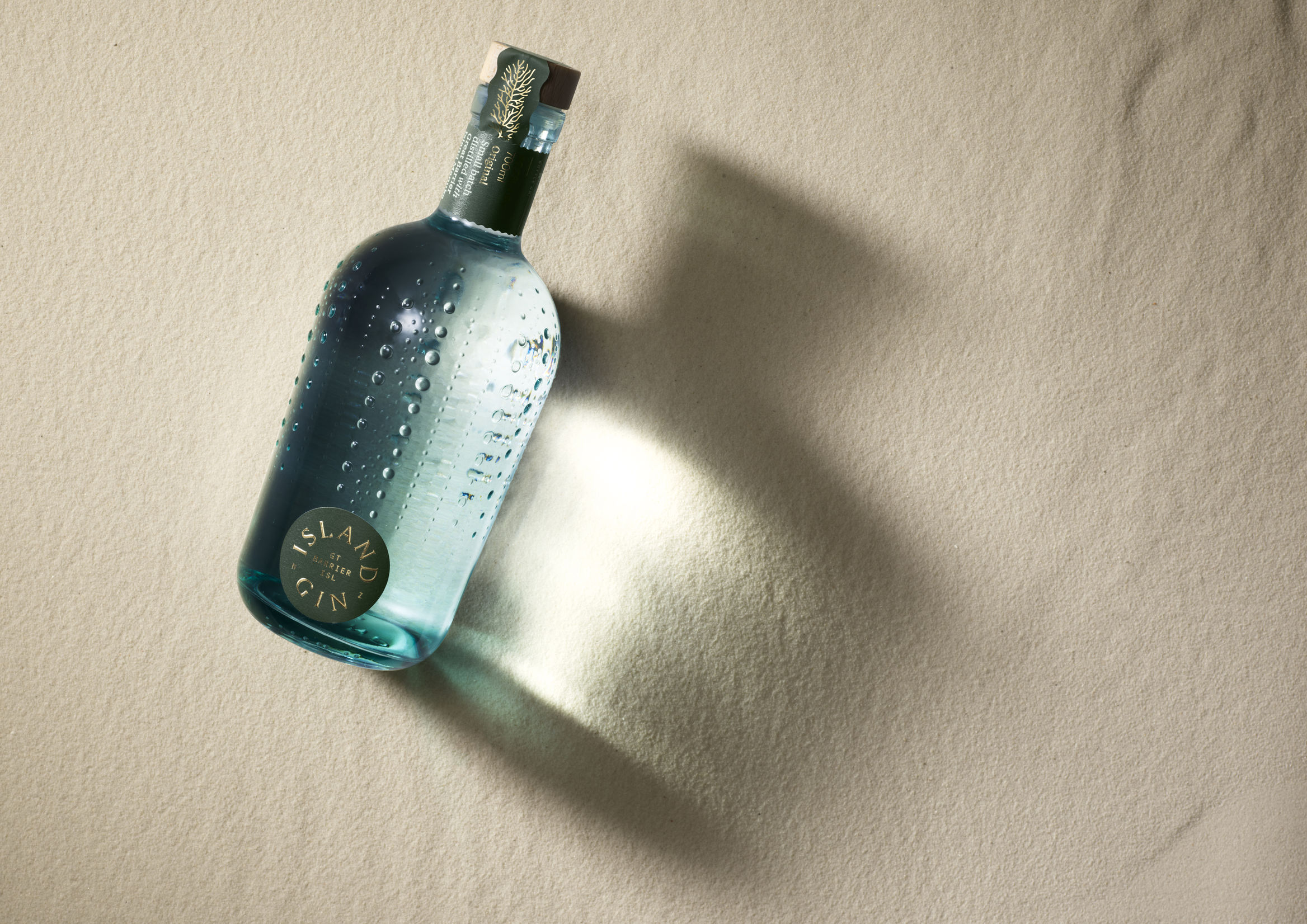
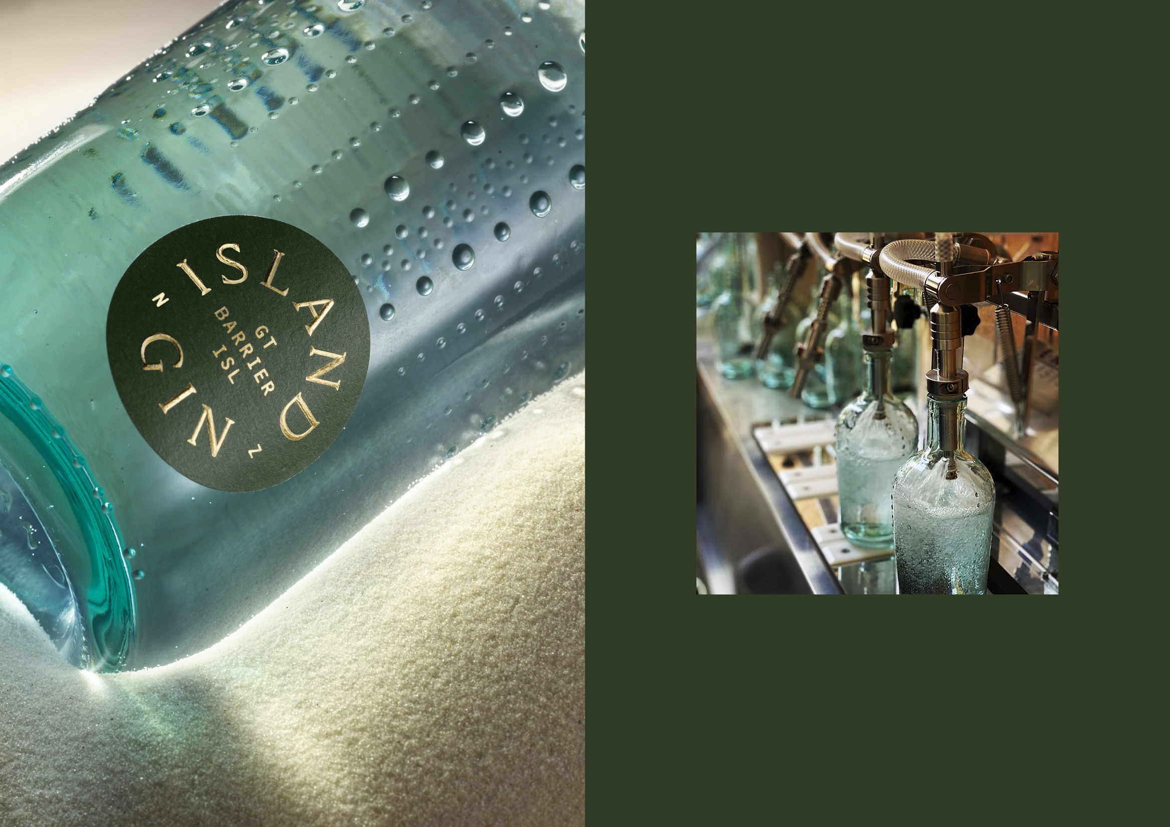
Island Gin by One design Studio
The sixth pick we’re going to look at is the work by graphic design and branding studio One Design Studio.
This project has been awarded:
- Best Design Awards in the Packaging category
- Silver Pentaward in the beverage design category
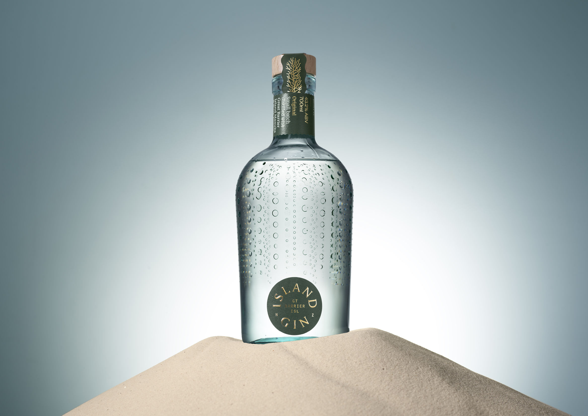
The project stands out for its conception and its final execution.
Marine elements are present in the bottle itself, such as the skeleton of a sea urchin, which serves to communicate with the client and consumer through touch.
Why?
- For how the project was conceived
- For the use of materials
- For its personal feel
- For its tone of voice
- For its final execution
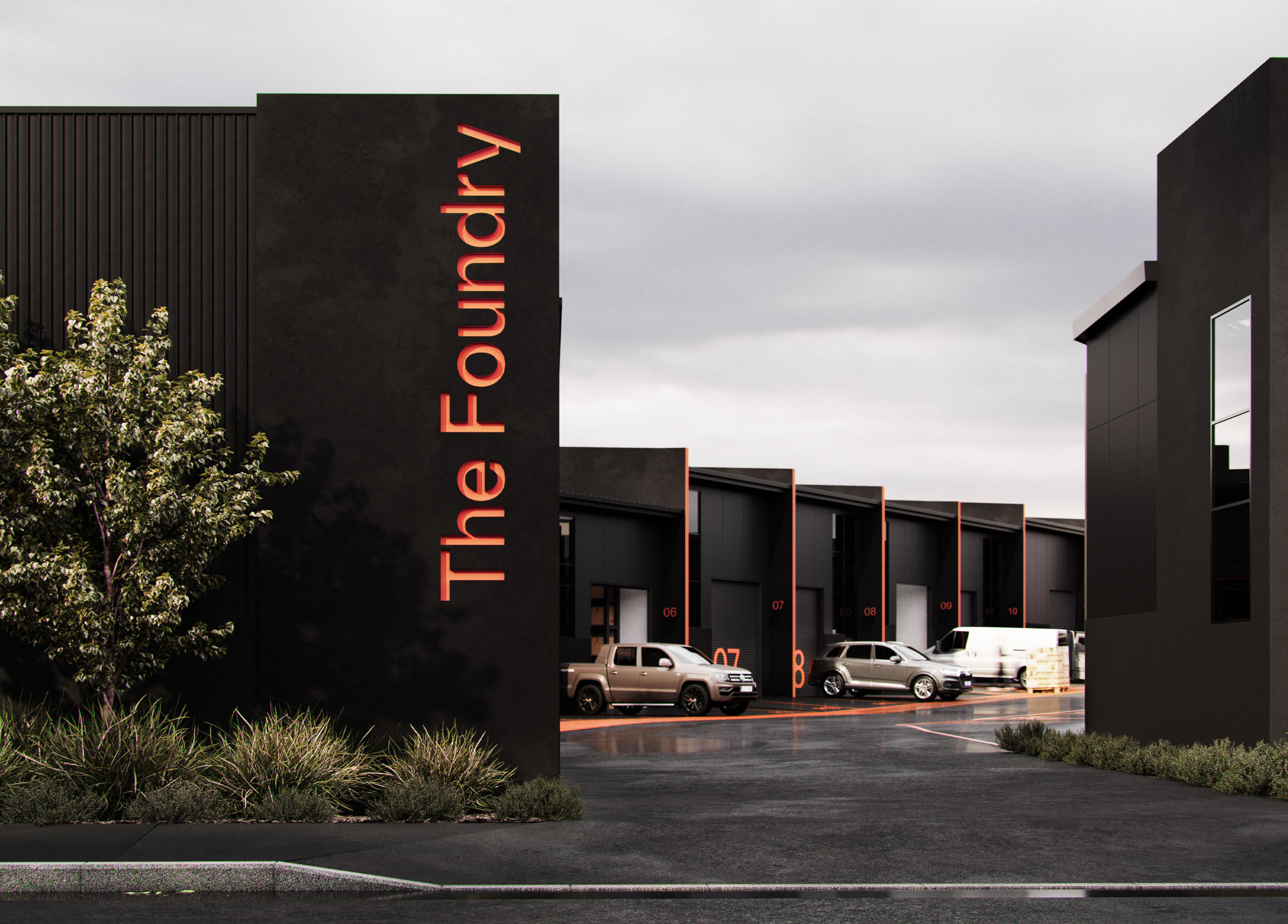
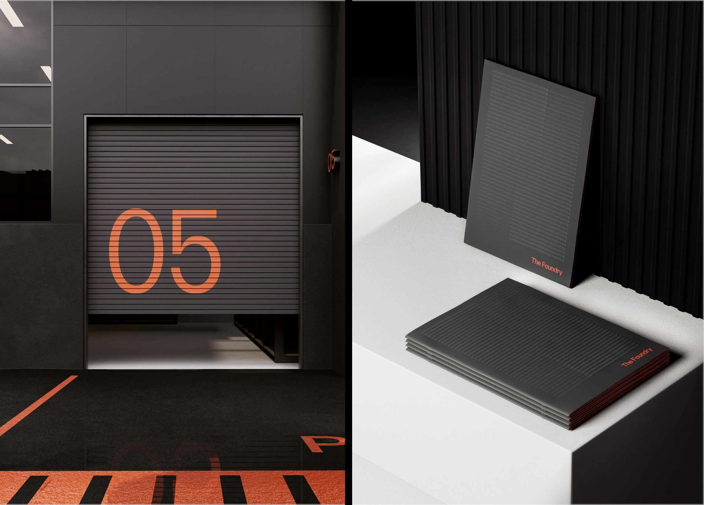
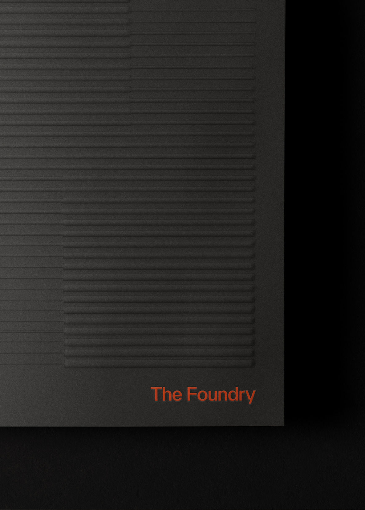
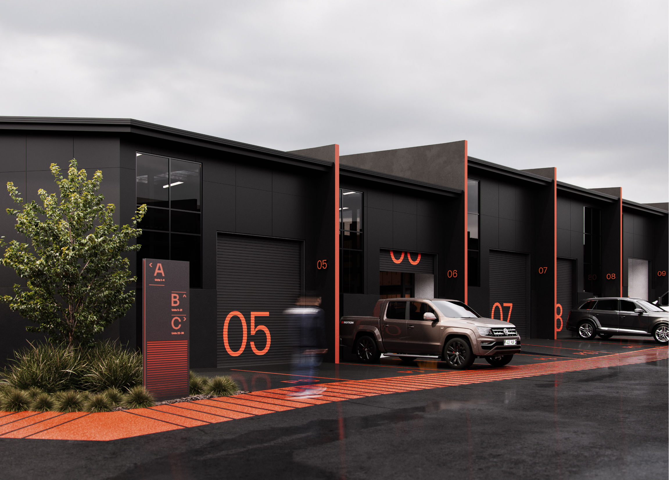
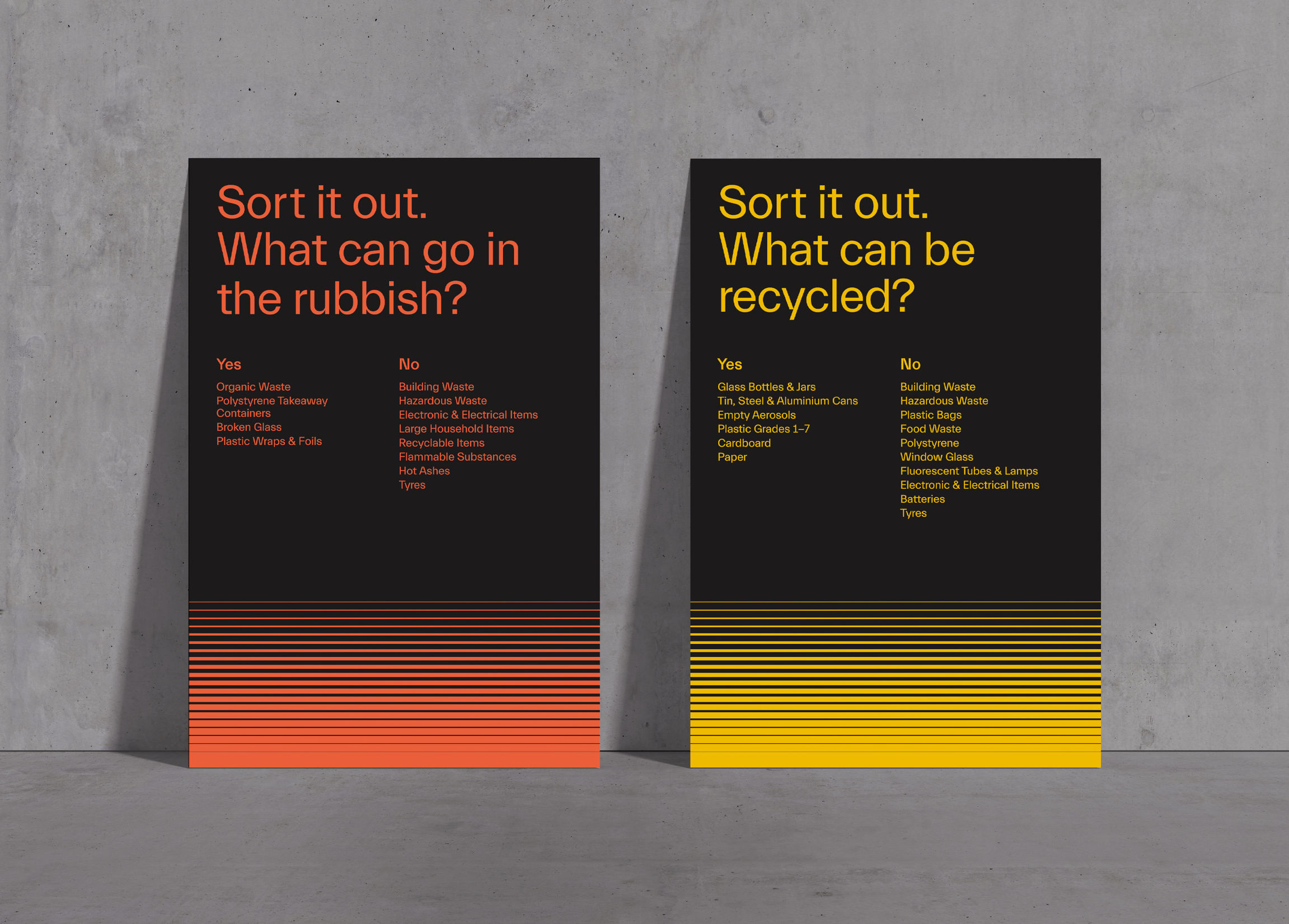
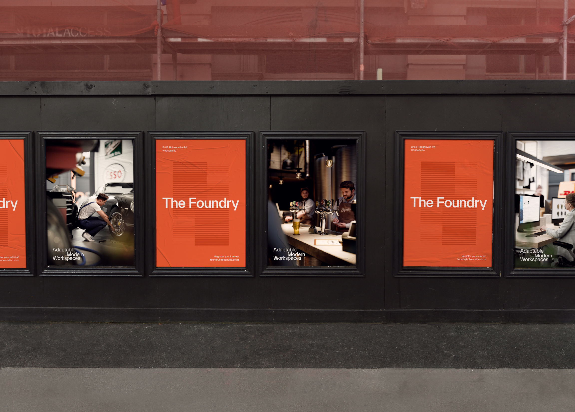
The Foundry by Oneforall
A project by Chris Labrooy’s graphic design studio in video and animated form, combining the latest technology to show classic American, British and German cars customised into flying inflatables.
Don’t miss the images — enjoy.
Why?
- For the use of colour.
- For how the project was conceived.
- For the eighties look.
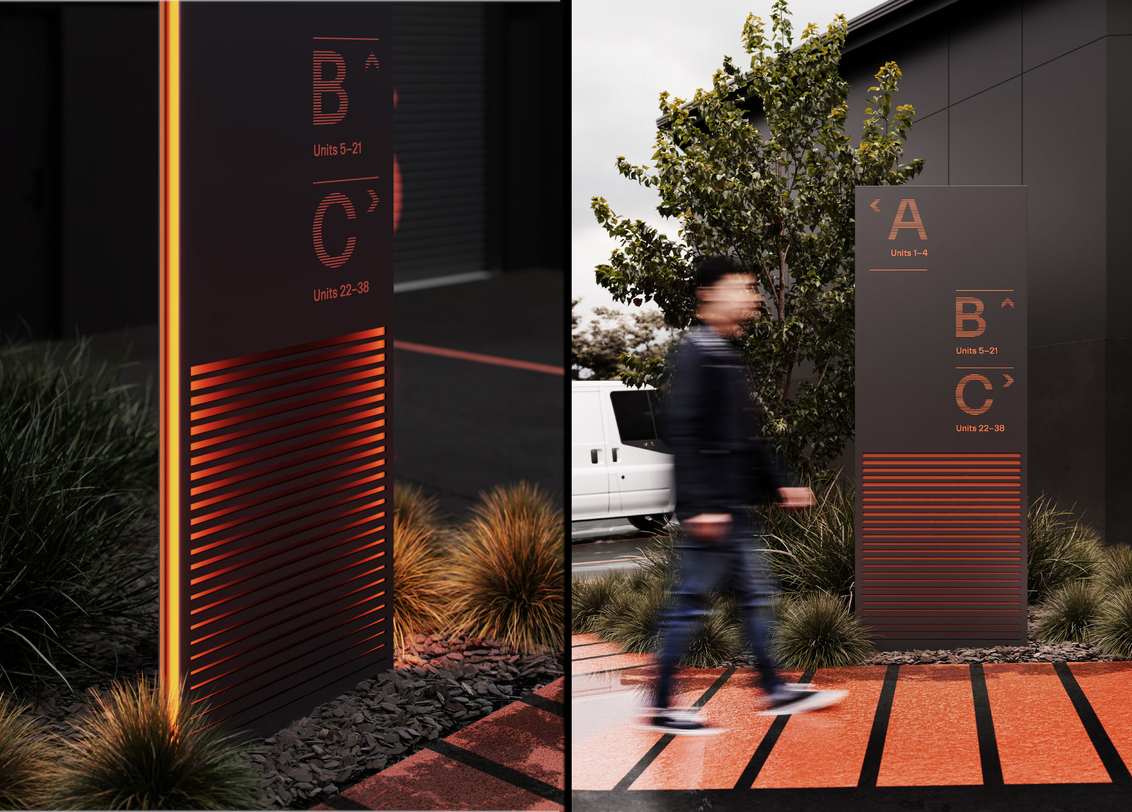
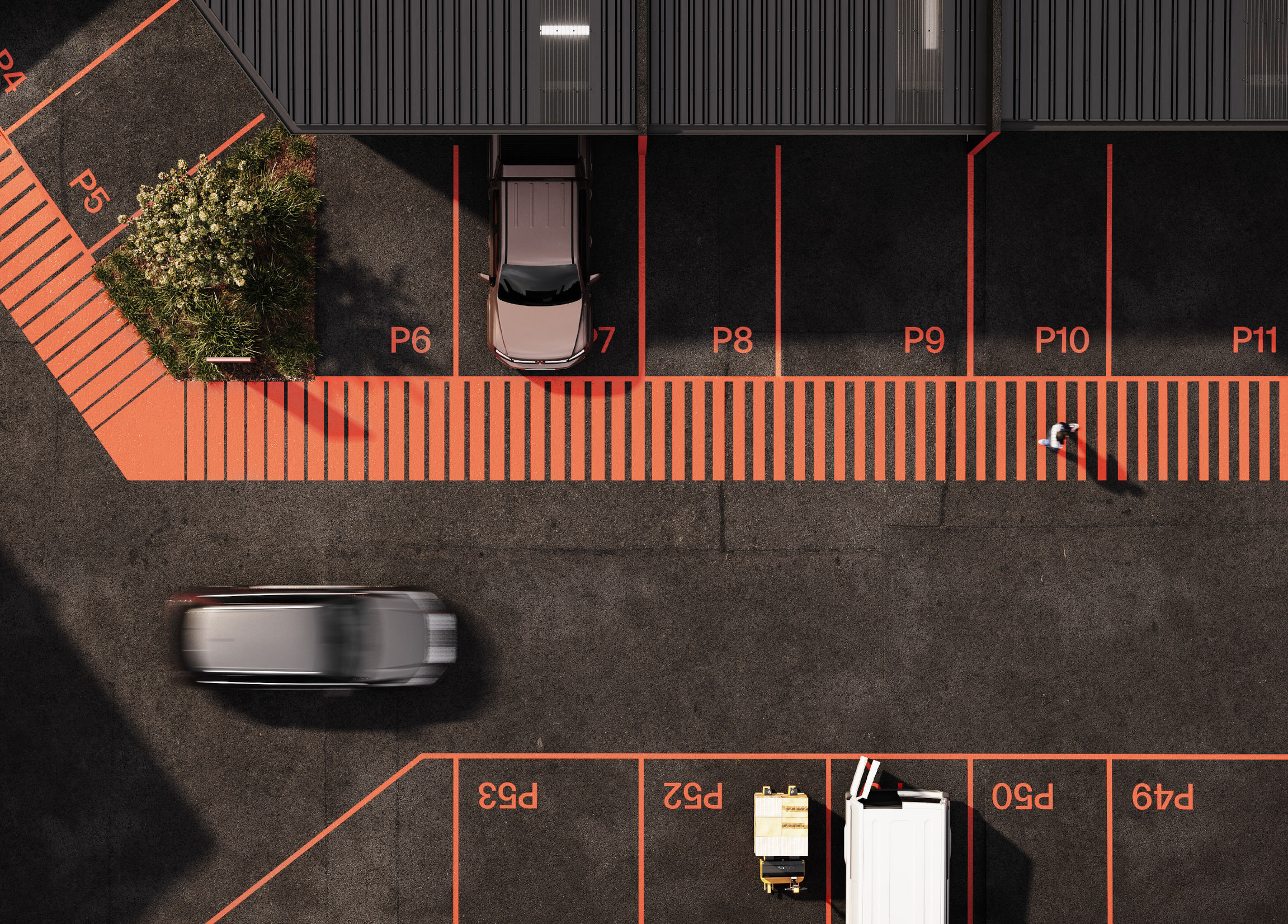
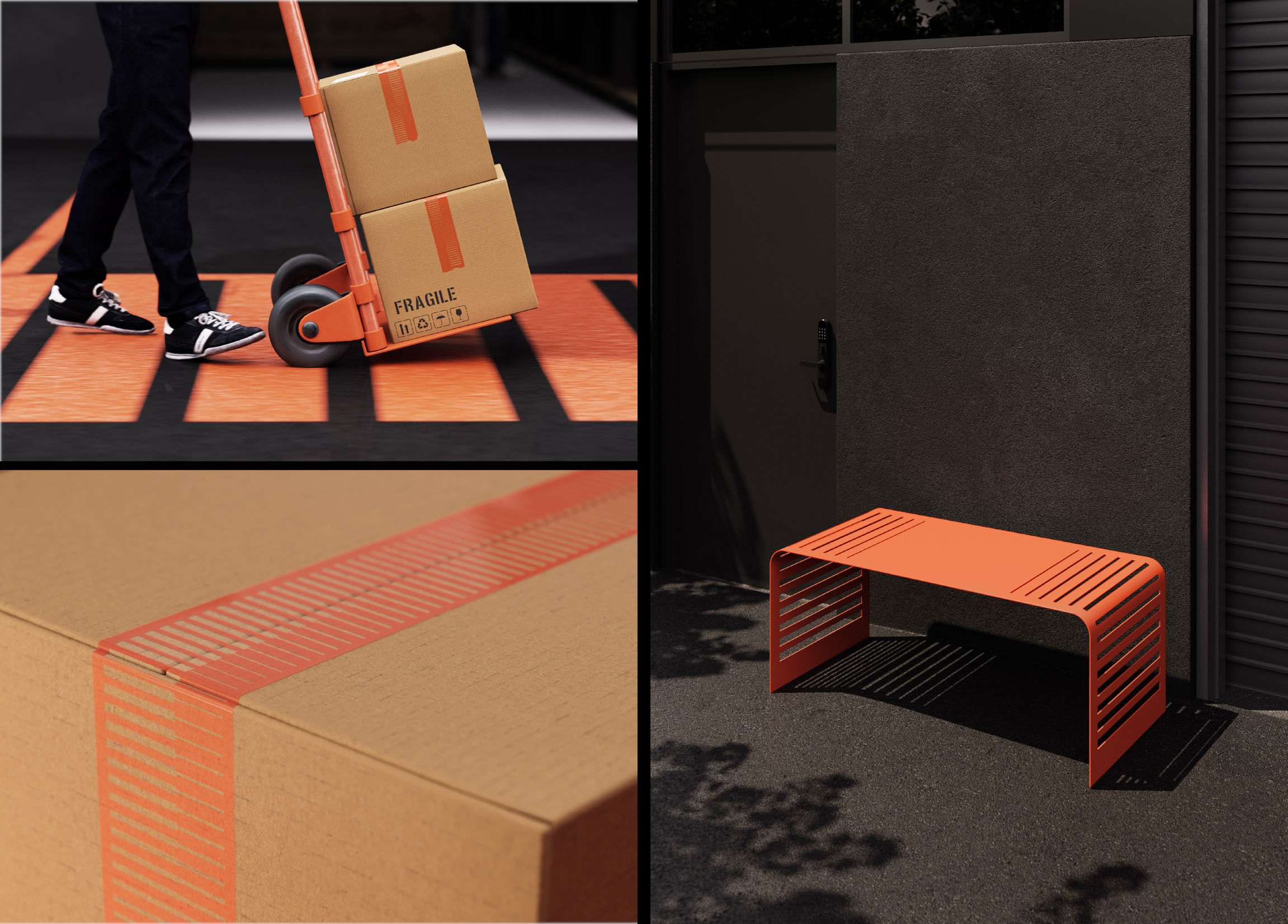
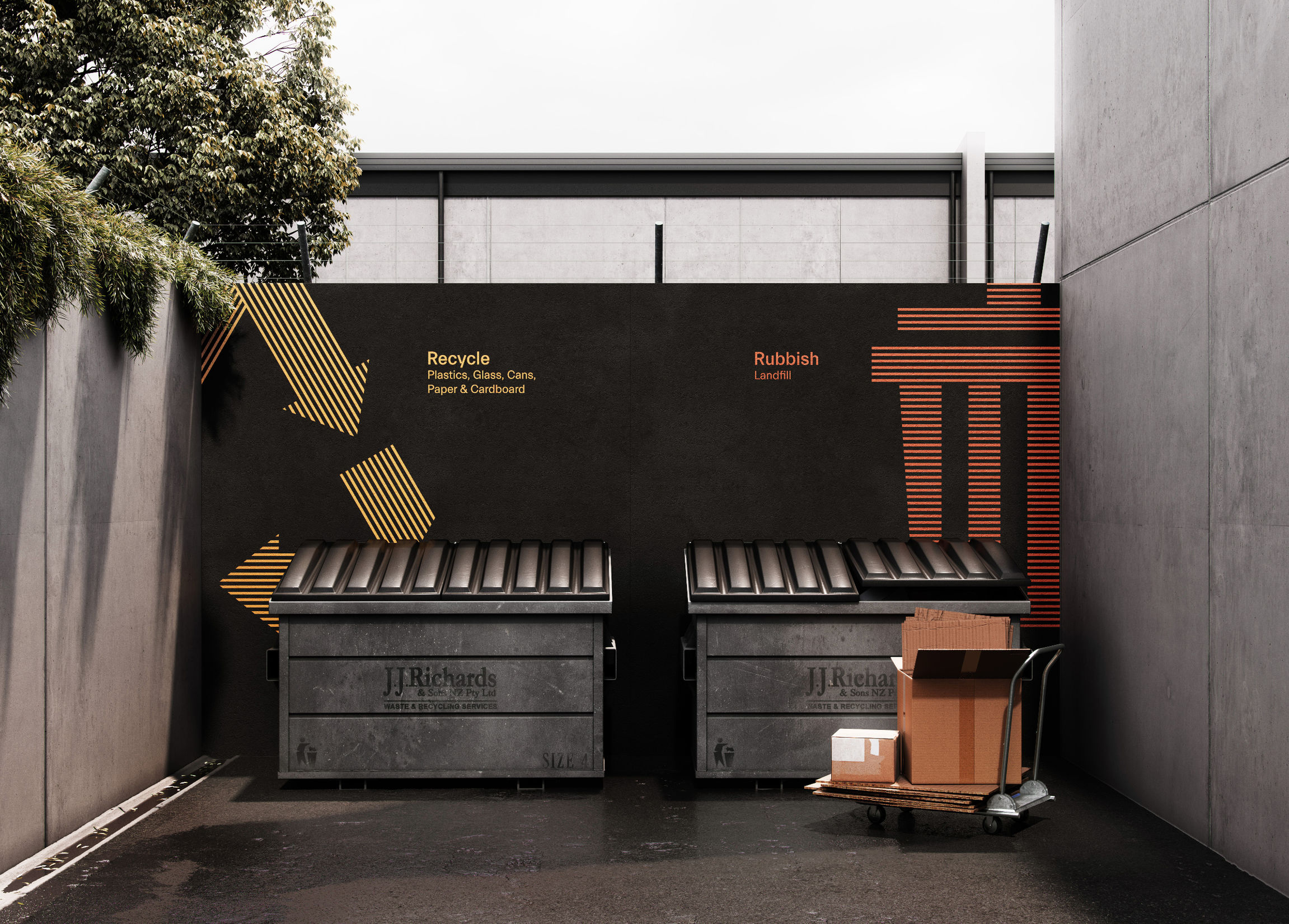
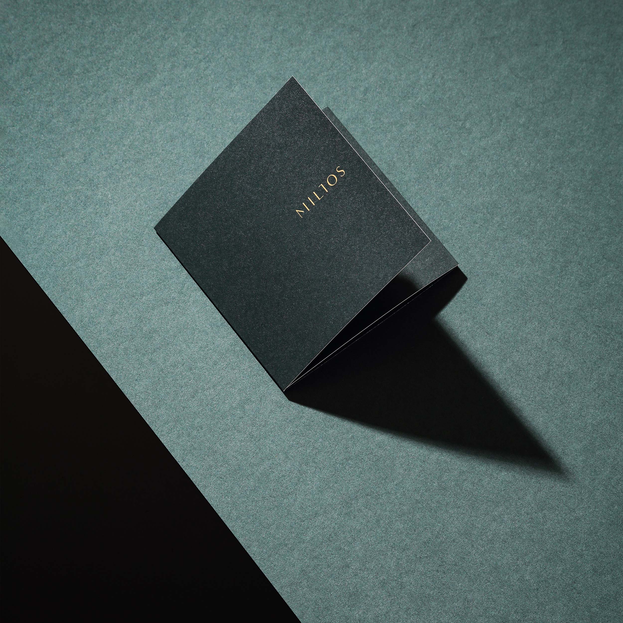
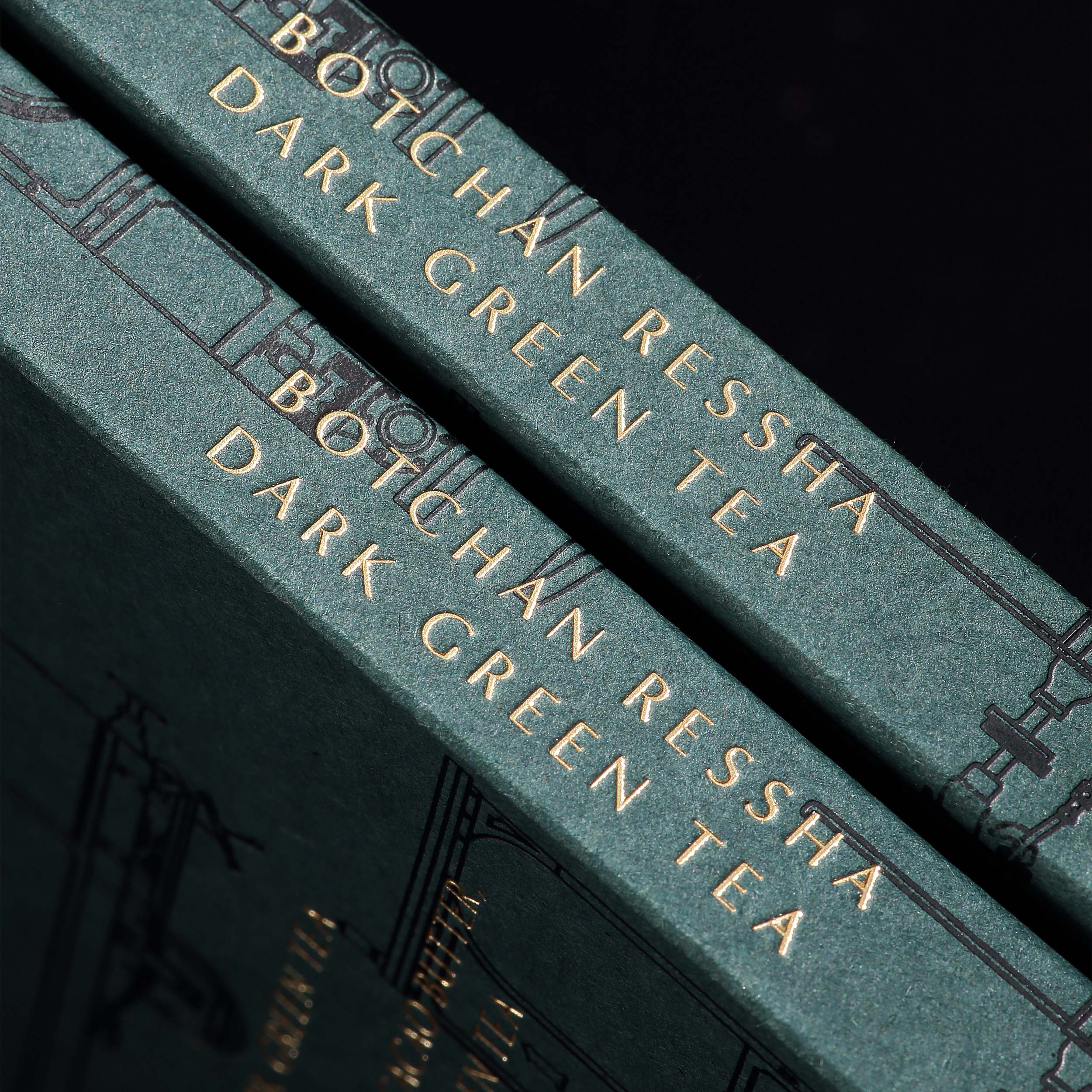
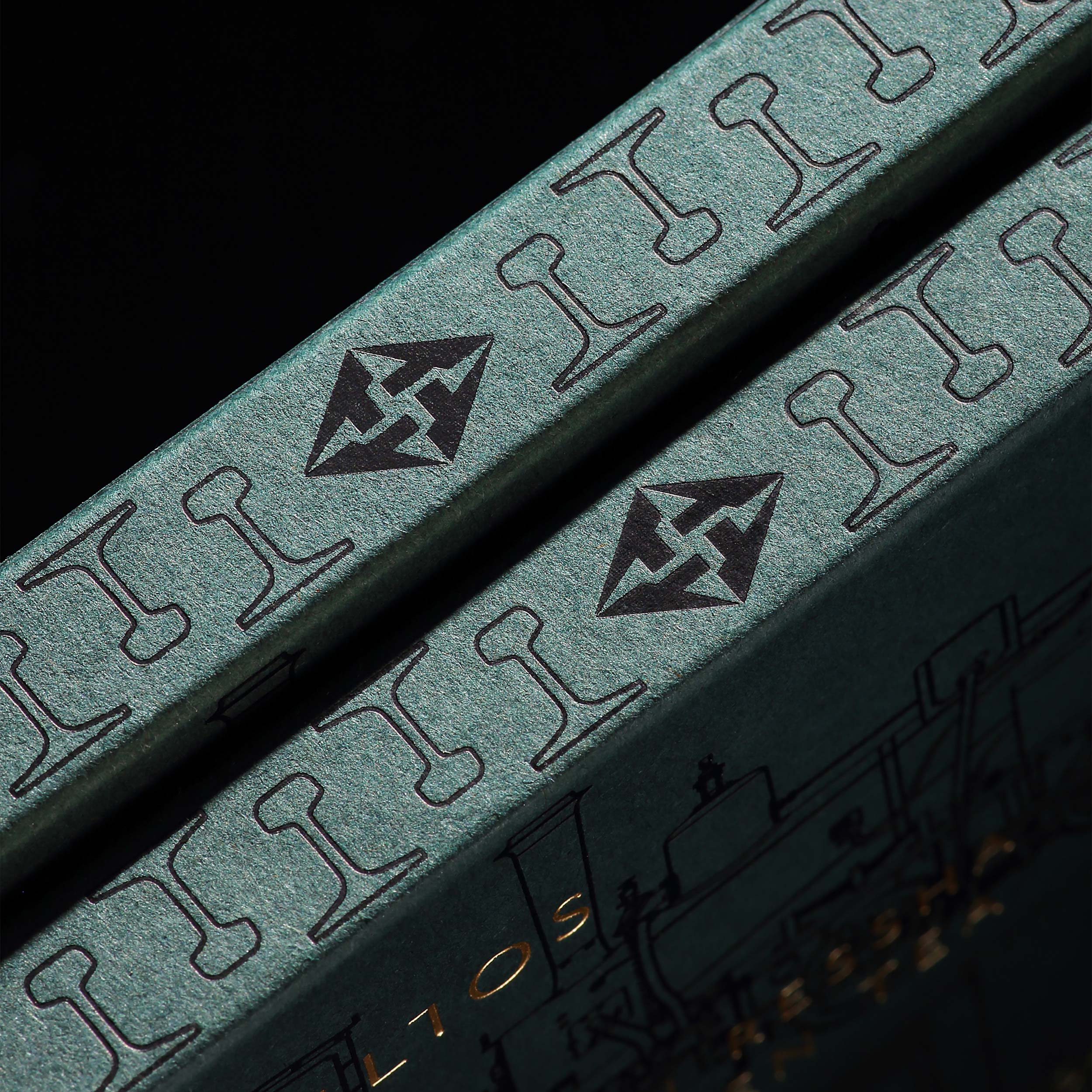
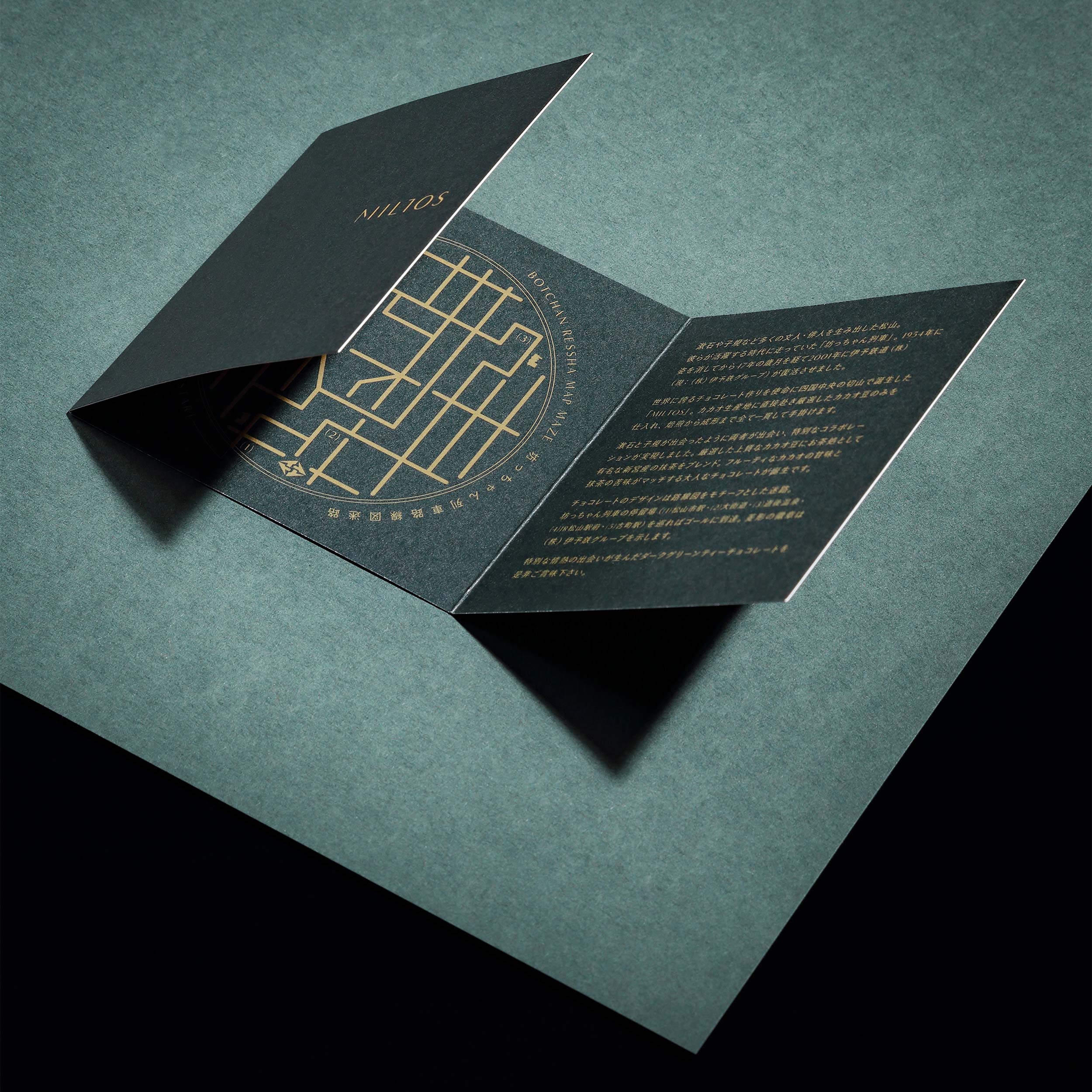
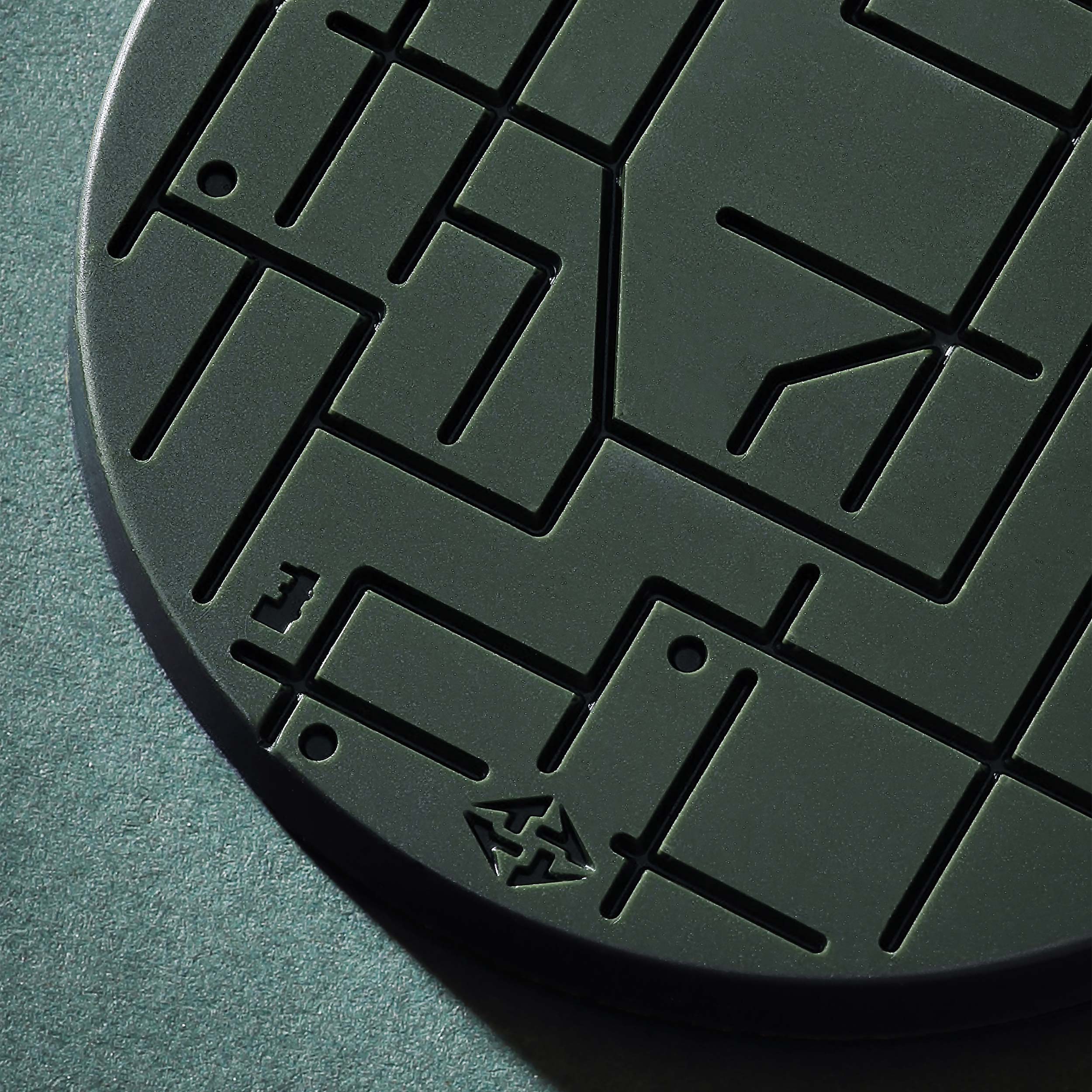
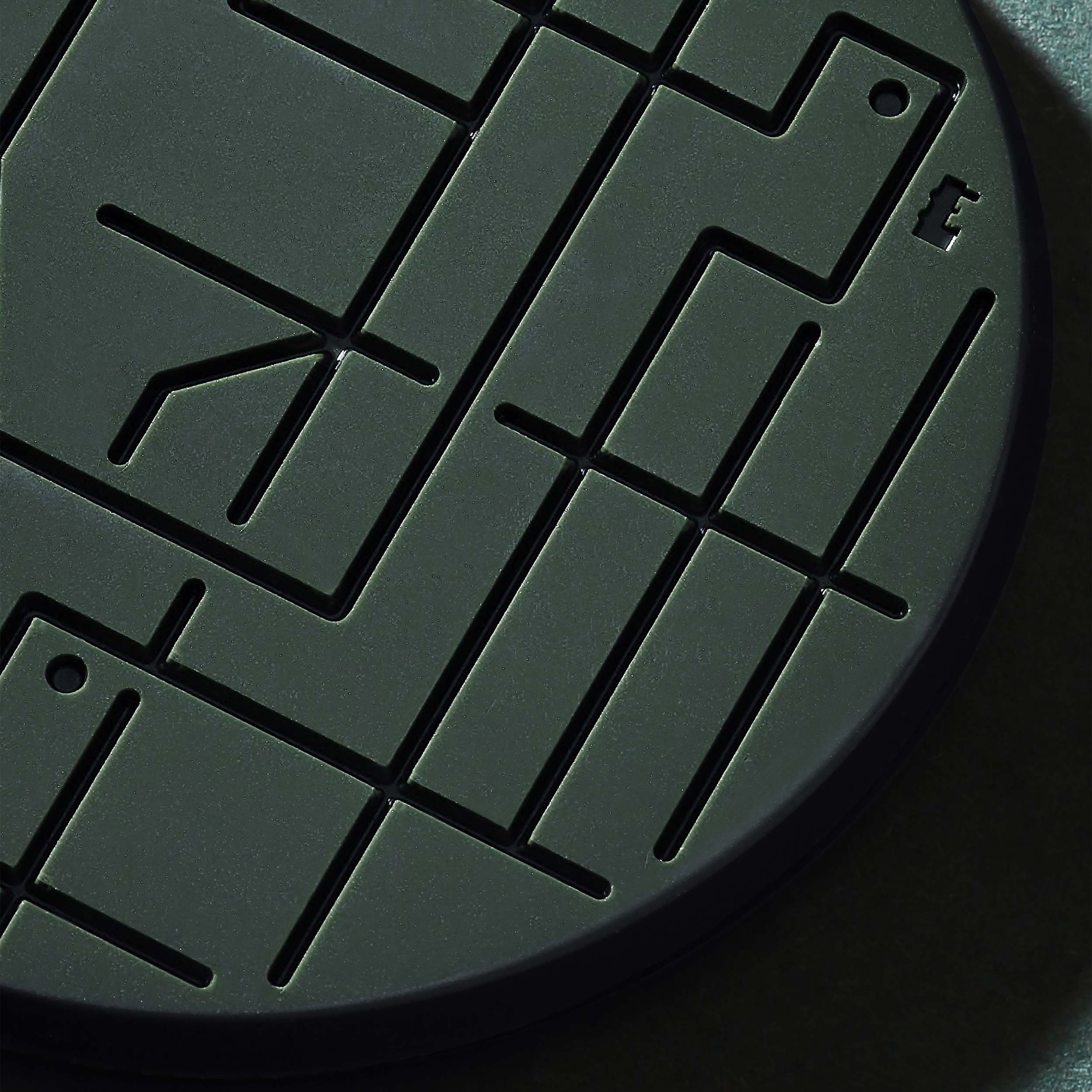
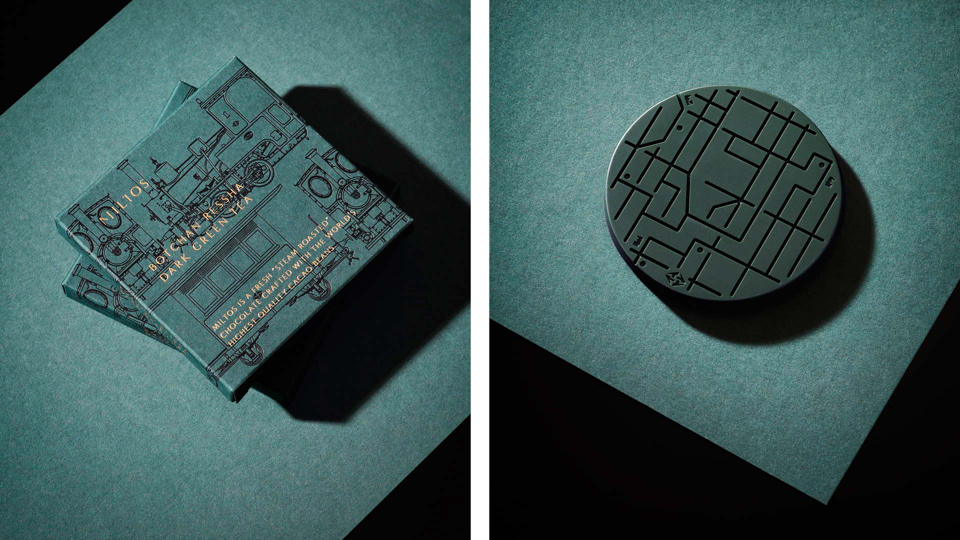
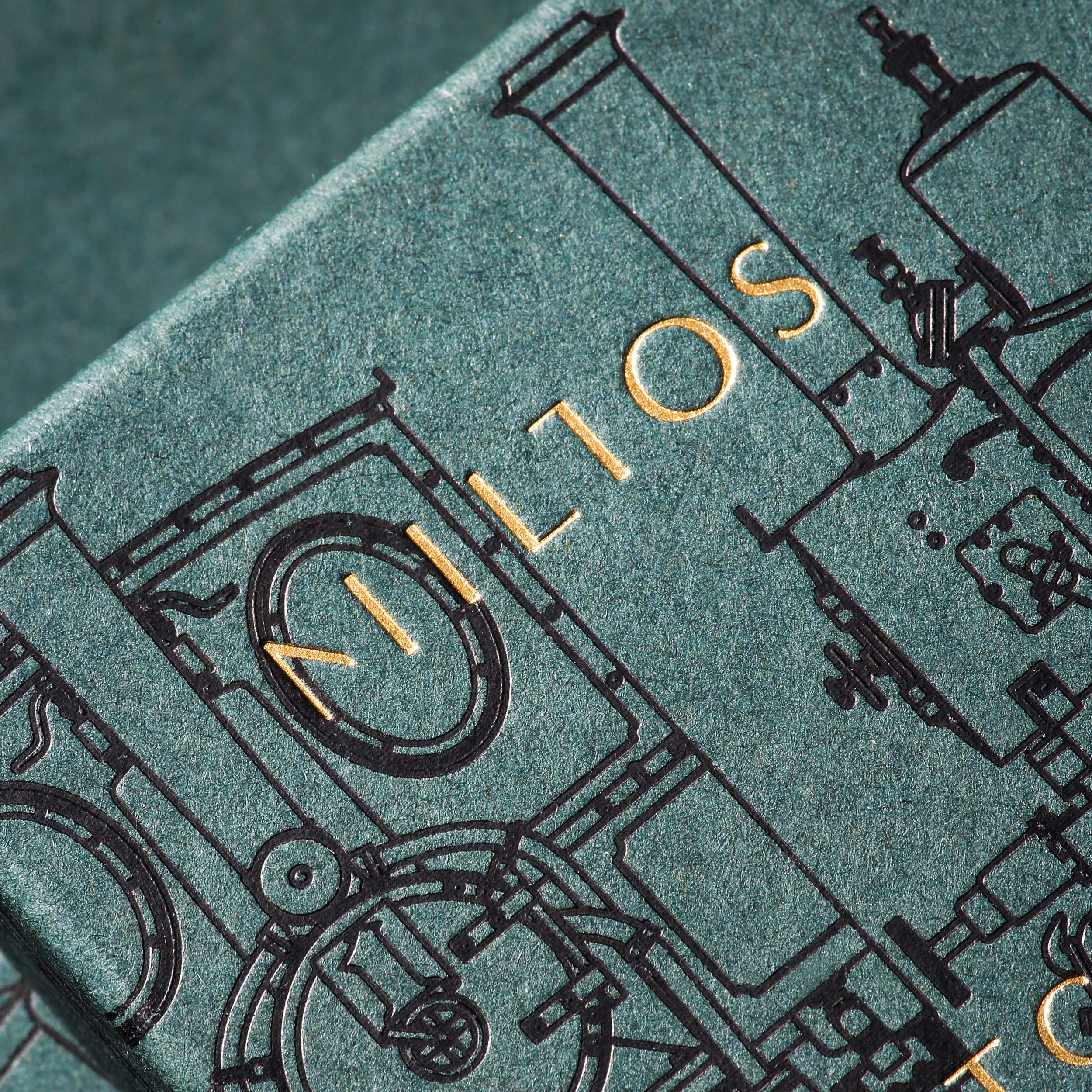
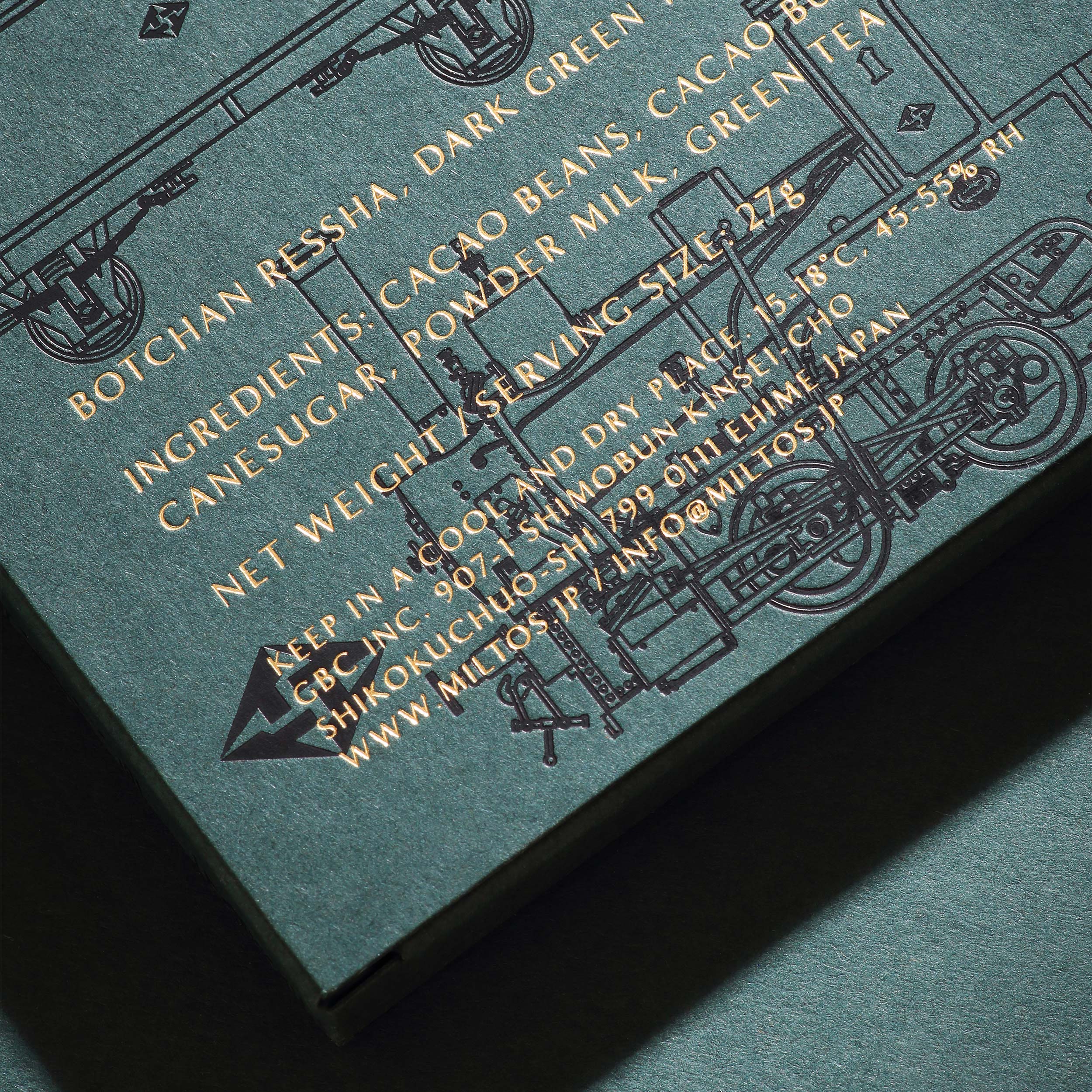
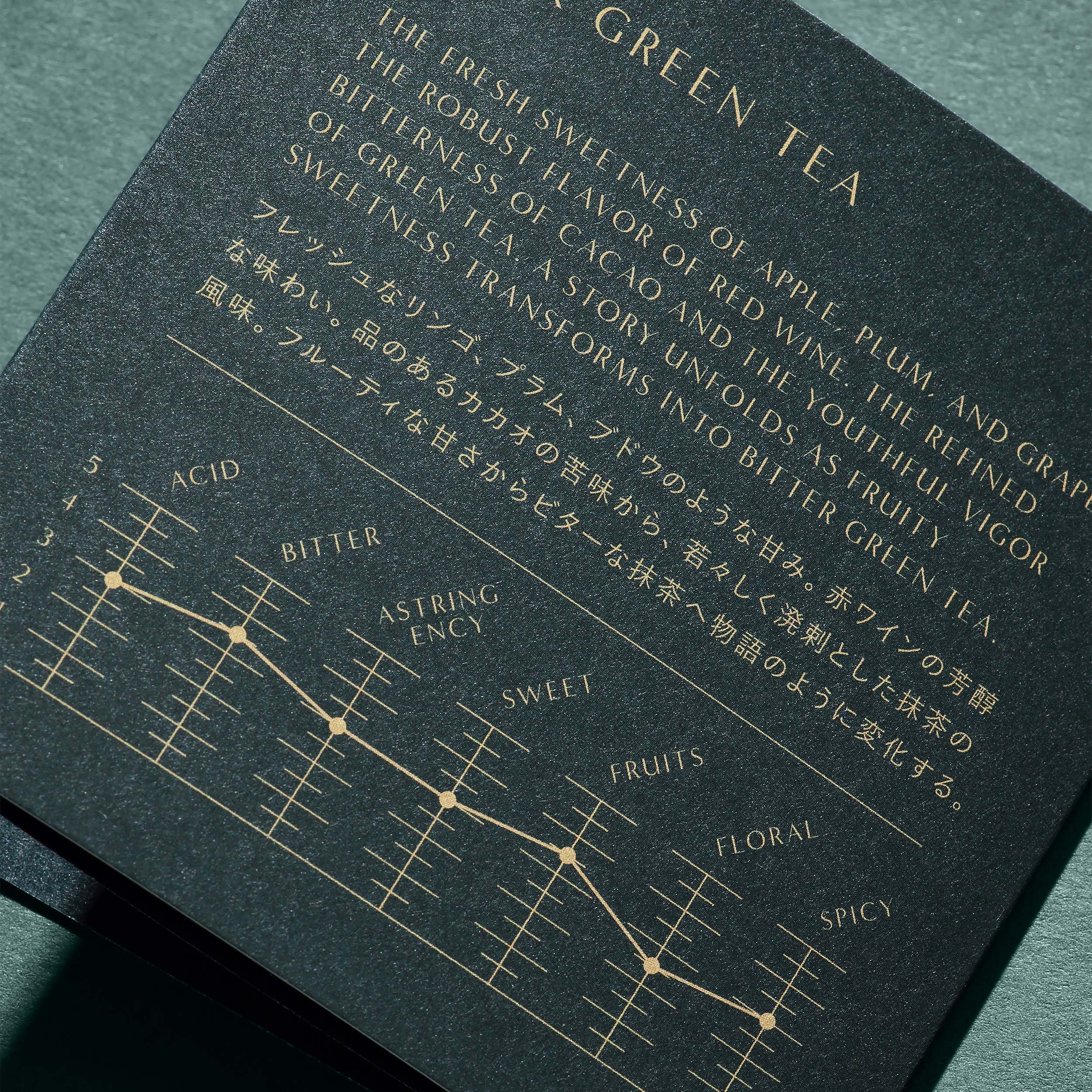
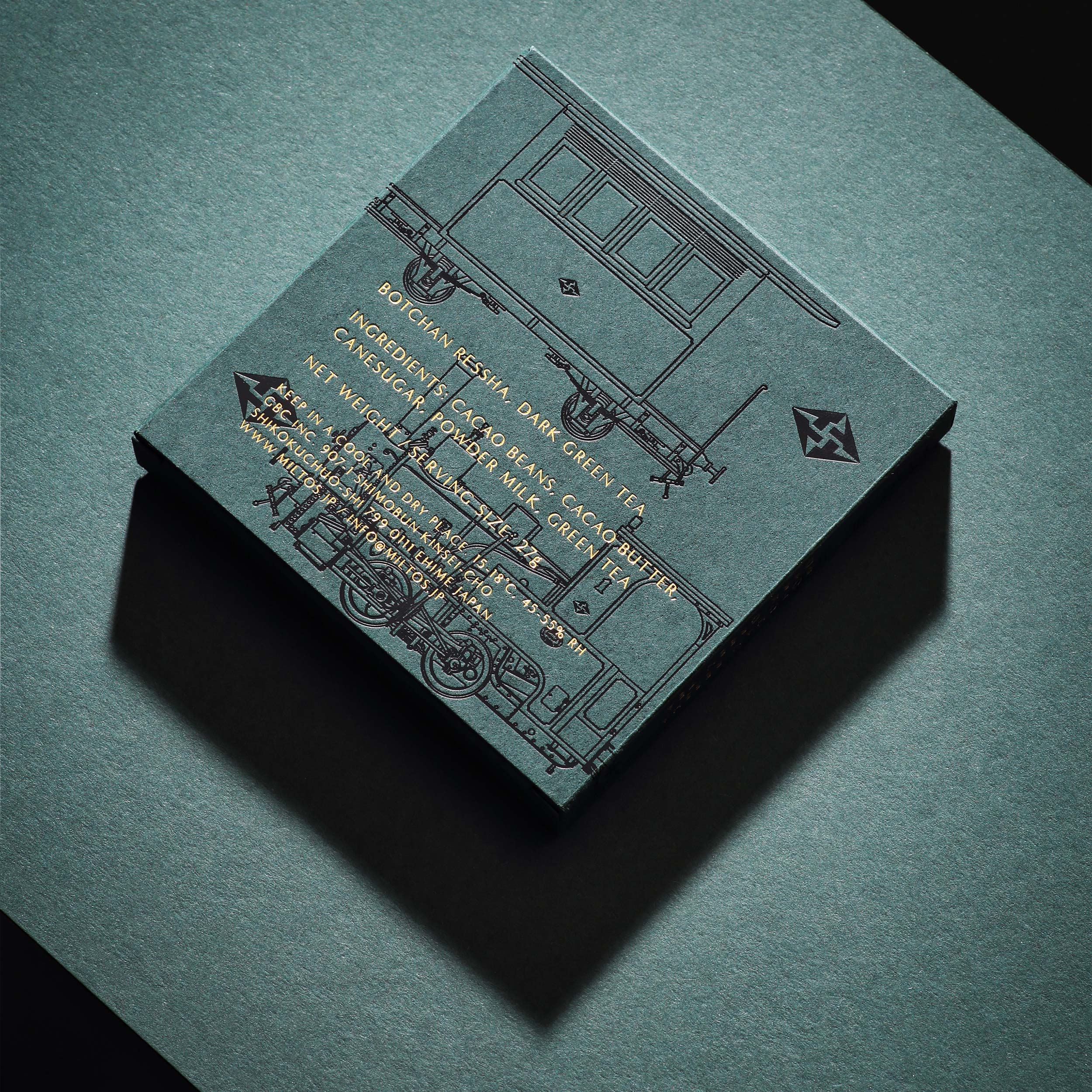
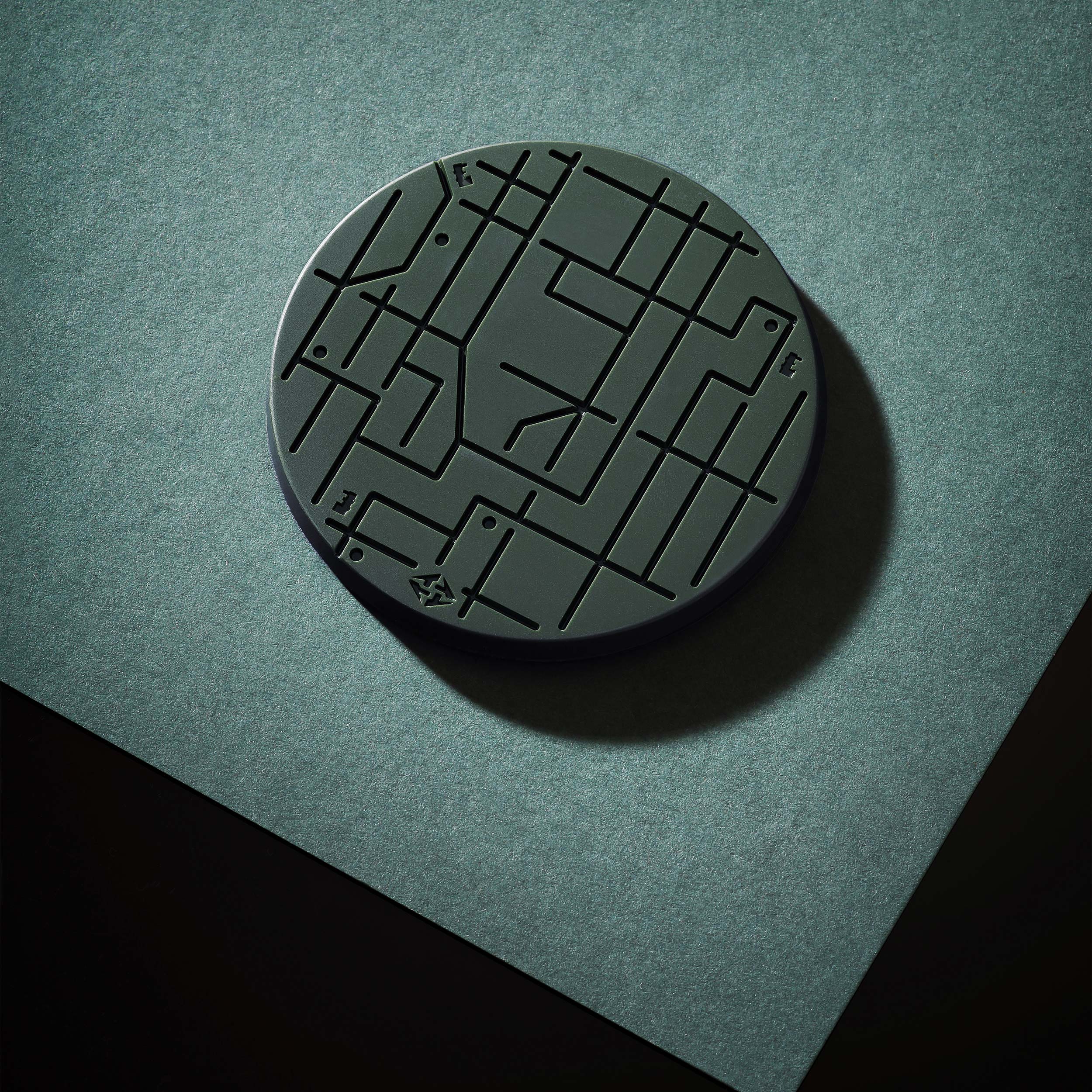
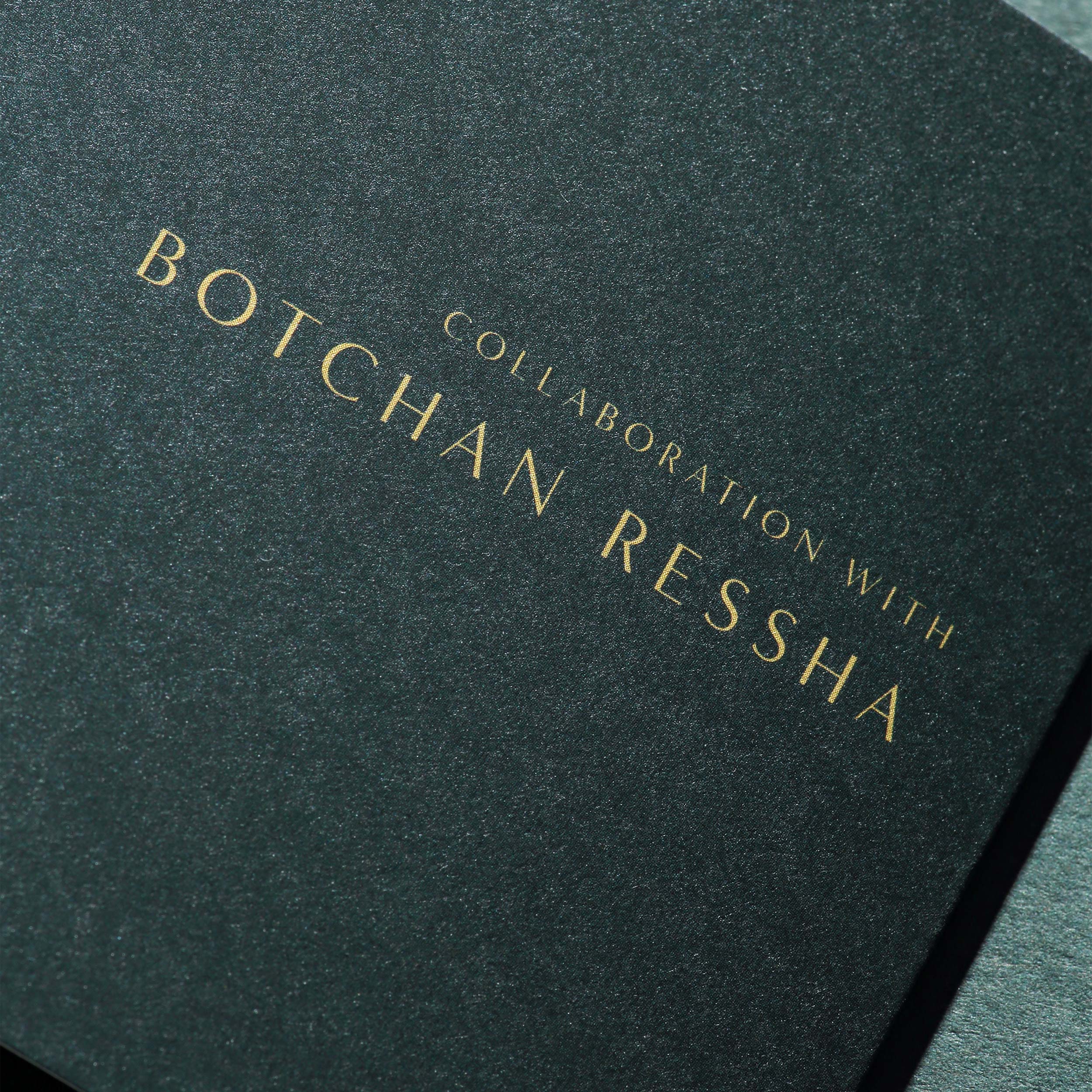
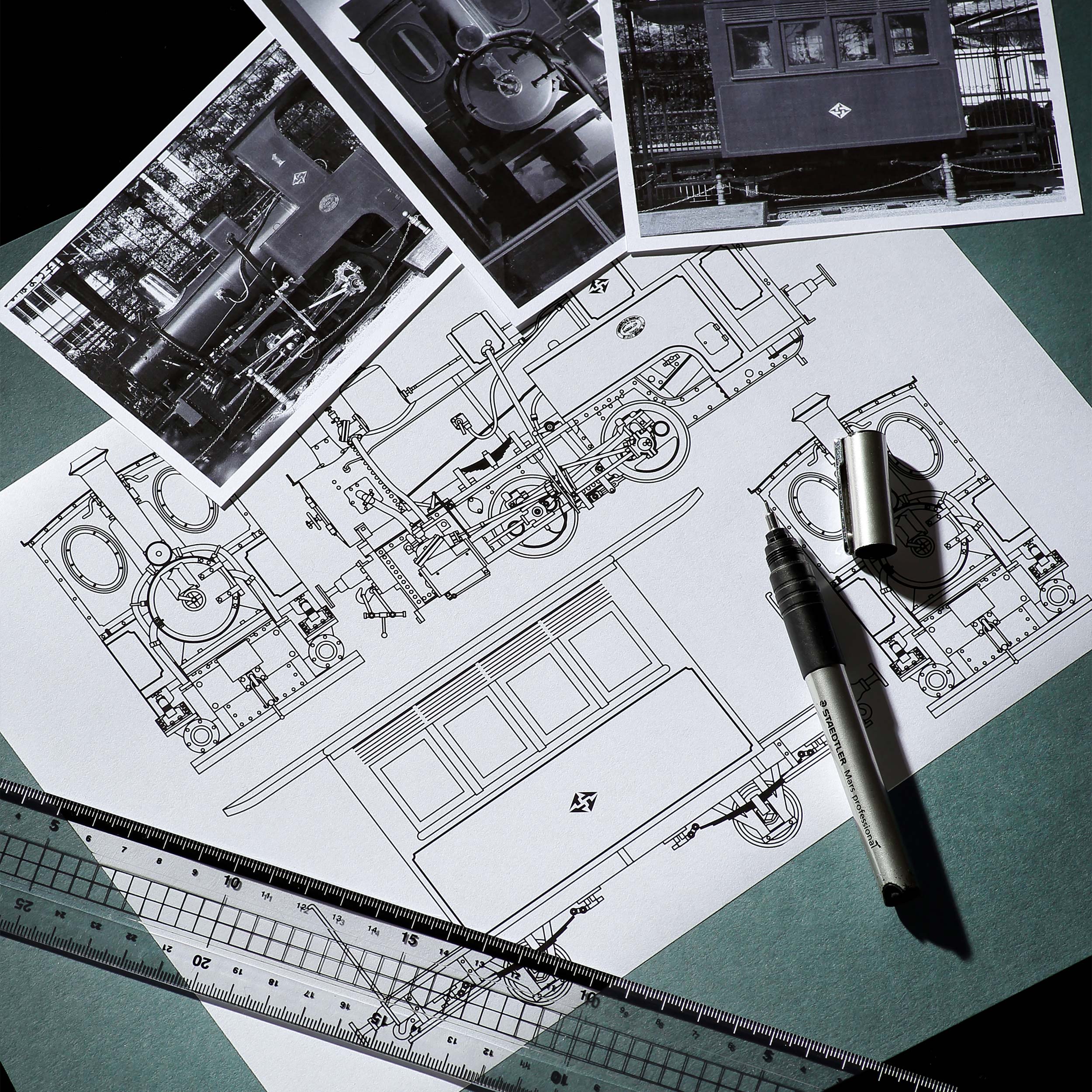
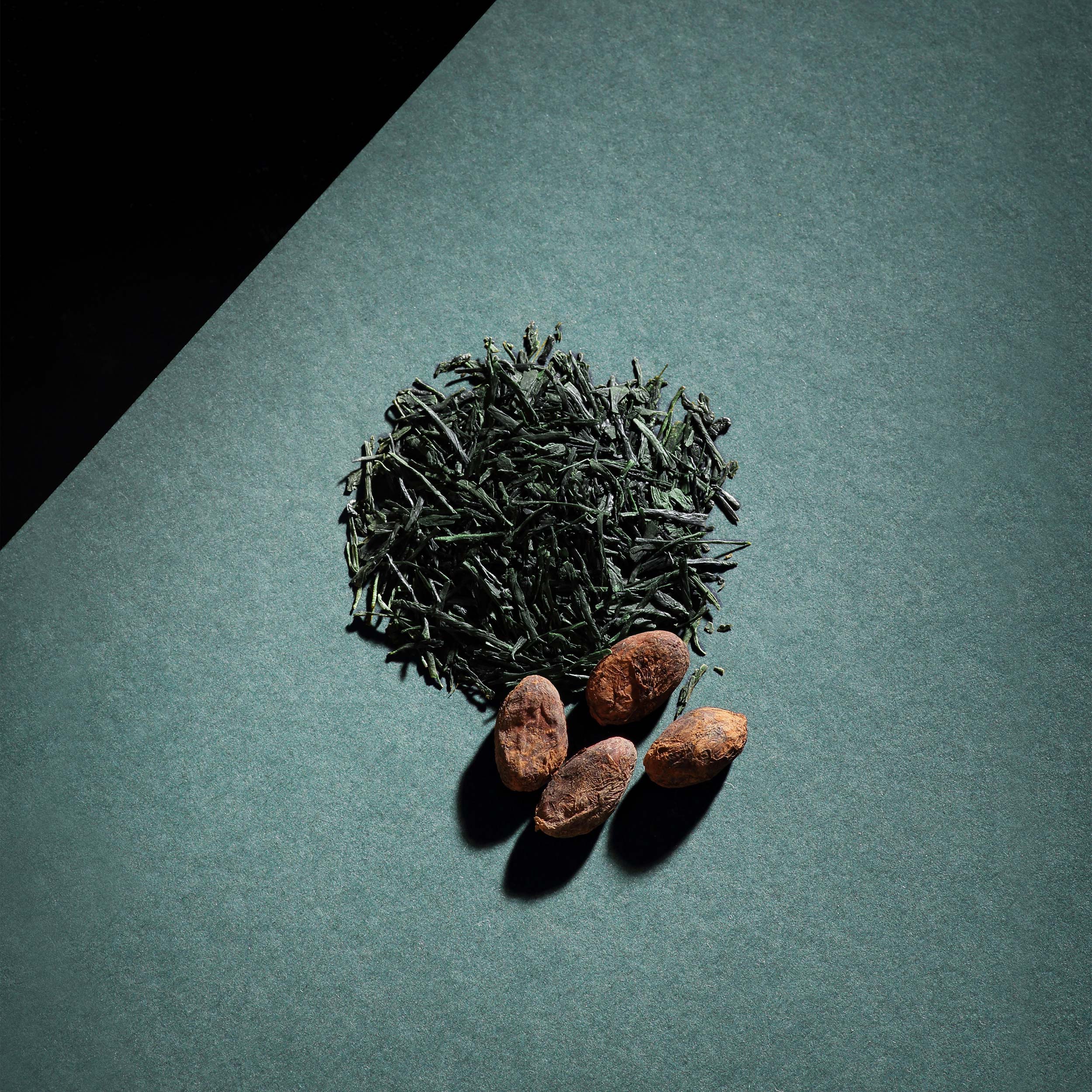
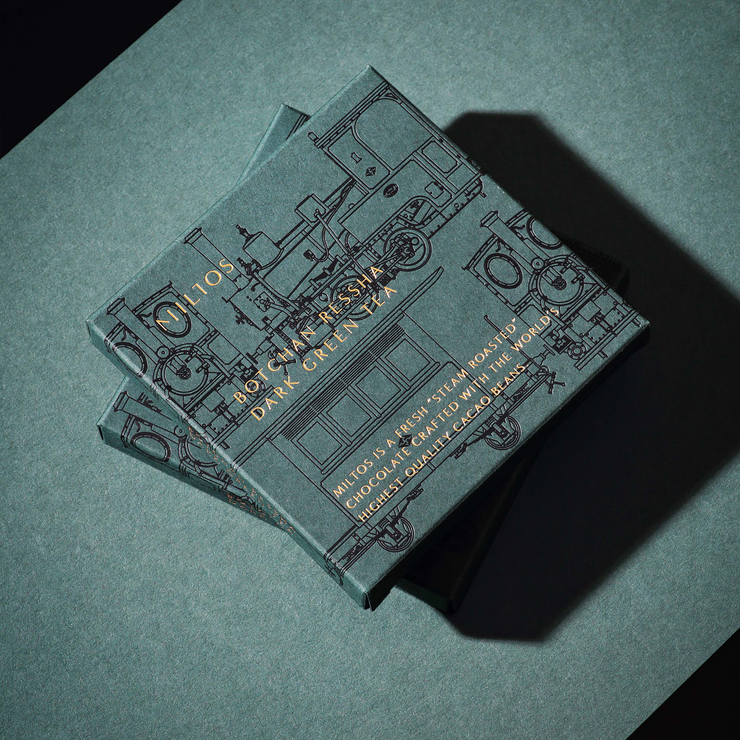
Milton Chocolate by Yuta Takahashi Design Studio
A project by Chris Labrooy’s graphic design studio in video and animated form, combining the latest technology to show classic American, British and German cars customised into flying inflatables.
Don’t miss the images — enjoy.
Why?
- For the use of colour.
- For how the project was conceived.
- For the eighties look.
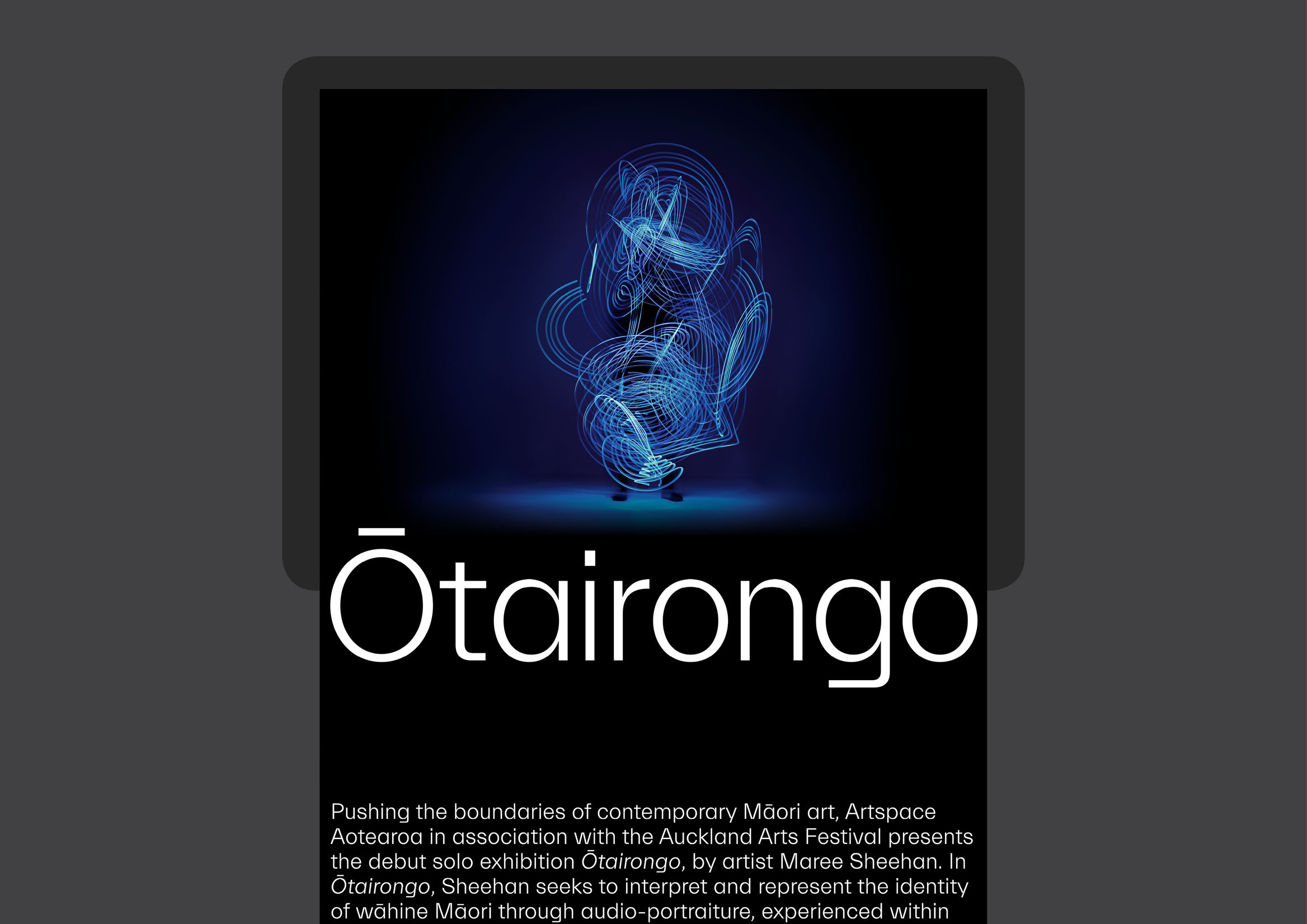
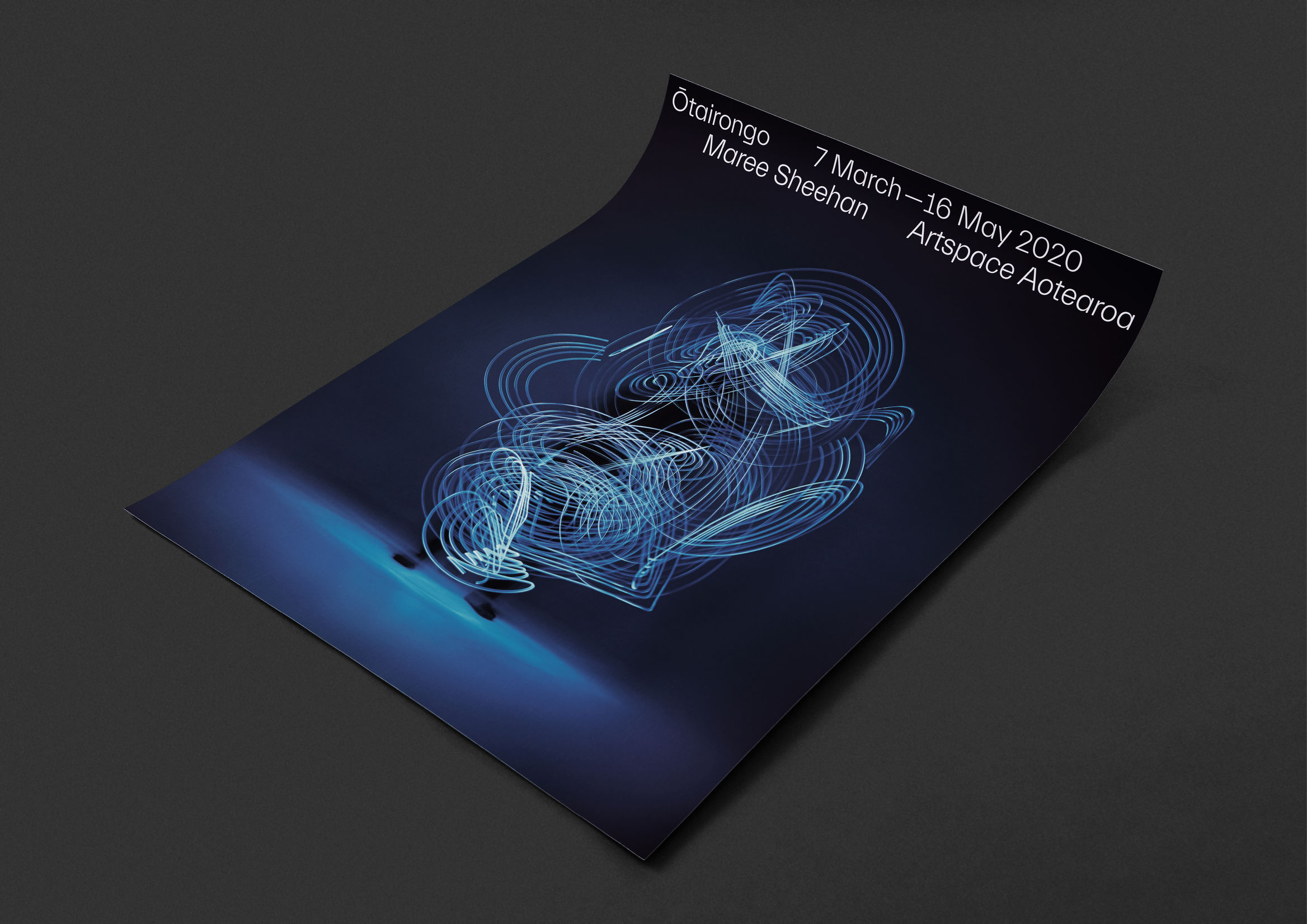
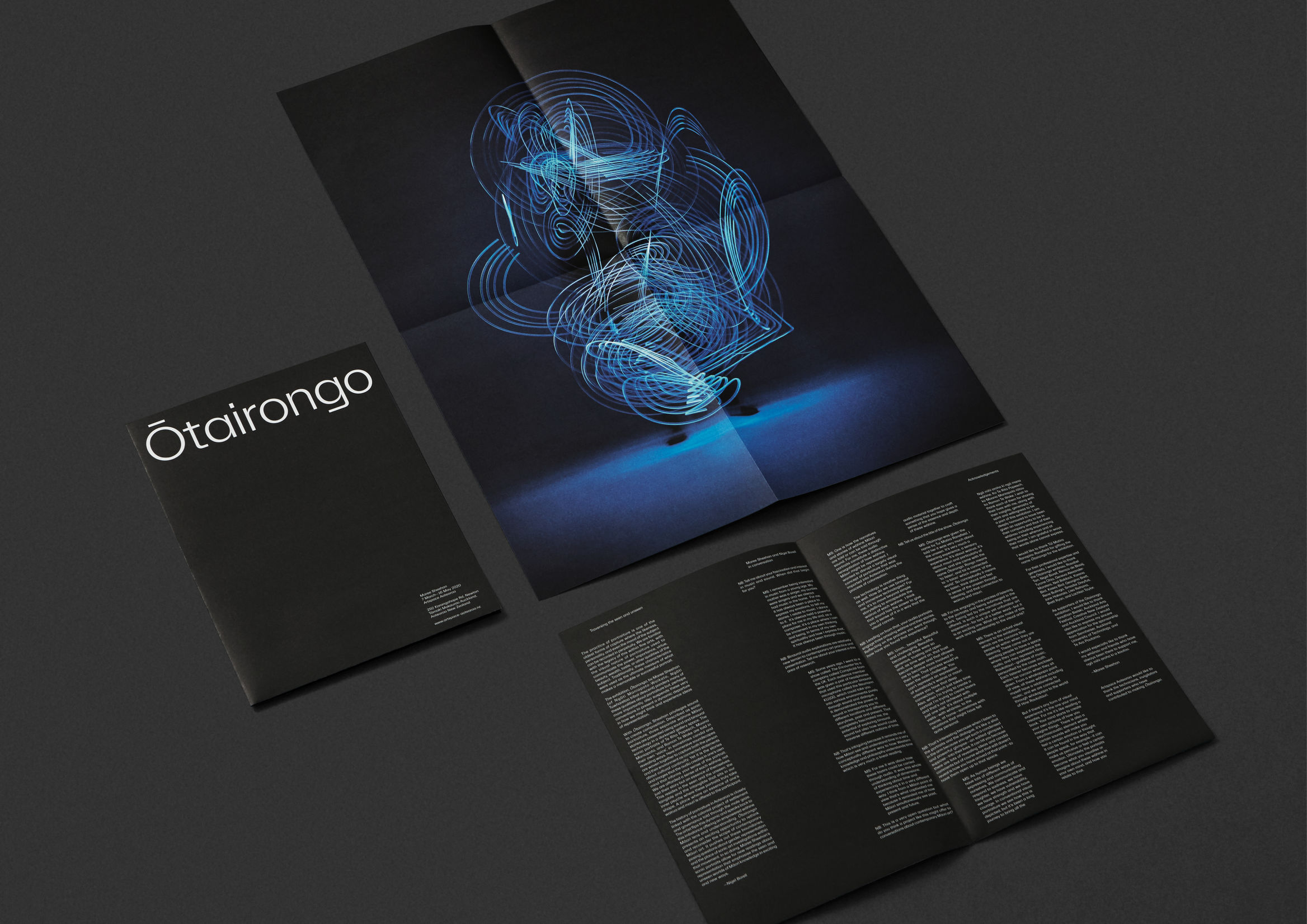
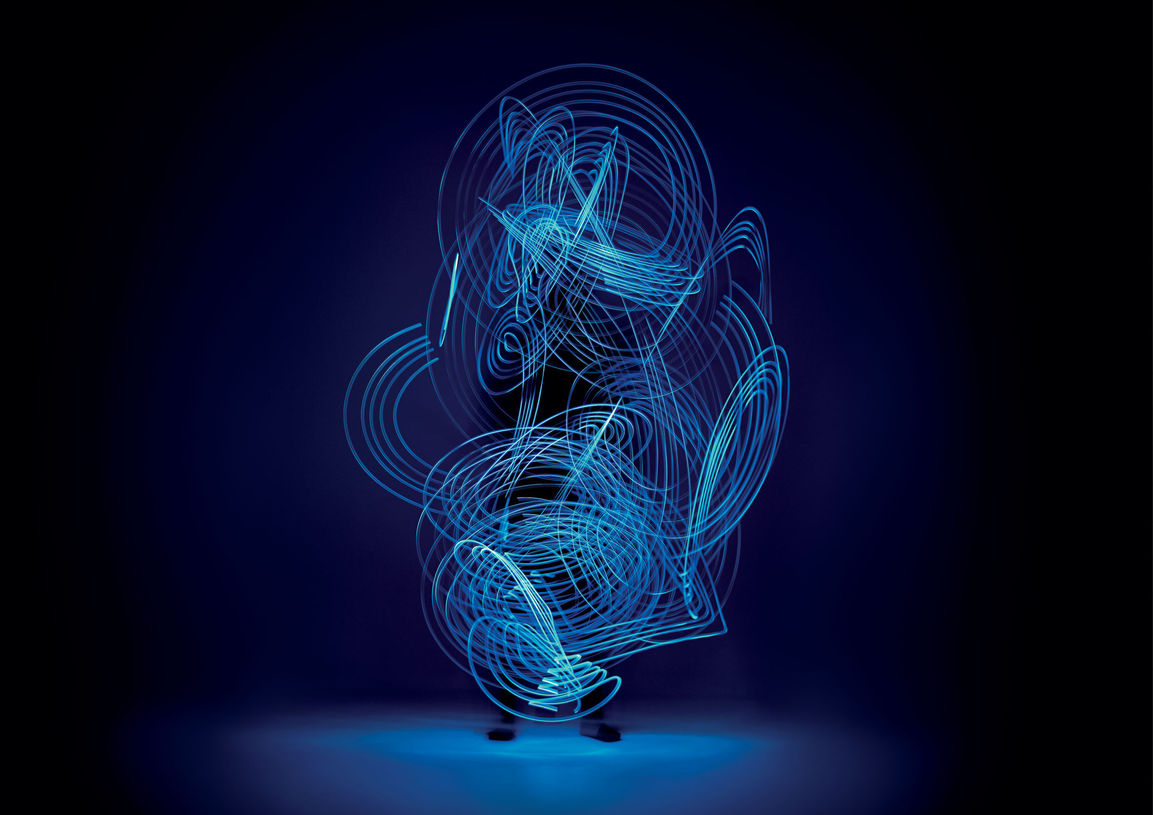
Ōtairongo by Extended Whānau
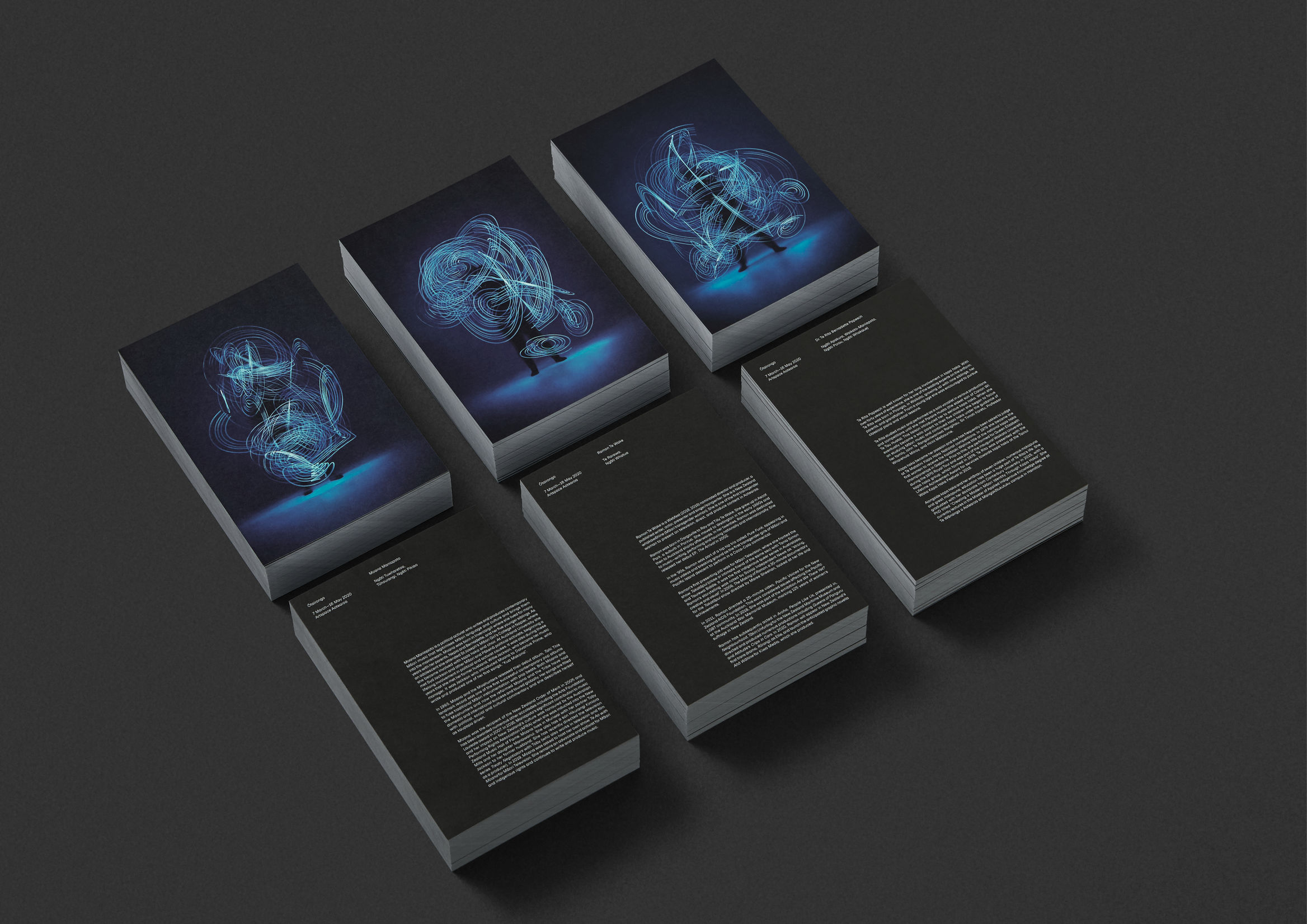
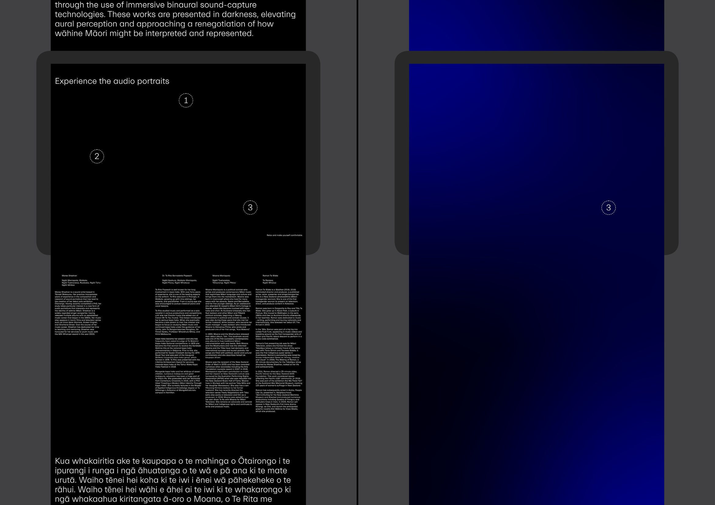
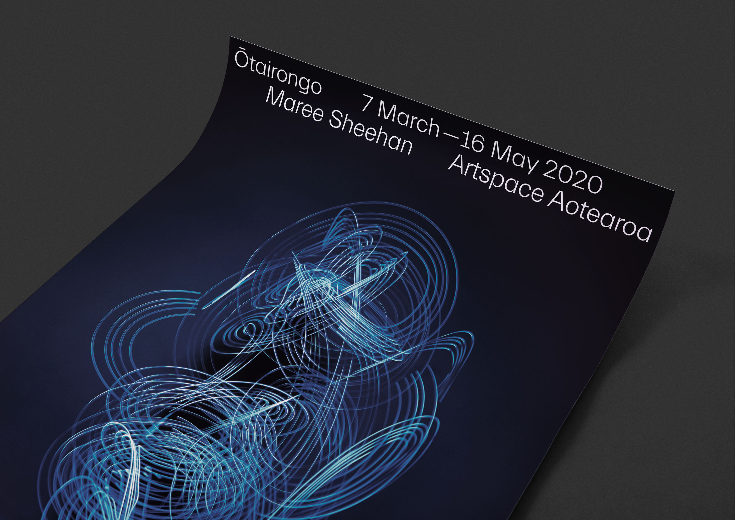
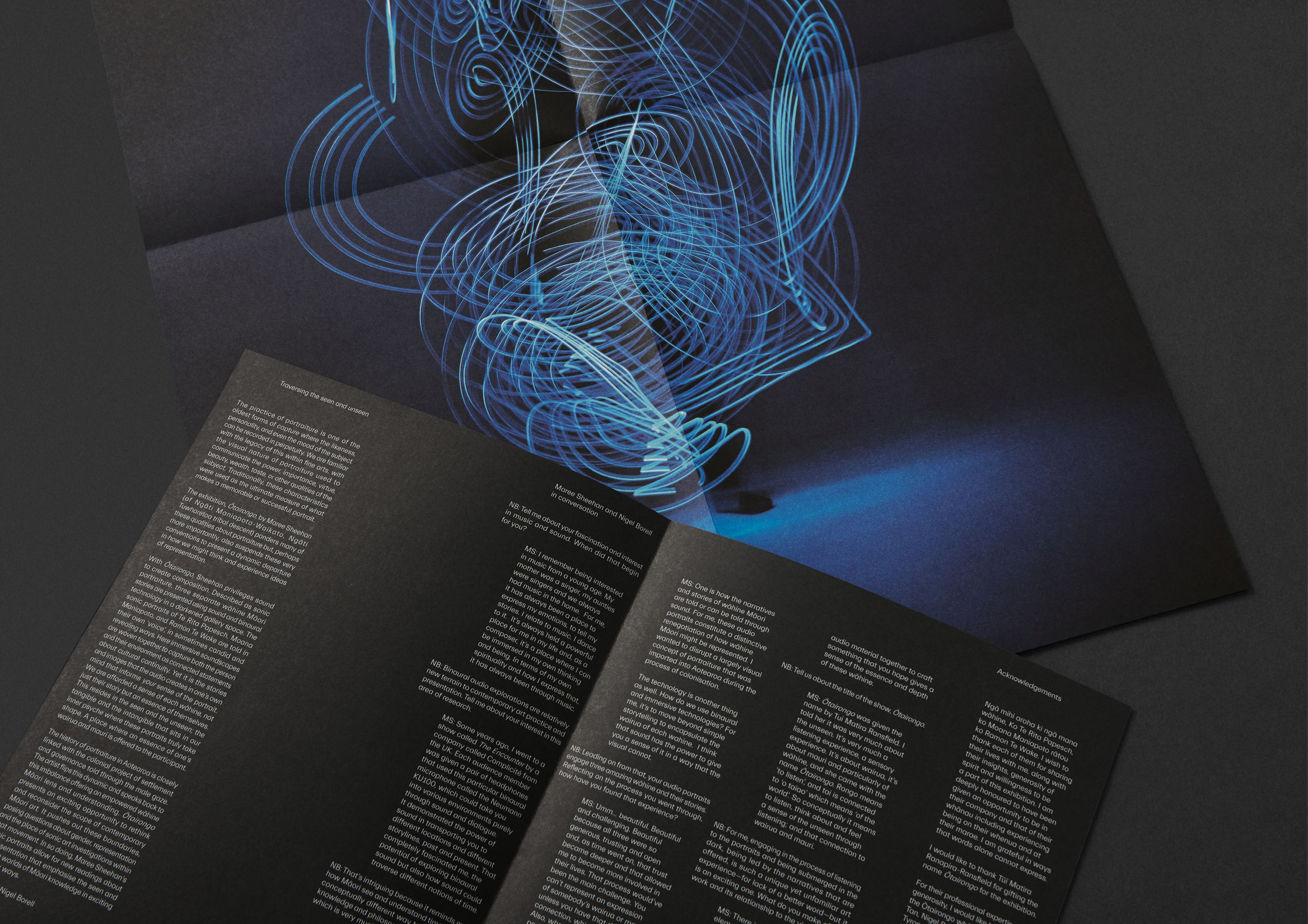
Another masterpiece we felt had to appear in this list of the best graphic designs of 2020 and 2021 is the work graphic design studio Extended Whānau did for Ōtairongo.
The project has been awarded:
- Best Awards in Design Communication
- Best Awards in Company
- Best Awards in Design Craft / Photography
- Best Awards in Small Scale Websites
The project stands out for its originality and contemporary conception, which produces a very solid, powerful image.
Why?
- For how the project was conceived
- For the use of abstract shapes
- For the overlaid elements
- For the high-contrast treatment
- For how it’s applied across the elements that make up the corporate identity
It will undoubtedly be an excellent source of inspiration for thousands of projects this year.
Better Bankside by NB Studio
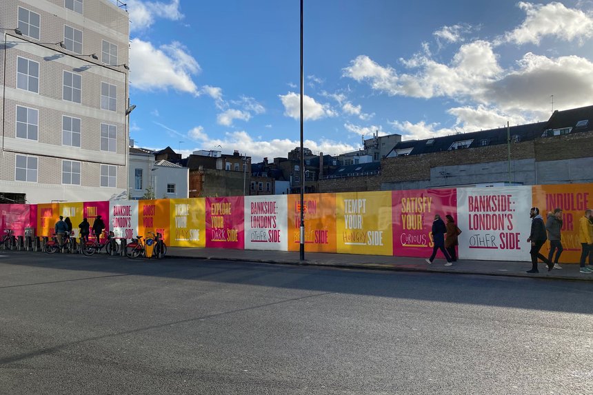
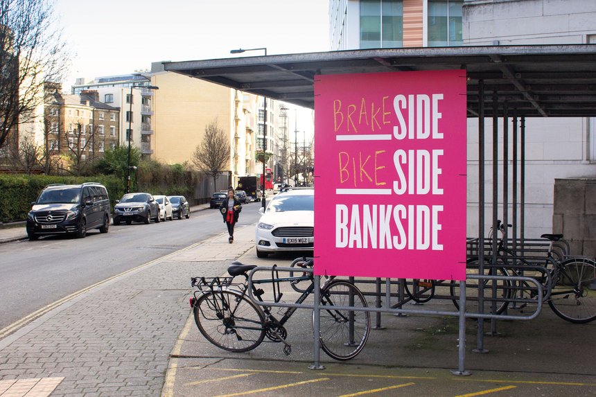
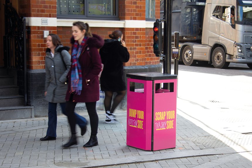
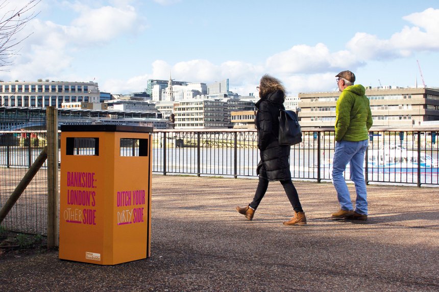
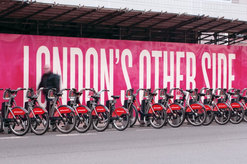
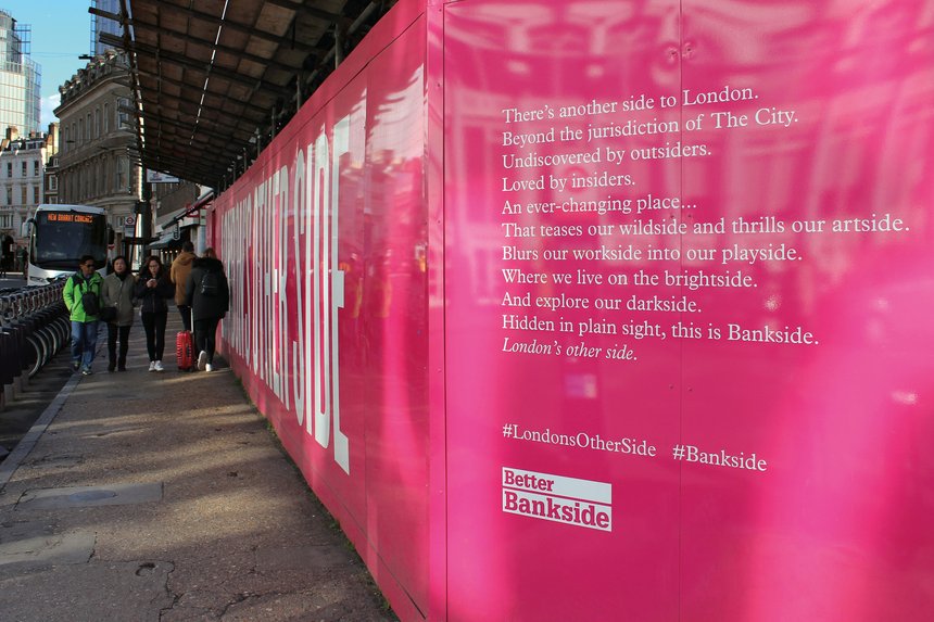
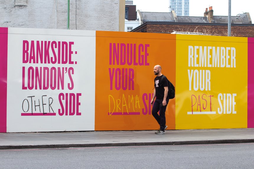
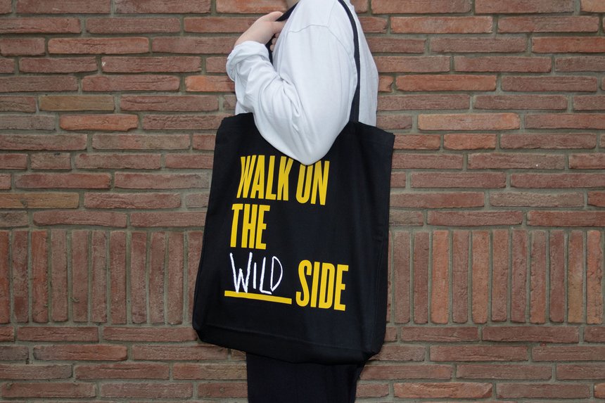
We close our search for the year’s best graphic design with the work graphic design and branding studio NB Studio did for Bankside.
The campaign’s aim was to strengthen the neighbourhood’s local ties and reinforce Bankside’s image as the other side of London.
The design uses a creative system with several graphic elements to open a communicative dialogue with the viewer.
Why?
- For how the project was conceived
- For the use of colour
- For the use of large type
- For its tone of voice
- For being a social project
- For its final execution
Conclusions:
Twelve picks is what we’ve just been through. Twelve exponents and examples across different fields of graphic design that have earned their place in our own list of the year’s best graphic design.
Some will surely have been left out, because it’s almost impossible to see and assess the hundreds of thousands of projects that appear each year.
This is our contribution as a graphic design studio, so that each year you have a good source of inspiration.
Related work
These pieces come out of well-resolved brand systems. That is what I work on here: