The best freelance designers in this selection for 2027 have a voice you recognise as soon as their work appears. There are letters that take over the screen, identities that move comfortably between formats and compositions that invite a second look. I have gathered professionals whose independent practice is documented, alongside projects that let us examine their decisions closely. Time for the pictures. And for a look at what makes them work.
This editorial selection offers inspiration and helps you compare different ways of working. The 2027 edition brings together references consulted in October 2026, with original dates and collaborators identified in each case. Some projects are older: what matters here is an idea’s ability to sustain an identity, an interface or a family of applications. When an author presents a concept or a personal project, I identify it accordingly.
The title covers freelance designers, and the selection keeps that breadth. You will find digital art direction, interface design and visual identity. Each professional has a particular territory. When preparing a commission, I look at the person’s contribution, the relationships between their applications and the decisions my project will need. A portfolio with personality gives us plenty to discuss, particularly when it takes us beyond the opening screen.
If you are already looking for a freelance web designer, explore the examples with a simple question in mind: which visual language suits your brand and the content you need to present? For more complete websites, there is also the selection of best web designs 2027. Here, we will put names to the people and take a closer look at their work.
Daniel Spatzek turns his portfolio into a playground
Daniel Spatzek puts classical painting, scattered letters, enormous arrows, a television and a banana into his portfolio. There is plenty to explore. The presentation of dnlsptzk IV, his 2022 edition, enjoys mixing references and allowing each section to do something of its own. Typography connects the journey, even as the backgrounds and objects change considerably from one screen to the next.
His professional profile combines freelance graphic design, art direction and creative development with his role as founder of Spatzek Studio. The project retains the joint credit “Spatzek Studio / Daniel Spatzek” for art direction, design and development. Its Awwwards listing documents Site of the Day on 16 June 2022. Here we revisit the author’s original presentation, published on Behance that year, as a reference for how he builds a personal visual world.
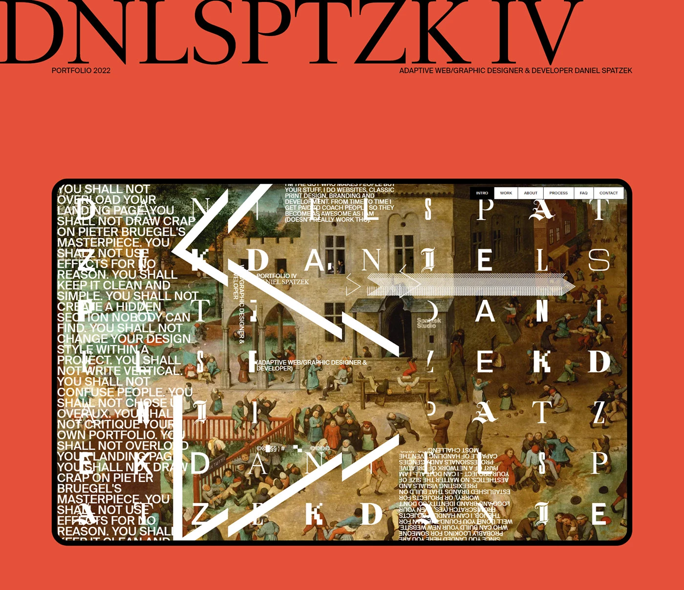
The first board opens with a coral background and a large black title. Inside the screen, painting and white letters meet arrows and overlapping blocks of text. The composition has the energy of a collage. There is a clear intention to turn the designer’s own name and short phrases into graphic material. You can take in the whole image first, then keep finding details. The portfolio invites precisely that play with attention.
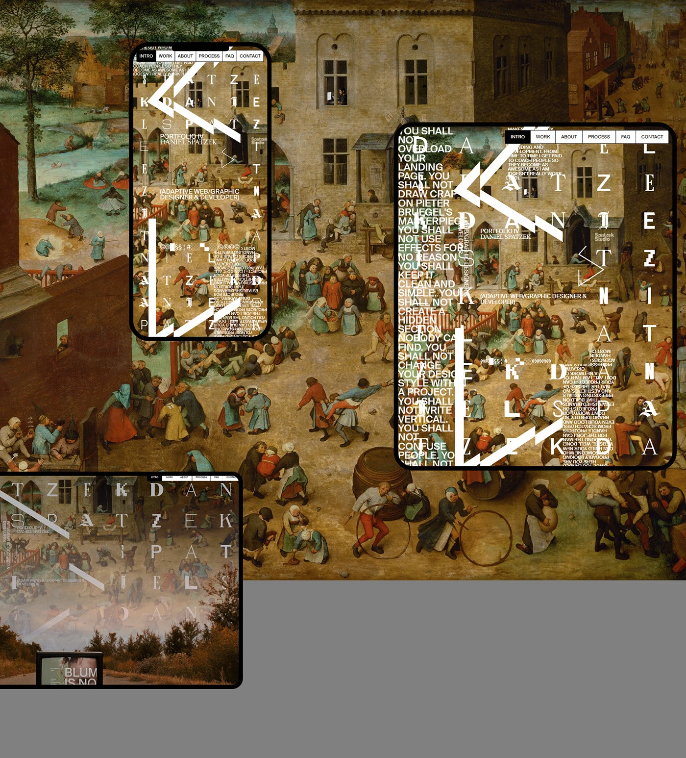
The applications board changes the screen proportions while keeping the mixture intact. Letters, arrows and text blocks are rearranged across the painted background, while small navigation labels remain at the top. These presentations help us compare how one idea occupies different surfaces. What interests me is the ability to vary a composition while preserving the project’s visual register.
The original video explores another part of the portfolio. A television standing on a path displays project images while a list occupies the left side. The recording then reaches the working process, blue frequently asked questions and a closing scene dominated by the banana. Changes of atmosphere are part of this personal website’s character. Small navigation labels provide a point of reference within these visually assertive scenes.
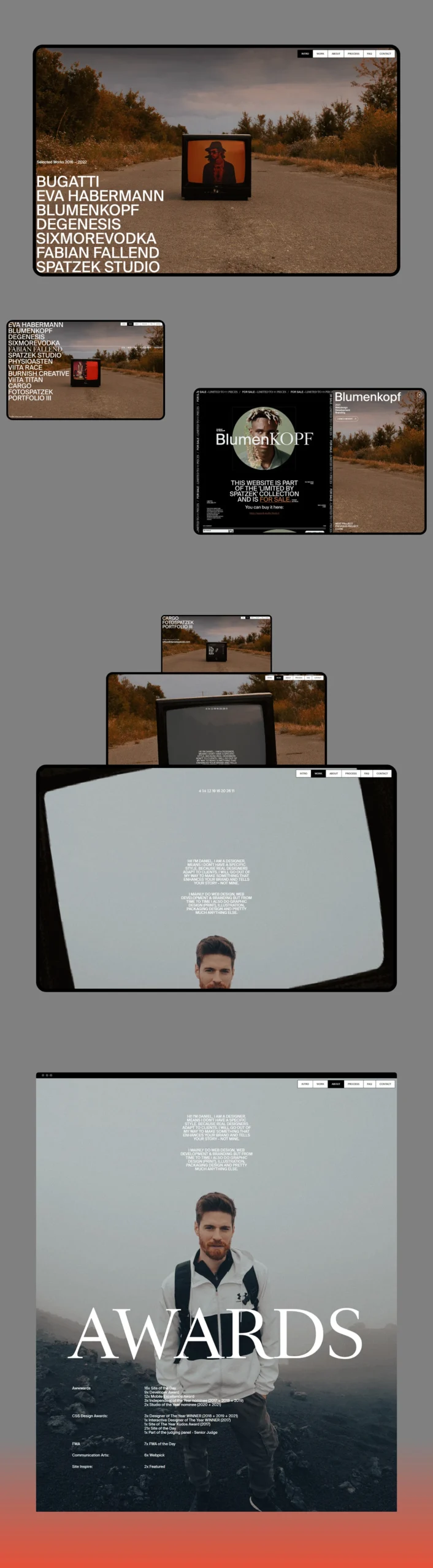
The project-list board gives us time to study the television device. The landscape becomes a setting and the television screen contains each project’s image, with the names gathered in a list. Further down, a personal introduction pairs the author’s portrait with a large word devoted to awards. The board shows two ways to bring information into the portfolio’s world: an object that presents the work, and a photograph that accompanies the author’s identity.
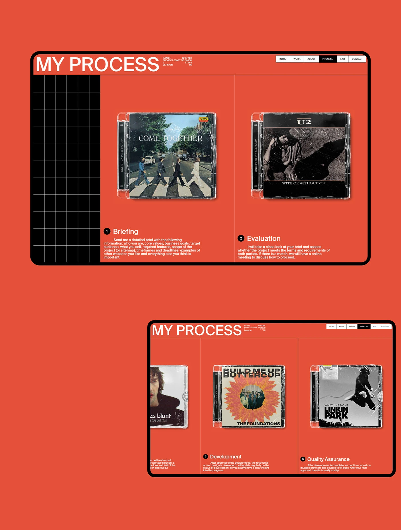
The process is explained through CD cases on coral. Numbered stages and the grid give them order; the covers introduce another tone to the presentation. Briefing, evaluation, development and review each have an associated image. I like how concrete this is: a process section can explain the work and say something about the person signing the website at the same time. Those CD cases do plenty for the second part.
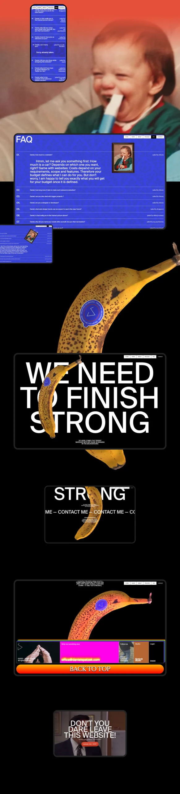
The FAQs sit on a blue background beside a framed childhood portrait. The closing section turns black and lets an enormous banana share the space with white contact lettering. Humour runs through two sections that usually carry practical information: questions and contact. In a personal portfolio, those choices make a voice recognisable. The banana certainly has ambitions beyond icon size. It is claiming its share of the screen.
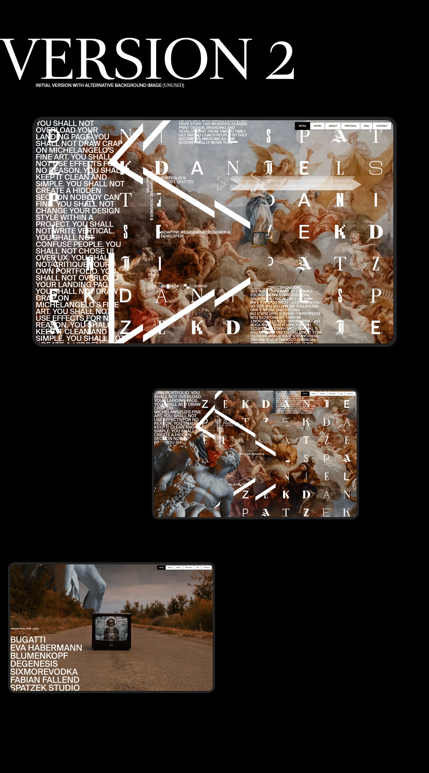
The author marks the alternative version as an early, unused proposal. It keeps the white letters, arrows and overall structure over another classical painting. Comparing it with the opening board shows how much the atmosphere changes when the image changes. This process material is valuable for exactly that reason: it lets us examine a decision before the final composition was chosen.
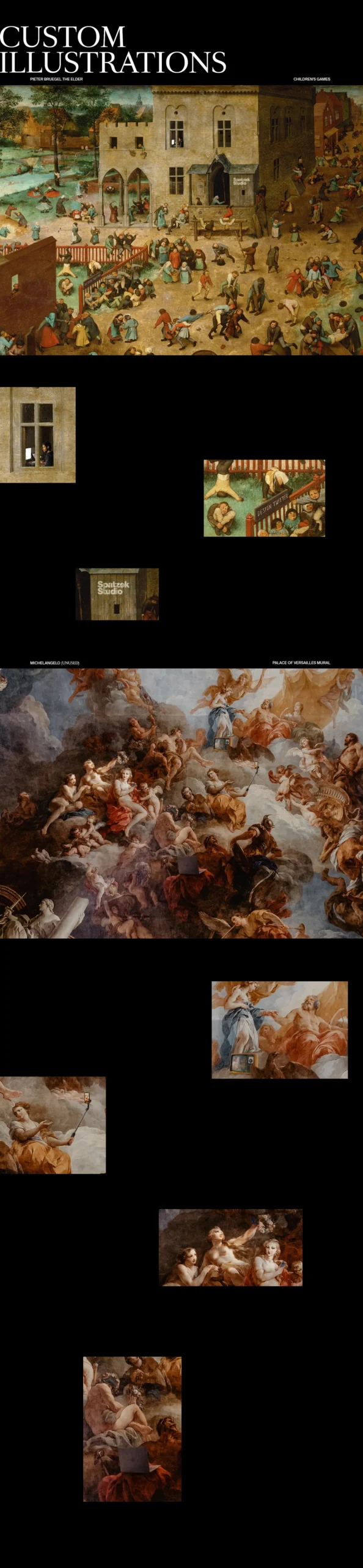
The illustration board shows details and interventions within the painted backgrounds. The main one includes elements inserted into the scene and close-ups that let us inspect them. Another unused alternative is documented afterwards. These images explain the treatment of the reference material; the original paintings retain their own authorship. The portfolio’s identity emerges from the relationships between those interventions, the letters, the scenes and the objects encountered along the way.
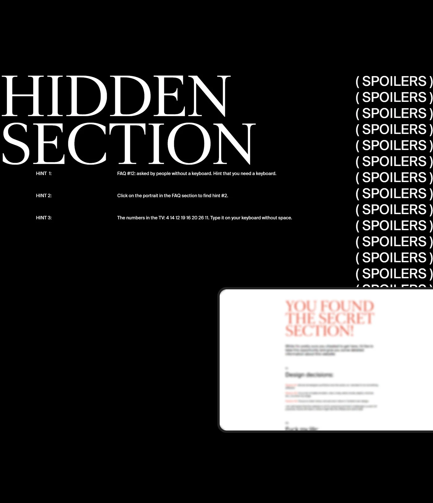
There is still a hidden section to consider. Its presentation gathers clues beneath a large white serif title and a repeated column of spoiler notices. We read this as documentation of a playful layer in the 2022 portfolio, without assuming it still functions on the current site. As an editorial reference, it shows another personal choice: reserving some content for discovery and making the clues part of the graphic material.
I would look at Daniel’s work for art direction capable of maintaining a very personal voice across several sections. This case covers the opening screen, project list, introduction, process, questions and contact. I would keep that breadth in mind when preparing a brief: decide which spaces need a character of their own and which elements will connect them. You can also continue exploring the graphic design trends 2027. Here, personality reaches quite a long way. All the way to the fruit bowl.
dnlsptzk IV, a 2022 portfolio. Art direction, design and development: Spatzek Studio / Daniel Spatzek. Images and video from the original Behance presentation. Awwwards Site of the Day on 16 June 2022. Freelance and founder profile consulted on 13 October 2026 through his professional profile.
Núria Madrid gives colour room to build an entire identity
Núria Madrid brings Mòdul an intense blue, a warm coral and shapes that seem to have their focus somewhere else. The blur gives them a particular presence: you see blocks, curves and luminous surfaces, alongside an atmosphere that can change composition while keeping its voice. It makes you want to look at colour closely. There are several ways to do that here.
The creative designer works from Barcelona and offers freelance collaborations through her professional profile. Her portfolio presents Mòdul as a visual identity and brand design project developed in a sprint, around a system of collaborative workspaces. The screen and advertising images are applications illustrating that proposal. We will look at how the identity moves between these formats.
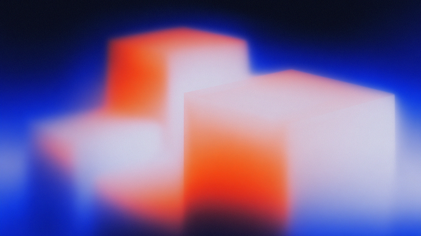
The first composition lets the volumes speak for themselves. Coral flows through the blocks, white catches the light and blue occupies the background. Grain adds visible texture within the soft areas. The combination has personality before a name even appears. For an identity that needs plenty of supporting imagery, recognisability through colour, shape and treatment offers a fertile starting point.
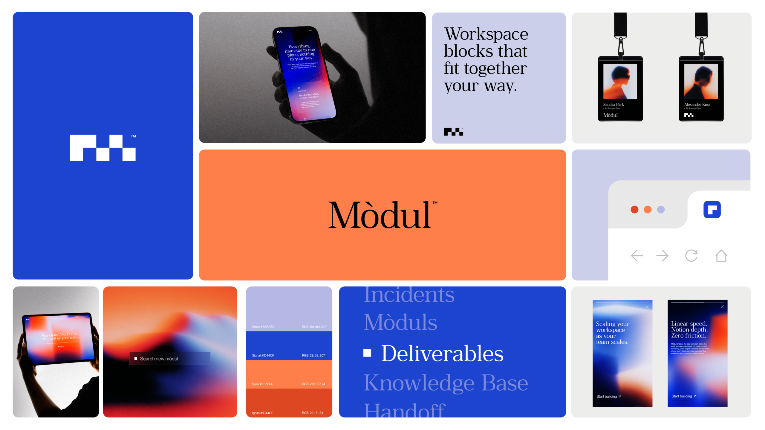
The overview board shows how everything enters the conversation. Square components form the modular symbol; Mòdul’s name appears in a serif; blue, coral and lighter tones are distributed across backgrounds, screens and cards. We also see passes, a phone application and a browser detail. The symbol’s geometry contrasts with the drawing of the letters. These components provide a recognisable structure that allows the brand to vary its imagery.
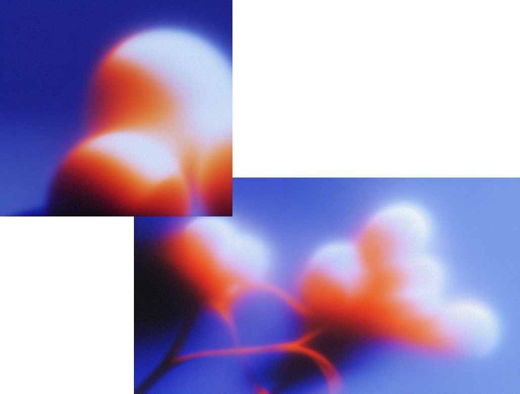
The next image changes the shapes and keeps the overall temperature. Blocks appear in one composition, rounder curves in the other. Both maintain the blue, coral and soft boundary between colours. This is a useful example of what a freelance designer can contribute when a commission needs a visual system with room to grow: related pieces that refresh the composition while retaining the same identity.
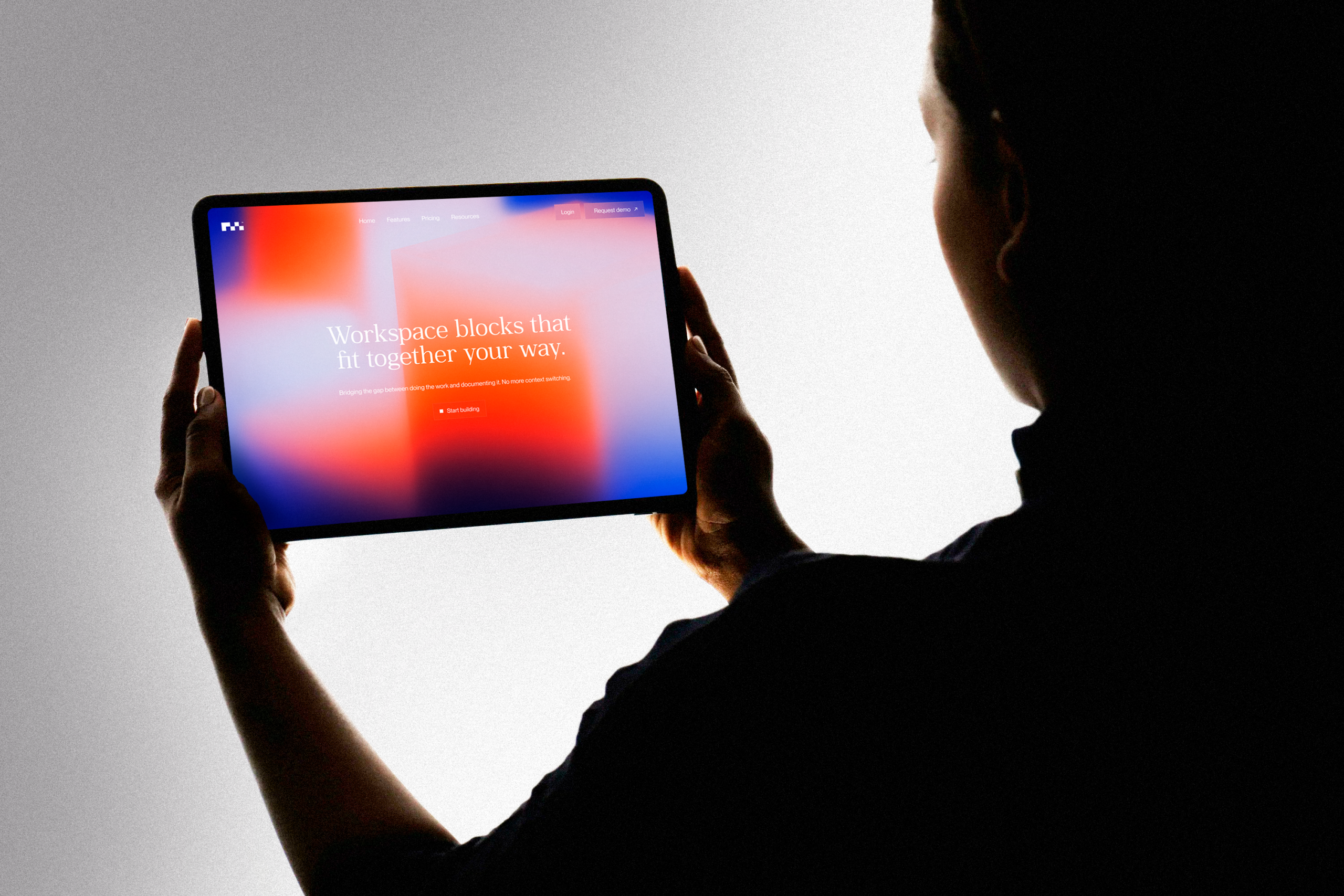
In the tablet application, the background fills the screen and the message sits in the centre in white serif lettering. Navigation stays at the top, with the action below the headline. The presentation photograph shows the proposal in a horizontal format. Its hierarchy is what interests us: colour carries the brand’s voice and text establishes a reading point within that expressive surface.
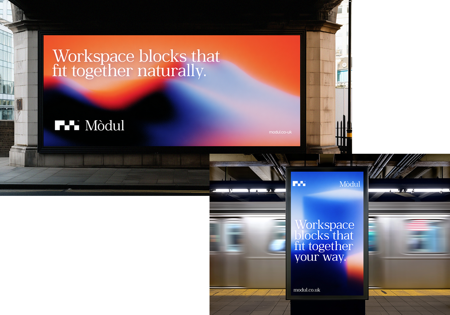
The advertising mockups change scale. On the horizontal surface, text stretches across the upper area and the signature stays below. In the vertical format, the message occupies more lines and blue has more room. Both preserve the identity’s atmosphere. These mockups show a proposed adaptation to the available space. They provide material for evaluating the brand’s art direction, without suggesting that an advertising campaign was installed.
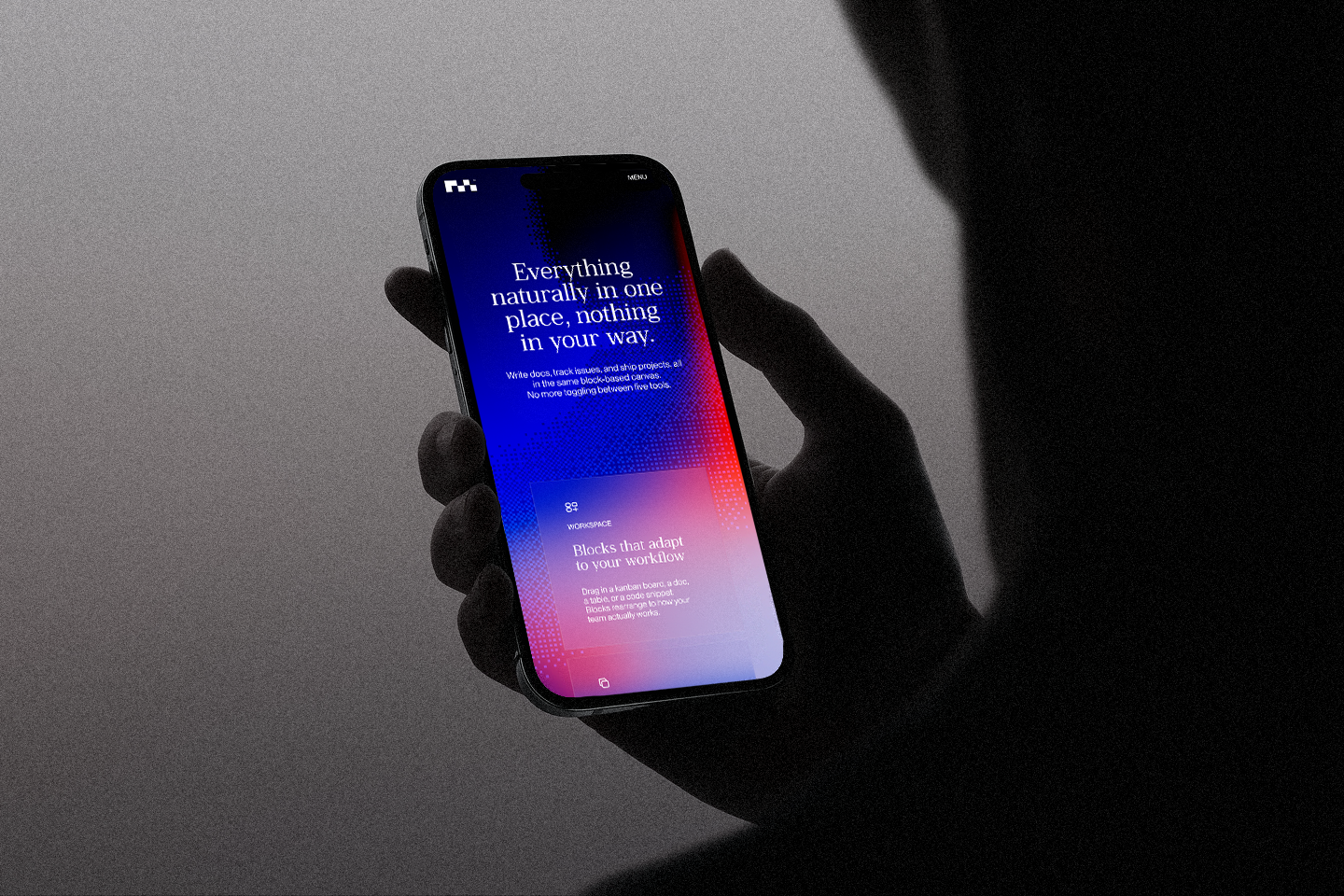
The phone condenses the system again. Symbol at the top, centred message and a translucent card further down. The background treatment remains present, while the card establishes a distinct area for another piece of content. This kind of application helps us study a designer’s work beyond the logo: we can see how levels of information are organised when the surface becomes narrow and content needs to continue vertically.
The video presents vertical cards moving horizontally. Each keeps the name at the top, small geometric motifs in the centre and a message below. The background changes between blue and coral variations. The sequence reveals related pieces within one arrangement. Movement presents them and lets us compare their visual relationships: colour changes cheerfully, while structure keeps everything connected.

The last composition returns to large blurred blocks. Blue has more weight, alongside a coral accent and a very open white area. After the applications, this image helps us recognise the ingredients running through the case. The identity has a texture and its own way of building backgrounds. That material can accompany new formats without always depending on the same image.
I would look at Núria’s work for a commission where identity and graphic design need to support a family of pieces. Mòdul allows us to compare components, variations and applications within one project. When preparing the brief, I would list the formats the brand needs and which ones require their own composition. That detail turns inspiration into a scope of work we can discuss. Colour has plenty of places to go here; give it some good ones.
Mòdul. Visual identity and brand design: Núria Madrid. Project presented as a design sprint; applications and mockups according to the original case study. Freelance practice consulted on 13 October 2026 through her professional Behance profile.
Serhii Churilov gives product presentation a spectacular entrance
Serhii Churilov places the Koenigsegg Gemera in a black scene with reflections, yellow and considerably large lettering. The car has room to change perspective and the message takes a substantial share of the width. This proposal has an appetite for spectacle. Its strength lies in the relationships between the product image, typography and small controls around it.
The art director and digital designer describes himself as a freelancer based in Kyiv on his professional page. The Koenigsegg case study describes a promotional website concept and credits him with art direction, web design and motion. Music and sound design are credited to Dmitry Tkach, with management by Danylo Matvienko. The screens and videos examined here belong to that design proposal.
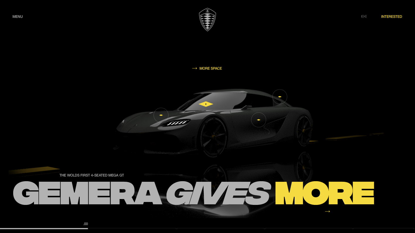
The opening screen brings two scales together. The car occupies the centre, with a reflection extending the scene downwards. A large headline crosses the width, and yellow highlights part of the message. Small points on the body mark areas of interest. The emblem remains above, separate from the rest. This composition lets a product image coexist with an assertive statement and quieter interface details.
The name and emblem animation proposes another entrance into the graphic world. In the clip, black pieces appear against a grey field and gather above the name. The contrast between small figures and an empty surface focuses attention on the symbol’s construction. We are evaluating a motion proposal applied to Koenigsegg’s brand, whose emblem is already part of its identity.
The wheel shot moves much closer. A ring of warm light occupies the interior, while the grey body remains restrained against the black background. The difference between that light and the rest of the object gives the detail a presence of its own. It is a useful example of product art direction: choose a part, build a frame and give it a treatment that belongs to the overall scene.
The opening video begins with headlights in the dark, then presents the vehicle, headline and yellow points. The car’s perspectives change within the sequence, while the composition retains its main references. The reflection helps sustain the staging. It is enjoyable to watch the product find its place between a huge statement and interface elements working at very different sizes.
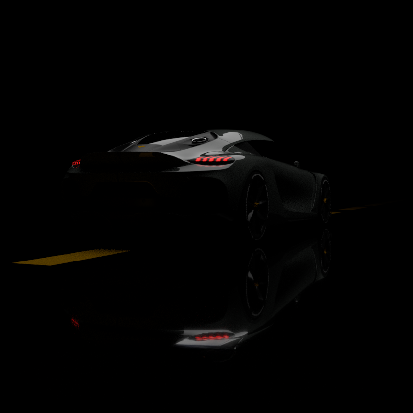
The rear view adds another accent: red lights. A yellow line crosses the base and the reflection doubles some of the car’s details. With very few colours, the frame shifts the point of interest from the opening screen. In a selection of freelance designers, complementary images matter because they reveal the judgement holding a collection together. The angle and lights change here; the atmosphere still belongs to the same project.
The clip devoted to space and aesthetics opens the doors and shows the yellow interior. The large headline sits below, controls remain at the edges and a complementary content panel occupies one side. Across the recorded states, the screen’s organisation is preserved even as the product perspective changes. The proposal finds a structure for presenting several aspects of the car in one language.
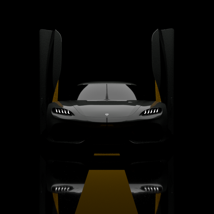
The frontal image with raised doors has pronounced symmetry. Headlights define the vehicle and the yellow stripe continues through its reflection. This composition shows how a silhouette can become the organising element for an entire screen. Opening the doors changes the object’s shape substantially, and the framing uses that moment to create an image with the presence of a poster.
The emotions sequence switches to a view from above. Yellow lines curve along both sides and numerical readings appear in a column. The car and statement stay in the leading roles; the other elements create a visual sense of speed. Those figures belong to the presented concept, so we consider them part of its composition. For another project, the interesting decision is how to combine a viewpoint, a piece of information and a moving image.
The menu gets its own serving of giant typography. It changes to a light background, stacks slanted black entries and uses yellow to highlight one in the video. The emblem remains above, with small indices accompanying the list. The proposed navigation shares the opening screen’s character. When a design has such a distinctive voice, finding it in the menu helps the whole maintain its personality.
I would look at Serhii for a digital art direction commission where a product needs an expressive presentation, with a visual narrative connecting several scenes. This case gives us material to discuss framing, messages, navigation and motion before an interface is developed. To take those decisions into a website, define what will be designed and who will handle the freelance web development. A concept this graphic starts a concrete conversation about scope, with pictures that have plenty to contribute.
Koenigsegg Gemera promotional website concept. Art direction, web design and motion: Serhii Churilov. Music and sound: Dmitry Tkach. Management: Danylo Matvienko. Material from the original concept case study. Freelance profile consulted on 13 October 2026 through his professional page.
Glenn Catteeuw brings graphic energy to a financial website
Glenn Catteeuw gives an investment firm a striking entrance with an enormous statement, three blue underlines and generous open space. The RRE Ventures opening screen has the presence of a poster. Black serif lettering takes the centre, controls stay in the corners and blue marks the words giving the composition its character. There is personality at first sight, along with an idea capable of accompanying the rest of the website.
The designer and interactive art director currently presents himself as a freelancer on his professional page. This case study credits him with UX, UI and motion design, with Studio Freight as the agency and RRE Ventures as the client. That distinction stays visible: we are looking at his design contribution to a collaboration, and we do not automatically credit him with its code or entire production.
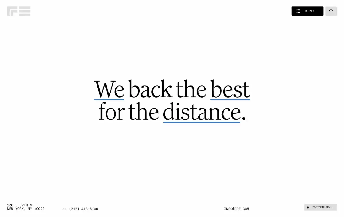
The first image concentrates the approach neatly. A broad white space surrounds the headline, while an address, telephone number and user access line the lower edge in tiny, technical-looking lettering. The contrast in scale establishes a clear hierarchy: tools above, information below and a message with its own voice at the centre. This composition uses few ingredients and takes a confident approach to size.
The original video expands that vocabulary. Blue portraits, technology imagery and urban photographs appear as the statement successively highlights “We”, “best” and “distance”. The images share a halftone treatment and colour despite their different subjects. The result feels like an editorial collage: pieces enter the composition, cross the message and give it space again. At the end of the reviewed sequence, the complete headline is visible in black. We analyse what this project recording shows; a specific live interaction would need to be tested on the website.
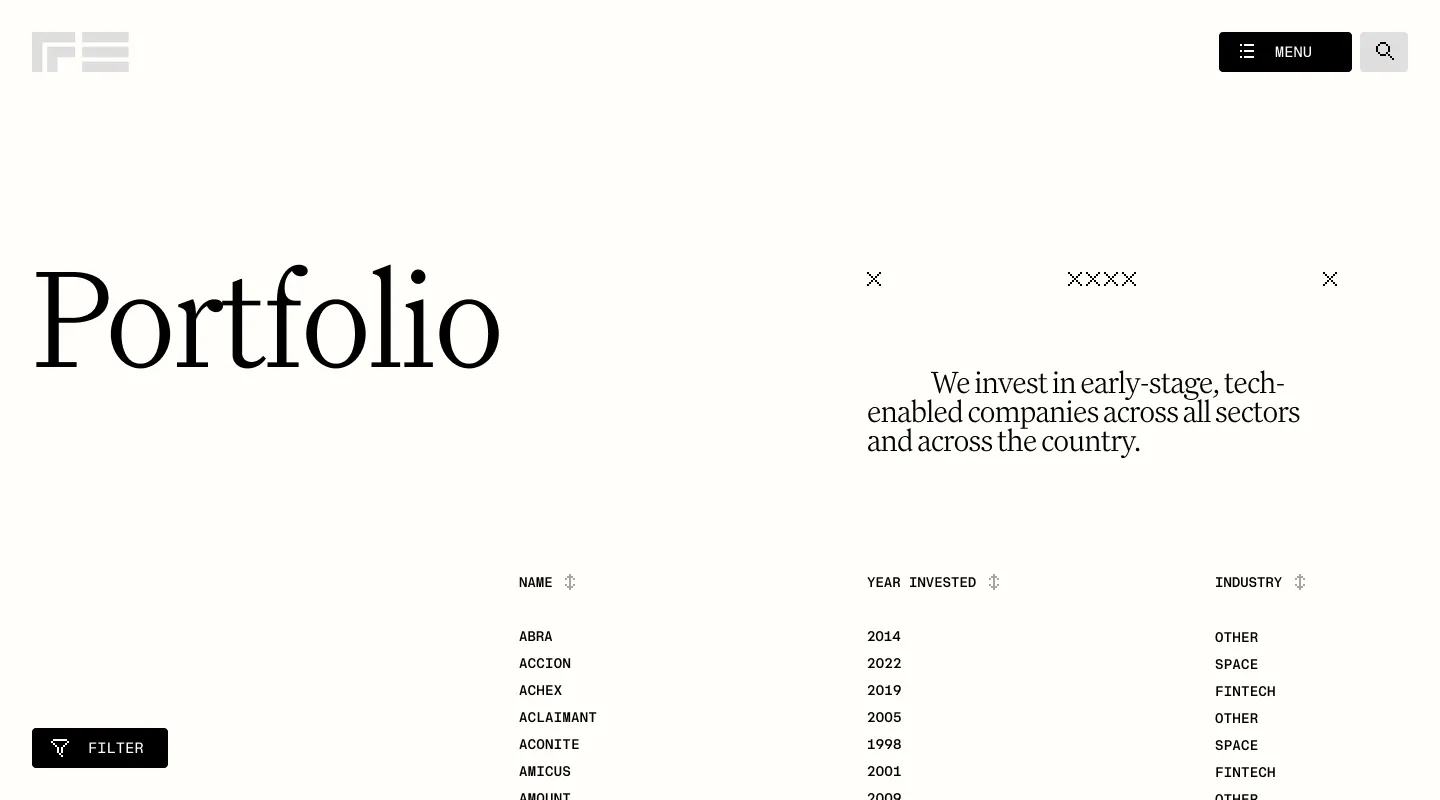
Then comes the table, which has its own appeal here. “Portfolio” retains the headline’s generous size and leads a list of companies organised by name, investment year and sector. The black filter button sits separately at the bottom. The image shows a change of pace for consulting information: rows become compact and headings structure the reading, while the opening screen’s graphic character continues. The brand has a place even when information needs organising.
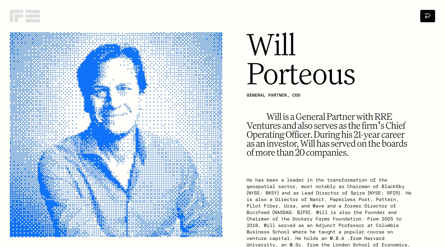
Will Porteous’s profile puts a face to the system. His halftone portrait occupies the left half; name, role and biography occupy the right. Blue makes the photograph part of this identity, and the serif gives the name weight again. That continuity interests us: a choice that seemed confined to the opening screen holds up on a team page. When a freelance designer shows related screens, we can evaluate how an idea develops through different kinds of content.
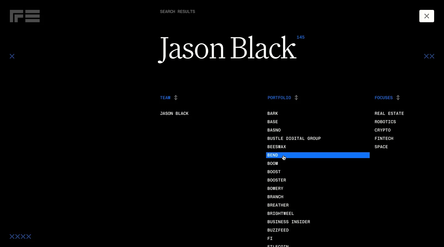
Search changes the atmosphere: black background, white text and blue accents. Results are grouped into team, portfolio and areas of interest. The blue row visible in the image introduces a recognisable visual state within that organisation. The inverted colours still sound like the same website. Typography, texture and accents remain, while a search task is distinguished from the main page journey.
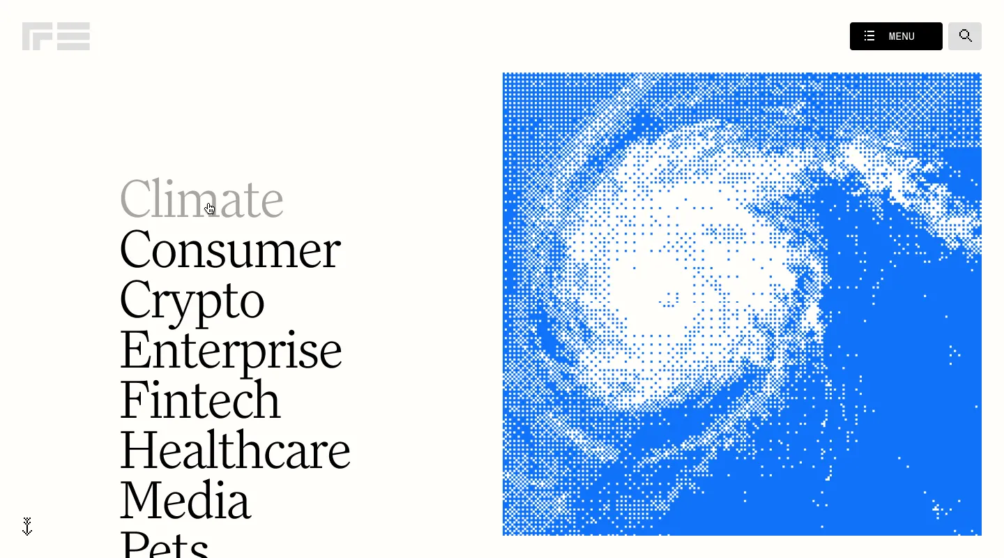
In the investment areas, sector names become something close to a vertical poster. Climate, Consumer, Crypto and the other entries fill the left with a gigantic serif. On the right, the planet receives the same blue halftone treatment. The list has force on its own and the image provides another branded surface. It is useful material for remembering that a content page can also lead the visual selection in a portfolio.
Which commissions would make me look at Glenn? Digital art direction that needs to connect a recognisable concept with several types of page, imagery and movement. This case lets us evaluate those relationships in detail. When preparing a freelance web design project, asking for an equivalent sample of an opening screen, list and detail page helps define the visual scope we need. The three speak to each other here. And the blue certainly turns up with enthusiasm.
RRE Ventures project. UX, UI and motion design: Glenn Catteeuw. Agency: Studio Freight. Client: RRE Ventures. Images and video from the original project case study. Professional status consulted on 13 October 2026 through his About page.
Dennis Snellenberg gives a grid room to make some noise
Dennis Snellenberg brings design and development together in his freelance practice, and FABRIC offers a combination worth pausing for: deep black, a red volume with a luminous edge and a name so large it almost requests another screen. Thin grid lines cross that graphic presence and reappear on content pages. The opening gesture continues through the project. That makes the complete case worth exploring.
The case study places the work in the United Kingdom in 2023 and credits Dennis with the website’s design and development. Branding is by Ché Heijnen. We include it as a reference for this professional’s language in our 2027 selection, keeping its original date visible. His portfolio continues to present him as a freelance designer and developer based in the Netherlands.
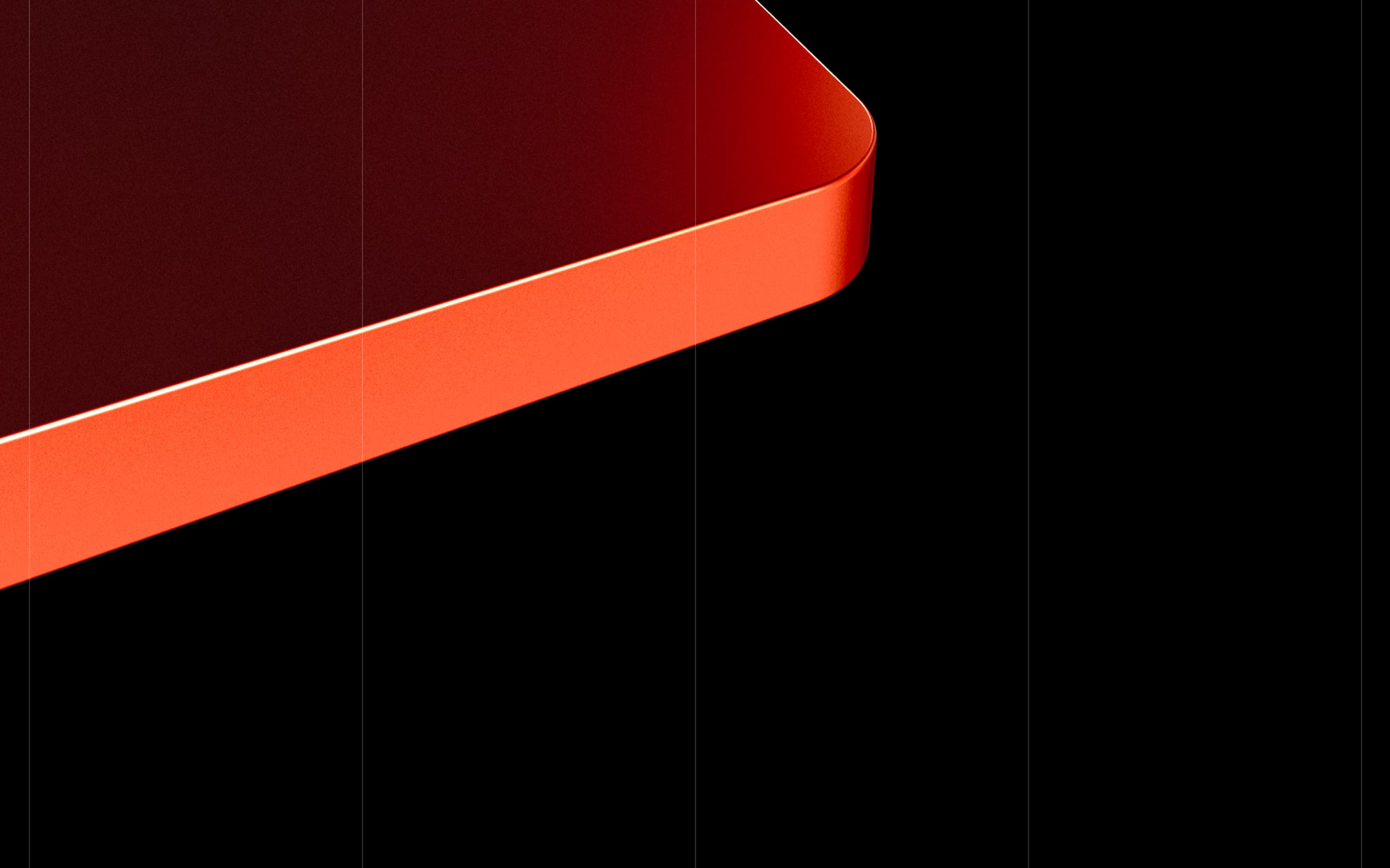
The header’s red curve has an edge that catches light and makes the object seem to emerge from the black background. Vertical divisions stay visible beneath it. We like the relationship between a volumetric image and a strongly marked flat structure: each brings a different reading to the same surface. Red focuses the eye, while the lines prepare a framework for the following blocks.

FABRIC’s symbol is built from four pieces around an empty centre. In isolation, it has a compact scale; in the videos, those pieces become another interface resource. When evaluating a web designer working with somebody else’s identity, this relationship is particularly useful: it reveals the possibilities they find in the brand and how they develop them on screen. The branding and website credits remain distinct here.
The first video travels through the opening screen to the portfolio cards. FABRIC occupies a tremendous width, the red volume crosses the composition and descriptive text gathers in a column. Further on, companies appear on light cards with logo, location, year and category. The grid moves from supporting a large brand statement to distributing concrete information. There is intensity on arrival and room for consultation as the recording advances.
The principles clip brings back the symbol and enlarges it. Its quadrants change illumination between recorded states, alongside a text block organised into labels. The identity’s shape gains a role in the content presentation. It is the sort of detail that makes you want to explore: the composition lets you relate an illuminated piece to the explanation beside it. The recording helps study that visual relationship without promising the same behaviour on another website.
The Writing section changes to a light background and keeps its columns. Titles stay above; categories, dates and arrows gather below. In the video, one card is highlighted in grey and “Read on Medium” appears near the cursor. The state has enough presence to signal a link within a restrained composition. The first article’s orange thumbnail preserves a small echo of the opening screen’s palette.
The last clip shows navigation over the Community page. A white panel opens in the upper right corner, with links in a short list and the remaining screen dimmed. The page becomes visible again afterwards. The menu’s contained size contrasts with the content’s large letters and figures. Diagonal arrows beside some entries help identify a difference between destinations within the recorded list.
I would look at Dennis’s work for a website where identity, interface design and development need a close conversation. FABRIC provides examples of an opening screen, portfolio, editorial content and navigation in a shared language. If you are preparing this kind of site, define those four parts and their scope from the outset. In a freelance UX/UI design commission, that exercise helps specify the pages, content and interaction states the project needs. Visual references can start very practical questions.
FABRIC, a 2023 case study. Web design and development: Dennis Snellenberg. Branding: Ché Heijnen. Material from the original FABRIC case study. Professional profile consulted on 13 October 2026 through Dennis Snellenberg’s portfolio.
What to look for when choosing a freelance designer for your project
The five profiles reveal different ways of building an identity. Daniel Spatzek takes his portfolio towards collage and humour; Núria Madrid develops a family of colours, shapes and applications; Serhii Churilov turns a product into a staged experience. Glenn Catteeuw connects a large typographic idea with information pages, and Dennis Snellenberg keeps brand, interface and development in conversation. Each case provides specific references for a different kind of commission.
I would start by choosing the decisions my project actually needs. That might mean assertive typography, a distinctive way of displaying work, an image treatment or a system of brand applications. I would then relate them to the available content. A catalogue needs product pages and information; an identity needs formats; a personal website has room for a direct voice. That list gives us a clear intention when looking through a portfolio.
I would also examine the credits before comparing professionals. A case may bring together branding, art direction, interface design, motion and development, with different people responsible for each. The original case studies in this selection identify some of those responsibilities. When explaining the commission, agree what the designer delivers, who produces images and text, who develops the website and how revisions are shared. These questions make starting a collaboration easier.
To evaluate a portfolio, I like seeing several pieces from one project. The opening screen shows the entrance; a list and detail page show information organisation; navigation states reveal other interface decisions. In a brand identity, applications let us observe what remains when proportions change. Mòdul’s images and the RRE Ventures screens allow exactly those comparisons.
If your project needs bespoke design and development, explore my work as a freelance web designer and define the pages and content you need. For more inspiration, the best web designs 2027 series extends the selection with brand experiences, catalogues and cultural projects. Here we focus on the people and the decisions that make their work recognisable. There are ideas for a good stretch of designing. The banana is optional.
Key questions about the selection
How were the best freelance designers in this 2027 selection chosen?
This editorial selection is based on projects that allow specific decisions about visual identity, interface design and art direction to be examined. Each author's professional presentation has been consulted, and responsibilities, collaborators and sources are identified. The 2027 edition brings together references available in October 2026, with the original project dates where documented.
What should I look for in a freelance designer's portfolio?
Look for several pieces from the same project and examine their relationships. For a website, compare the opening screen, list, detail page and navigation. For a visual identity, examine the symbol, typography and applications. Credits explain the professional's contribution to a collaboration. Combining examples with responsibilities helps prepare a more specific brief.
What is the difference between commissioning visual design and UX/UI design?
Visual design develops graphic expression through colour, typography, imagery, composition and identity. A UX/UI commission also defines information organisation and the screens and states an interface needs. Scope depends on the project. Specify which pages or pieces will be delivered, how they will be reviewed and who will subsequently develop the solution.
Can a freelance designer work with an agency or development team?
Yes. The selected cases show distinct responsibilities and collaborations. For RRE Ventures, Glenn Catteeuw credits UX, UI and motion design, with Studio Freight as the agency. For FABRIC, Dennis Snellenberg credits web design and development, while branding is by Ché Heijnen. When commissioning work, define decision-making, each collaborator's deliverables and how revisions are coordinated.
How can I turn these references into a brief for my website?
Choose the decisions that interest you and describe their relationship to your content. You might ask for large-scale typography, a distinctive team presentation or a project list with clear metadata. Attach the references, list the pages and states you need, and agree the resources available to produce images, text and movement.