The best web designs in this selection for 2027 have something in common: they have made the effort to look like themselves. There are letters that take up half the screen, landscapes that become interfaces, catalogues with personality and a homepage or two that arrive sideways, tyres smoking. There is also content, structure and plenty of design decisions worth taking a closer look at.
One of the series I most enjoy putting together for this blog is back. If you came here for the best web designs of 2018 and 2019 or the 2020 and 2021 selection, you know the drill. A tour of websites that dare to do their own thing, with observations on what works and what needs thinking through before you take it into another project. Make yourself comfortable. There is plenty to look at.
2027 is the edition year of this collection, put together to inspire new projects. The references were documented in 2025 and 2026, with their dates included in the credits. I have selected twelve websites from Awwwards and reviewed the sites themselves: some are brand experiences; others need to organise products, services or cultural information. The screenshots preserve the versions presented by their creators, which may change over time.
Your business does not need a major brand’s budget to take something useful from these examples. A clear hierarchy, a well-chosen visual idea or a better way of showing a product are also design. Sometimes they do more for a website than adding another effect desperate to get noticed.
1 Lama Lama brings its character to the screen
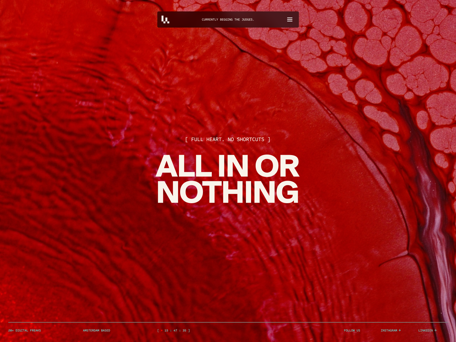
Lama Lama opens the selection with a design that has little interest in keeping a low profile. The red in the presentation, the textures and the oversized headline set the tone before you have read the agency description. The art direction is already doing its job on the first screen.
The header image belongs to Lama Lama, a reference documented in 2026. Studio listing and credits.
The second composition shows another side of that character: a luminous form fills the centre, while the text and navigation hold on to their space. I like the relationship between an image with real presence and a layout that still makes room for the message. The typography does not try to match the image’s complexity; it responds with size and impact.
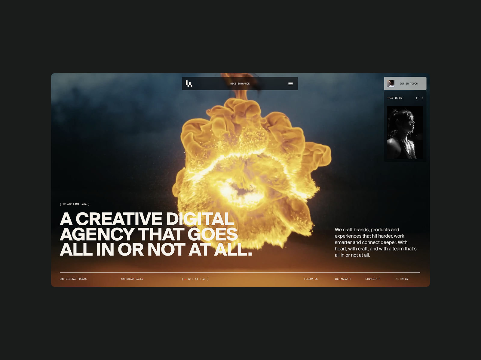
The interaction clip adds an interesting layer: the image transforms, revealing a particular way of handling content. The effect belongs to the studio’s visual world. It does not look like something bought late in the afternoon so the homepage would have a little something going on.
What I would take from Lama Lama is its way of giving a straightforward statement real character. The headline remains direct, even with all that spectacle around it. For a service agency, I would first test the homepage with its message and actual work. Then I would decide which image transformation could express its creative approach. If the idea holds up on an inner page, there is something worth animating. If all we have is glowing smoke, the brand still needs work.
2 Son Daven draws a place before you visit it
Son Daven presents a resort and architectural development project in the Carpathians. The website by The First The Last, with Maksym Stepenko and Ivan Chopei among the credited contributors, combines earthy colours with large-scale lettering and illustration. The opening feels part poster, part story about to unfold.
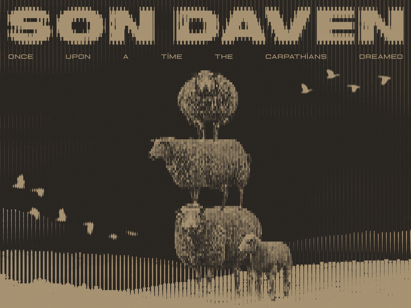
Look at the way lines build the image: the name, trees, landforms and birds seem to be made from the same graphic material. This is a drawing language that runs through the page’s identity and gives it a recognisable character, rather than a set of decorations arranged around an attractive photograph.
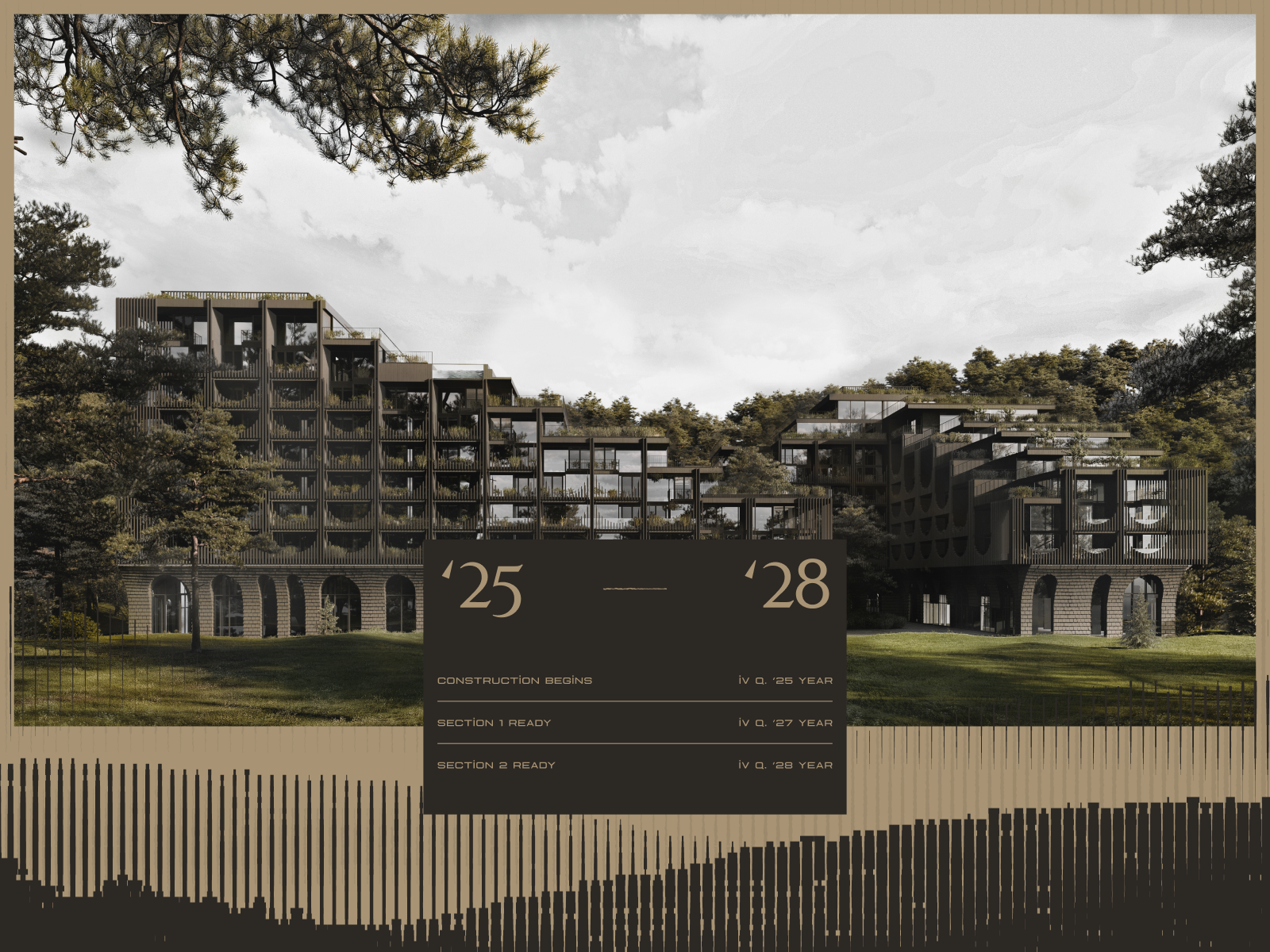
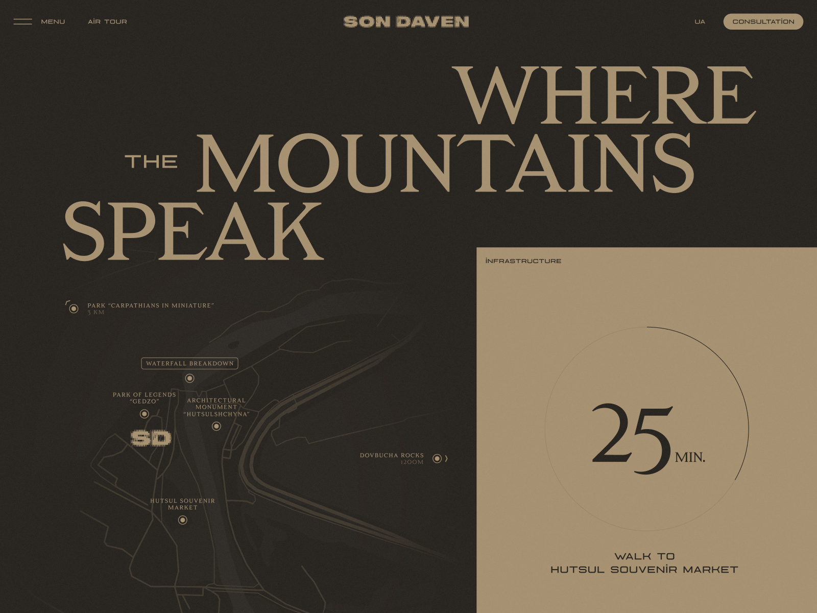
In the location section, the map appears on the same dark background, while a lighter block highlights the journey time. The serif lettering changes the rhythm established by the illustrated name at the entrance. That contrast makes it possible to move from the story of the place to practical information. Son Daven is presented as a development project; its architectural images show a proposal, with the schedule communicated by the developer on its website.
As a design reference, what interests me is how the character survives the arrival of information. That is often the challenge on an architecture website: keeping the project’s sensibility while explaining floor areas, location or process. Son Daven has a voice you can recognise on a homepage and in a content block. View the project website.
For a hotel, the visual story can continue beyond the website: an invitation to return, a seasonal opening or a new experience. Lead The Mood’s email marketing for hotels brings that work into campaign planning, copy and design. This is an application to a new hotel brief, rather than a claim about Son Daven’s marketing.
3 Floema makes the catalogue part of the design
Floema designs furniture and signage for outdoor spaces. Bürocratik presents a website where identity, product images and the organisation of collections share the spotlight. Good news for anyone who still thinks an industrial catalogue is doomed to look like a folder full of technical data sheets.
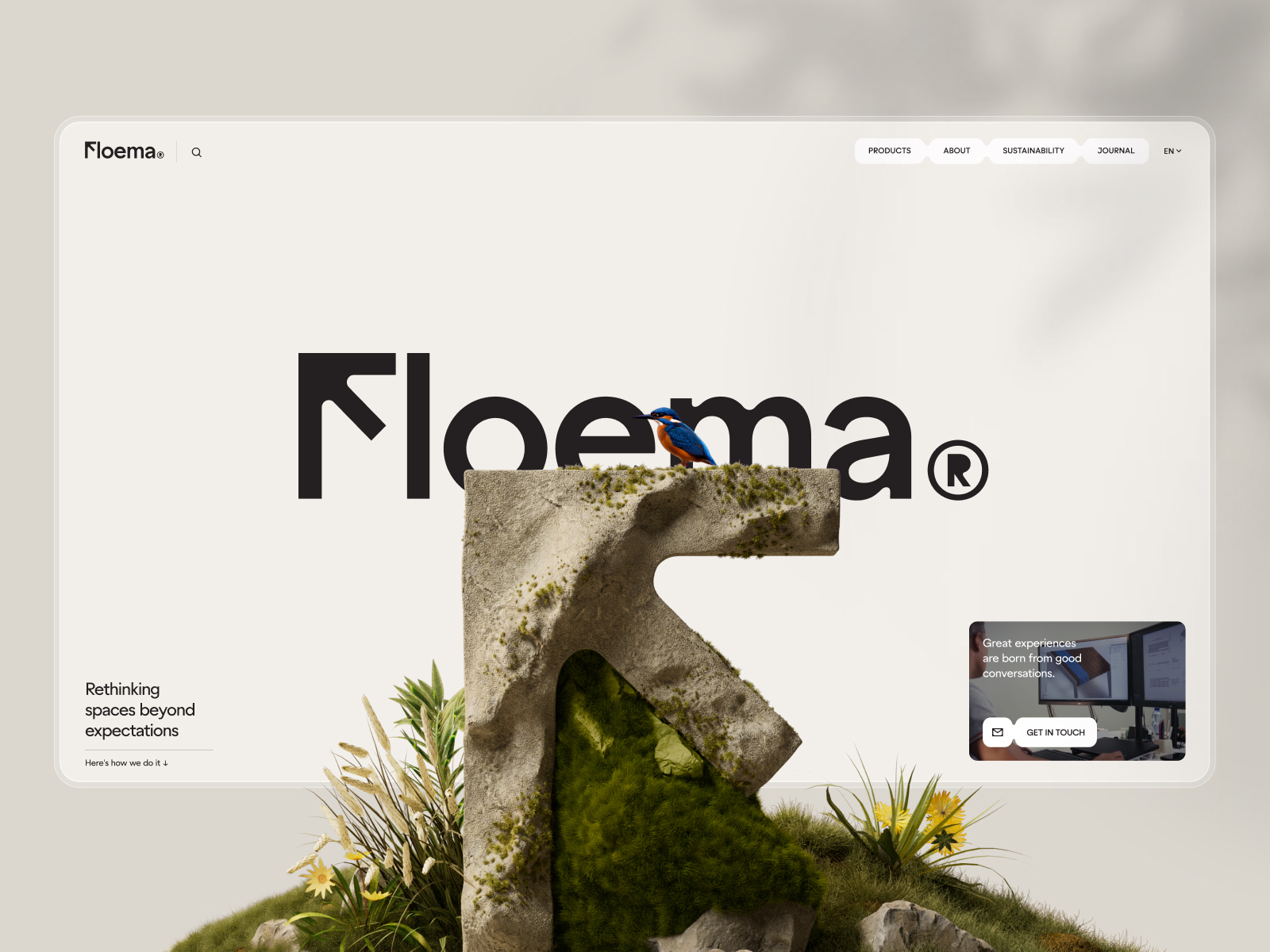
The large F becomes an object made of stone and vegetation in front of the Floema name. Below it, the catalogue is organised into areas such as Urban, Nature, RePlastic and Golf. That is considerably more useful than mixing furniture, signage and materials into one undifferentiated display. The symbol opens up the brand’s world; the collection names let you enter with a specific purpose.
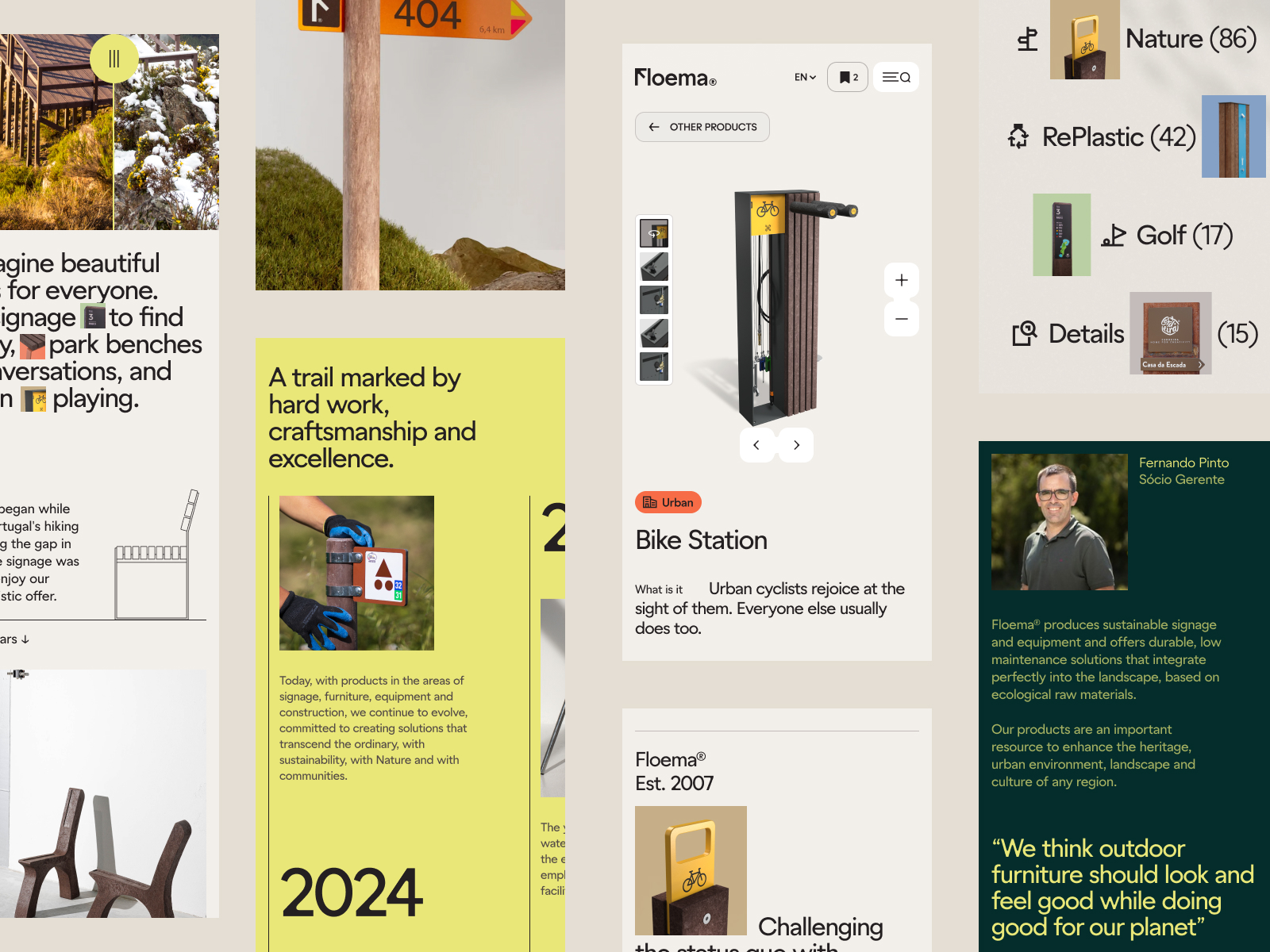
The mix of light backgrounds, colour accents, photography and short texts keeps every page from looking like the same product sheet with a different picture. The blocks have different jobs: showing, explaining, organising or leading into a collection. That variety works best when a structure supports it.
For a furniture manufacturer, I would study that route into the catalogue through use context. One architect may be looking for equipment for a public square, another for a path through a natural setting. The product page then needs dimensions, materials, variants and downloadable files. Floema’s reference encourages work at both levels: a collection you recognise at a glance and detailed information that lets you move the project forward. Making those details appealing takes a fair bit of design, too.
4 Lando Norris builds an identity with pace
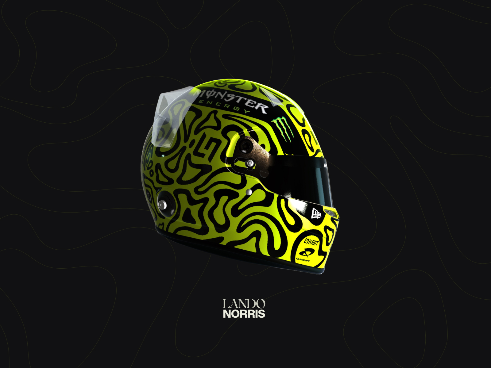
Lando Norris’s website, by OFF+BRAND. and documented in 2025, brings a sporting identity into digital design with some properly wicked graphic intent. The good kind. Black, vivid green, forceful lettering and a helmet that can almost act as a three-dimensional emblem.
The desktop and mobile designs show how that language works with images, statistics, an archive and a shop. Separating on-track activity from life off the track also gives the content a structure. There is more here than a large portrait with a contact button underneath.
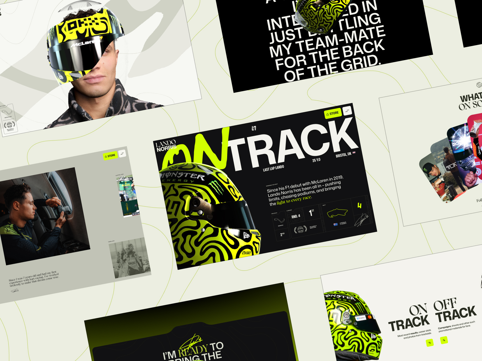
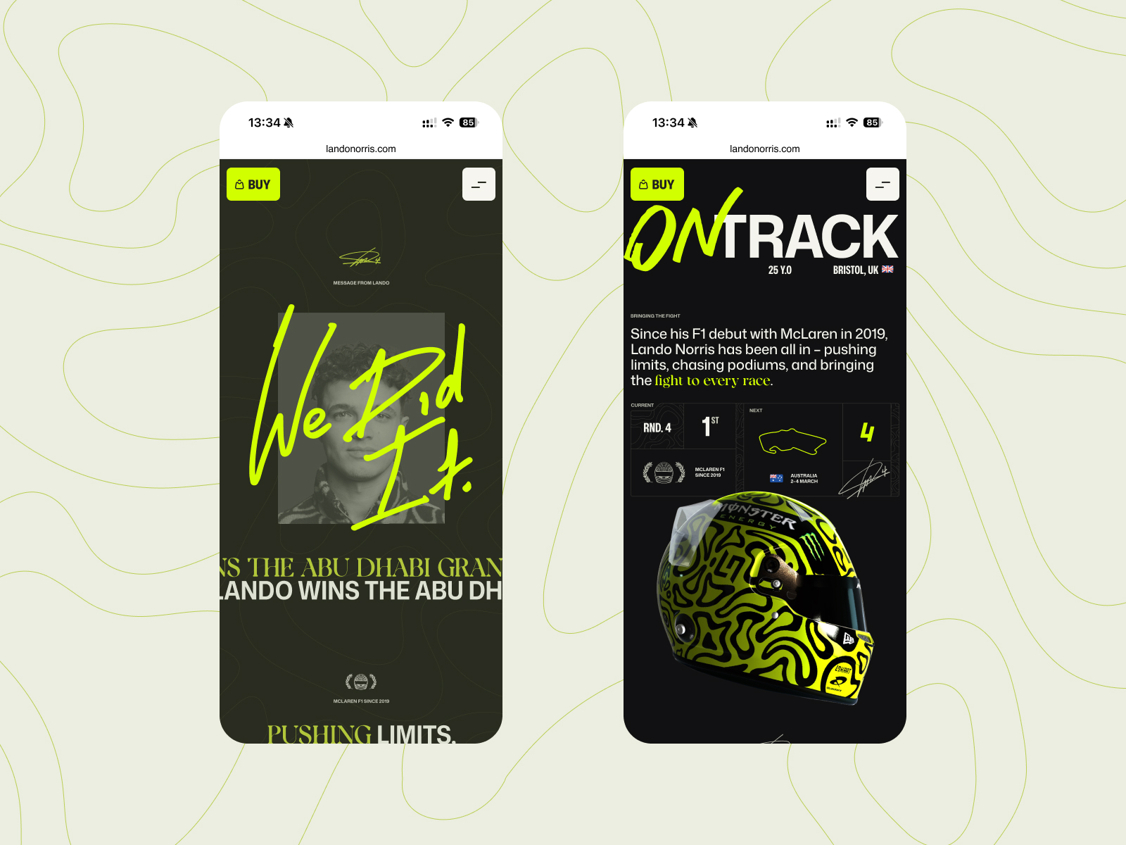
The helmet is the star, but look at the pattern carried into the background and the two typographic voices as well. The slanted ON TRACK headlines have a different energy from the serif words and small data points. Green ties the mixture together. I like an identity that can accommodate a shout, a gesture and precision on the same page. The statistics do not need dressing up as another poster.
The lesson for a personal brand is specific: design can organise different aspects of a person and let them coexist. Before choosing an eye-catching palette, establish what each visitor needs to find. A fan, a collaborator and someone looking for an item in the shop arrive with different intentions. Visit Lando Norris’s website.
5 Siena Film Foundation navigates like a film
Siena Film Foundation presents its filmmaking work through an interface that draws on the language of a film strip. The 2025 reference credits Niccolò Miranda, Federico and G-NS Studio. Black, film frames and typography create an opening closely connected to the work we are about to see.
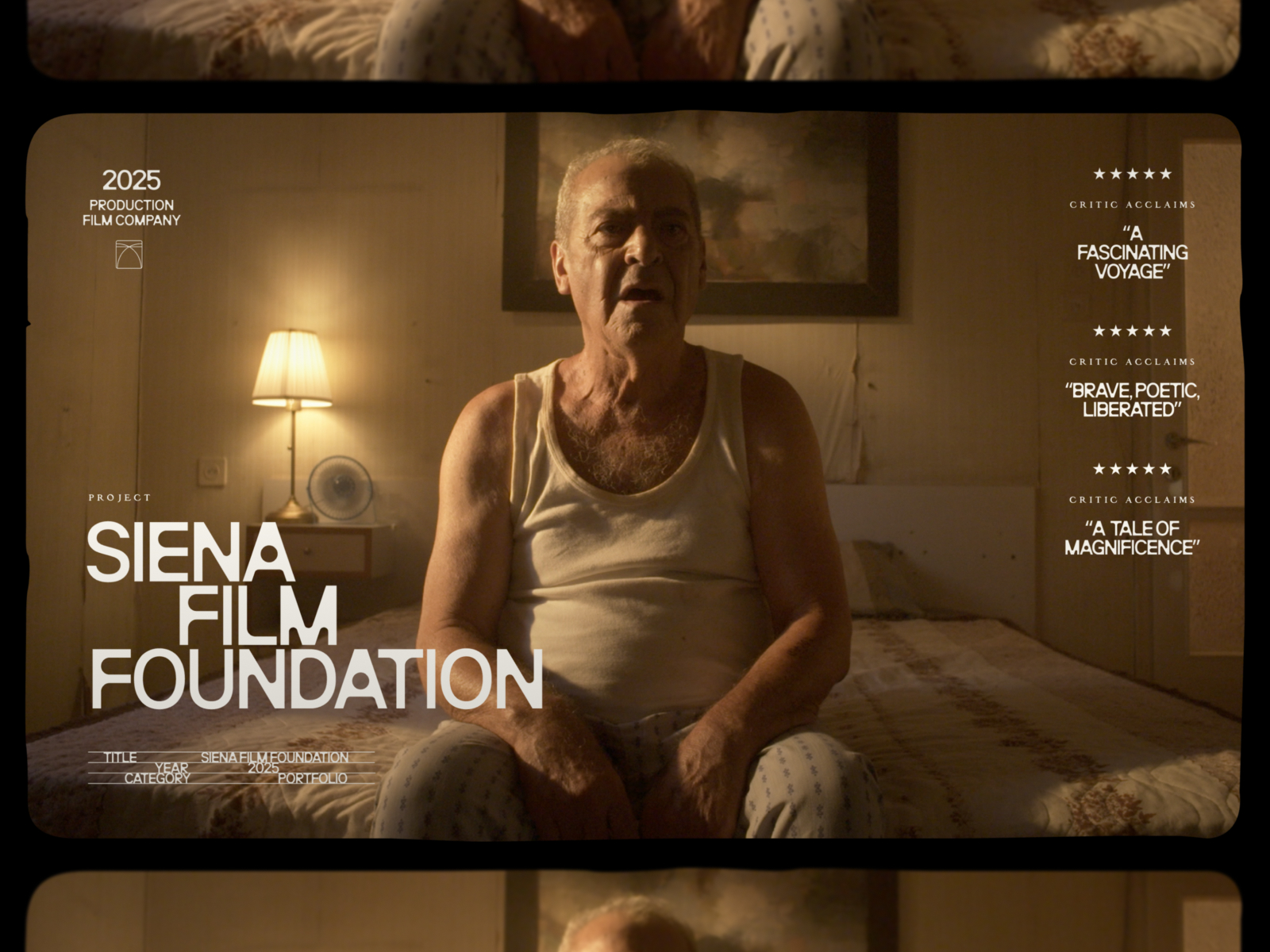
In the screenshot, the image fills almost the entire composition, with the name integrated over it. The curved frame and repeated bands suggest a sequence rather than an isolated card. The website uses that logic to turn its film catalogue into an experience with a distinctive rhythm.
It is a good example of the subject shaping the navigation. Cinema supplies visual material, a sequence and a way of moving between stories. The interface makes use of those relationships to create a menu that belongs to this studio.
The opening explains how to drag, explore a film and use the side menus. That deserves attention: the film strip offers a particular journey, while the interface also provides quick access. In a portfolio of my own, I would keep that playfulness for discovering the work and leave names, credits and contact details visible. Surprise works better when people can choose to follow it. Visit Siena.
6 Dropbox makes brand guidelines feel like play
The Dropbox brand website, developed with Daybreak Studio and documented in 2025, is an excellent reference for anyone who needs to explain a visual system. Its sections cover voice, logo, typography, colour, imagery and motion. The content is a guide; the design shows how much life that guide can have.
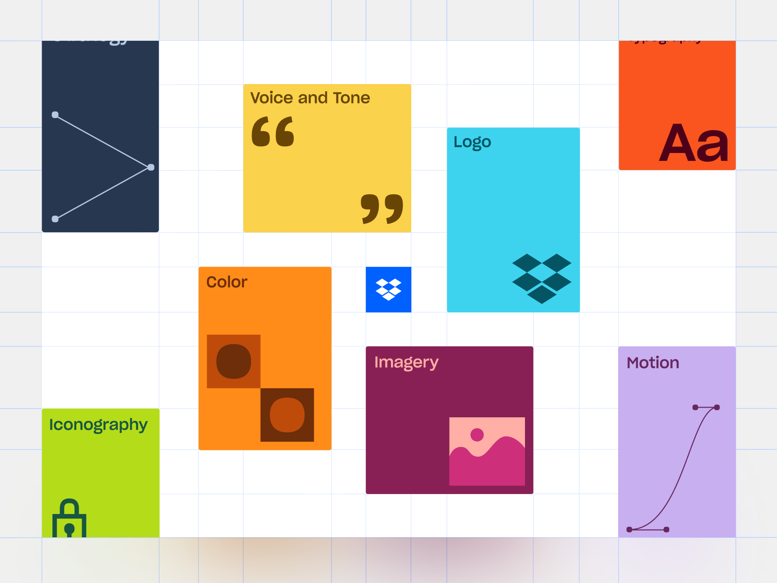
Coloured cards represent different parts of the system. A visible grid supports the composition, and the examples give each section a recognisable expression. You can start to understand what the guidelines make possible without first reading a huge block of rules.
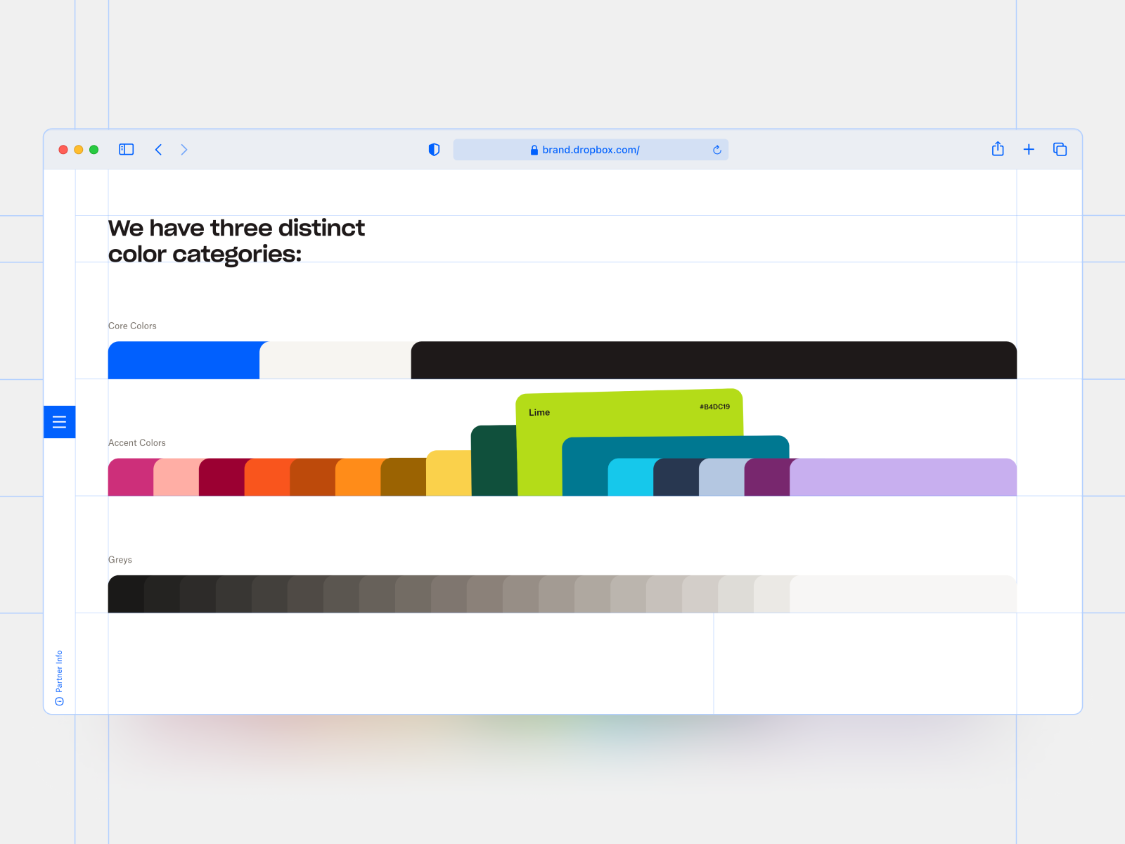
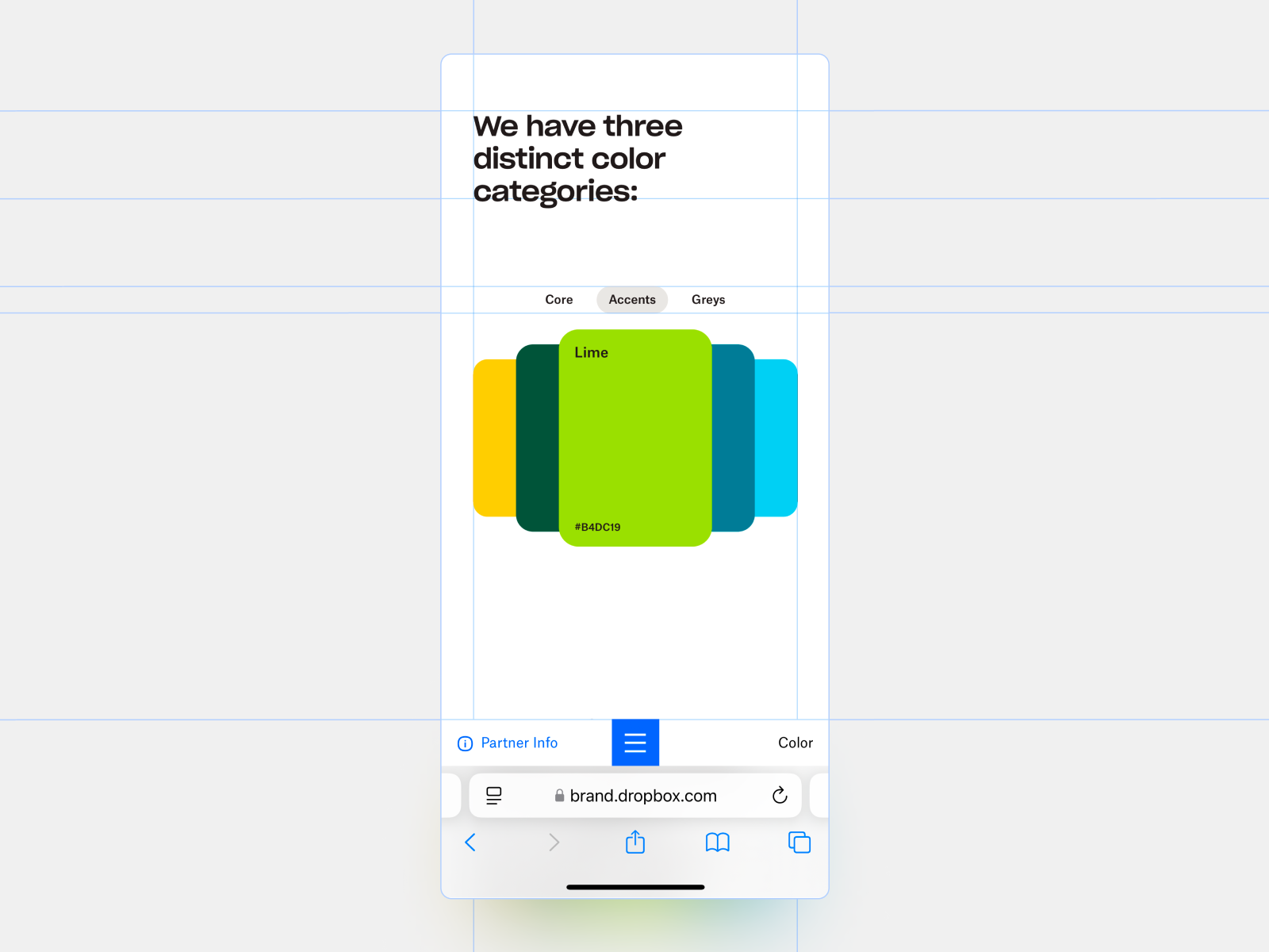
In the colour example, overlapping cards reveal names and relationships. The rules start to feel like material you can handle. Elsewhere in the project there are demonstrations of typography, motion and icons. This is where a digital guide earns its keep: when content concerns scale, behaviour or combinations, the interface can demonstrate them in the very place where it explains them.
A smaller business can apply the same thinking to a catalogue, a process section or a user guide. Choose an example that answers a real question and give it a clear form. If the design helps people understand and use the information, the interaction has a job to do. Explore the Dropbox guidelines.
7 Terminal Industries gives logistics a visual presence
Terminal Industries earns its place in this selection of corporate websites through the visual presentation of its award-winning 2025 version. Awwwards credits REJOUICE® and PROPAGANDE. In the image, a truck, a container and warm lighting occupy the centre of the composition.
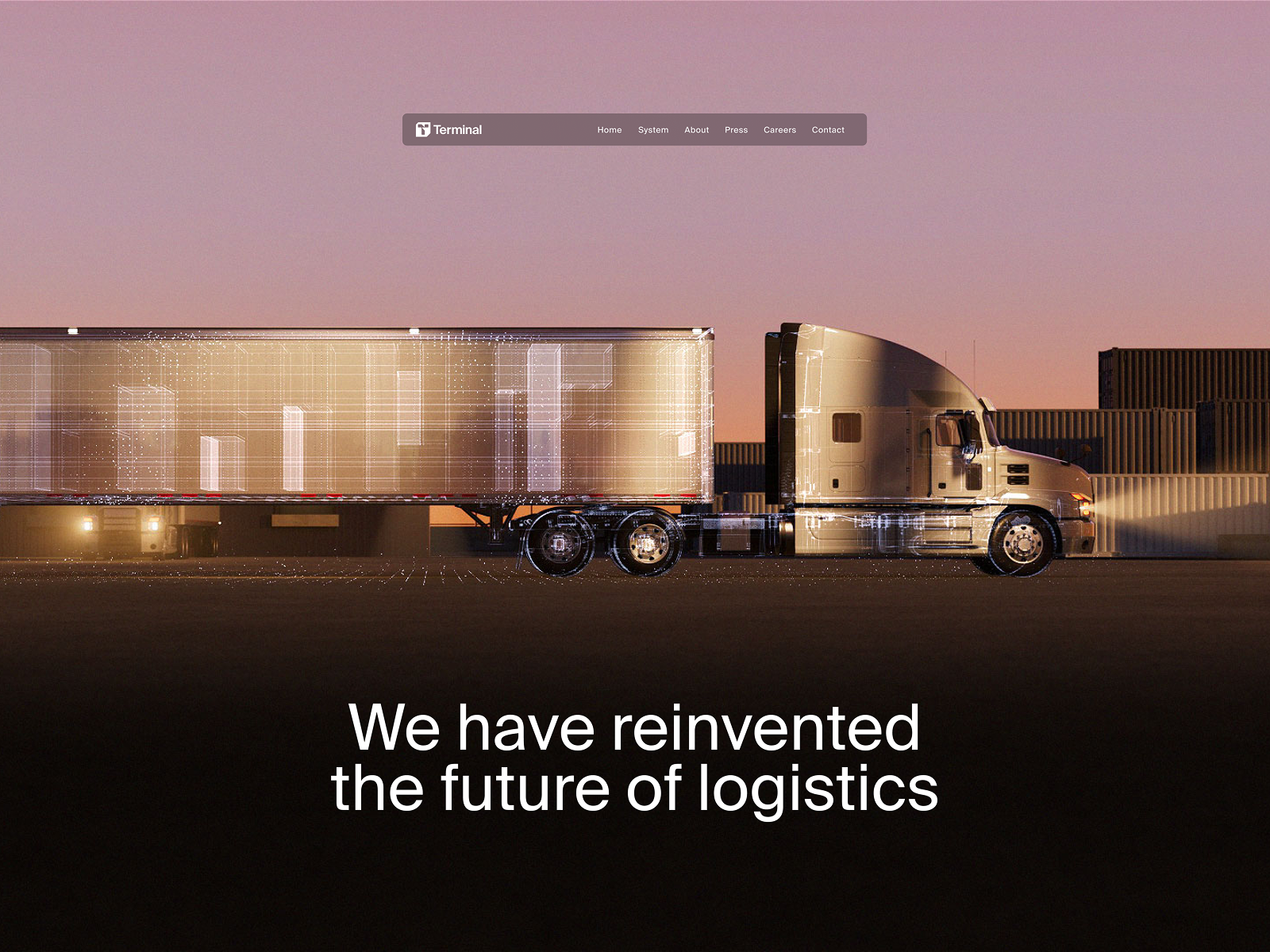
The choice of object makes sense within the sector. The vehicle and its load give us a concrete visual introduction to the business, which then needs to explain operations and product. There is no need for a collection of generic technology symbols to locate the company in its field.
Navigation is concentrated in a bar, and the headline gives the scene breathing room. That difference in scale helps separate the element that makes the first impression from the controls that let you move around. The current website has expanded its content; here I am considering the composition documented in the project’s presentation.
For an industrial business, this is an interesting direction. Showing an actual object, environment or operation from its own world can give a homepage a much more specific presence. The information needed to assess the service has to follow. Design opens a door; it should not leave the visitor waiting in the lobby while all the important details stay hidden. View the current website.
8 Montfort turns landscape into a system
Montfort, by Immersive Garden, introduces a commodities and investment company through digital landscapes. The version documented in 2025 places a mountain among clouds and uses variations in atmosphere to present different areas. There is a calmness to the whole that contrasts with the selection’s more explosive use of colour.
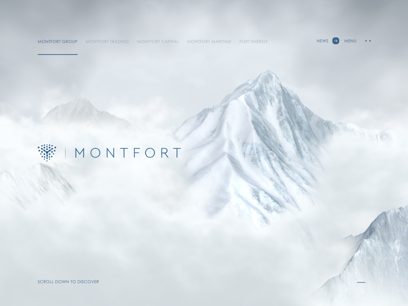
The mountain is both a central image and a way of connecting the different divisions. The light changes, the setting changes and the name over the scene changes. The composition retains a visual family resemblance, helping us understand that we are inside one organisation with several parts.
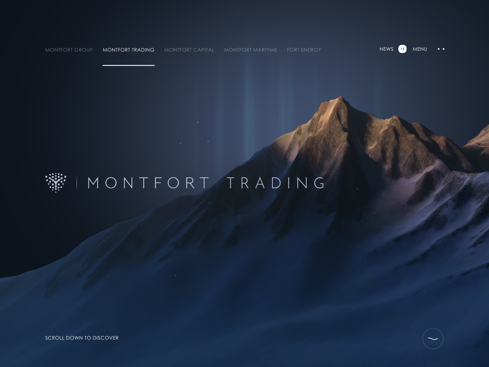
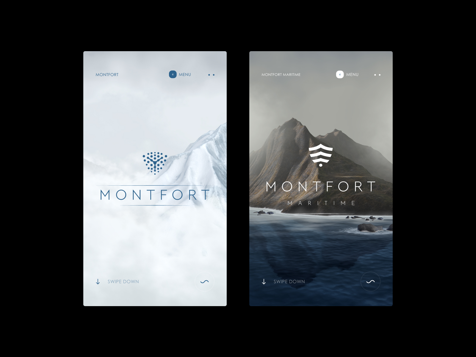
I am interested in that use of landscape as a vocabulary. The art direction builds a family of images with a clear relationship between them. Navigation and text occupy a discreet space that leaves the image room to work.
For a group with several divisions, I would start with a specific question: what visual device can the whole organisation share, and what changes when we enter each business area? Montfort uses the mountain, light and surroundings. Another project could explore one object in different materials or a photographic series with a consistent framing. Keeping that family resemblance makes a change of division visible without requiring a fresh brand introduction on every screen. Visit Montfort.
9 Anime.js shows what its product can do
Anime.js is an animation library for the web. Its website, credited to Julian Garnier and documented on Awwwards in 2025, makes good use of an advantage: it can use its own speciality to explain what it enables. The homepage and demonstrations connect imagery, movement and technical information.
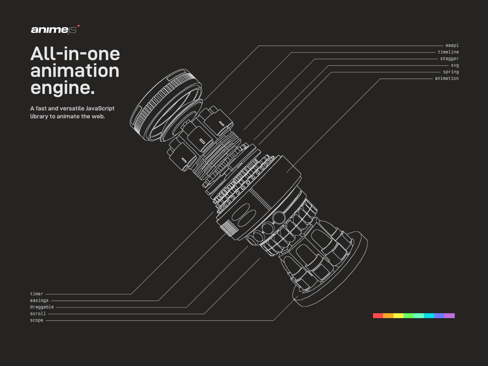
The engine metaphor organises a composition of components and lines against a dark background. Function names relate to that diagram, while small colour accents provide precise contrast. There is detail, but the image keeps an order that lets you take in the whole.
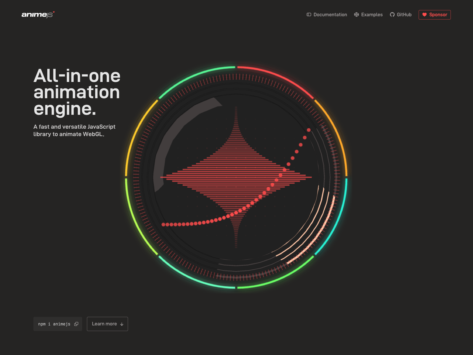
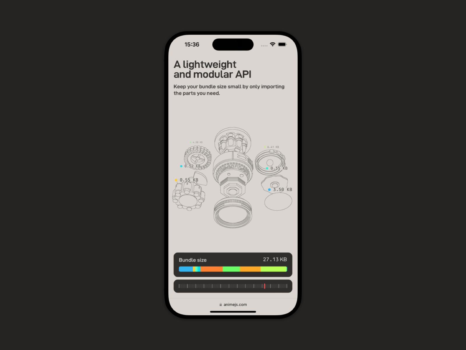
The website also separates documentation, learning and examples. That matters for a product aimed at people who need to use it as well as discover it. A demonstration can spark interest; the next step needs to explain how to work with the tool.
The idea carries over to less technical services. If you sell a process, show it through an example of your own. If you manufacture a product, show a transformation that helps people understand it. A demonstration becomes stronger when it answers the visitor’s question. If you are exploring animation and 3D for a website, start with that question before choosing the effect. Explore Anime.js.
10 Tracing Art turns data into a story
Tracing Art, by Getty and Resn, presents stories about the provenance of artworks using the Getty Provenance Index. The reference was documented in 2025. The content is demanding: relationships, people, works and movement over time. Design creates a visual way into that material.
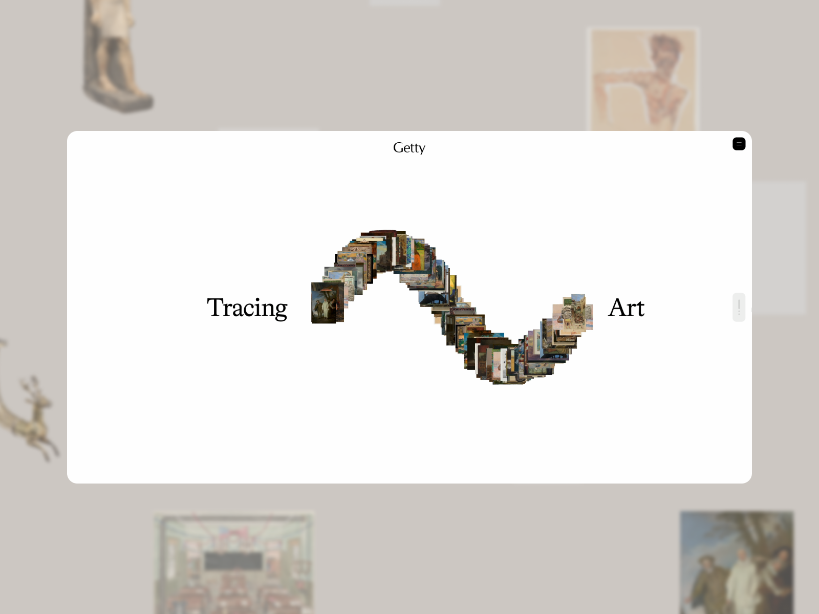
The homepage forms a curve from small images of artworks. Titles sit on either side, and the white background gives the figure clarity. The image suggests a relationship between pieces, fitting content devoted to tracing histories of ownership and collecting.
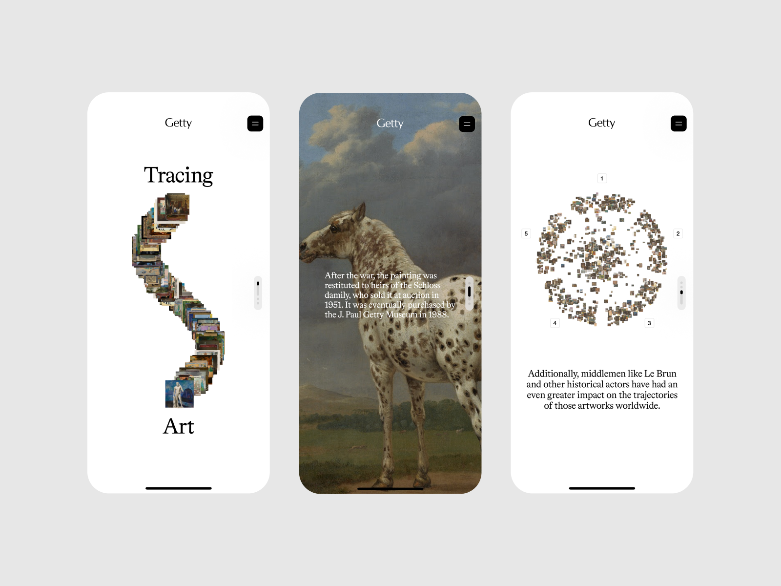
On mobile, the design moves from one prominent image to a field of small, related works. The site’s chapters offer entry points through different questions about painting, artists and collecting. Photography brings us closer to the object; visualisation opens up the relationships between objects. These two scales of reading need each other. I find it a particularly interesting reference for an archive that wants to encourage exploration while keeping the substance of its research.
I would return to it as a reference for any organisation with an archive, research or complex material it wants to make accessible to the public. Choose a question and build a journey around it. The website can help people discover the material and provide an entrance to the broader source. Here, the archive and the experience have an explicit relationship, which is part of what makes the project interesting.
11 Why Zero gives an immersive experience a narrative
Why Zero, credited to Sindhur Dutta and Zero, is an experience presenting an educational offering. The 2026 reference combines three-dimensional scenes, expressive typography and a scrolling narrative. The screenshots have a deliberately fantastical feel, with hands, landscapes and symbols filling the screen.
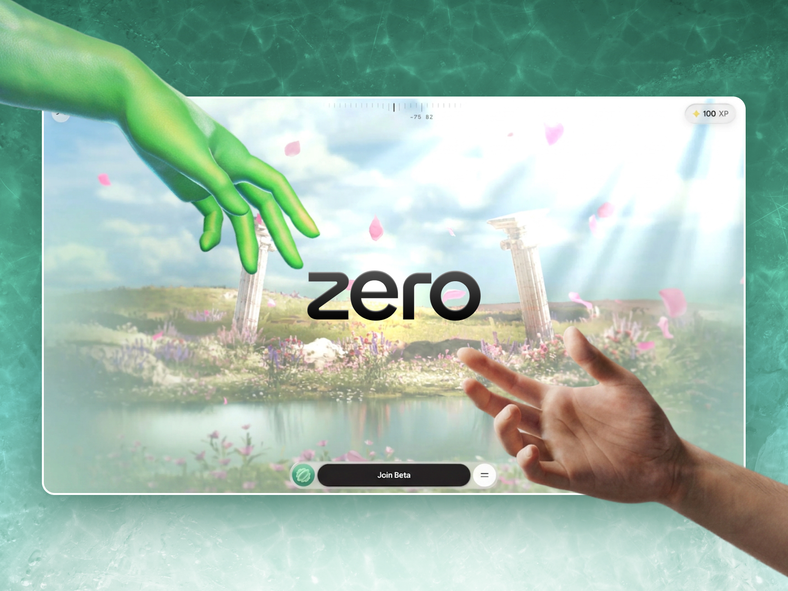
What interests me is how the composition changes register. The brand name is simple, while some messages use serif lettering at different scales. Objects build scenes around those messages. There is a narrative intention that goes beyond placing a 3D model on a background.
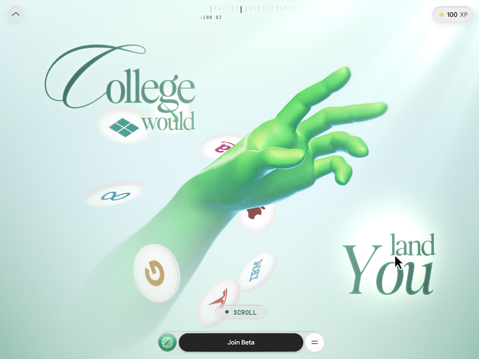
The service offering and its promises belong to the brand; the interest here is the design of its presentation. An experience like this makes sense when there is a story to unfold and an audience willing to follow it.
Before taking this approach into a corporate website, I would define which content needs direct access and which can be discovered through the journey. An immersive demonstration and an information page serve different purposes. Creativity can connect them, but everyone should be able to find an answer without being obliged to take the same trip. Explore Why Zero.
12 Shopify raises the curtain on a theatrical edition
The Renaissance Edition presents Shopify Editions Winter 2026, documented on Awwwards that year and credited to Shopify Design and its team. The art direction combines generative paintings with a classical feel and elements of contemporary commerce. That contrast is deliberate and forms part of the website’s concept.
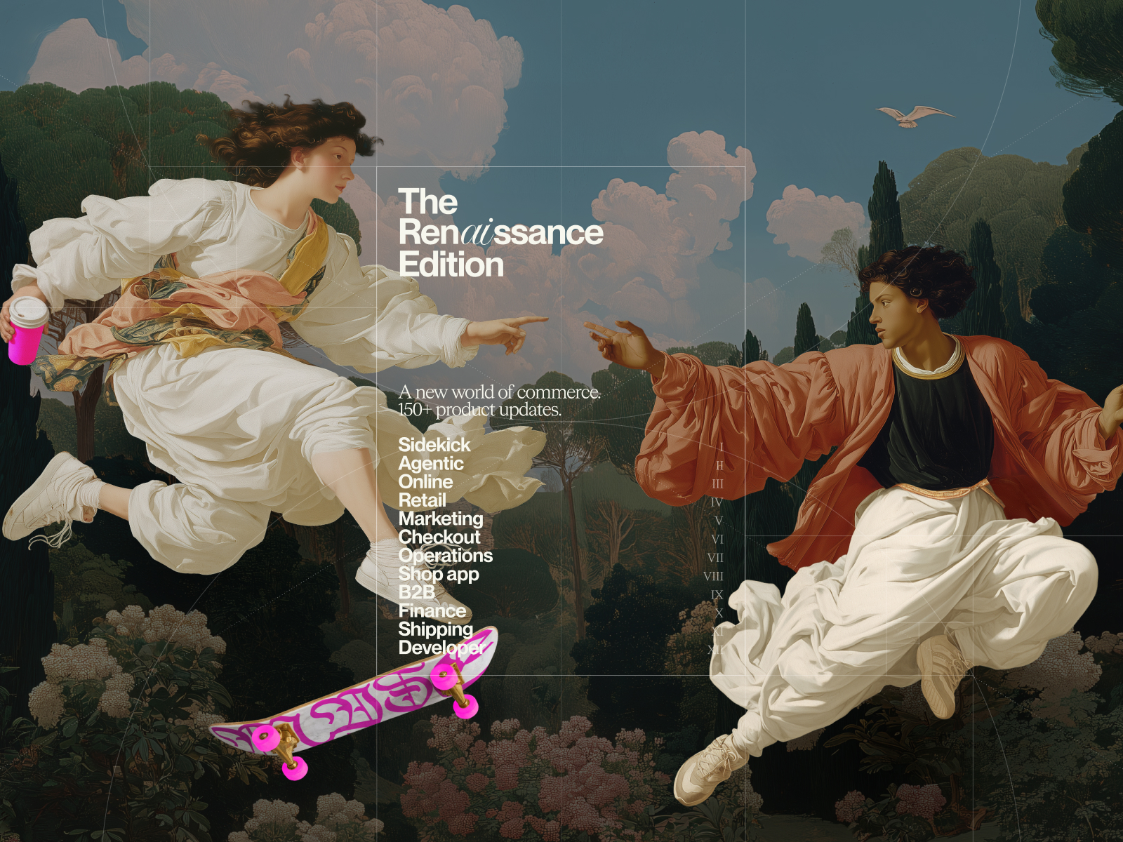
The homepage brings characters, landscape and present-day objects together in a scene that makes no claim to be a historical painting. The edition title and links to its product areas sit over it. Visual surprise is followed by a structure for finding specific updates.
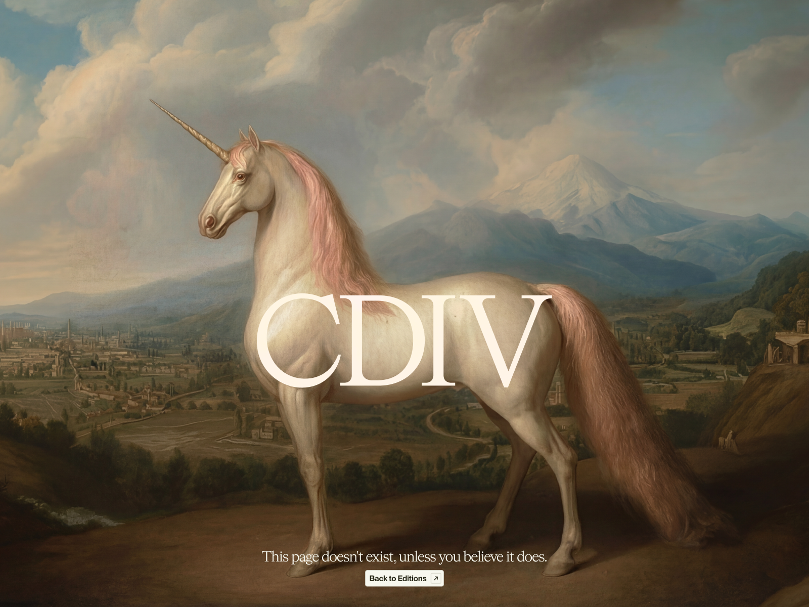
The error page gets art direction too. It is a small detail that shows how far the idea reaches: a website’s personality can remain present even when someone lands somewhere that does not exist. The route back preserves the purpose of the screen.
The product-area menu and search accompany a visual world that could easily have swallowed all the attention. That coexistence is what I would study for a launch: someone browsing for pleasure can enjoy the scene, while someone looking for a specific update has a way in. With more than 150 updates in this edition, organisation matters as much as the unicorn. And the unicorn certainly puts in a shift. View Shopify Editions Winter 2026.
What the best web designs can teach us as we prepare for 2027
After twelve references, it is easy to want everything: Son Daven’s lettering, Lama Lama’s motion and Floema’s catalogue. Mixing them without an idea can look like a meeting where everyone talks at once. The selection becomes more useful when we choose which decision to study and why.
Start with the content people need to find
Imagine you are planning a website for an architecture studio. Three important visits might involve seeing a comparable project, understanding what the studio does and discussing a commission. Write down what someone needs on each journey: the case’s location and photographs, the scope of the service and a clear way to get in touch. That list helps distribute content across the homepage, projects and services. The effect you choose later will have somewhere to do its job.
The references show different ways of resolving this. Floema has product families; Dropbox divides up a brand system; Getty offers chapters. They share a selection of content with a clear logic. You can work on that decision before producing a single image.
Find a visual idea you can sustain
Try a direction on three screens from the same brief: the homepage, a project page and contact. For example, a typeface with plenty of character can open the first; on the project page, it needs to sit comfortably with the location, year and captions. If those details start to feel awkward, adjust the scale and rhythm. A good visual idea makes room for spectacular moments and for the small facts the visitor came to find.
In my work as a freelance web designer in Barcelona, the relationship with identity matters a great deal. If the company’s visual language still needs defining, it is worth developing that foundation through a corporate identity system. A website needs its own resources to express its own personality.
Give motion a specific purpose
Animation can explain a change, show a relationship or guide attention towards a detail. Decide what the person should understand by watching it. Also plan how the information will read when motion is reduced or a screen cannot deliver the same experience.
An Awwwards clip lets you study a transition and its graphic intention. Assessing its implementation in your project requires testing real devices, navigation and loading. The demonstration inspires a decision; the technical review establishes how to support it. These are complementary stages, and both need time within the project.
Design the pages where the actual task happens
The homepage tends to get the conversation and applause. Someone who wants to compare two products, examine a project or check terms will then move to another screen. Give those pages time: hierarchy, useful images, complete information and understandable actions.
On an architectural project page, a wide image can explain the space, while a sequence of details can show materials or junctions. Add captions that contribute information and retain the project credits. Then check whether the intervention makes sense when you browse that selection on mobile. These are small decisions beside an immersive homepage, but they give visitors concrete reasons to keep looking and assess the work.
Check mobile, reading and maintenance
Open the main pages on a phone and follow the journeys you defined. Check that headings still make sense, buttons are recognisable and information can be found without relying on a hard-to-discover gesture. The desktop composition is only part of the experience.
Test content that puts a little pressure on the layout: a long project name, a portrait photograph and a project with fewer images. Look at what gets lost when you introduce them. If everything relies on titles being the same length, the composition needs another pass. Resolving those variations helps preserve the personality as the website grows, which is exactly when the design has to show it can hold up.
If you are considering an update, the article on what makes a web design modern develops that thinking through structure. If the project needs a change in organisation, you can also review the approach to website redesign before deciding what to keep and what to rethink.
Frequently asked questions about the best web designs for 2027
Were these websites published in 2027?
No. This selection is intended to inspire and help prepare projects for 2027, using references documented in 2025 and 2026. Each credit retains the relevant year. When a website changes, the screenshot still shows the version presented in the source. The year in the title identifies the edition of the collection.
Is the order an official Awwwards ranking?
No. The selection and order are editorial. Awwwards provides projects, credits and demonstrations; this list reflects the aspects I want to study and the variety of references. It does not reproduce a jury ranking or award a single winning website a prize of its own.
What do I consider when choosing a good website?
I look at the relationship between identity, content, structure and visual devices. A page may stand out through typography, a demonstration or the organisation of a catalogue. Its operation then requires a specific review of navigation, mobile use, accessibility and performance. The quality of a screenshot alone does not certify all those aspects.
Can a business website have this much personality?
Yes. Character can emerge through simple decisions: a coherent set of photographs, a distinctive grid, a relevant illustration or a well-constructed typographic scale. First define what the business needs to communicate and what visitors need to find. You can then decide how prominent the expressive elements should be.
Do I need 3D to make my web design feel current?
No. In some projects, a three-dimensional scene helps demonstrate an idea; in others, a photograph or diagram will be more useful. The choice depends on the content, audience and resources available to produce and maintain it. A website can have enormous personality through carefully considered typography, imagery and composition.
Can I use these references when commissioning my website?
They are a useful starting point for a conversation if you explain what interests you about each one. It might be the catalogue structure, the way a project is presented or the balance of image and text. That allows an informed discussion of a direction. The next step is to design a solution of your own for your brand, content and visitors.
How do we start a project with Jordi Ensenyat?
We can start by understanding the content, priorities and the work the website needs to do. The website diagnostic reviews those decisions before setting the project’s direction. If you already have a specific requirement, tell me about it here and we can see how to approach it.
A website’s visual direction draws on other disciplines too. You can extend the tour with the best graphic designs for 2027 and graphic design trends for 2027. To see how decisions change with the sector, the selection of pharmaceutical web designs for 2027 focuses on science, catalogues and professional audiences.
If these references have sparked ideas for your website, we can develop that direction through a freelance web design project. If your team also needs to publish projects, services or news, bespoke WordPress design brings the interface and the editing experience into the same brief.
Selection and editorial commentary by Jordi Ensenyat Disseny for the 2027 edition. The projects and their visuals belong to the credited creators and brands. Images and clips document the versions published in the named sources; these references are not presented as evidence of commercial results or a technical audit.