I’m ending the year with an article on the graphic design trends for 2020, an article where I’ll break down seven «musts» you can draw on to give your work a fresh twist.
This article is a summary of the one written on Code Barcelona analysing the graphic design trends of 2020.
The graphic design trends of 2020
1. Chrome, retro, 80’s look, neon colour
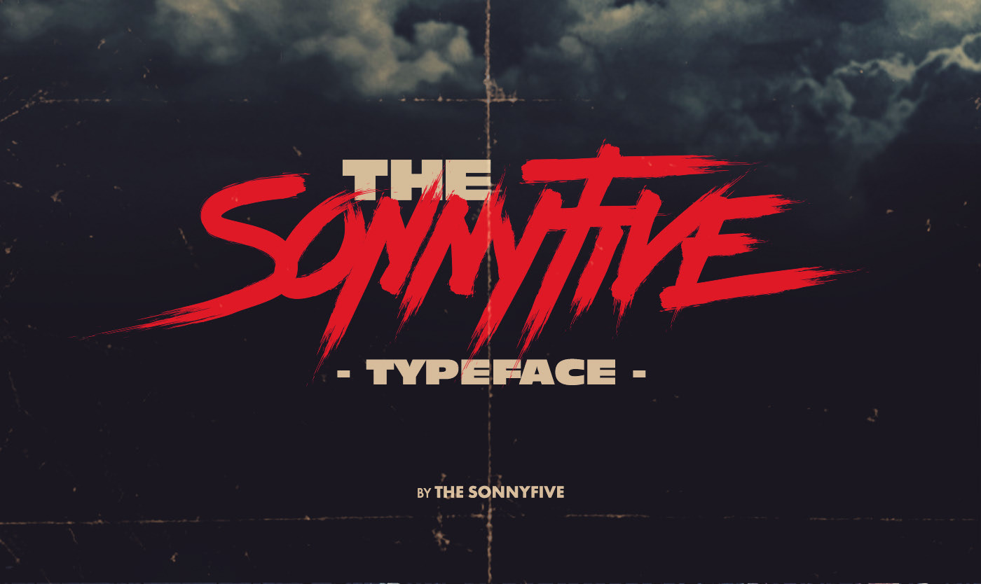
One of the main graphic design trends for 2020 is design with an eighties retro touch.
Along those lines we’ll see retro type used with touches of neon colour.
On top of that we’ll also see chrome finishes as a new device, contrasting sharply with retro designs and carrying that space-age feel of early science fiction films where astronauts’ suits looked like they were made of coloured tinfoil.
Graphic design projects using this trend
The Sonnyfive typeface by Sándor
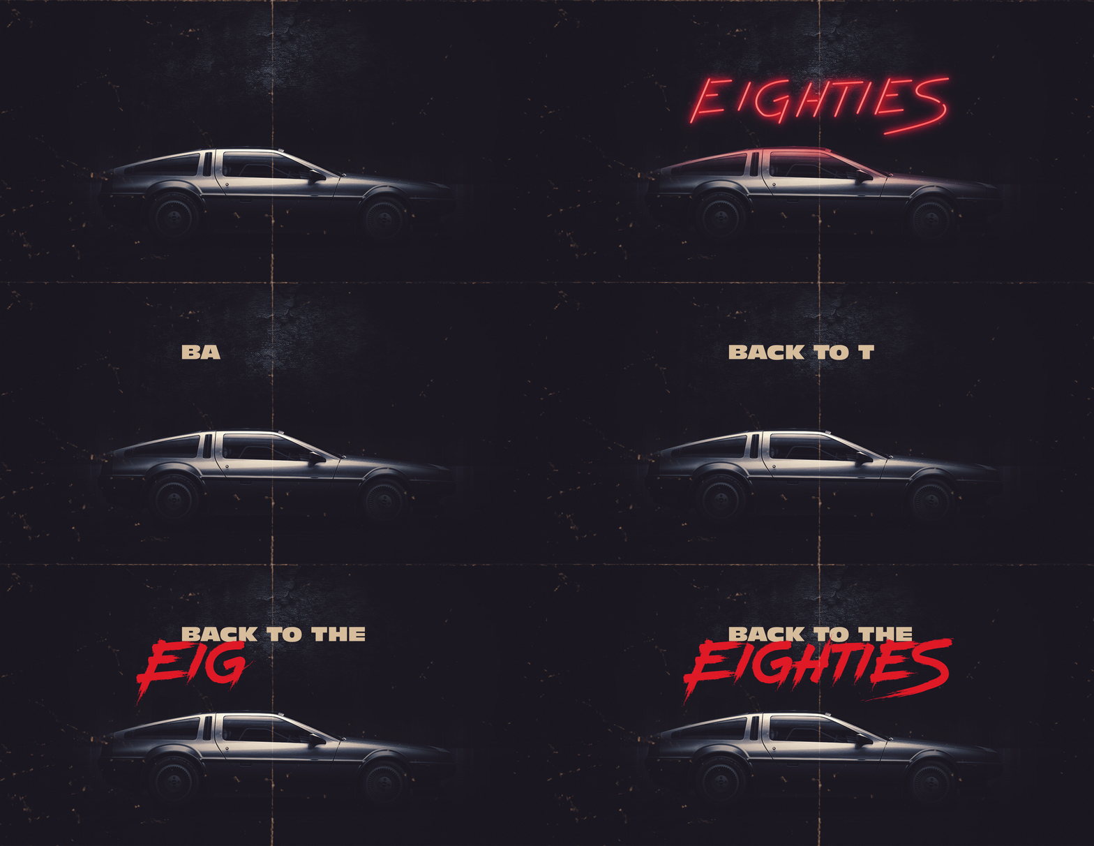
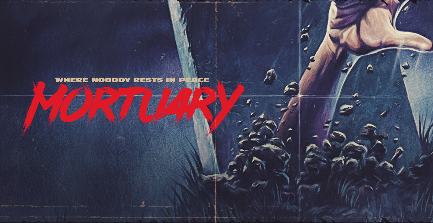
We can see how the design leans on imagery with a 100% eighties, retro look.
Grammari Packaging by Mohamed Moustapha
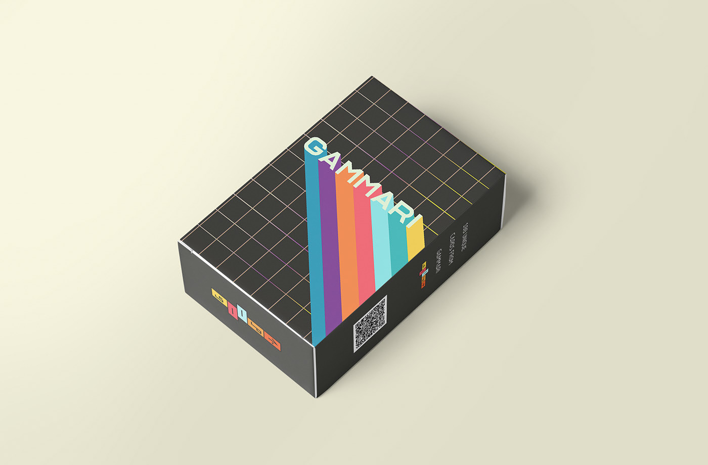
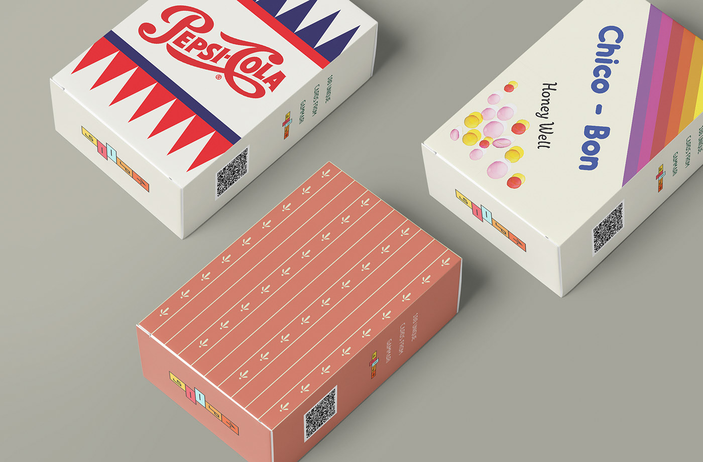
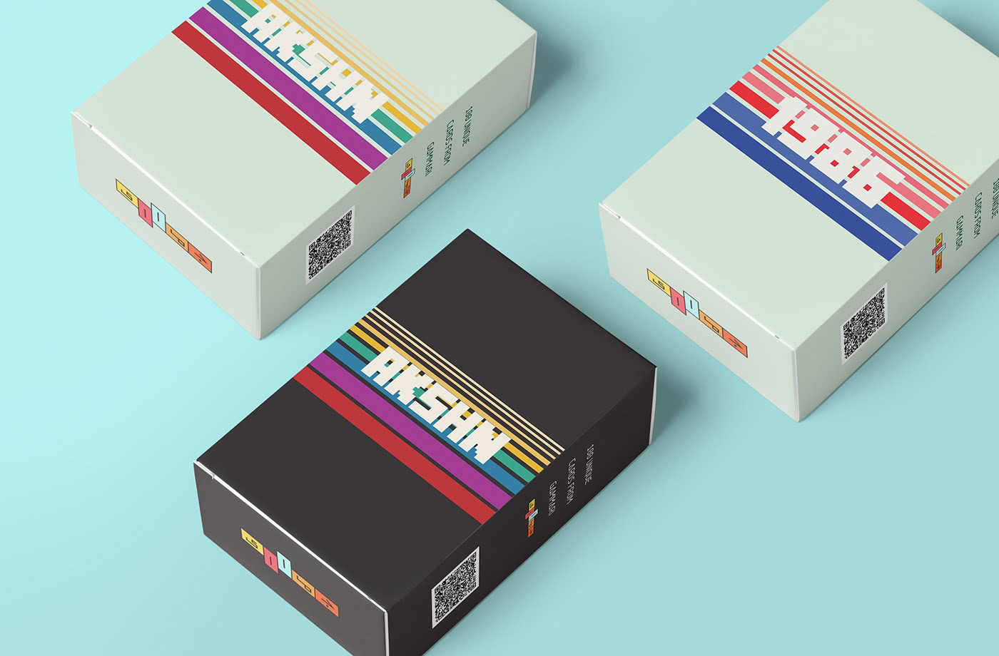
A series of packaging pieces where the eighties trend is very much present: the use of type and the colours.
NeoWave by James White
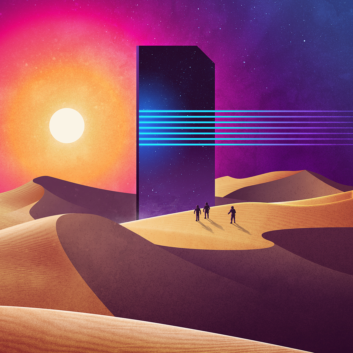
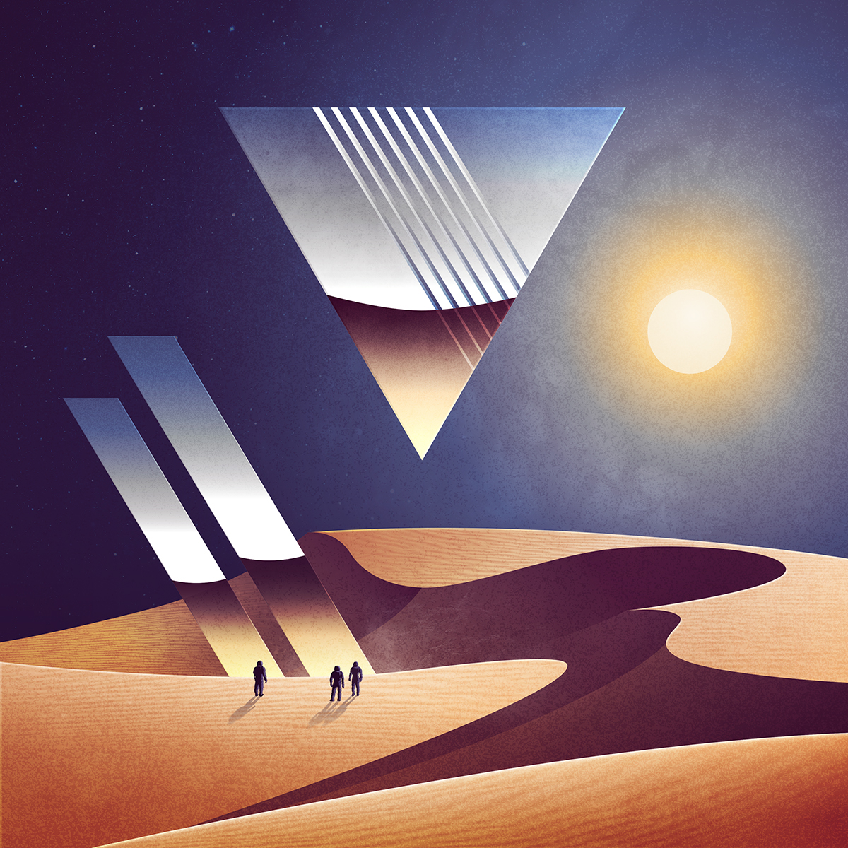
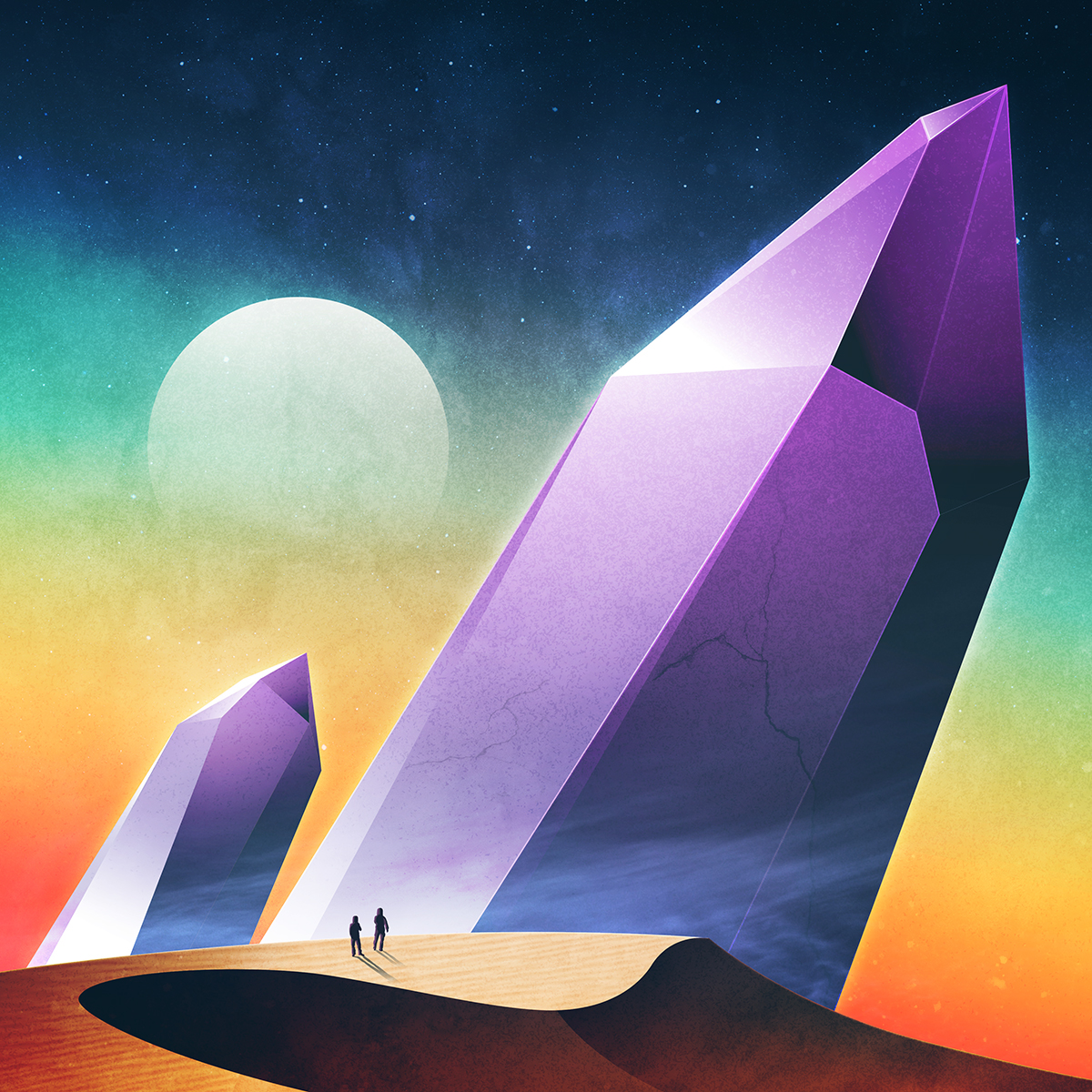
A series of images where we see neon and chrome colours used, all with a retro sci-fi feel.
Where you can use it
This trend will be everywhere in web design and poster design, but we’ll be able to apply it in corporate graphic design too.
- Web design
- Posters
- Corporate identity
- Landing pages
- Packaging
- Business cards
Tips for using it
- Pay attention to the type — it’s the difference between good design and rubbish.
- Mix more than one colour range and combine colours.
- Watch out for how chrome and neon colours print: not everything you see on screen is easy to reproduce.
2. Contrasting print textures
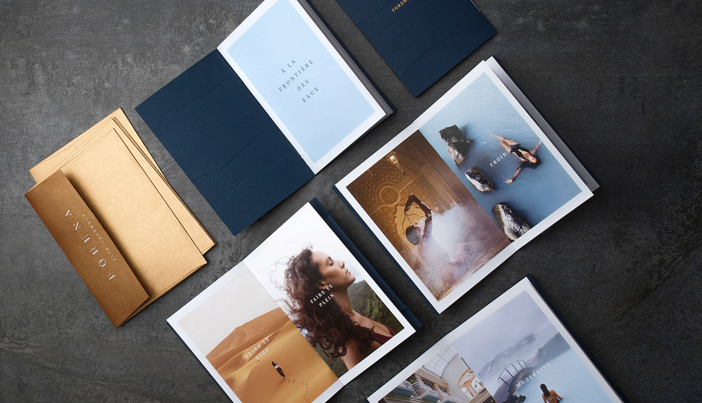
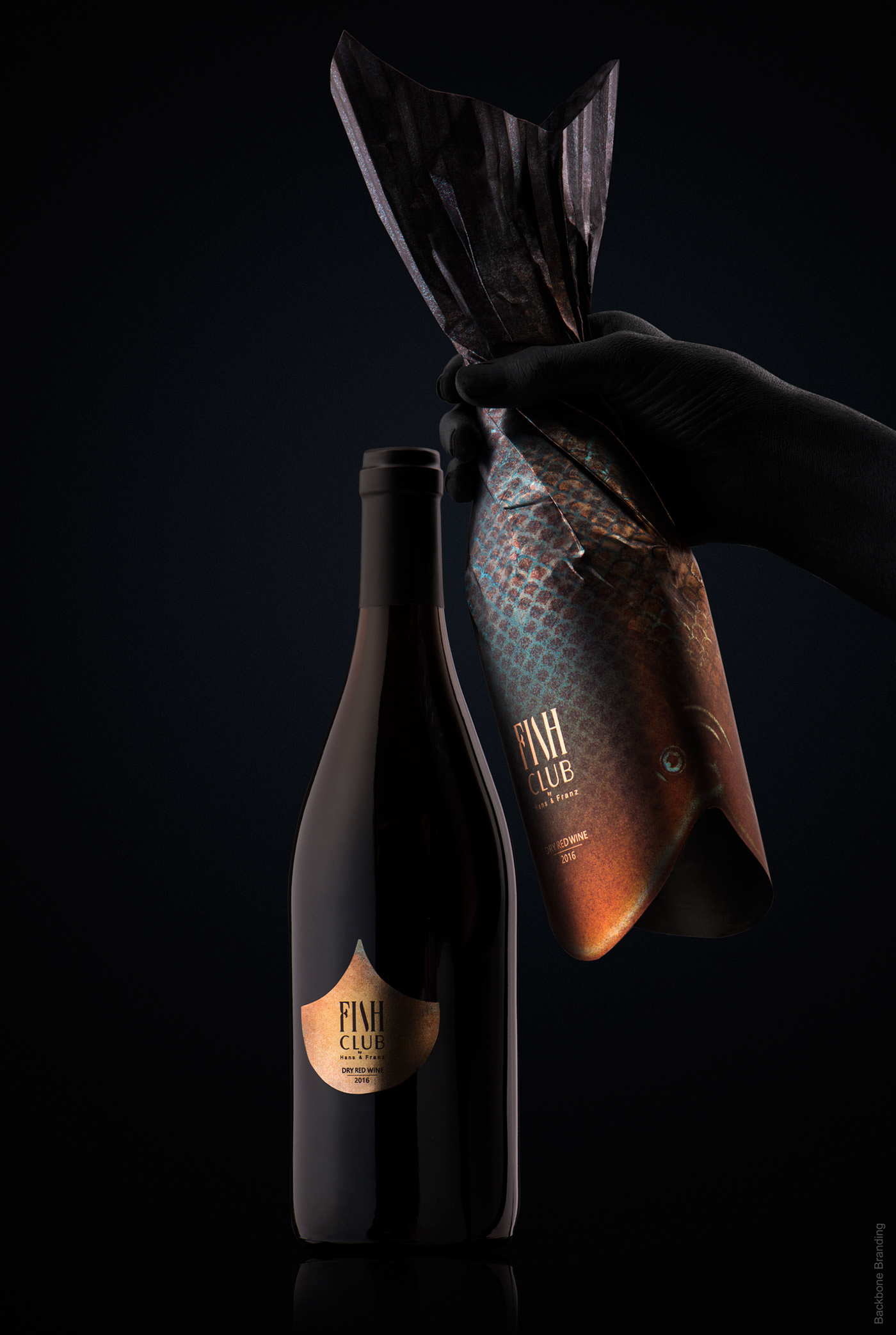
Another of the graphic design trends of 2020 will be using different textures in print to go a step further and get a product with real personality.
It’s riskier, but that’s the added value my work as a graphic designer brings.
Textured papers, embossed papers, metallic papers — there are no limits beyond good taste.
Graphic design projects using this trend
Forena spa by byHouse Studio & Josiane Cossette
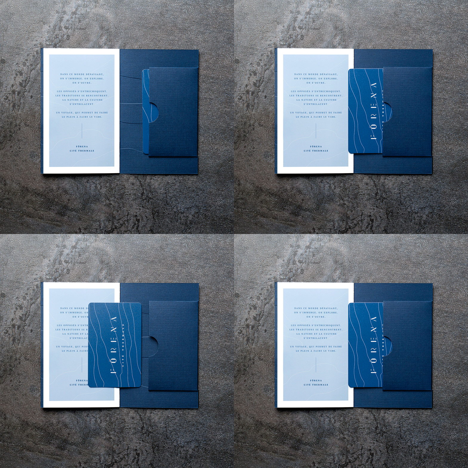
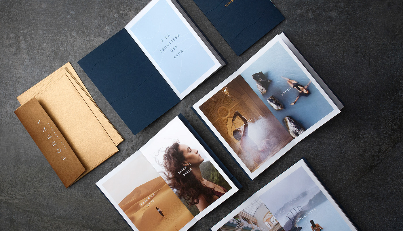
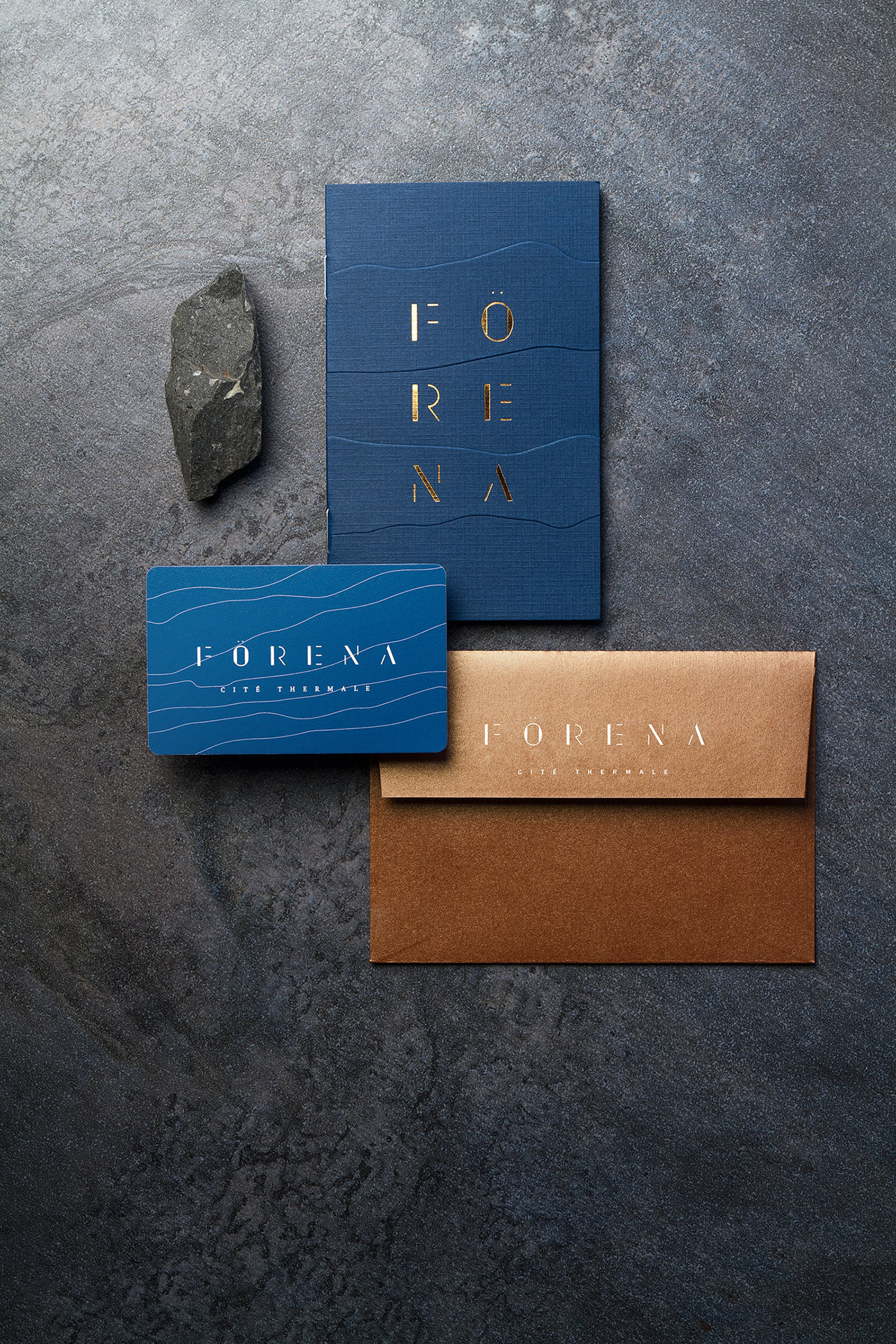
A corporate identity where we see different textures, embossing and metallic finishes in use.
Nuage by Anagrama
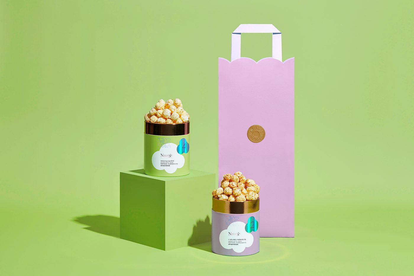
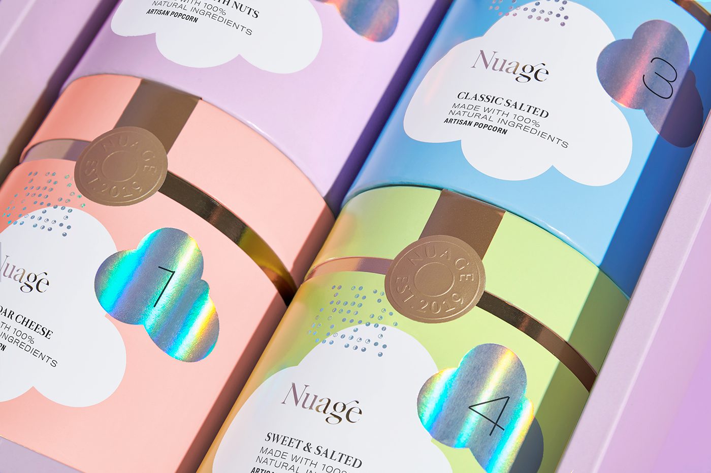
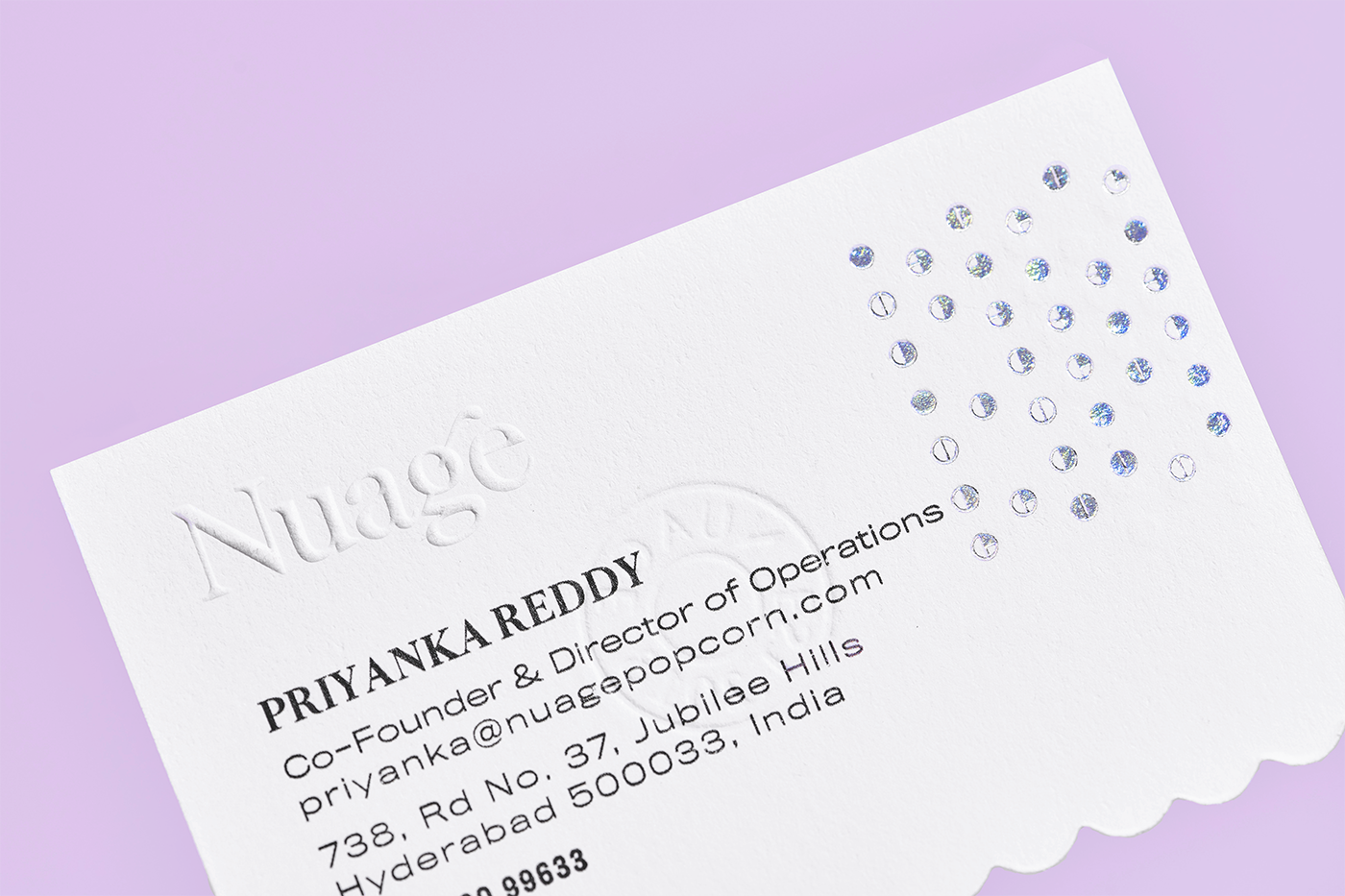
Packaging design where we see different textures, materials and metallic finishes in use.
Fanabela by Anagrama
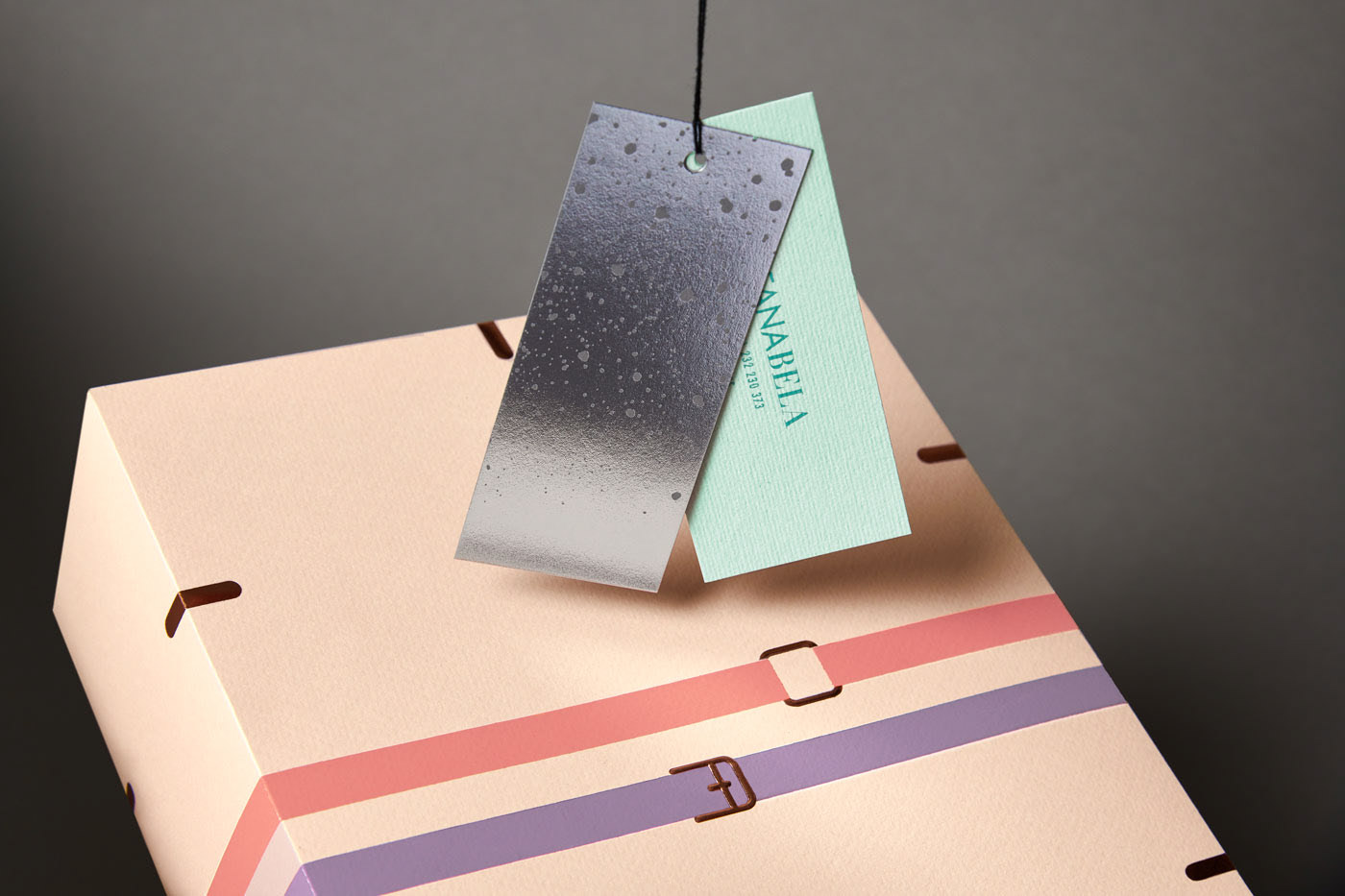
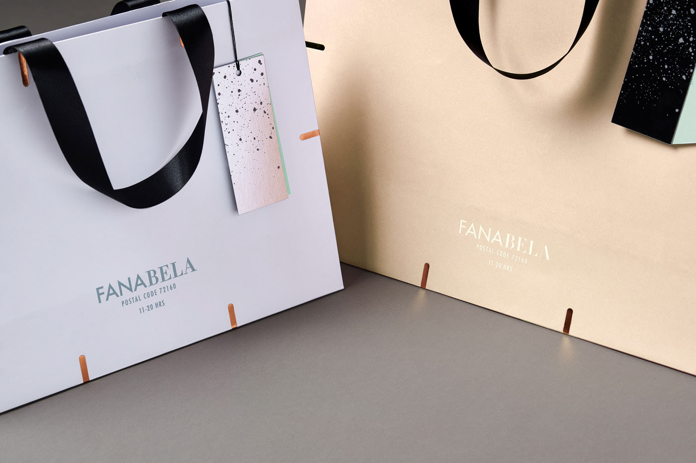
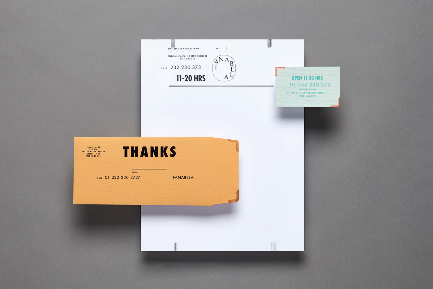
Another packaging example combining textures, metallic finishes and materials.
Where you can use it
Mainly in full corporate identity work, and also in:
- Business cards
- Labels
- Packaging
- Envelopes
- Bags
- Corporate documents
Tips for using it
- To combine different materials, use some graphic device as the connecting thread.
- Don’t overload the design with too many textures — find the balance.
- Before going to production, make a mock-up or a realistic render.
- Feel free to play with materials and textures. Trial and error.
3. 3D objects and glossy colours
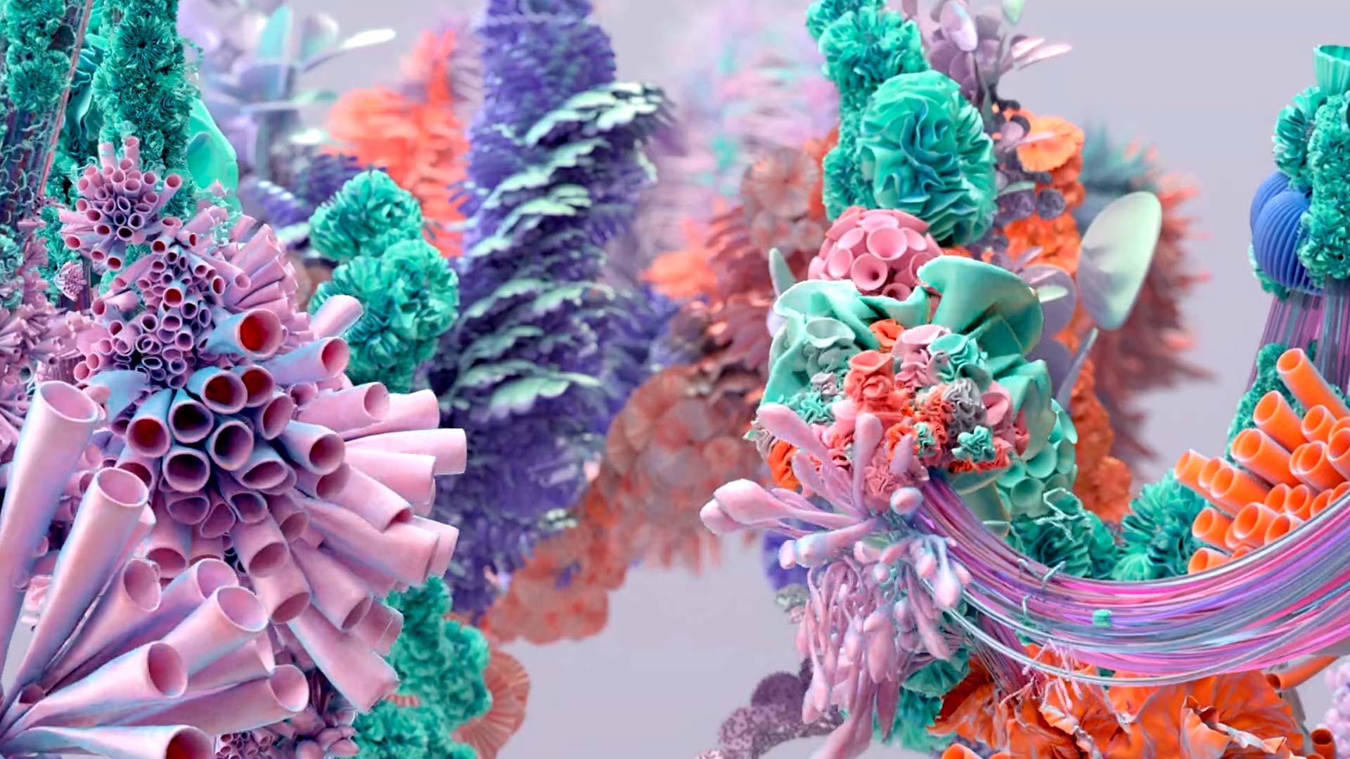
The power technology now offers has allowed 3D artists to bring graphic design one of the strongest trends of 2020.
Mainly we’ll see designs featuring 3D elements and a tremendous explosion of glossy colour.
Kiss my Airs by Lukas Vojir
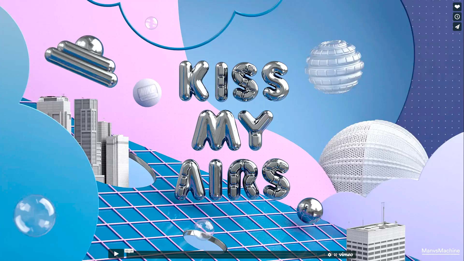
3D elements and glossy colours used to advertise Nike trainers.
Möbelix by Serial Cut
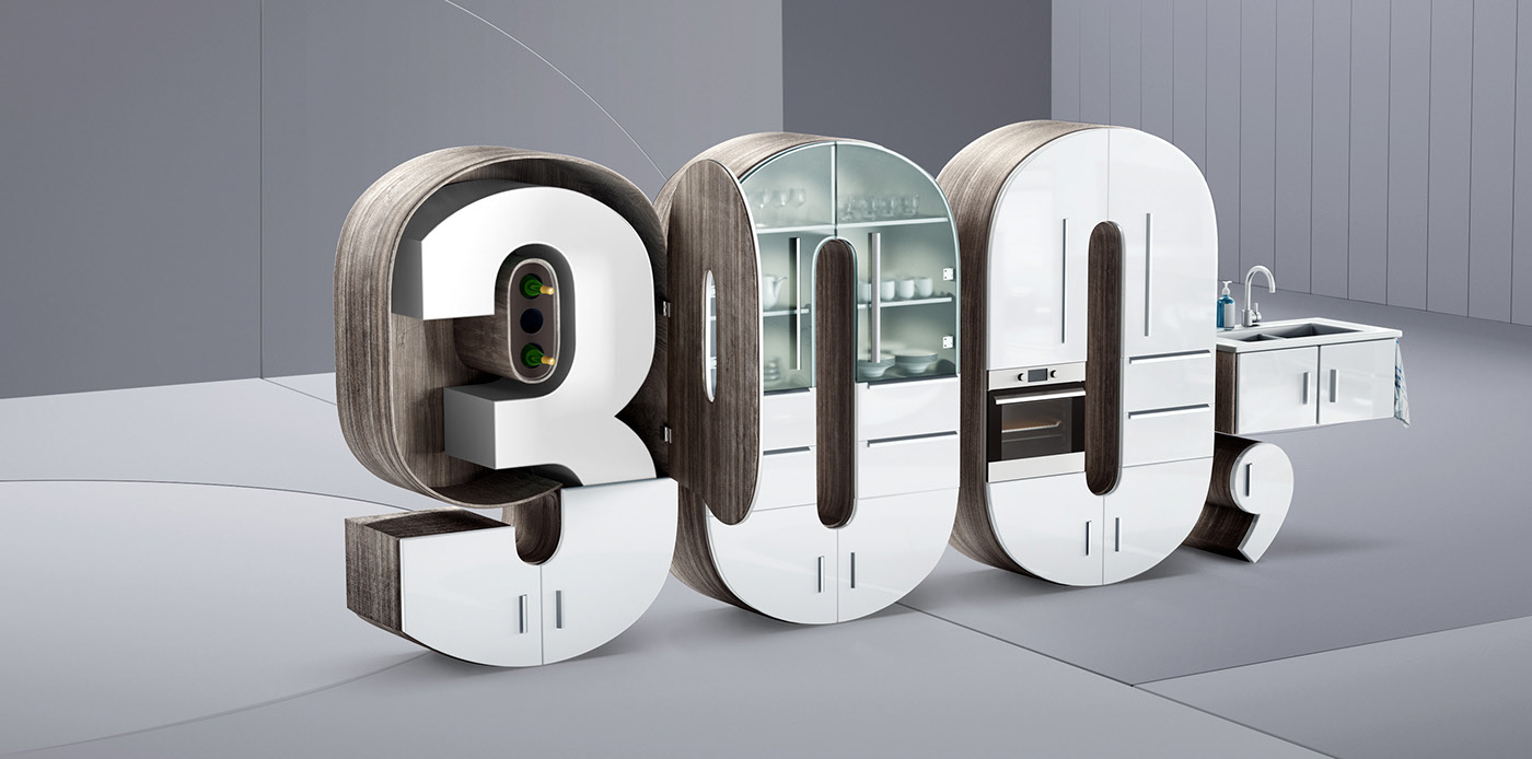
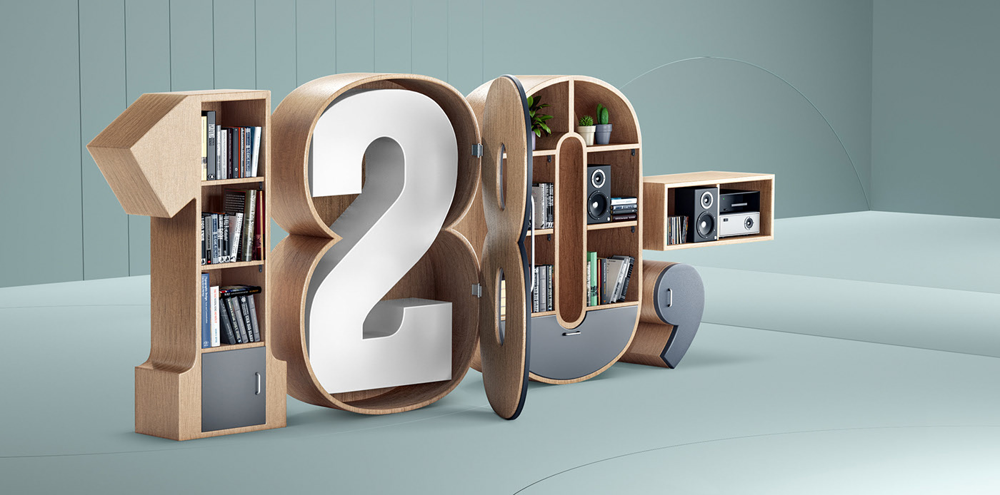
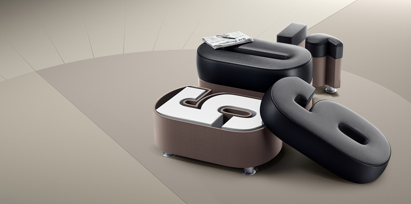
An advertising campaign announcing furniture prices for a furniture manufacturer and retailer.
Monster Prom by Marcurtasun
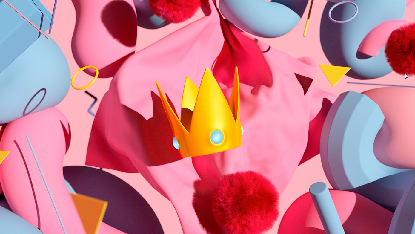
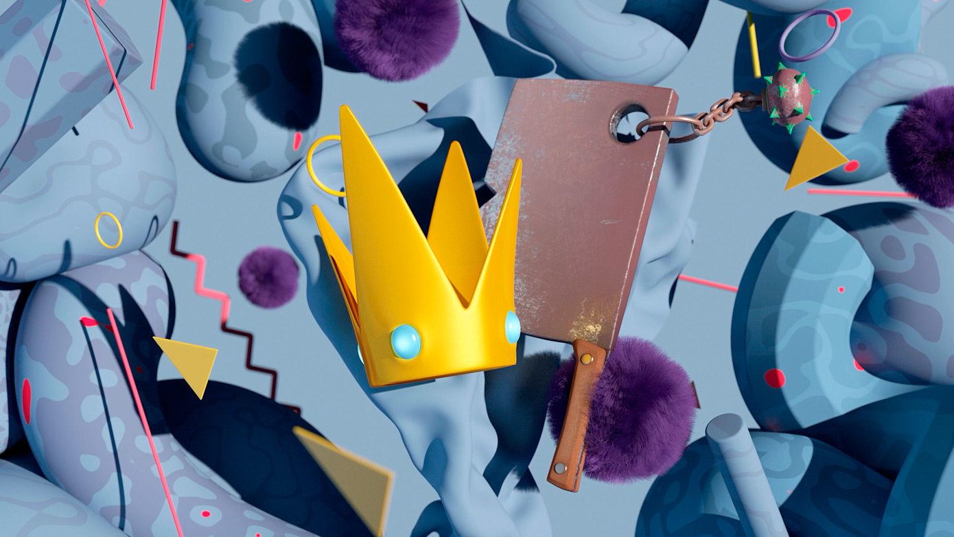
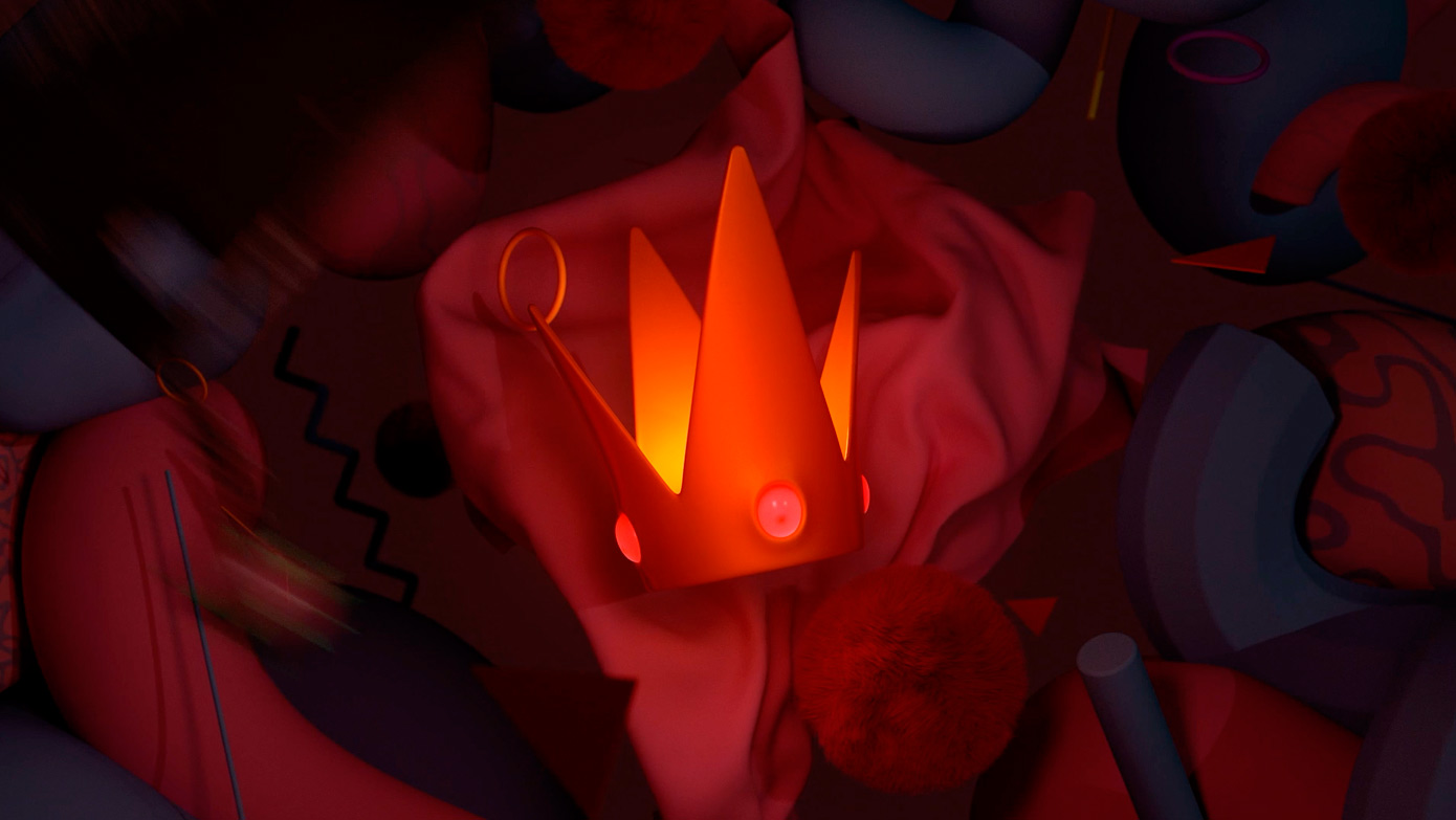
3D elements used in this digital piece by freelance designer Marcurtasun.
Where you can use it
- Digital media such as websites
- Advertising videos
- Posters
Tips for using it
- Don’t hold back on glossy colours.
- Play with textures, be creative.
- Bring your designs to life with 3D object animation.
- Think in 3D.
- On websites, use Three.js to embed models and create a really striking interactive experience
4. Backgrounds built on semi-realistic textures
The fourth graphic design trend of 2020 will be using semi-realistic textures in the backgrounds of your work, giving you a very personal and more transgressive design.
Graphic design projects using this trend
Sonos by Serial Cut & Paloma Rincón
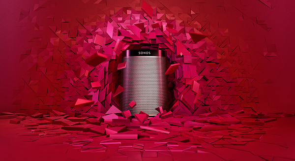
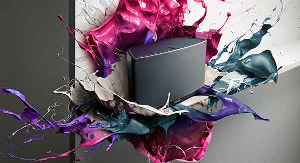
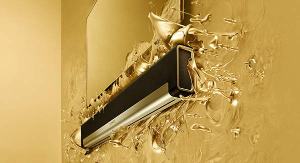
Work where you can see realistic liquid and solid textures used as backgrounds, integrated into the graphic design of the products being advertised.
Sisco by Mai Creative
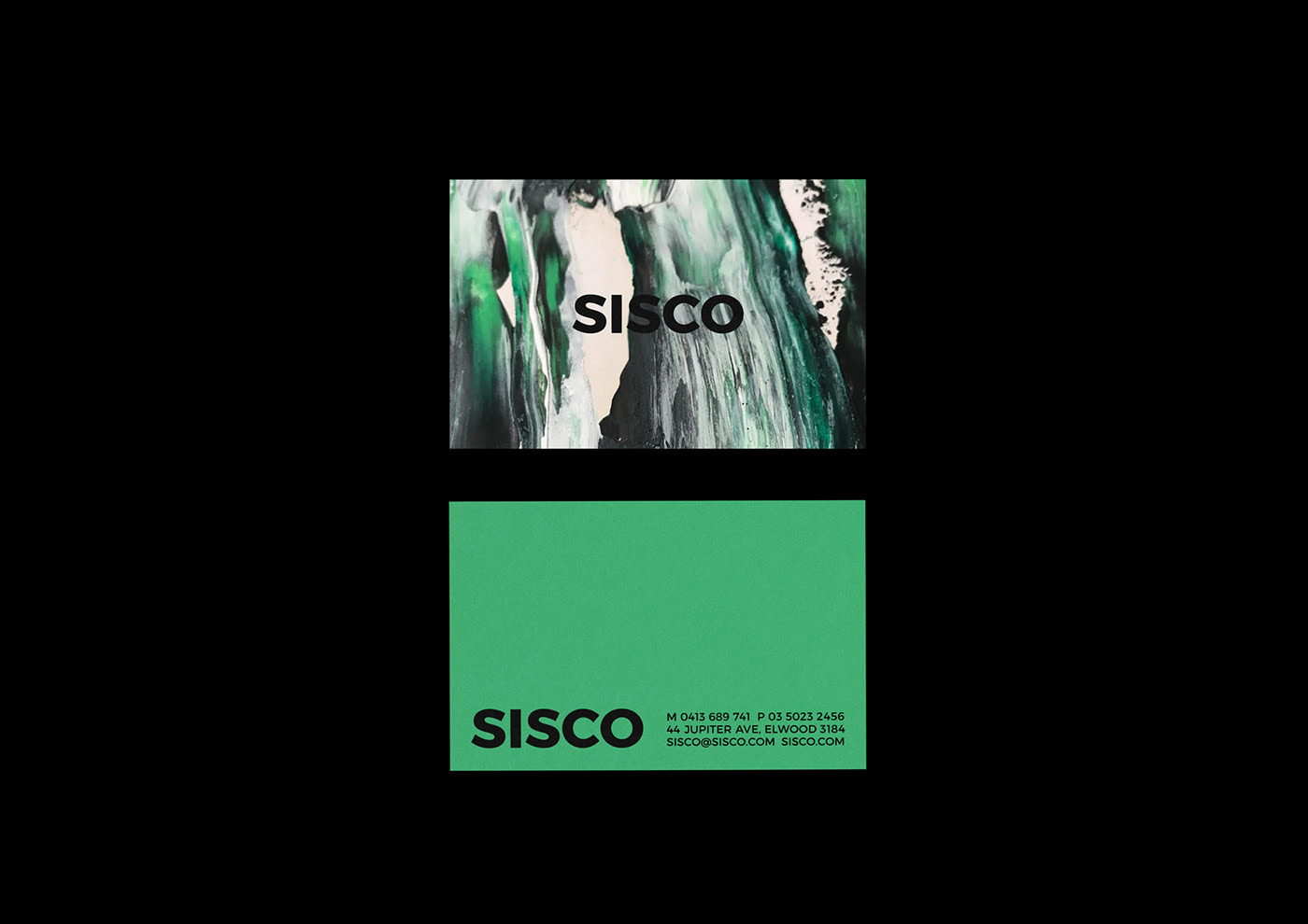
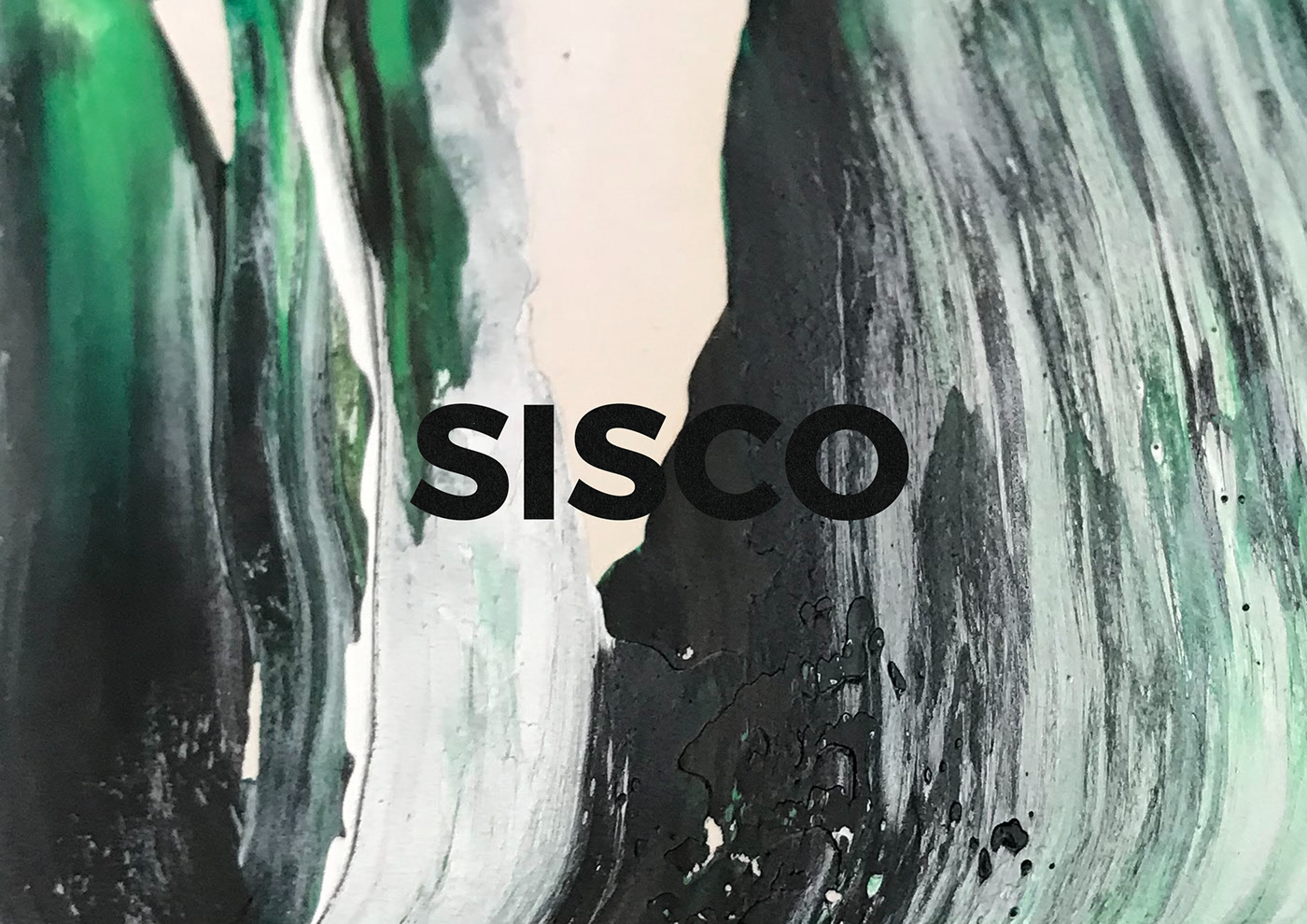
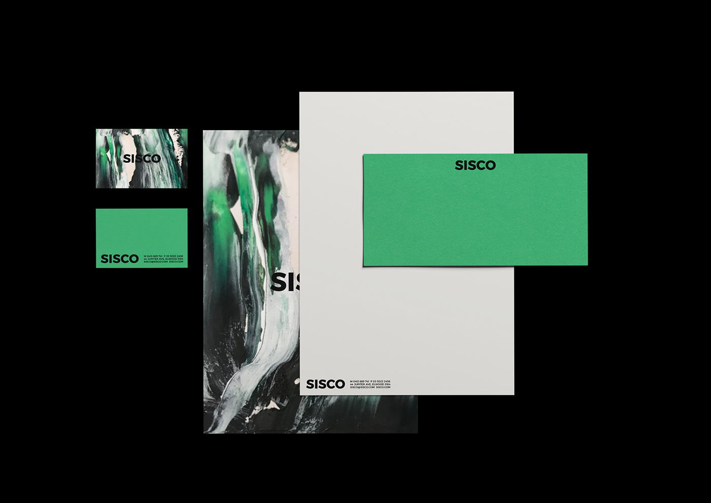
An example of a semi-realistic background using the design’s base colours, applied as if painted by hand when in fact it was made digitally.
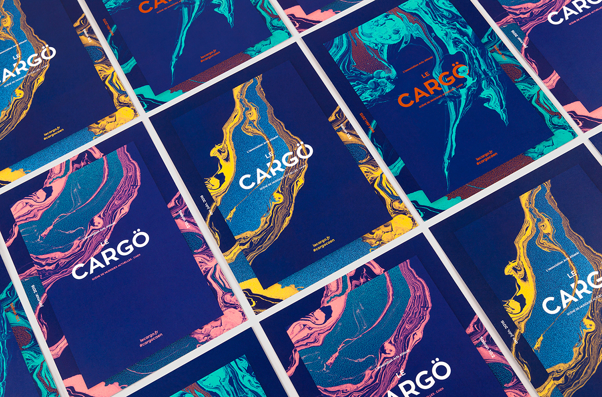
Le Cargö by Murmure
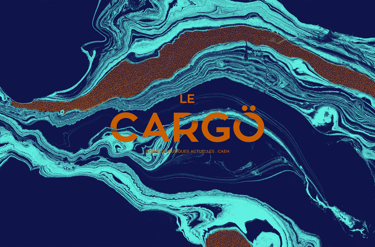
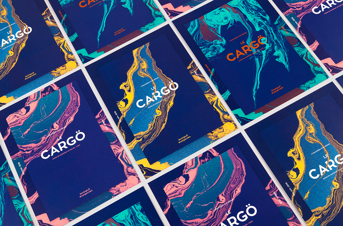
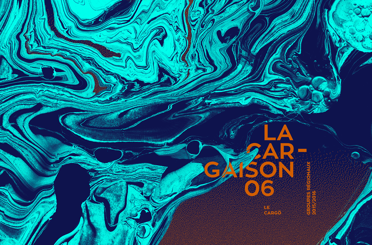
A semi-realistic paint-like background with an echo of marble and a spectacular play of colour.
Where you can use it
- Full corporate identities
- Business cards
- Catalogues
- Websites
- Posters
- Advertising videos
Tips for using it
- Use masks to apply textures to type.
- Play with animation and create interactive experiences.
- Use colour, contrast and texture.
- Use a good typeface to support it.
5. Grunge & Glitch
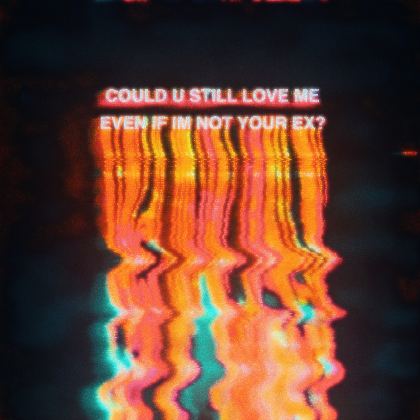
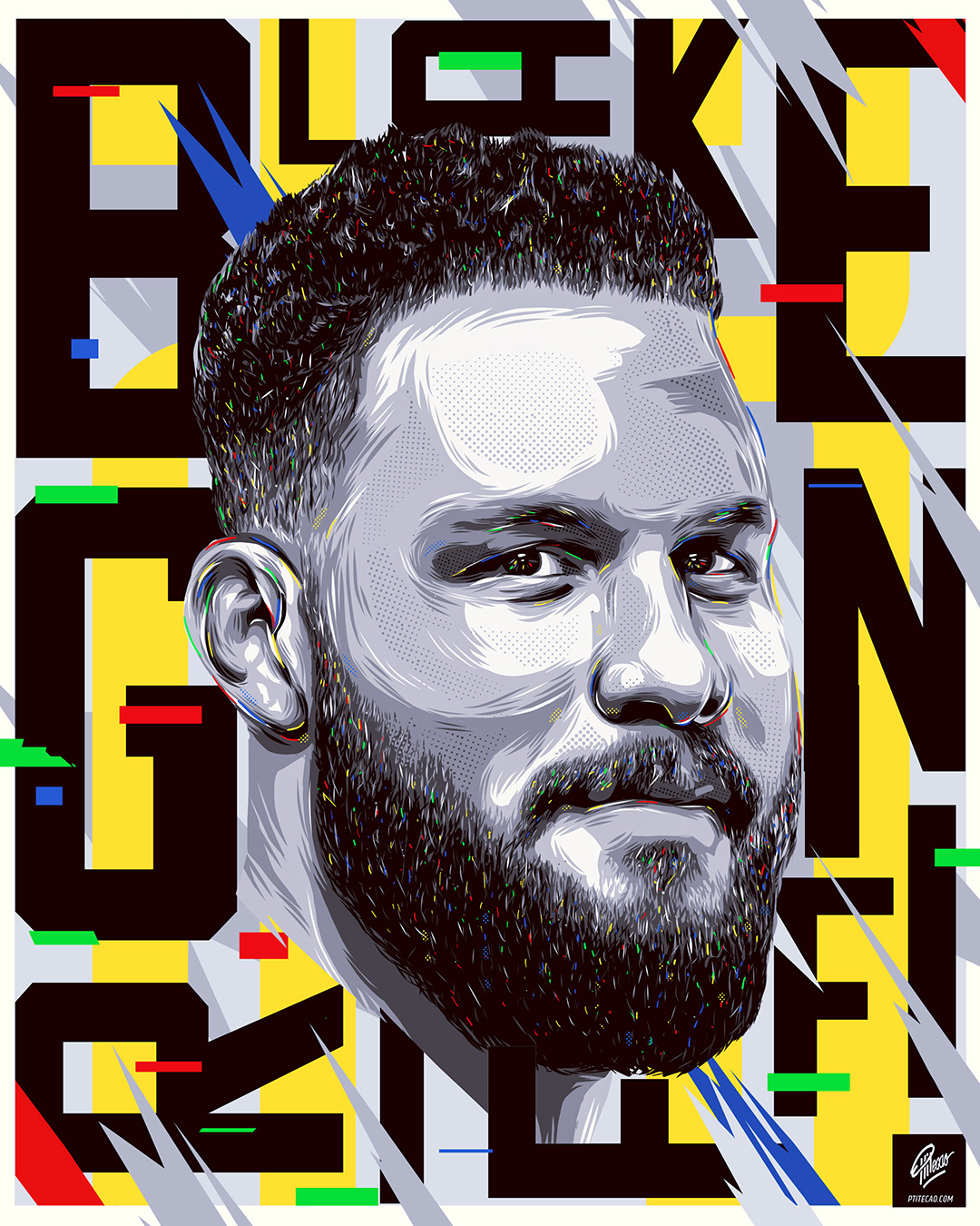
The fifth graphic design trend for 2020 will be the grunge and glitch style.
To get the effect you have to distort images and rough them up quite a bit. You can oversaturate, break type apart and whatever else comes to mind.
With this device we can convey pure, powerful emotion.
Graphic design projects using this trend
Glitch by Umut Guney
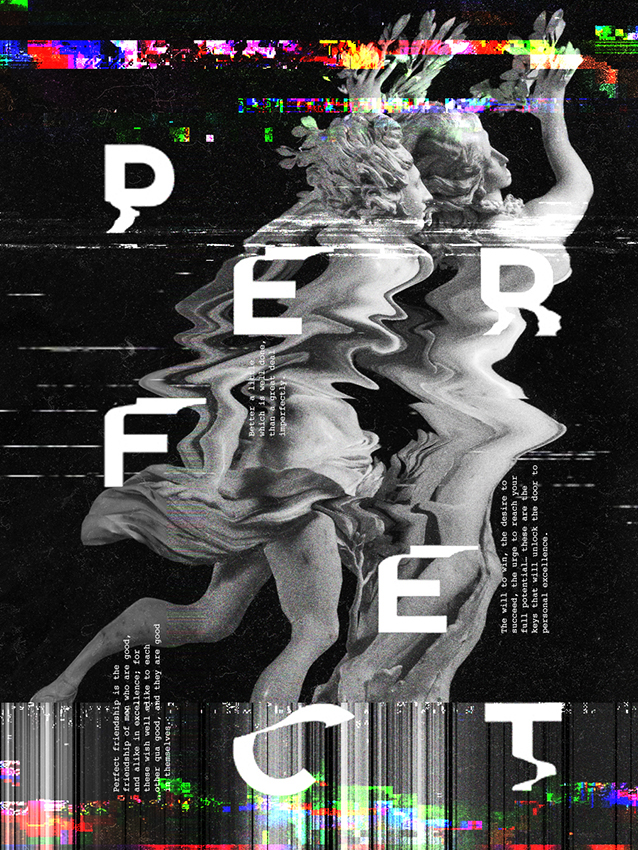
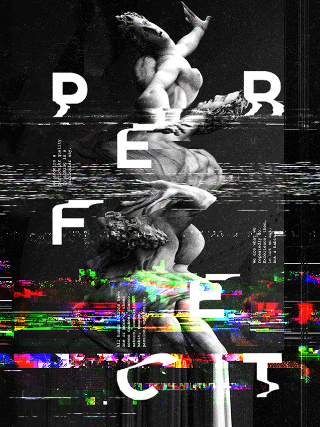
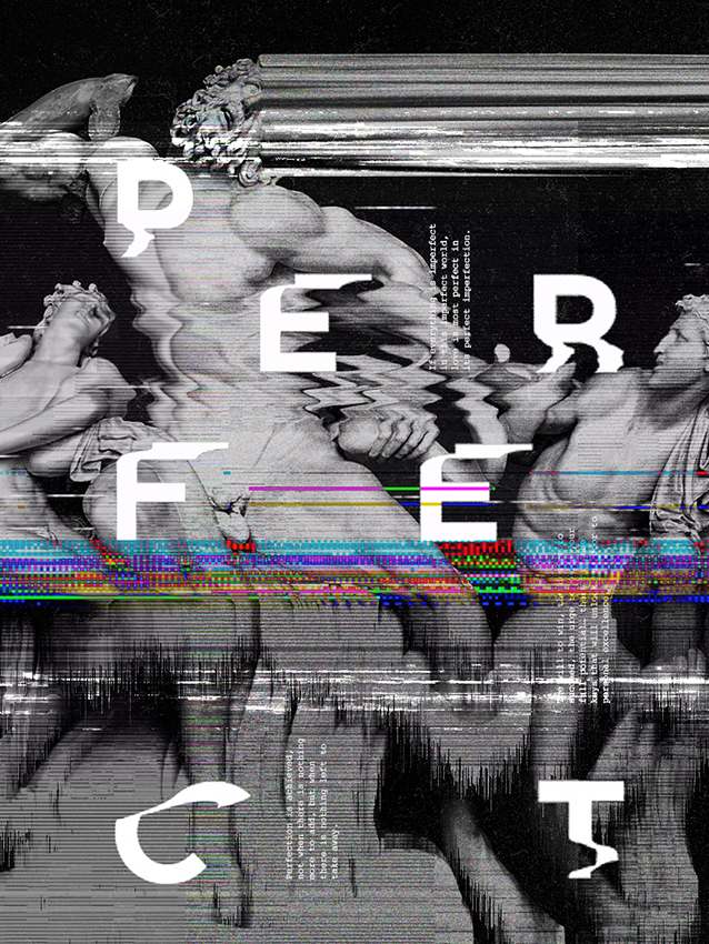
A poster where the glitch effect runs through every graphic element of the piece.
Basketline by Jorge Espinoza
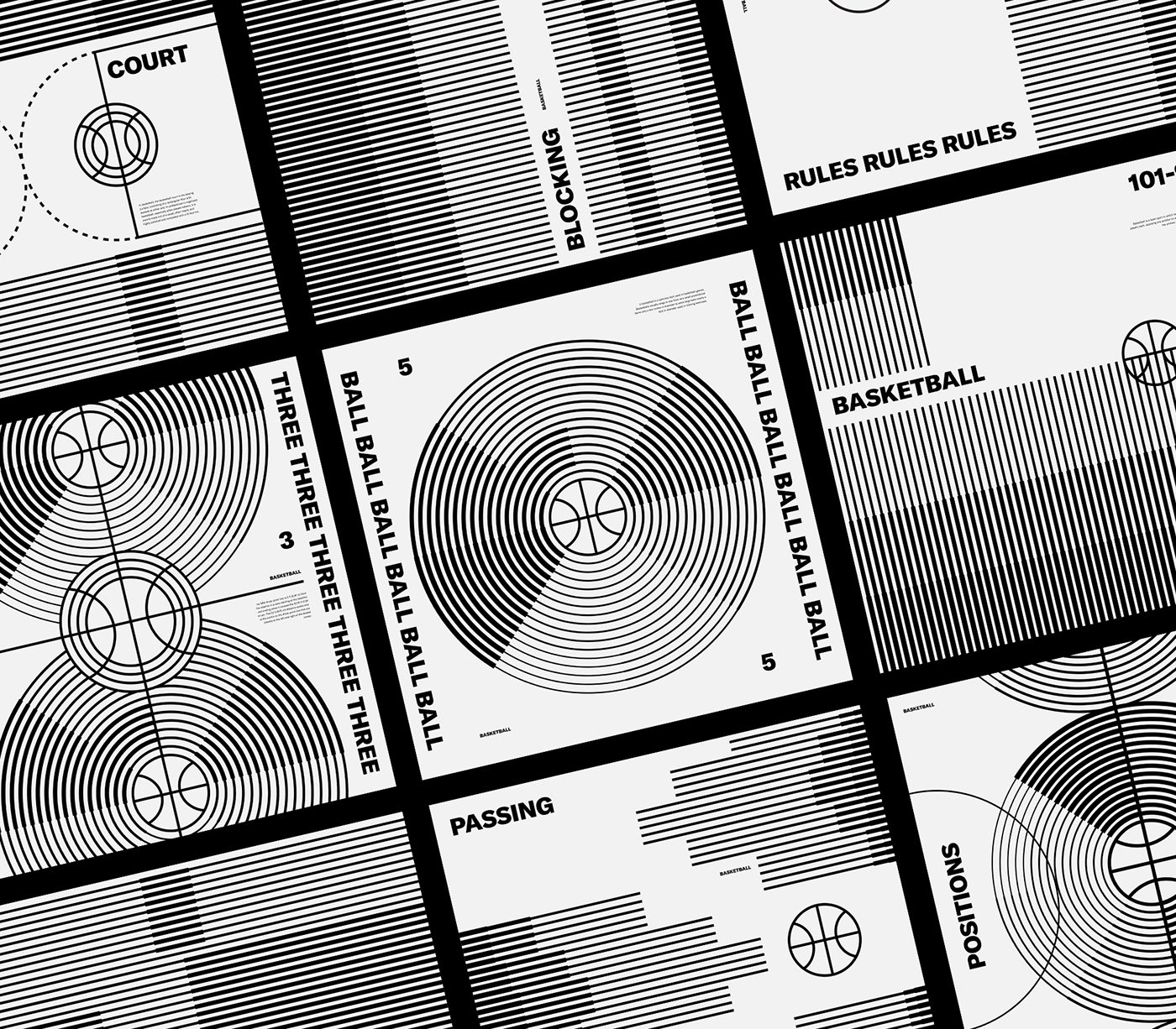
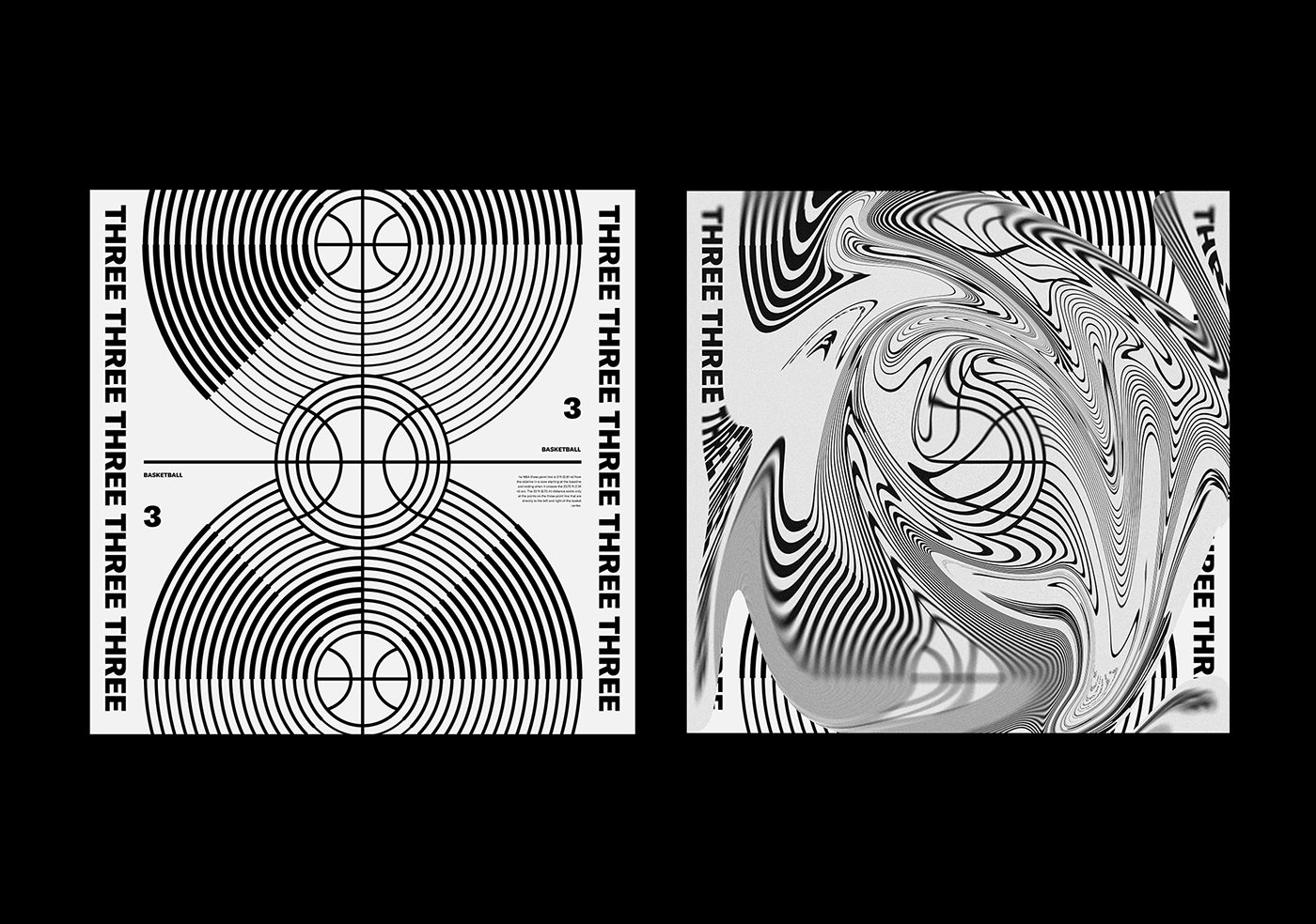
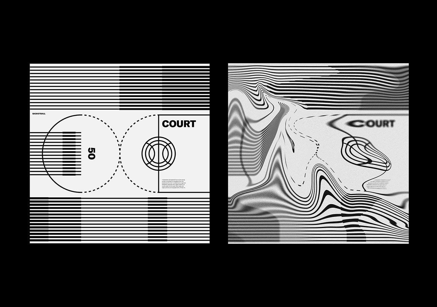
A project where we see the trend’s effect on the type and the line work.
Mishko fall 2019 by Nevan Doyle
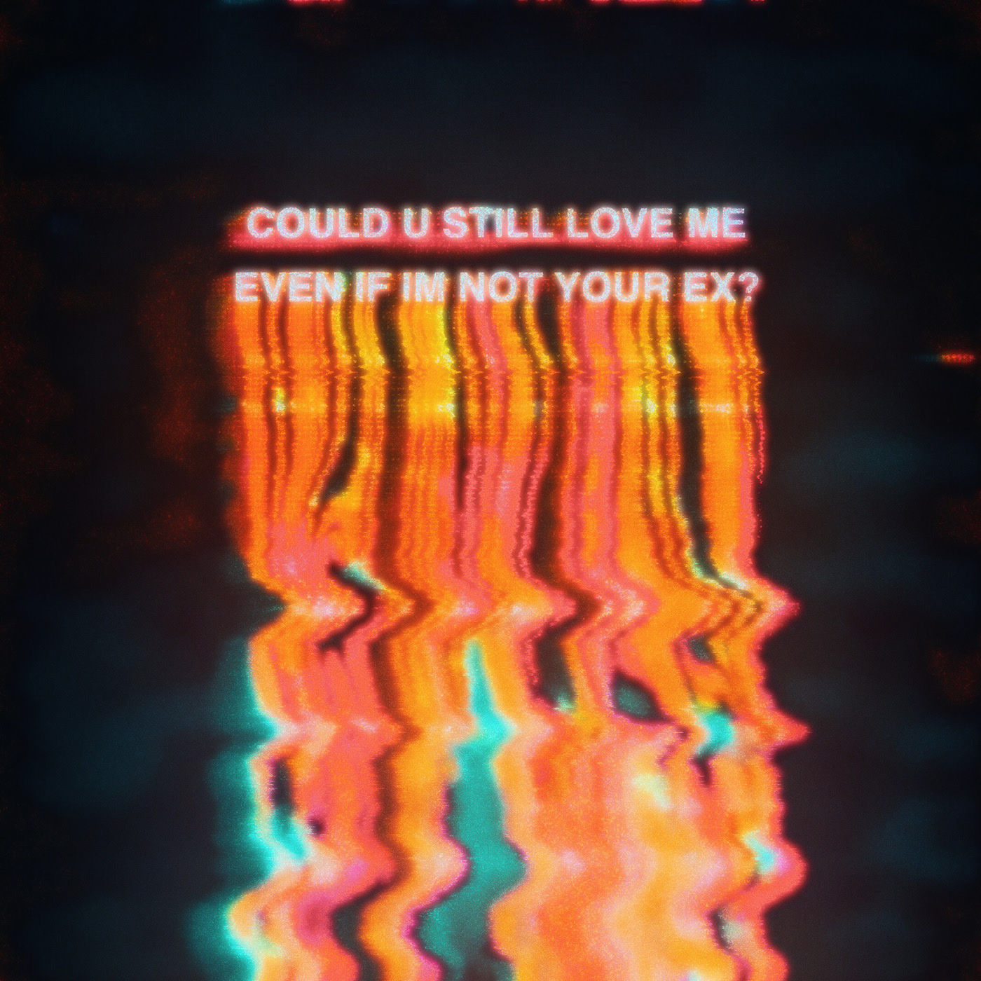
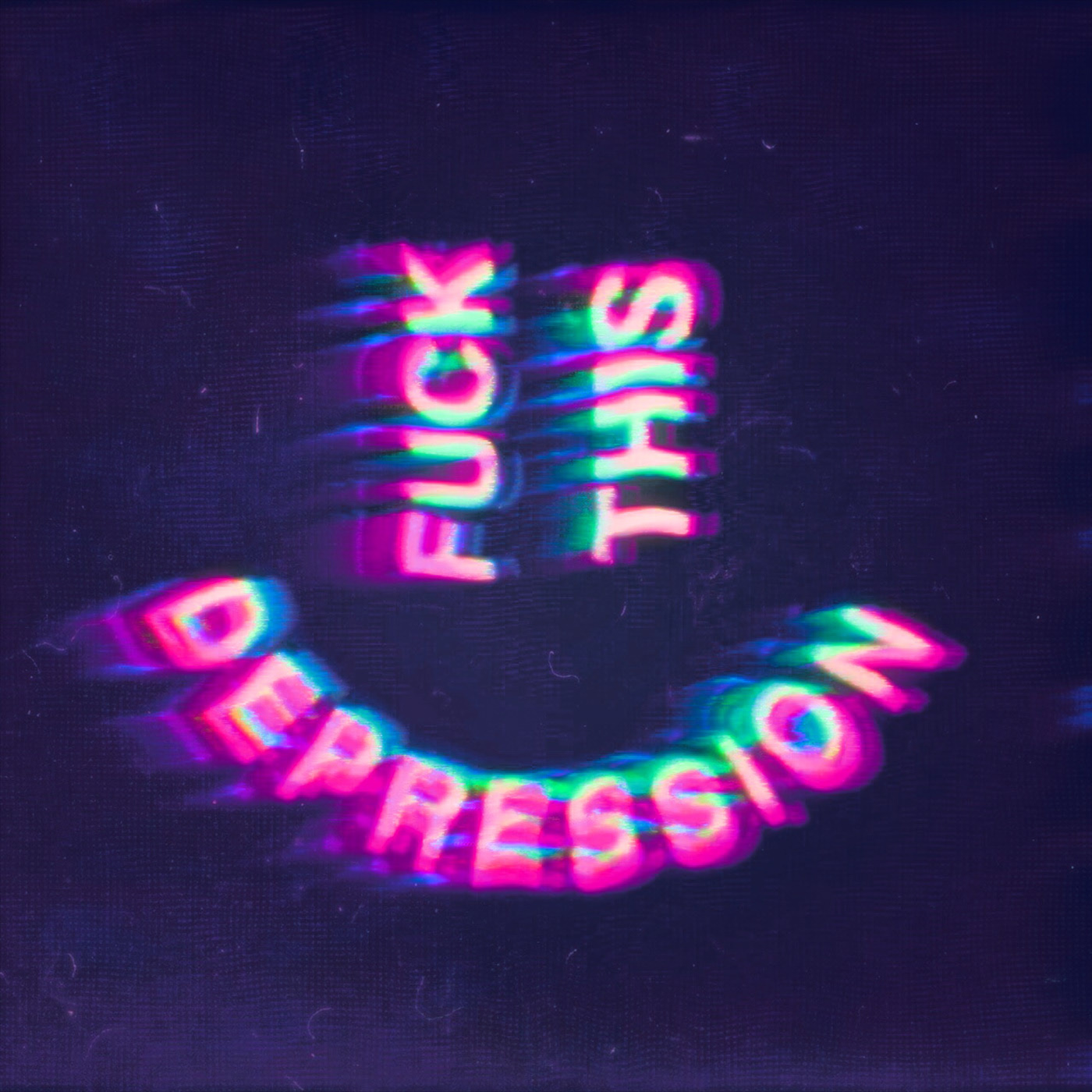
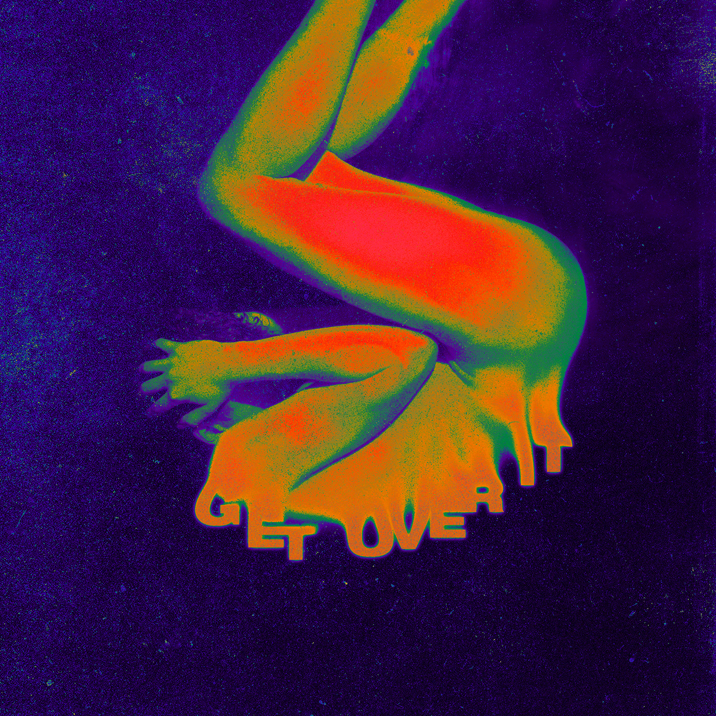
A series of advertising images where we see the wildest version of this trend.
Where you can use it
- Websites
- Landing pages
- Posters
- Corporate identities
- Cards
- Catalogues
Tips for using it
- Use libraries like Pixi.js for websites and landing pages.
- Don’t hold back at all when creating with this device.
- Not every project suits it.
6. Handmade and vector illustration
The sixth web design trend for 2020 is creating handmade and vector illustration to support any project that calls for it.
Graphic design projects using this trend
Sinner Chocolate by Mina Manzar
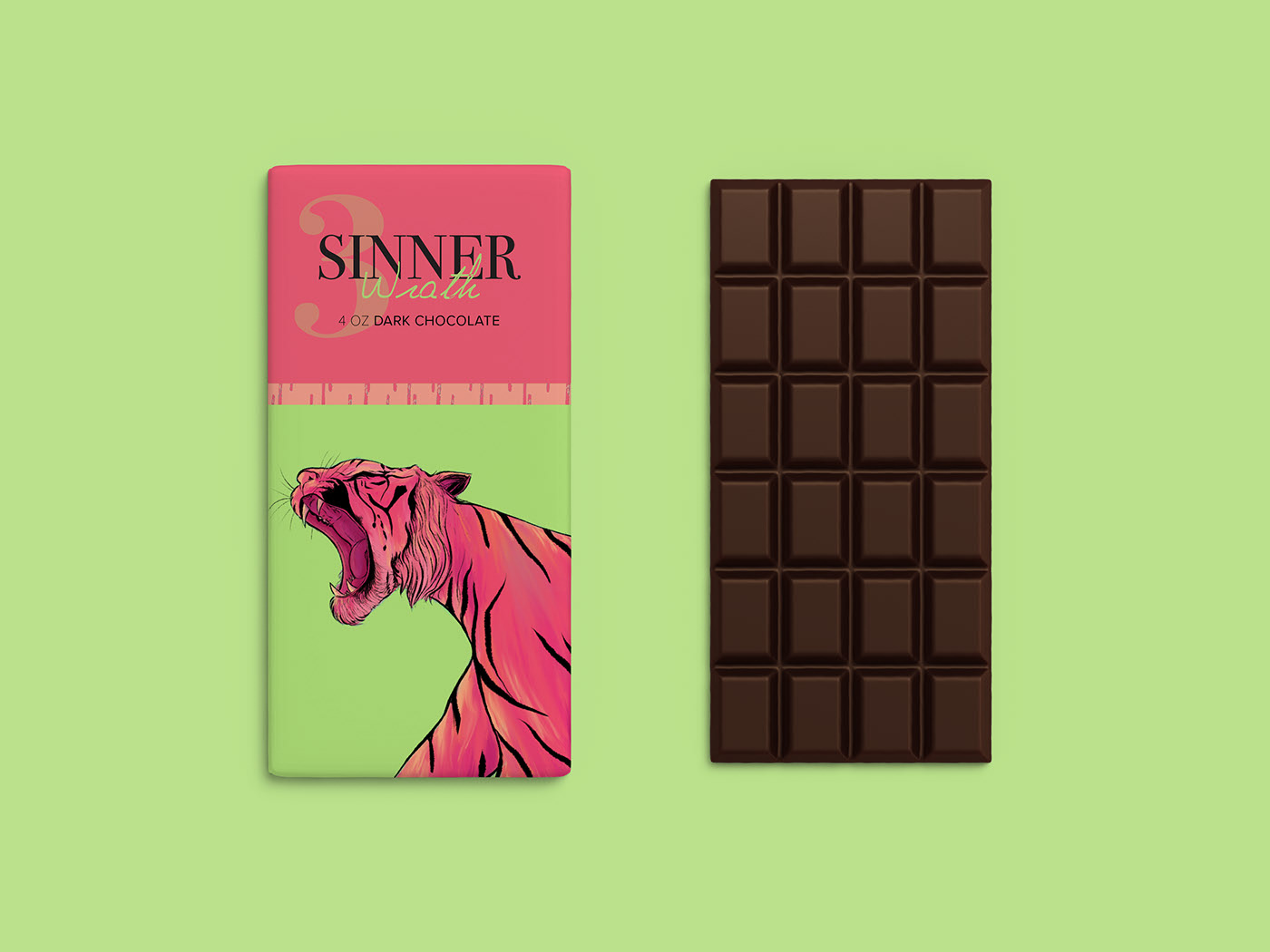
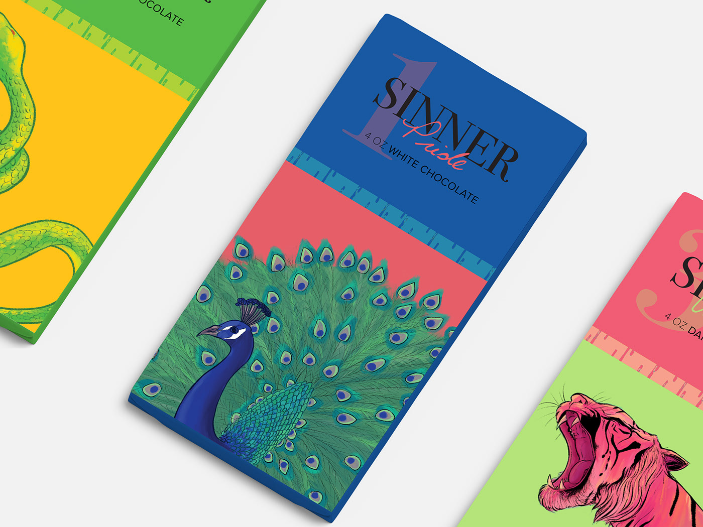
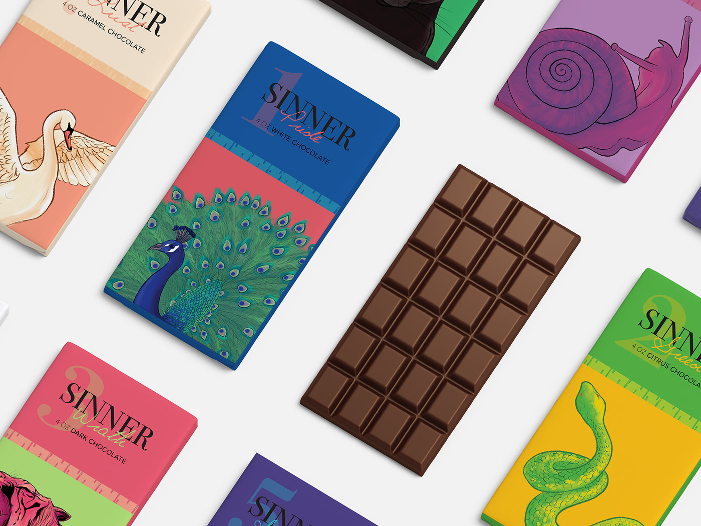
Packaging design incorporating illustrations of wild animals.
Kun Hei by 肖 楠杰 & meiin 米米
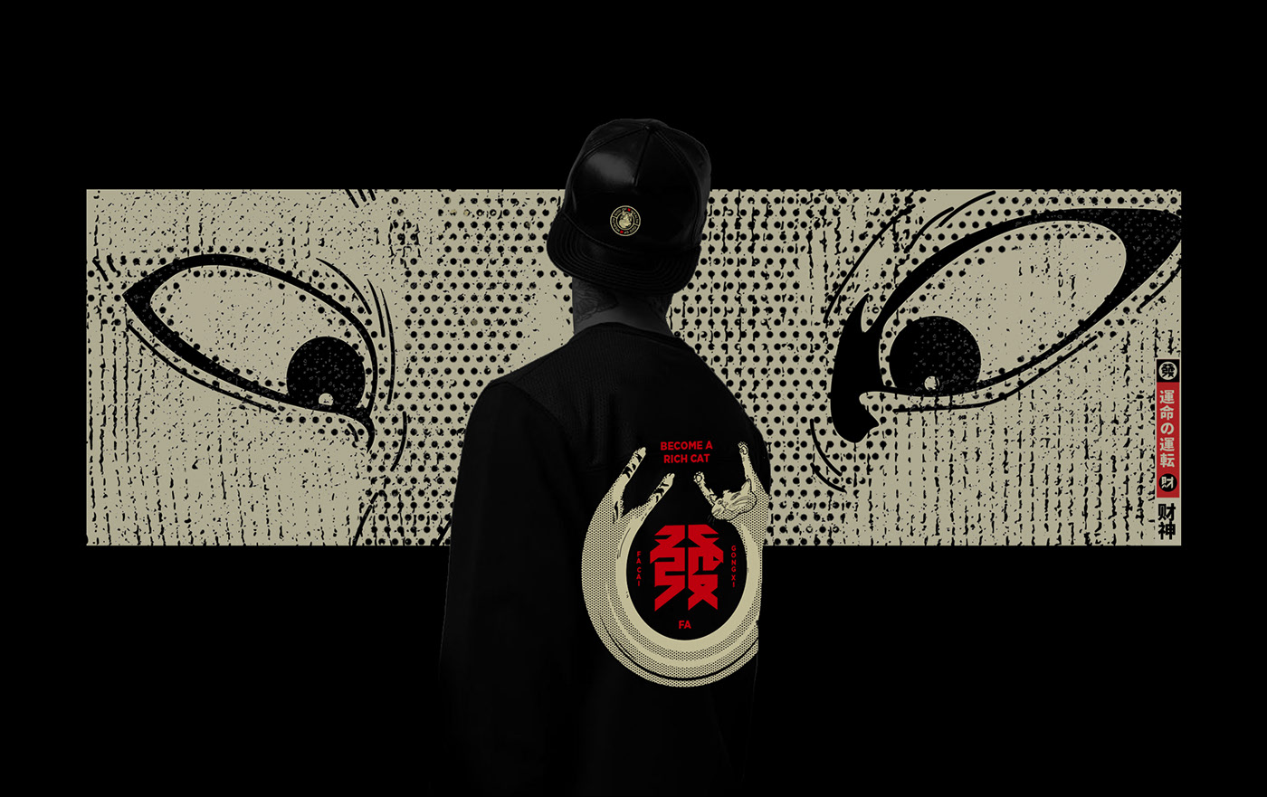
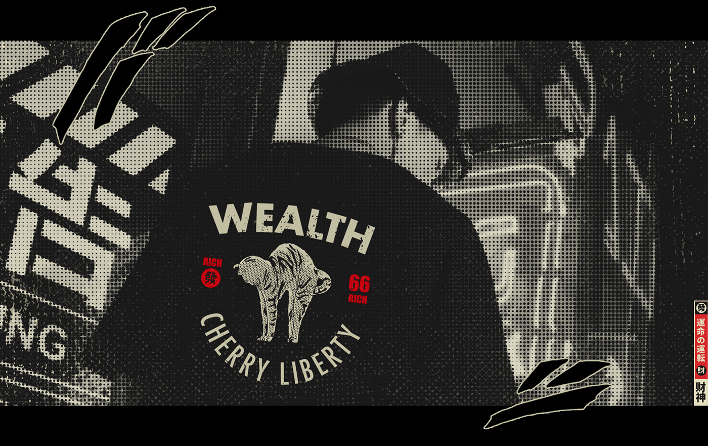
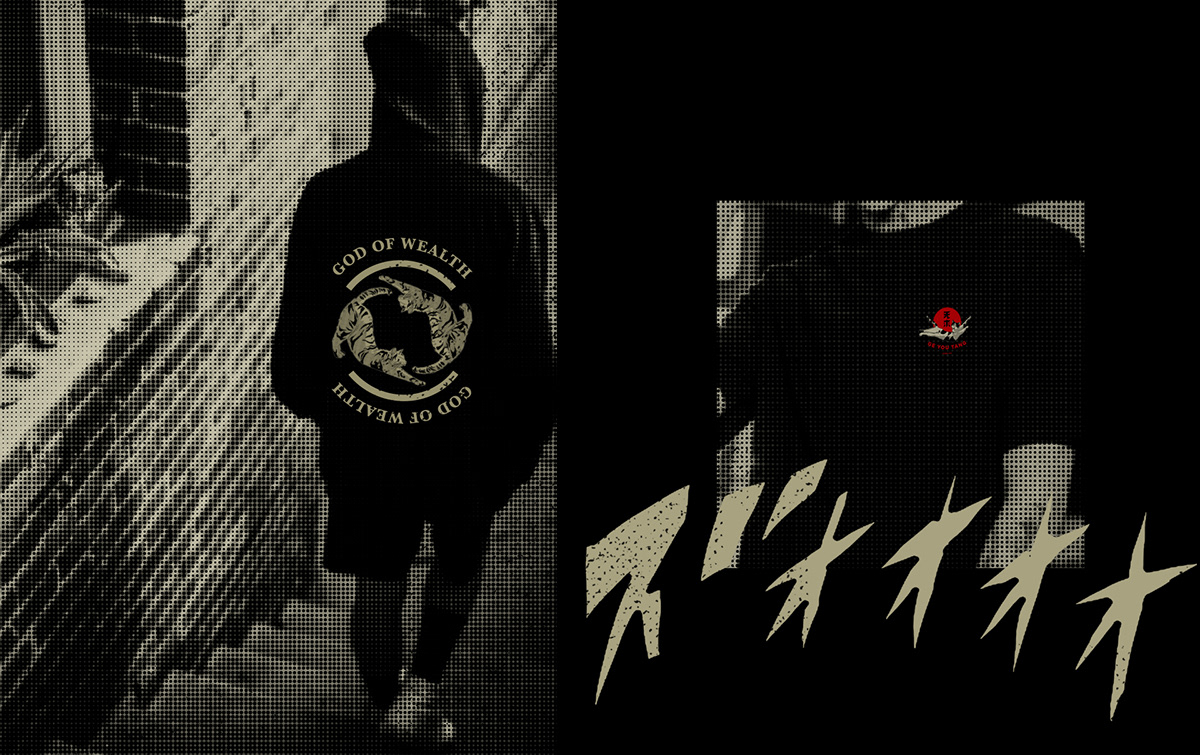
A project using freehand illustration as a graphic device to convey 100% personality
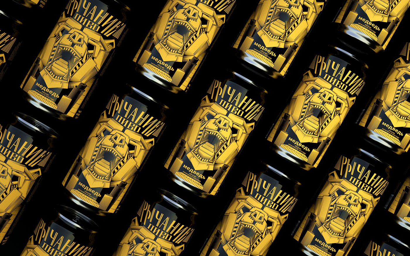
Roaring beer by Joker
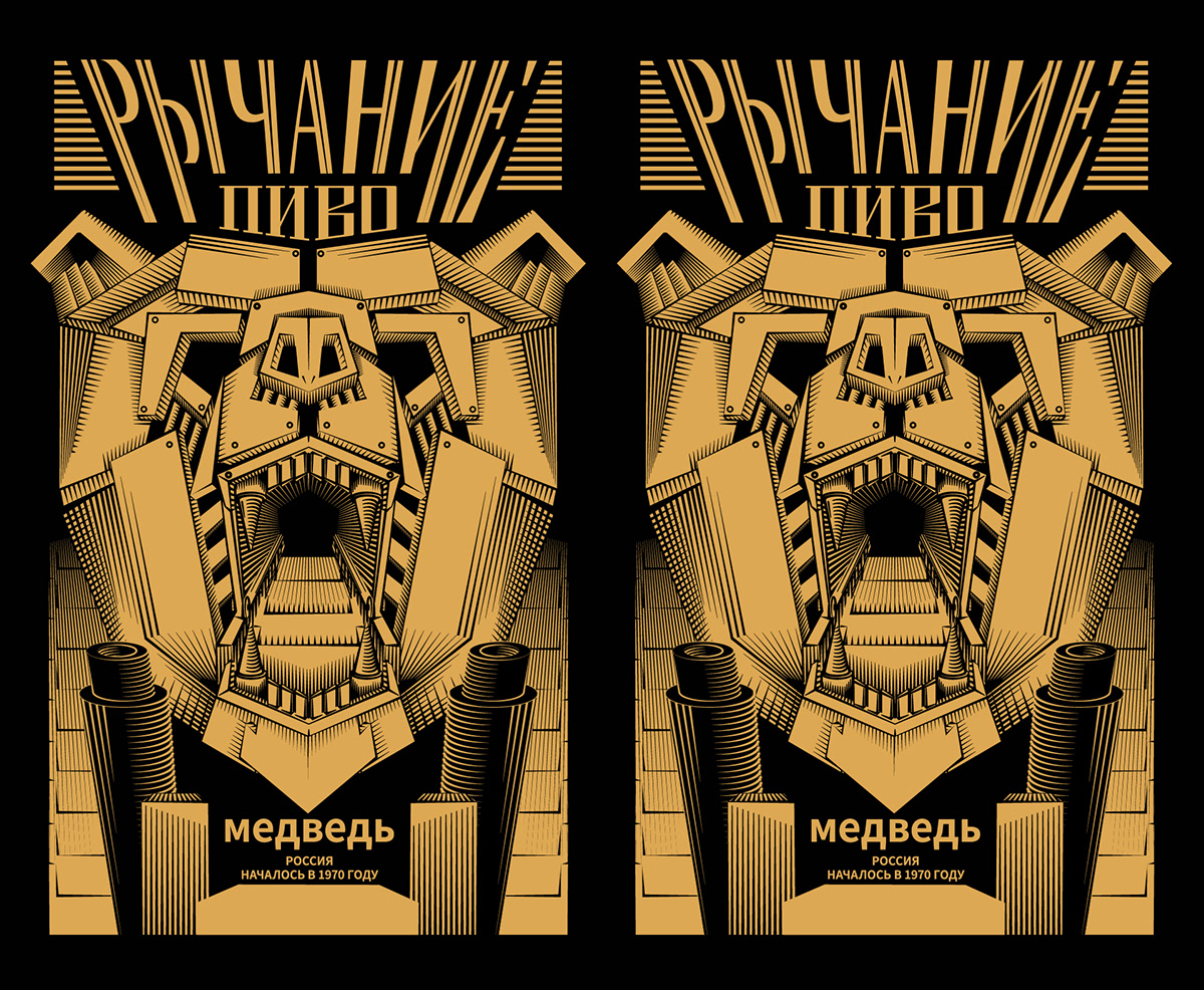
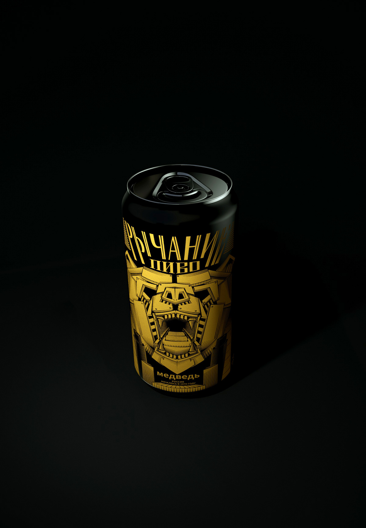
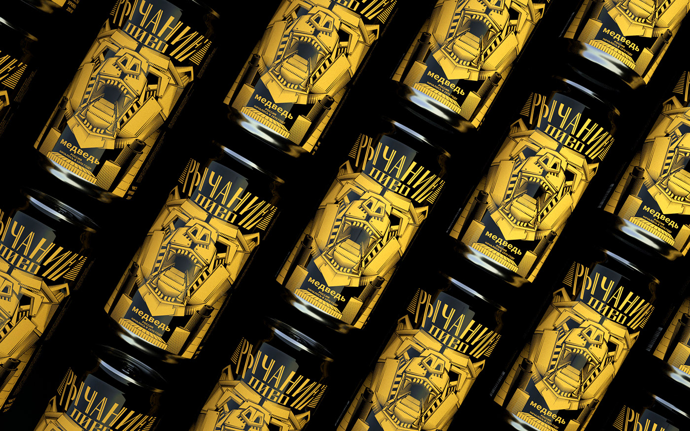
Beer can design with geometric vector illustration and a very powerful result.
Where you can use it
- Packaging
- Posters
- Websites
Tips for using it
- Combine freehand elements with shape-based ones.
- Remember there are no bad drawings — everyone has their own style.
- If you work freehand you’ll need to vectorise your drawings to work with them digitally.
7. Geometric shapes
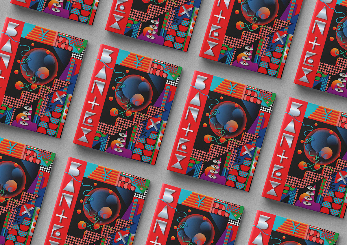
My final graphic design trend for 2020 is the use of geometric elements in design.
Graphic design projects using this trend
Poster designs by Quim Marin
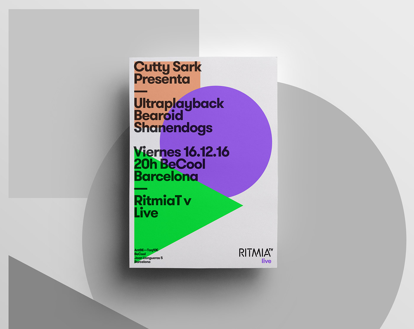
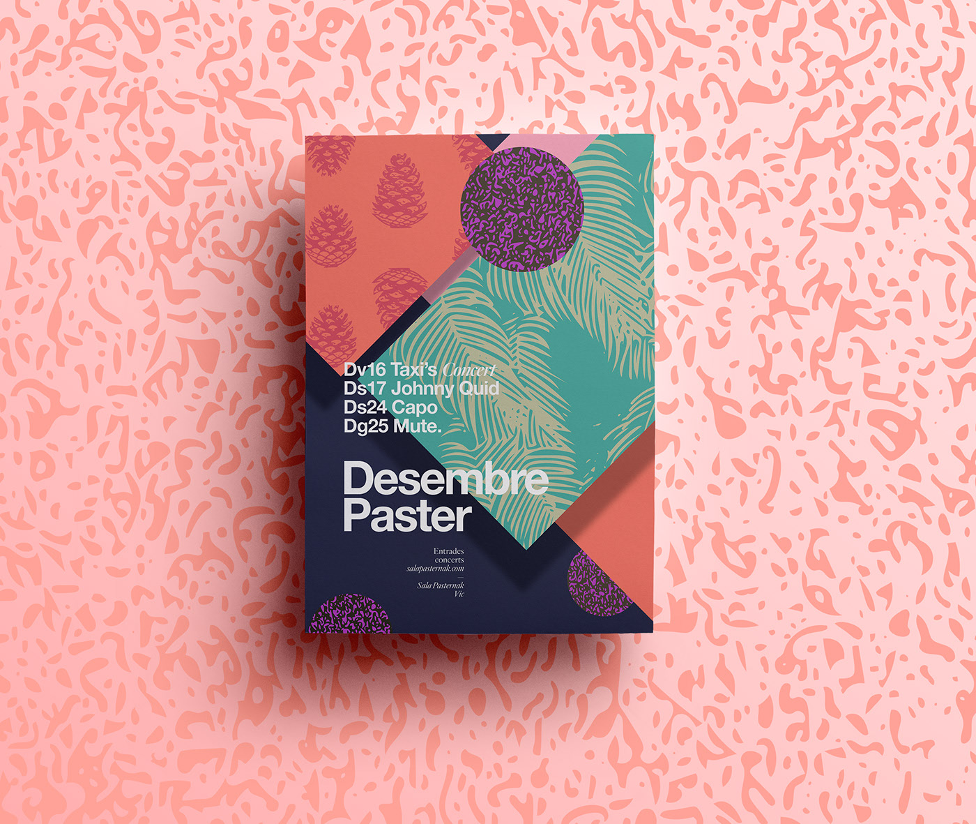
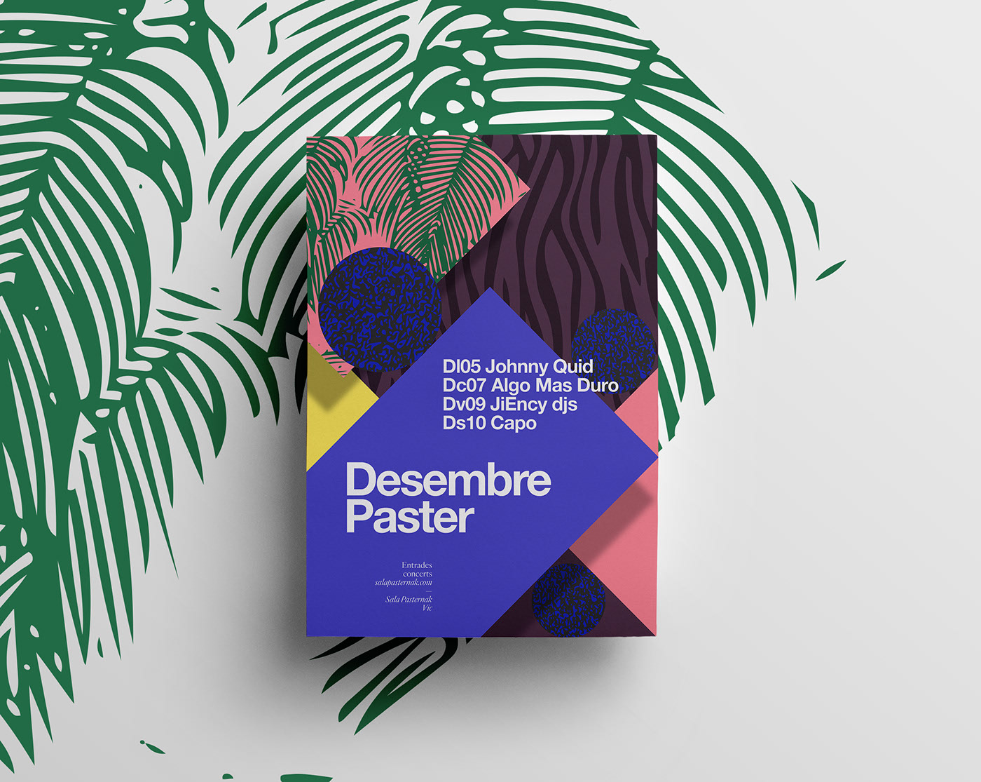
Poster design with eye-catching colours and geometric shapes.
Skap by Katarina Fegraeus
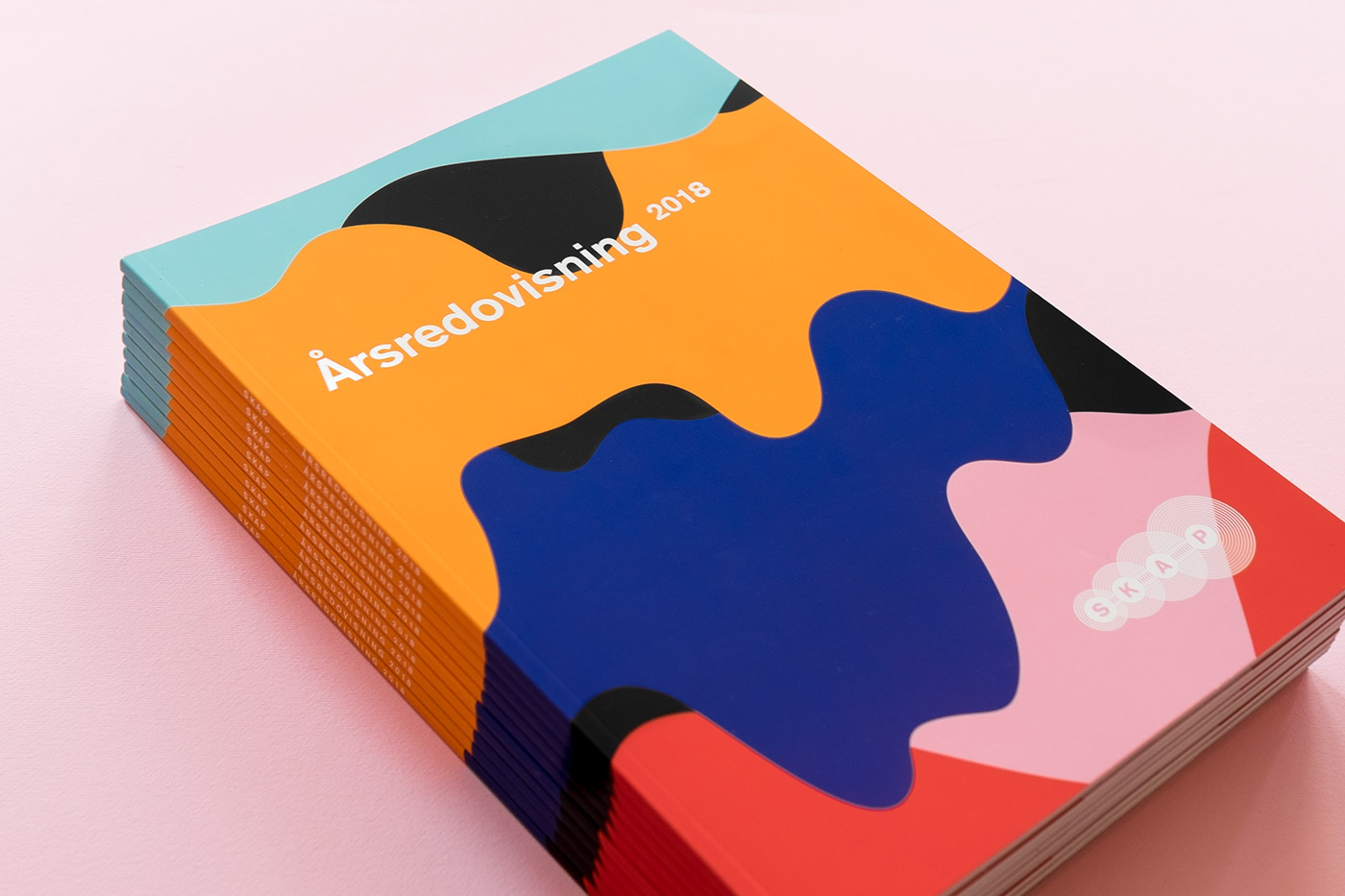
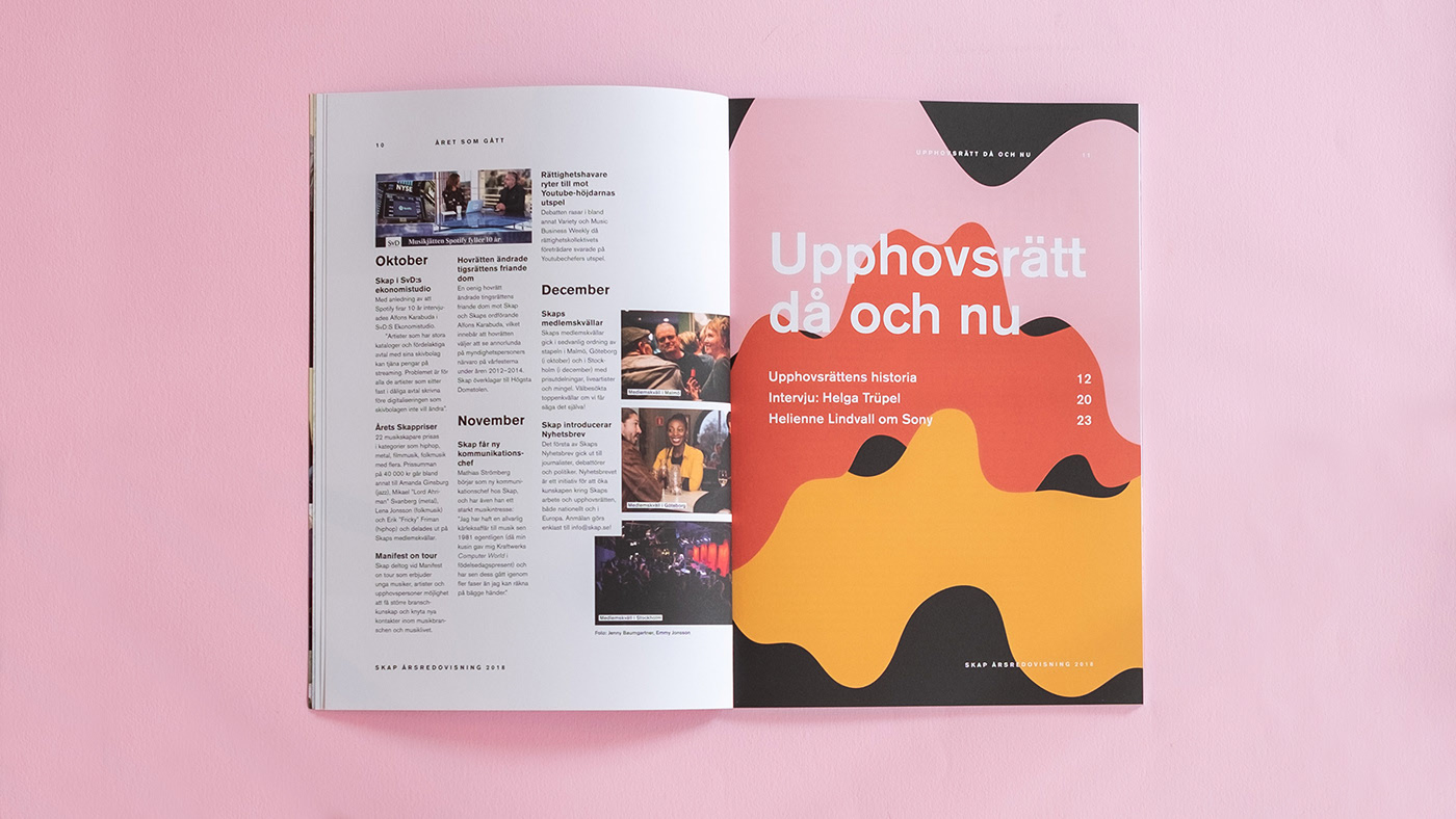
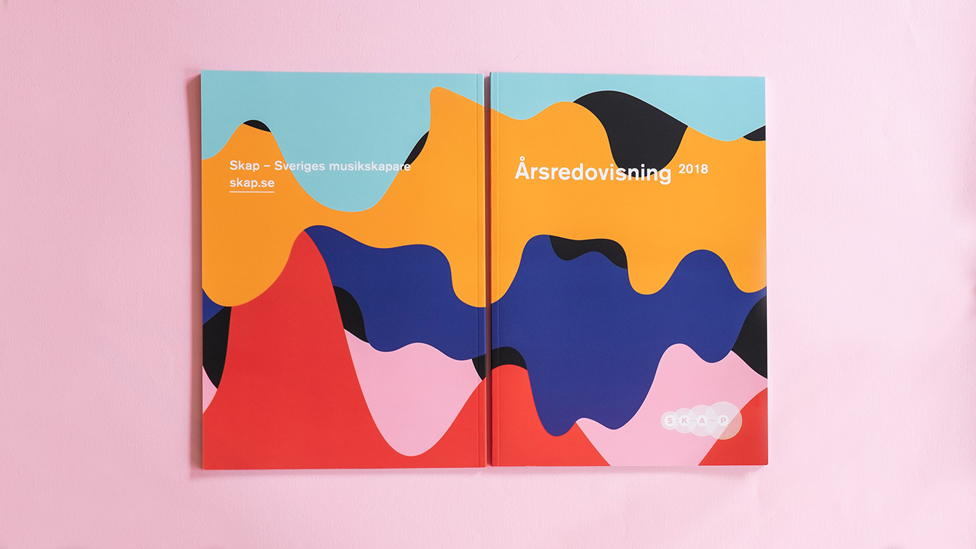
Editorial work with irregular vector geometric devices and a very personal result.
Bantex by Parmuditho Wahyudhana
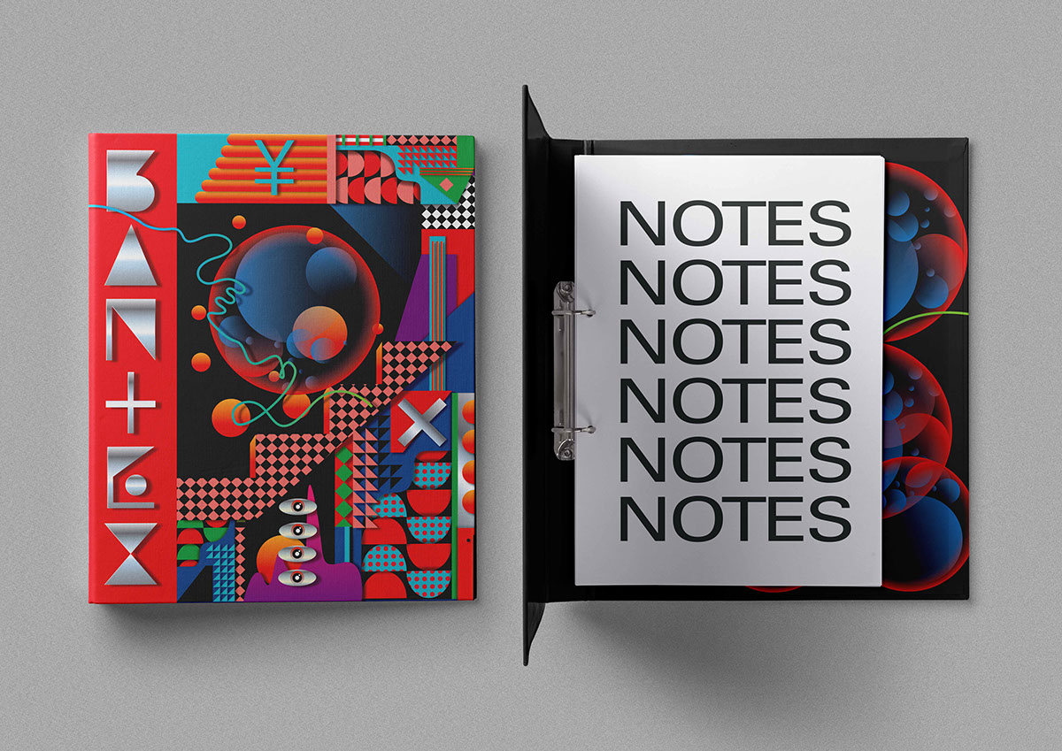
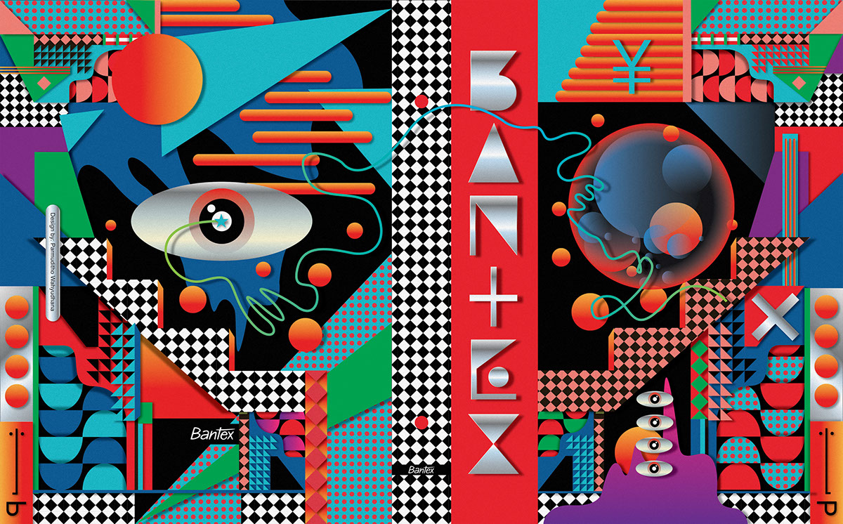
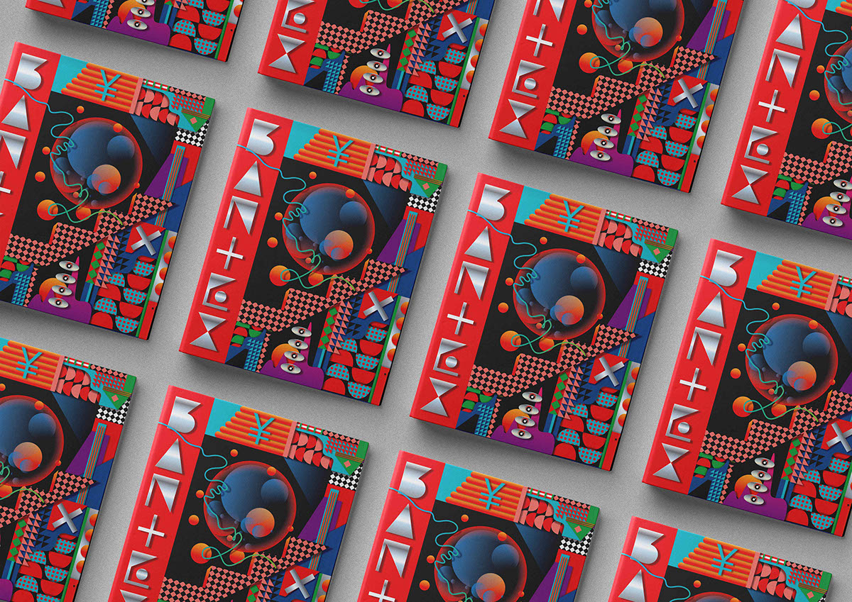
A highly daring editorial project using geometry as its graphic device.
Where you can use it
- Posters
- Websites
- Catalogues
- Corporate identities
- Business cards
- Envelopes
- Corporate documents
- Folders
Tips for using it
- Play with the aesthetics and build eye-catching creative sets.
- Watch the colour range.
- Combine this trend with others from this list.
- You can use gradients in your shapes to give your work volume.
- It can also be used in 3D.
Summary for slackers
- Chrome, retro, 80’s look, neon colour
- Contrasting print textures
- 3D objects and glossy colours
- Backgrounds built on semi-realistic textures
- Grunge & Glitch
- Handmade and vector illustration
- Geometric shapes
Note: this article is based on the list of graphic design trends Code Barcelona publishes each year.
Related work
If you are looking to apply any of this to a specific brand: