Some designs catch your eye and stay with you because there is an idea behind them. The best graphic designs in this selection for 2027 belong to that family: lettering that takes over the page, brands that get along with their packaging, illustrations with something to say and posters that can hold their own on a wall full of posters. The visual tour is back. And it has brought plenty of material.
This series has always mixed disciplines. The best graphic designs of 2020 and 2021 brought campaigns, packaging and theatre together. The previous collection made room for experiments with images, objects and formats. I am returning to that curiosity with ten Behance projects, chosen for decisions worth studying and for how they look when the logo leaves its white background.
2027 identifies the edition of this collection, intended to inspire new projects. The work was published in 2025 and 2026; the credits distinguish that date from the year of creation where the authors provide it. The selection and order are mine. Some projects are restrained, while others put their foot firmly on the accelerator. I want the tour to help you examine their decisions and find a useful question for your own brand.
1 Designfully gives its cover real presence
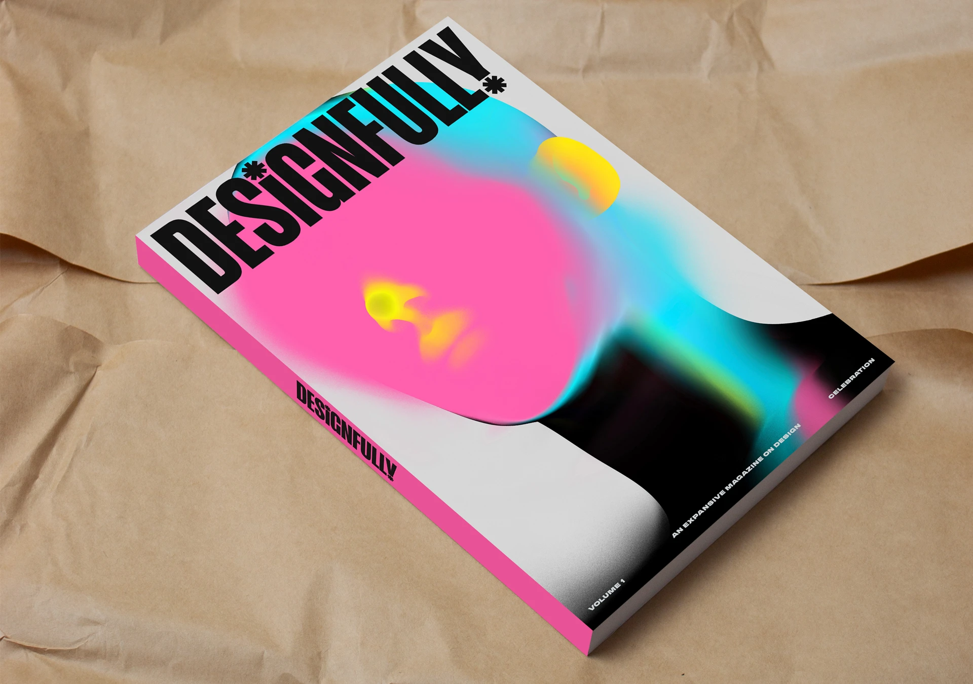
The header image belongs to Designfully, with a cover by Marta Cerdà Alimbau and art direction by Mary Hemingway. Published in September 2026, the project presents the first issue of a magazine dedicated to making underrepresented creatives in the industry more visible and inspiring new generations. The cover has a presence that does not ask permission to take up space.
Designfully. Marta Cerdà Alimbau; art direction by Mary Hemingway. Published on 15 September 2026. Project and credits on Behance.
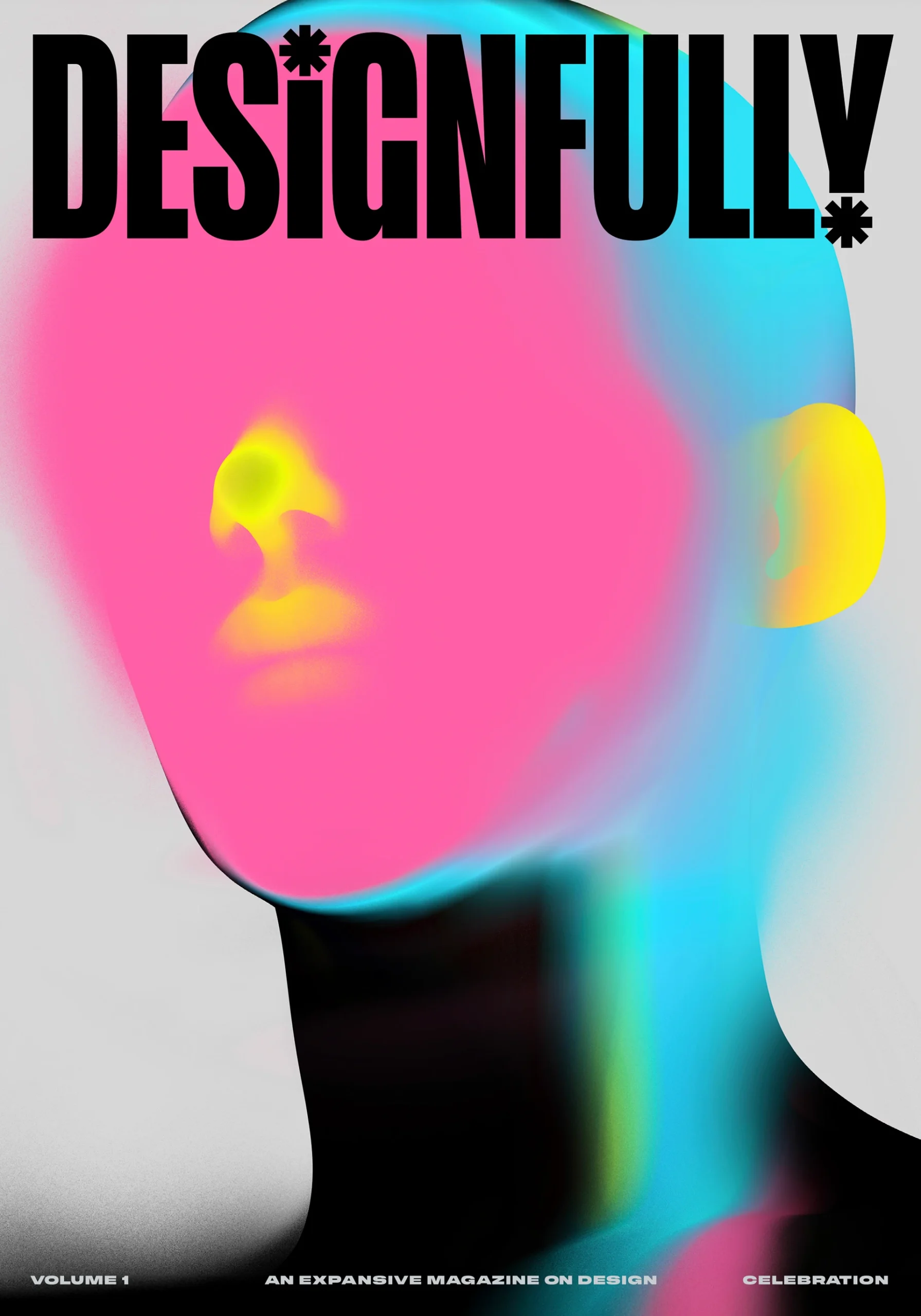
A face emerges through intense colours, blurred areas and contrasts with black. The large pink circle occupies much of the face; blues, greens and yellows make the figure shift between portrait and abstract image. The masthead uses tall, compact letters that hold the composition together without needing an assortment of extra effects.
I like the way the different degrees of precision work. The title reads forcefully, while the image invites a more open interpretation. There is tension between recognising a person and following the graphic treatment. The magazine’s name has enough weight to coexist with that image, and the small texts find a scale of their own along the bottom edge.
For a cover of my own, I would start by studying that distribution: a clearly defined masthead, an image that leaves room for mystery and three small texts at the foot. The intensity is concentrated in the face; everything else provides a structure. Print a proof at the magazine’s actual size and view it beside other publications. Then look at the thumbnail in an online shop. Those are two different encounters with the same cover, and both deserve to be designed for.
2 Tulipo Nero mixes character photography and materials
Tulipo Nero brings identity, photography and applications together in a delicious mix of black, red, white and silver materials. The presentation by F61 Agency and its team, published in March 2026, has a very specific attitude. An accessories brand can build a world around its objects without turning every piece into an entirely different scene.
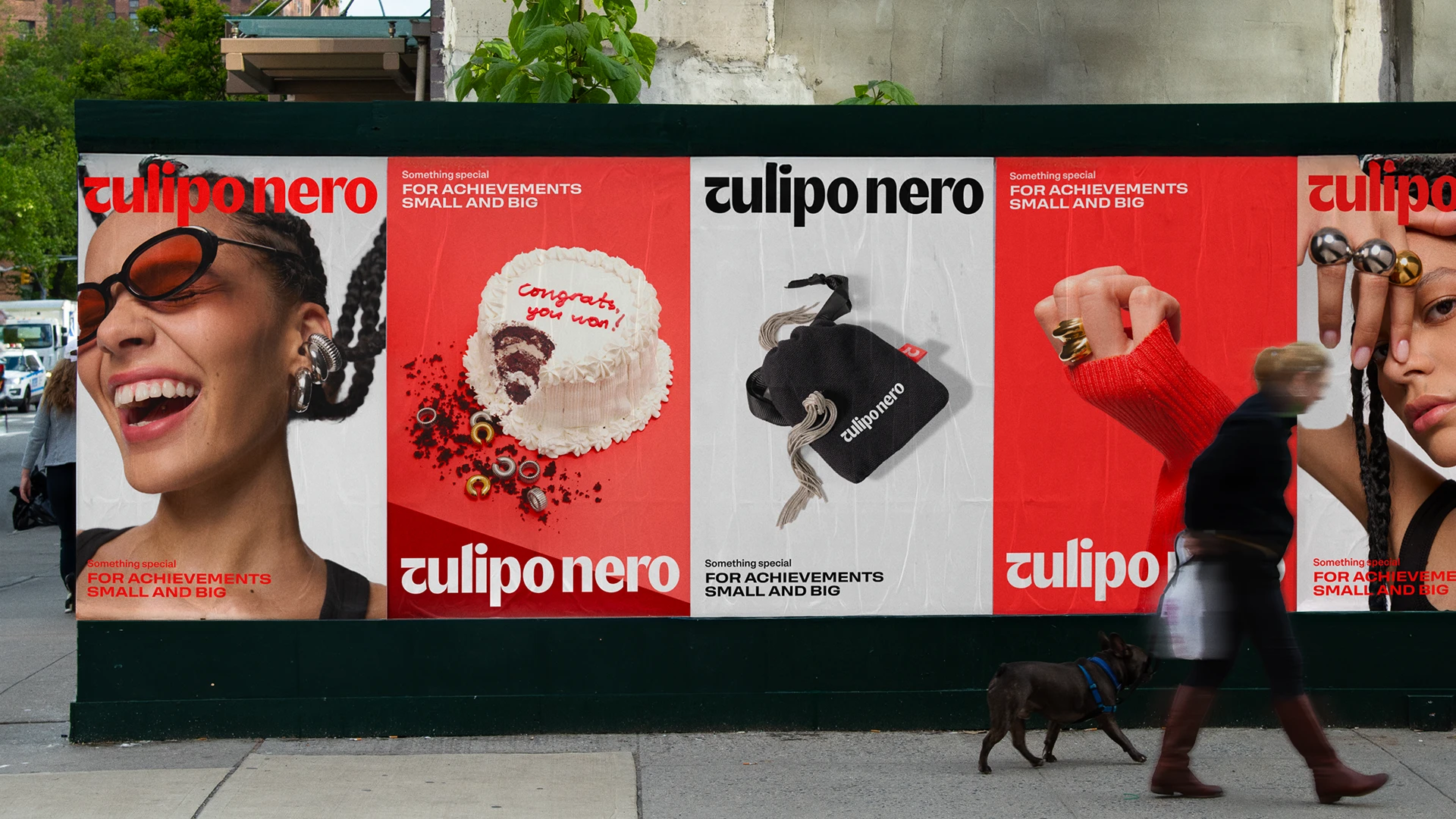
The posters alternate faces, products and a cake in a sequence where the name supplies continuity. Gestures and close-ups give the photography character; red moves from background to detail, then from detail to packaging tape. That circulation of colour lets you recognise the family without covering every surface in the same amount of ink.
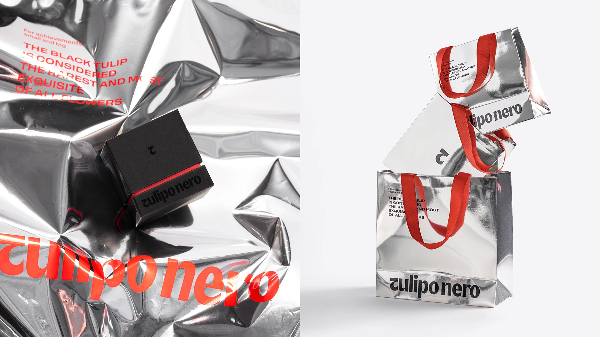
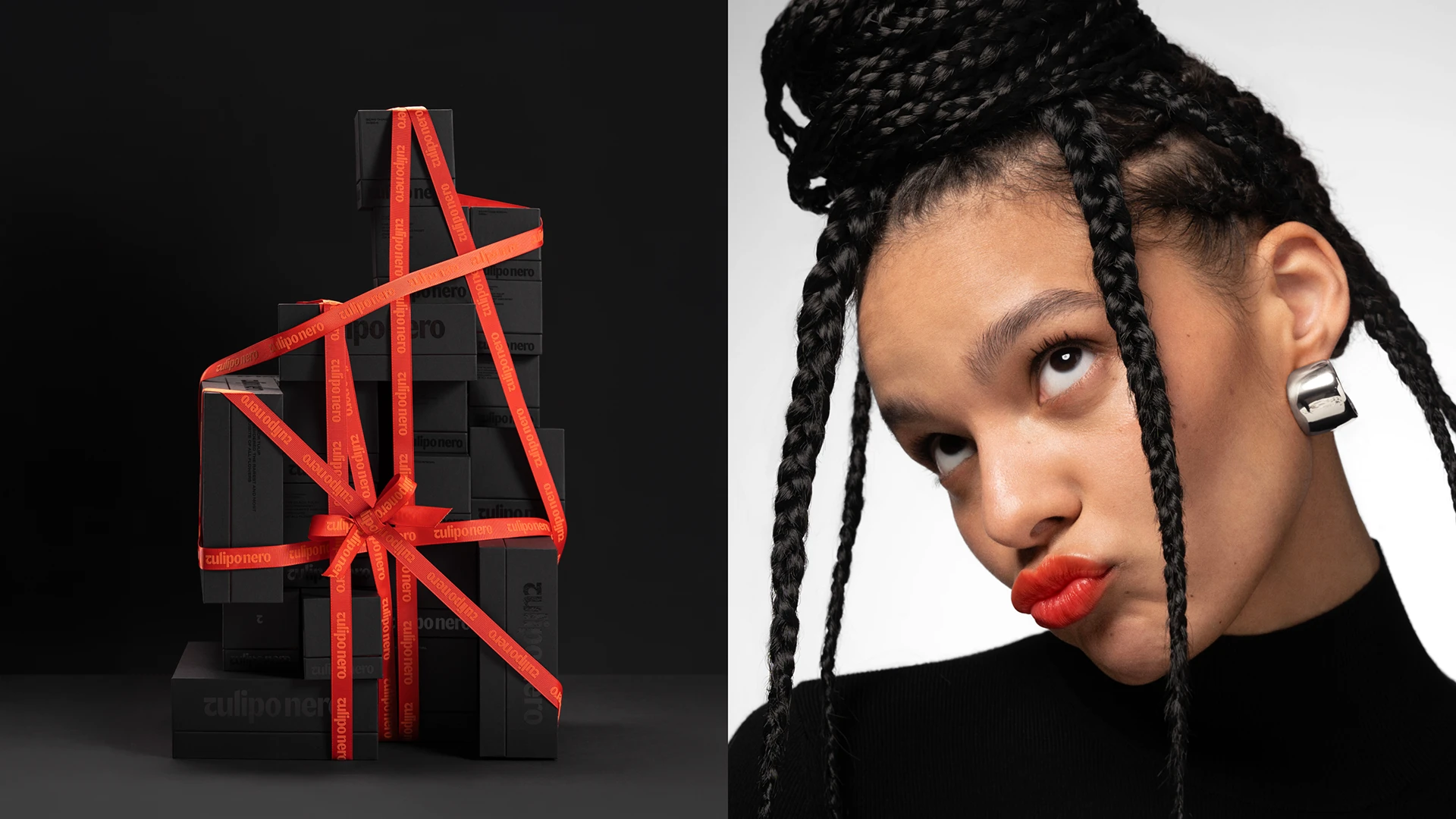
The silver material responds differently to light. On the bags, the name interacts with folds and reflections; on the black box, red tape draws another composition. It is a good reminder that identity is also designed on materials, and those materials will change how the brand looks.
The detail I would take away is the red tape: it can become a small thread connecting photography, packaging and delivery. The silver surface adds reflections, while the black box introduces another pause. For an accessories brand, I would test that relationship with the real product, a piece without a product and the parcel the customer receives. The system starts to have scope when we know which element supplies continuity at each of those moments.
3 Haze gives a lively mix a common identity
Haze Crepes & Smashs starts from a recognisable problem: two trailers and an offering of crepes, burgers and ice cream need a shared presence. In 2026, Henrique Regonato presents an identity that makes this mix its premise and gives it the tools to communicate. The whole thing looks ready to hit the street, get a burger wrapper greasy and keep working afterwards.
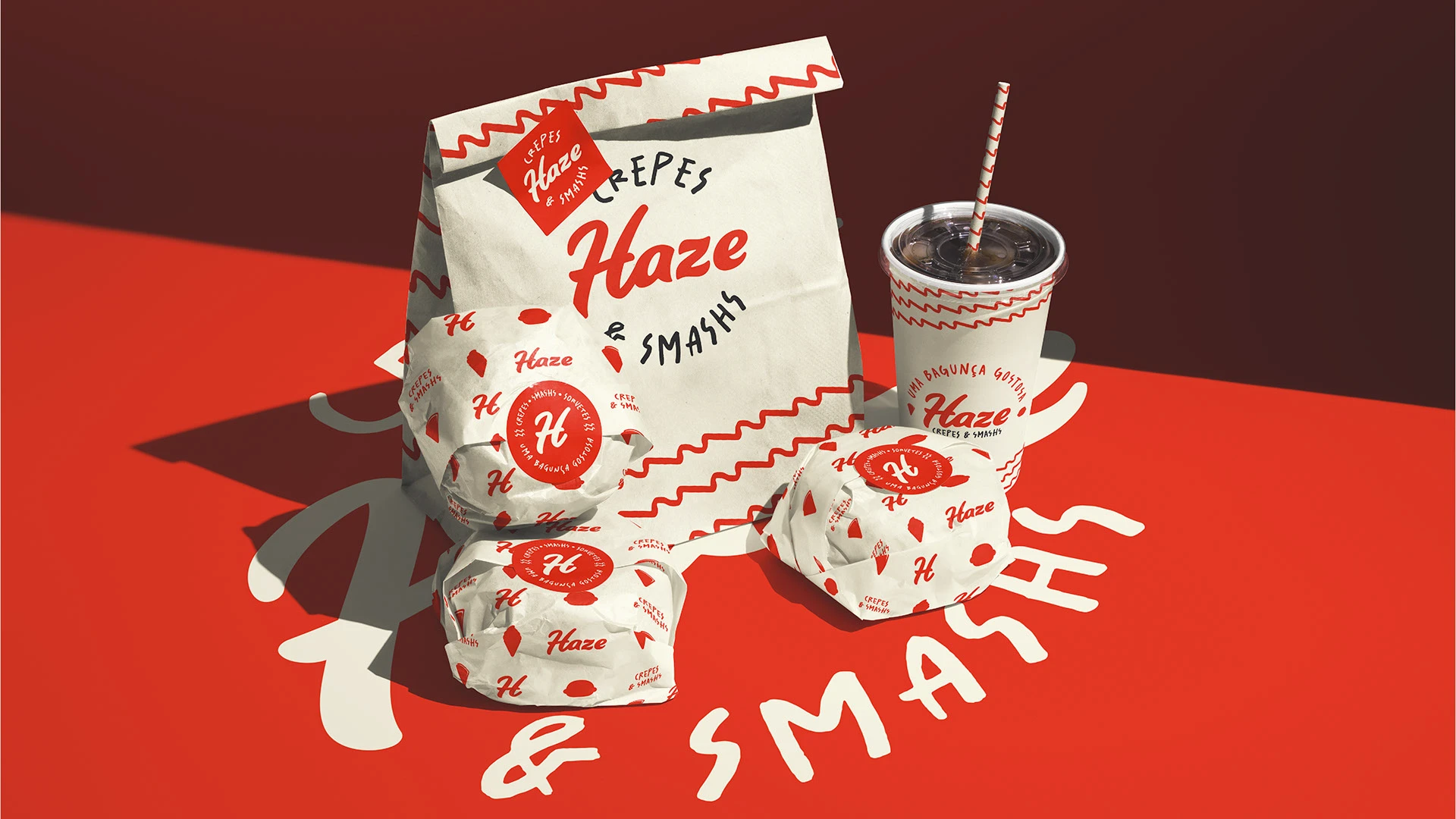
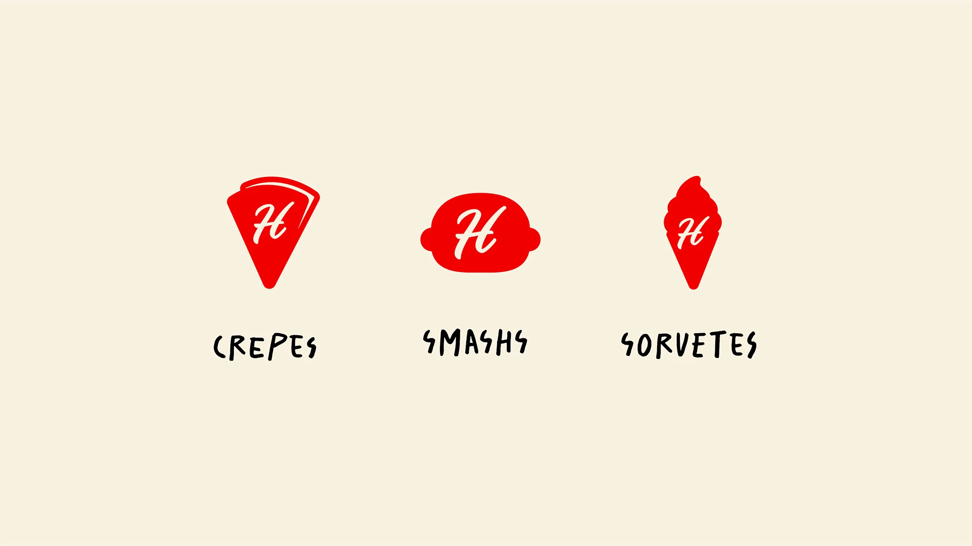
Red, black and a cream background create a readily distinguishable foundation. The name uses expressive lettering, while the surrounding texts allow some irregularity. Shapes represent the product families, with an initial that can live inside them. The design has versions for explaining things and versions for quick recognition.
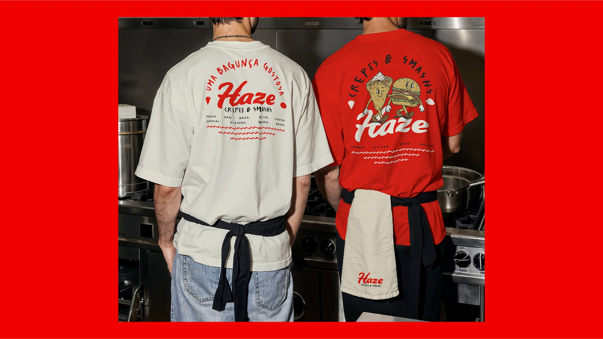
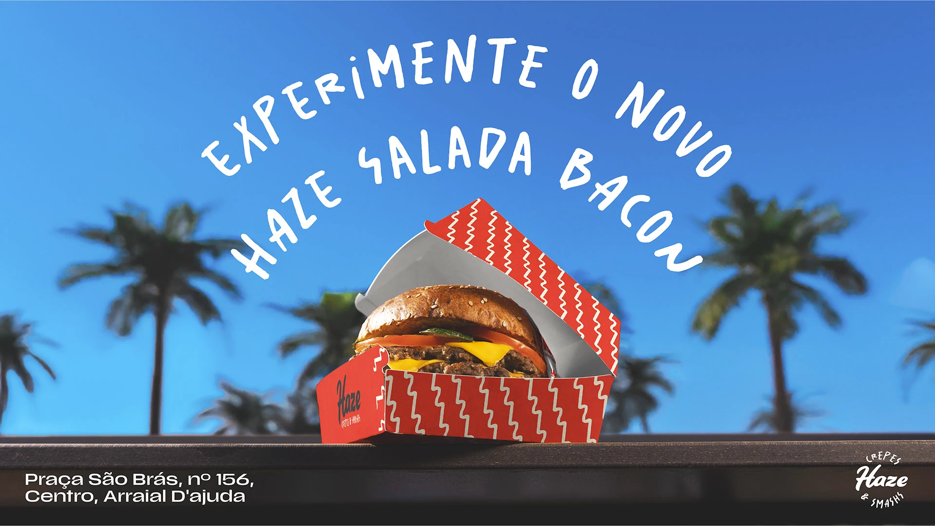
In the advertising application, the burger takes centre stage and the headline curves above it. Patterns and small symbols can change scale, accompany a container or add detail to a garment. I am interested in the different ways of saying “Haze” without always placing the full signature at the same size.
For a food business, this case opens up a discussion about everyday design use. Categories need explaining, a point of sale needs identifying and frequently updated pieces need producing. An identity with several resources can make that variety easier. My test would be to remove the logo from one application and see which elements still provide continuity: colour, drawing, lettering and composition. If several remain, the project has a much more interesting conversation ahead than “let’s make the logo a bit bigger”.
4 Figlio builds its own little empire
Figlio, an ice cream shop in Tandil, takes its Italian origins into a world of inscriptions, columns, stone and small emblems. Ufficio Studio develops the identity within Foguel Studio’s spatial concept. The project dates to 2024–2025 and was published on Behance in March 2026. It has an ambition that is a pleasure to look at: letting the brand and the place tell the same story.
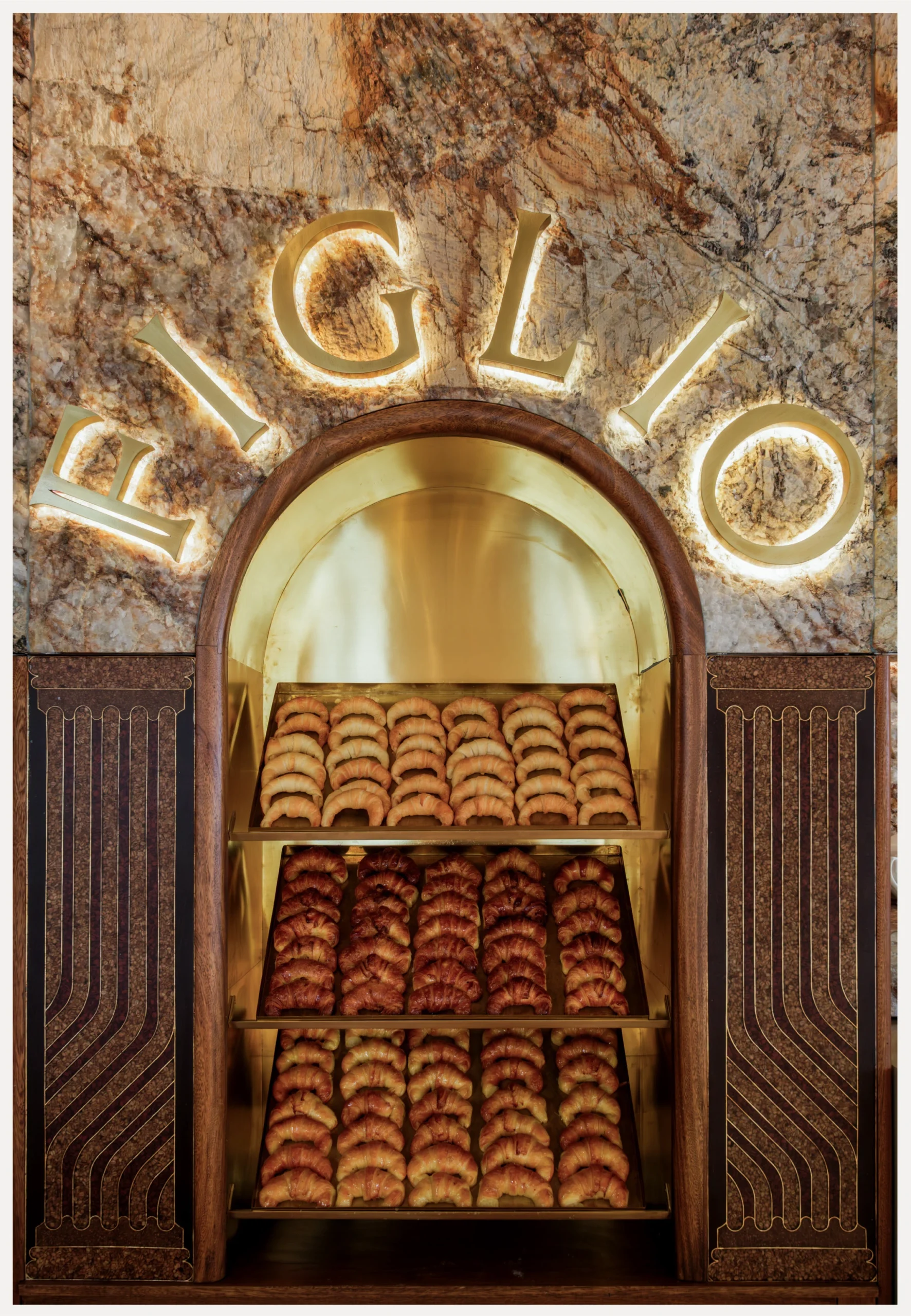
The main typeface is Louize Display, chosen for its kinship with Roman inscriptions. The logo’s F picks up the column, and the compositions build text blocks with the same intention. The lovely part happens beyond the screen: the letters acquire volume, meet marble and bronze and become part of the space. The historical reference turns into material the business can use.
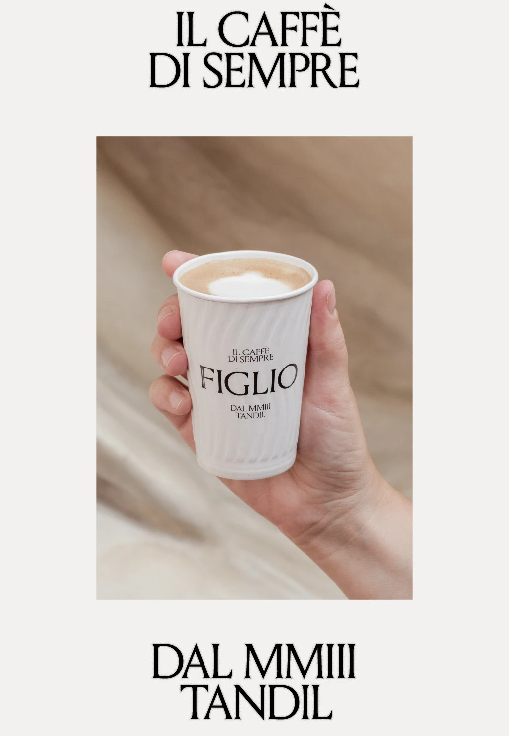
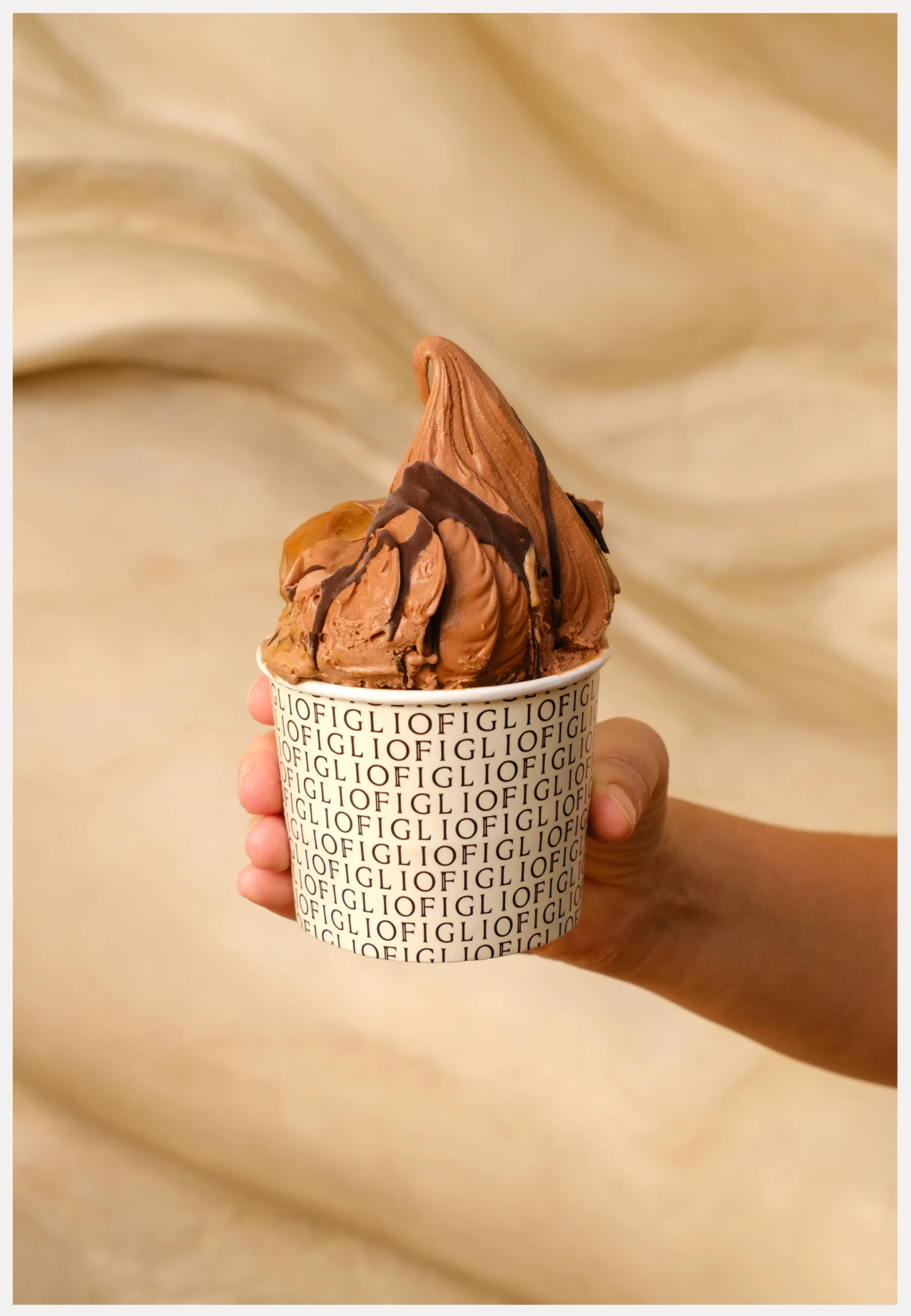
Then comes the small scale: a cup, a bag, a box and a coin. The repertoire adapts to each surface. The ice cream cup repeats the name; the coffee uses a more restrained signature; the coin introduces a two-sided symbol. Detail has a role here because it belongs to a shared story.
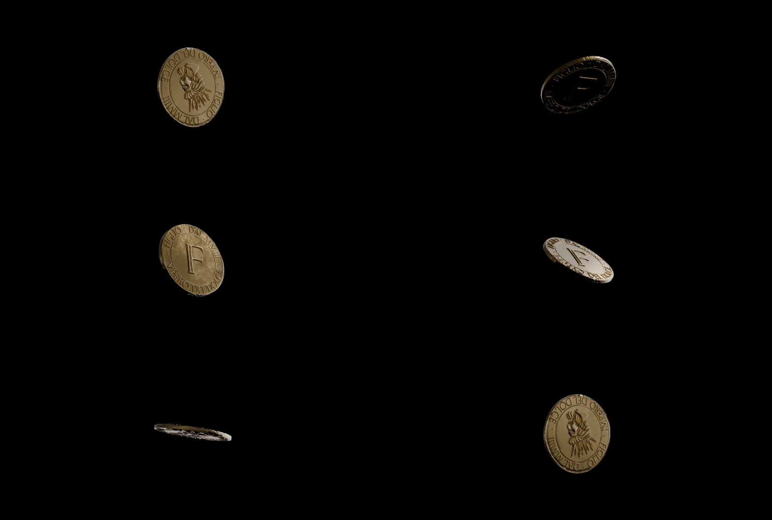
The verbal concept Impero del Dolce finishes connecting that repertoire. Lettering, a coin, containers and signage inhabit the same little world. For another ice cream shop, I would first look for the story that deserves to occupy the place, alongside its products and materials. Then I would test the name on the facade, the flavours on the menu and the cup that goes out into the street. Figlio is interesting for how far it takes one specific idea. Copying a column would leave you with the scenery.
5 PosterLad puts geometry to work
The PosterLad series for 2026, by Vratislav Pecka, is a good excuse to remember how much a composition can do with shapes and letters. The presentation brings together graphic explorations in different registers: volume suggested through colour, repetition, large typographic masses and small elements organised as a vocabulary.
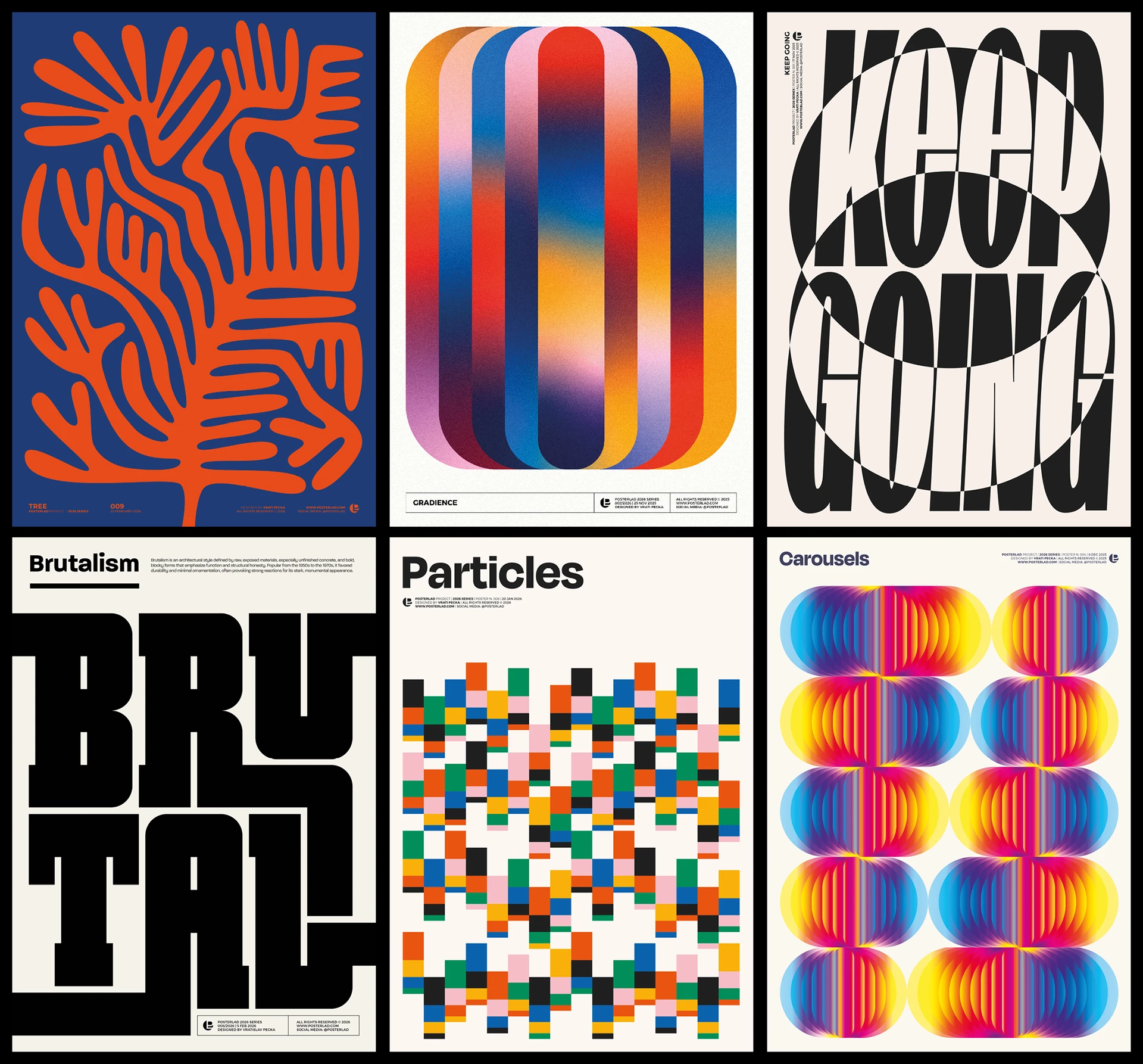
In the piece with black letters, a transformation of the composition makes the text expand and contract. The word fills the format and becomes the main image. In Carousels, repeating a shape and changing its colour suggest movement without the poster having to play an animation.
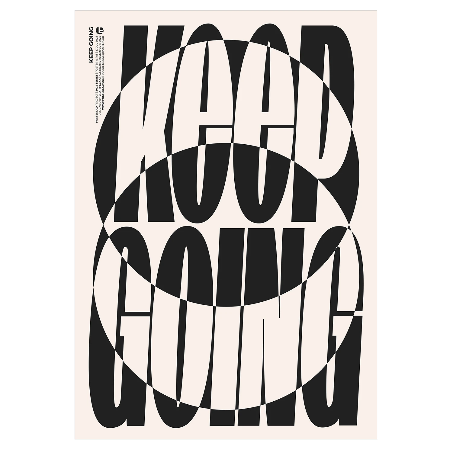
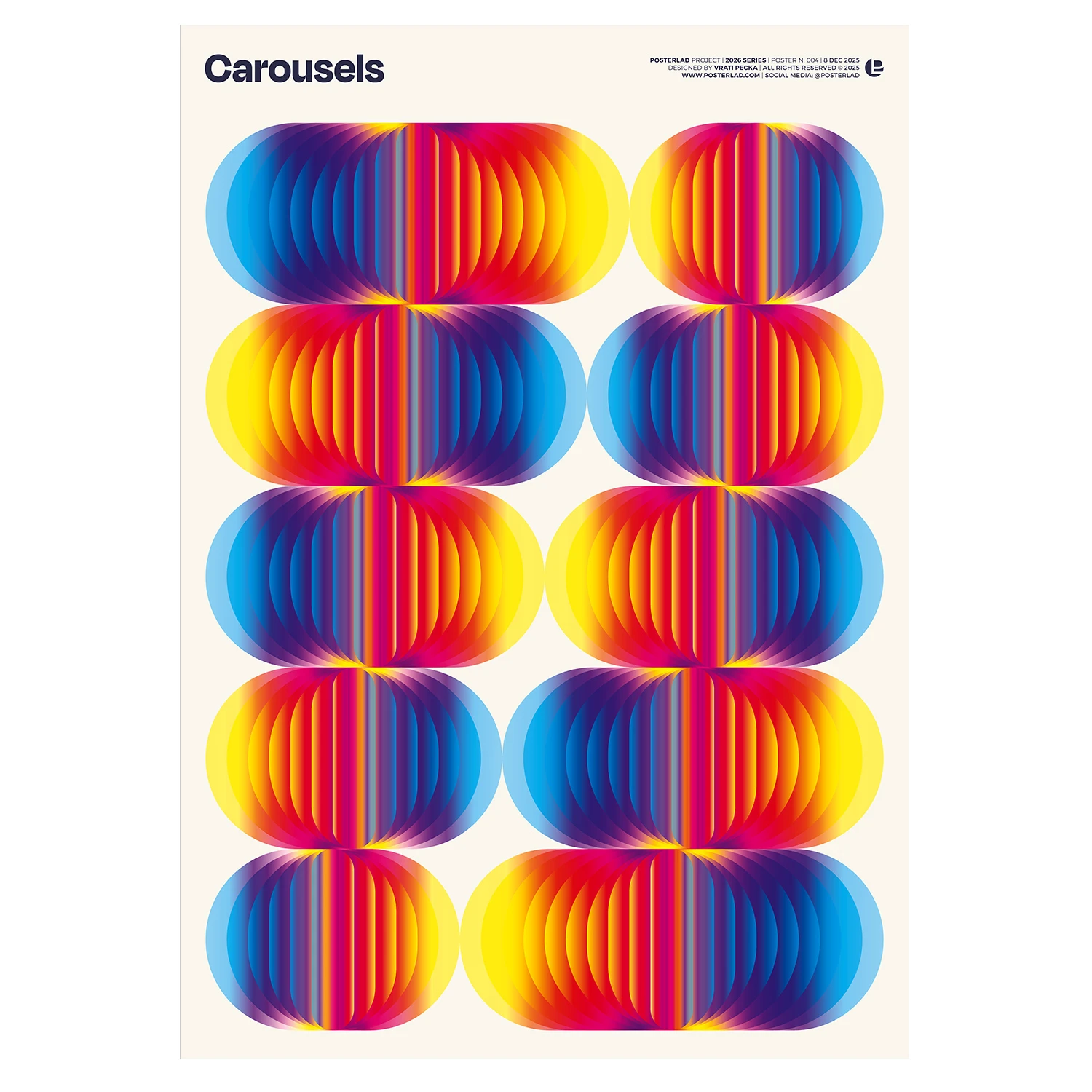
These pieces are presented as graphic artworks and should be viewed in that context. They do not all have to perform the tasks of an information campaign. Their interest also lies in exploration: choosing a rule, stretching it and seeing how far it lets you go. That freedom supplies ideas that can later be adapted to other settings.
For a brand, I would take the discipline of working with a family of shapes and comparing results. Make several compositions with one resource before adding another. Change proportions, density, space and contrast. Personality often emerges when we stop accumulating ingredients and get to know the ones we already have. The geometry here has plenty to say; it does not need a fashionable texture slapped on top so we can hear ourselves think.
6 Neubad Kilbi claims its space on the wall
The Neubad Kilbi 2025 poster, designed by Erich Brechbühl, announces the twelfth anniversary of the cultural use of a former municipal swimming pool in Lucerne. Black and white become a composition of lines that construct letters, changes of direction and apparent depth. It is one of those pieces that asks you to step closer to finish reading what had already caught your attention from a distance.
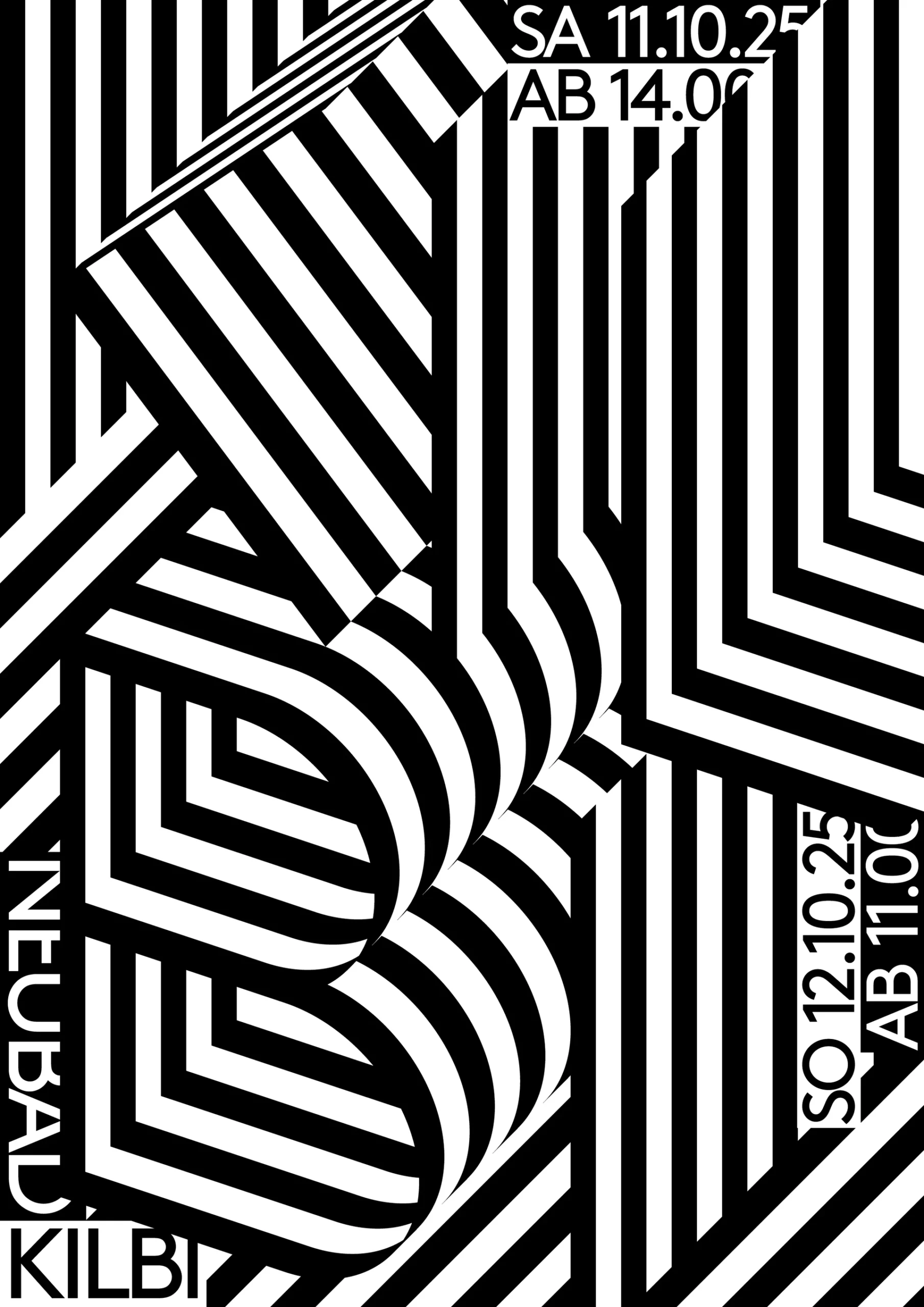
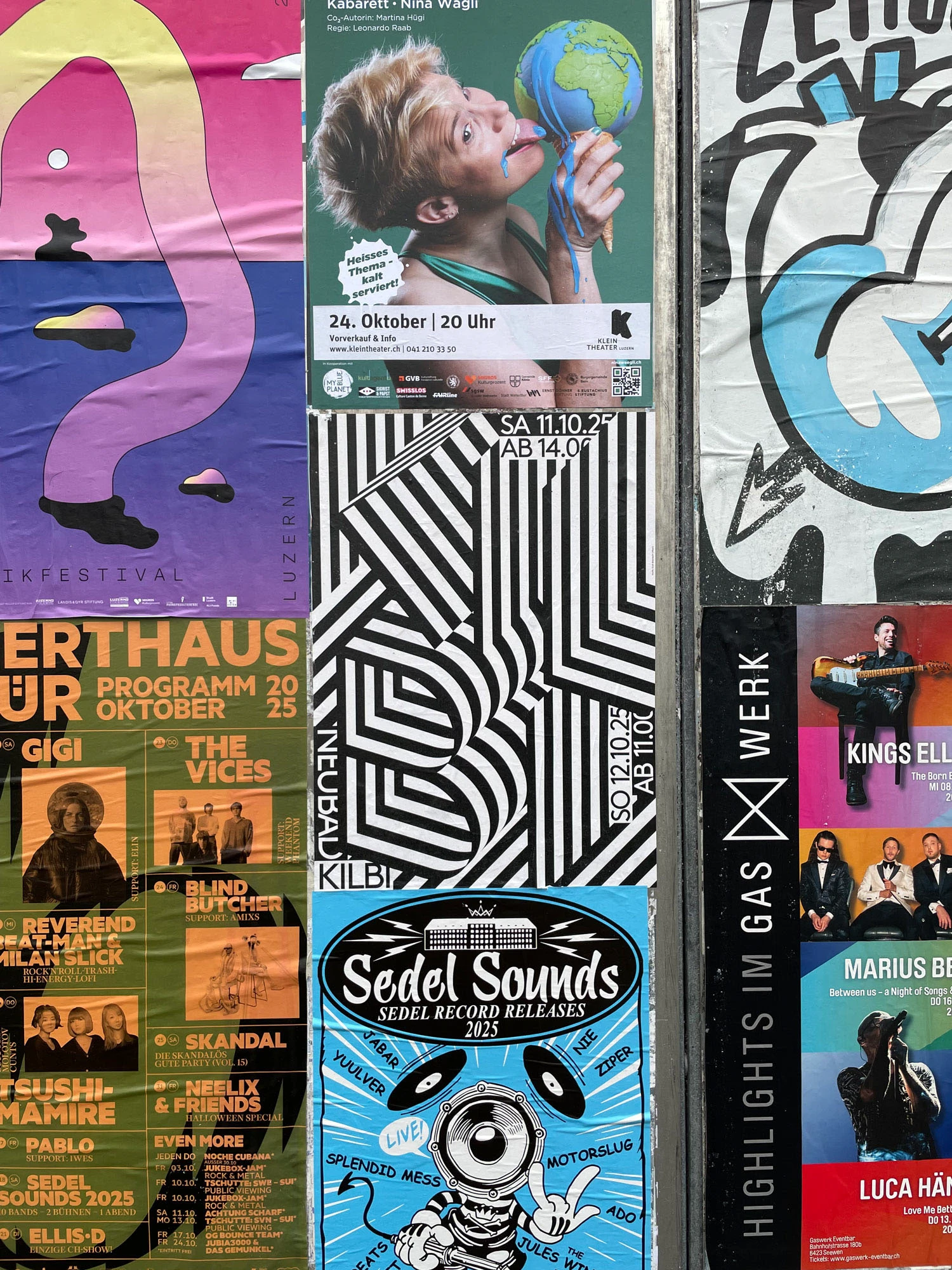
The event details sit in small blocks that interrupt the drawing. The name and the striped structure share the format. Contrast and rhythm provide the visual force, with areas where the lines seem to fold or change plane. The composition does not need colour to make its presence felt.
The photograph of the poster among other pieces adds something an isolated presentation cannot show: visual competition. Sizes, colours, photographs and styles coexist on a wall. This design establishes its own presence through the structure of its image. That is a useful context for assessing a piece people will encounter in the street.
I would use it as a reference for thinking about two reading distances. The first should attract attention and provide a recognisable signal; the second lets people find names, dates and details. Before producing a poster with heavily transformed typography, I would check both. An event needs personality, but it also needs someone to turn up on the right day. That small practical obligation can coexist with very daring design if information has a place of its own.
7 House of Potentia develops a visual world
House of Potentia, by Reliquia Studio, Fiorella Lachimia and Angello Torres, presents a fragrance identity with emblems, illustrations, gradients and a palette combining soft shades with green and earth tones. The source also credits Lucila Taba’s digital illustrations. Published in March 2026, the project shows how a visual language can move from brand to packaging and from packaging to digital communication.
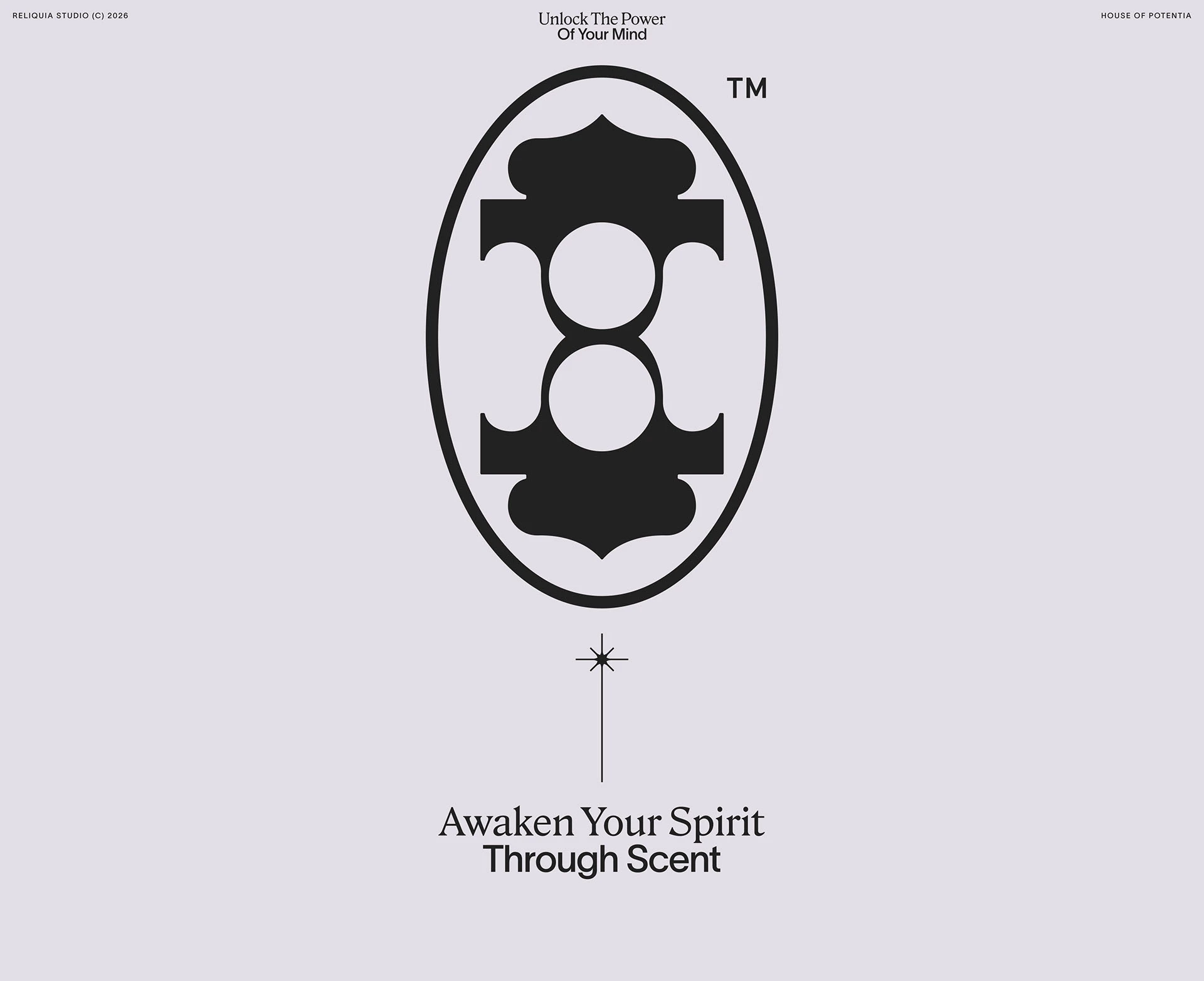
The black emblem has symmetry and an enveloping shape. Around it, serif lettering coexists with more functional typography. That contrast separates the name, messages and small details. Gradients add an atmosphere of their own without forcing the symbol to become complicated.
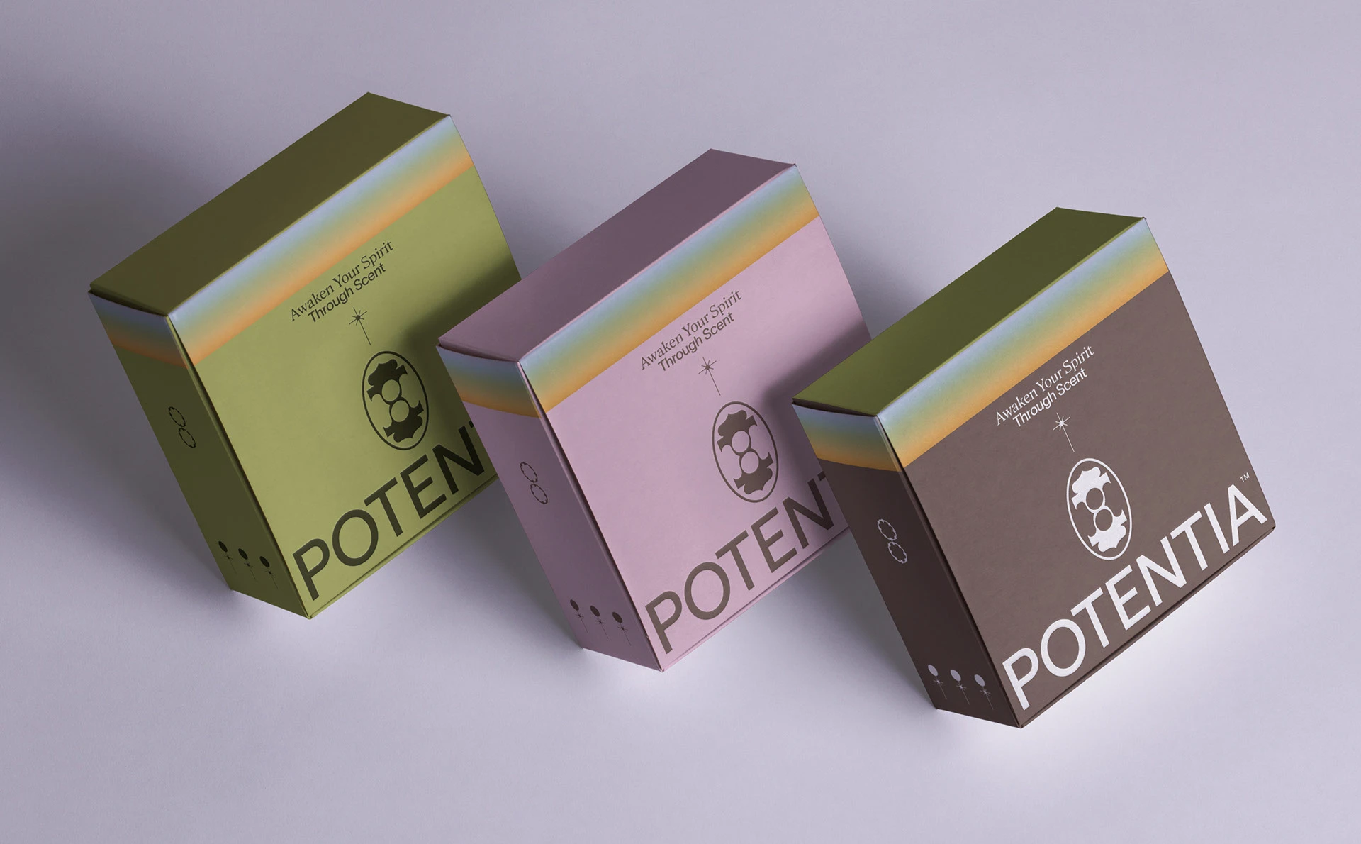
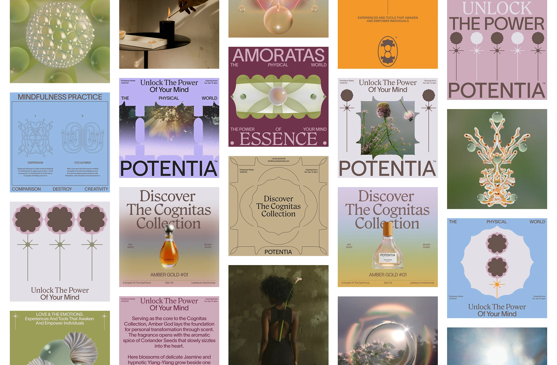
The range of applications particularly interests me. The brand appears on boxes, communication compositions and pieces with product photography. The resources change proportion: sometimes the object leads, sometimes the lettering, sometimes a graphic shape. That flexibility builds a family with several visual voices.
Colour changes across boxes and compositions, while the emblem and lettering retain their family resemblance. In a fragrance collection, that combination can help distinguish products before we read the details. That is the visual entry point we can study here. For a family of my own, I would test the design with every variant together and with just one on screen: each needs character and a clear way of belonging to the whole.
8 Heytea shows how far a good symbol can go
Han Gao presents HEYTEA’s visual update, created in 2025 and published in March 2026. The work covers the symbol, logo, materials and packaging. It enters this selection for a quality that may seem understated among so much colour: the ability of a simple image to sustain many applications.
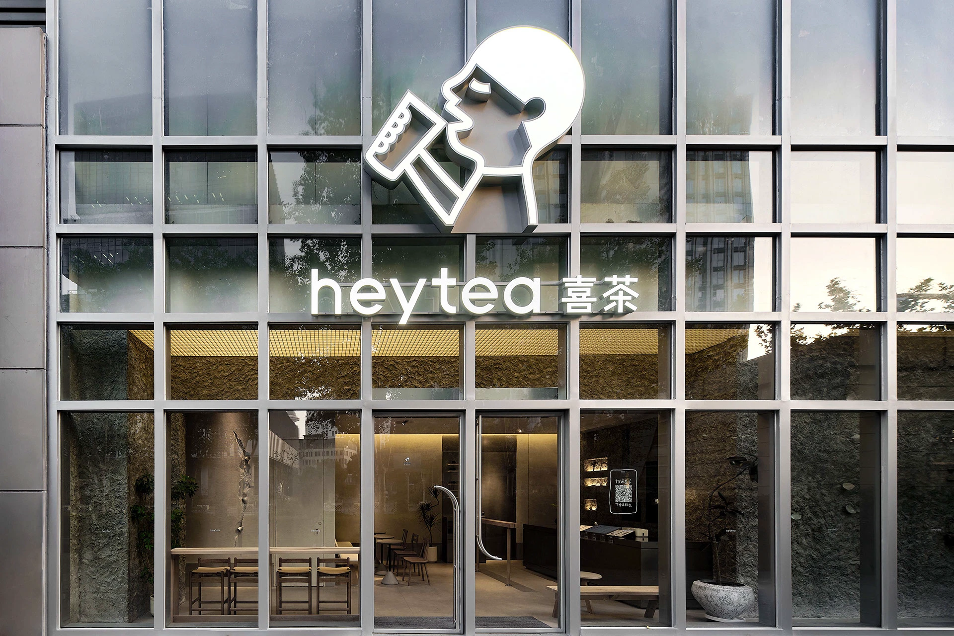
The figure of a person drinking keeps a clear silhouette. In black on white, it can occupy a cup, bag or label with very few additional resources. In a physical space, the same gesture acquires another scale and material. The symbol retains its relationship with the product and is recognisable without needing a particular background.
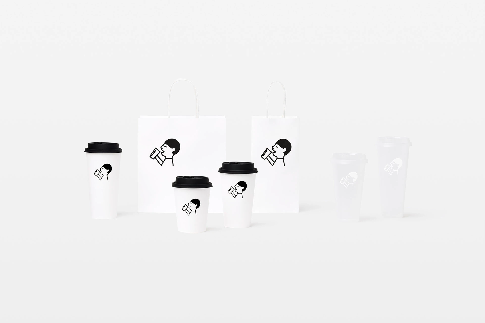
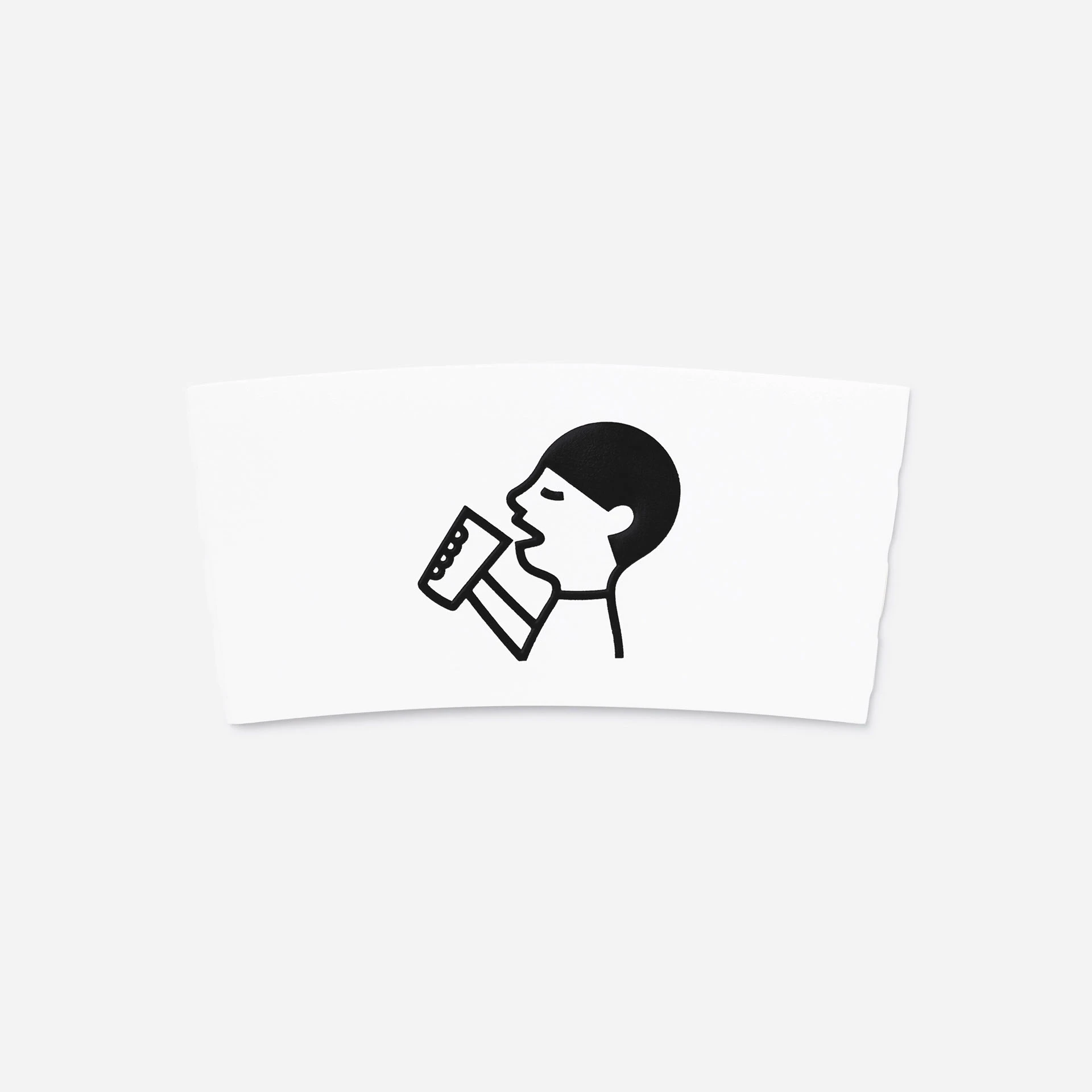
I like the breathing room the system allows. The size of the symbol and its distance from the edges are part of the composition. An entire bag does not need filling to identify the brand. The photograph of the space also shows how the name and figure coexist when windows, reflections and architecture become part of the surface.
It is a good reference for reviewing a symbol that already works. Before redrawing it, collect its uses on a facade, cup, bag and digital avatar. Look at which parts remain recognisable and where details get lost. The HEYTEA figure keeps a specific gesture and allows a substantial change of scale. That is a useful basis for deciding what needs adjusting and what deserves to remain familiar, particularly for a brand with years of accumulated applications.
9 Phá Cỗ Chơi Trăng designs the act of sharing
Phá Cỗ Chơi Trăng, by Ampersand Creative and Amanda Studio, draws on Vietnamese Mid-Autumn Festival traditions. The team led by Nana Nguyễn presents a mooncake box with illustration by Quynhday, patterns and a structure combining a circular container with square inner boxes. Published in September 2026, it offers a thorough example of an idea organising both an object and its graphic language.
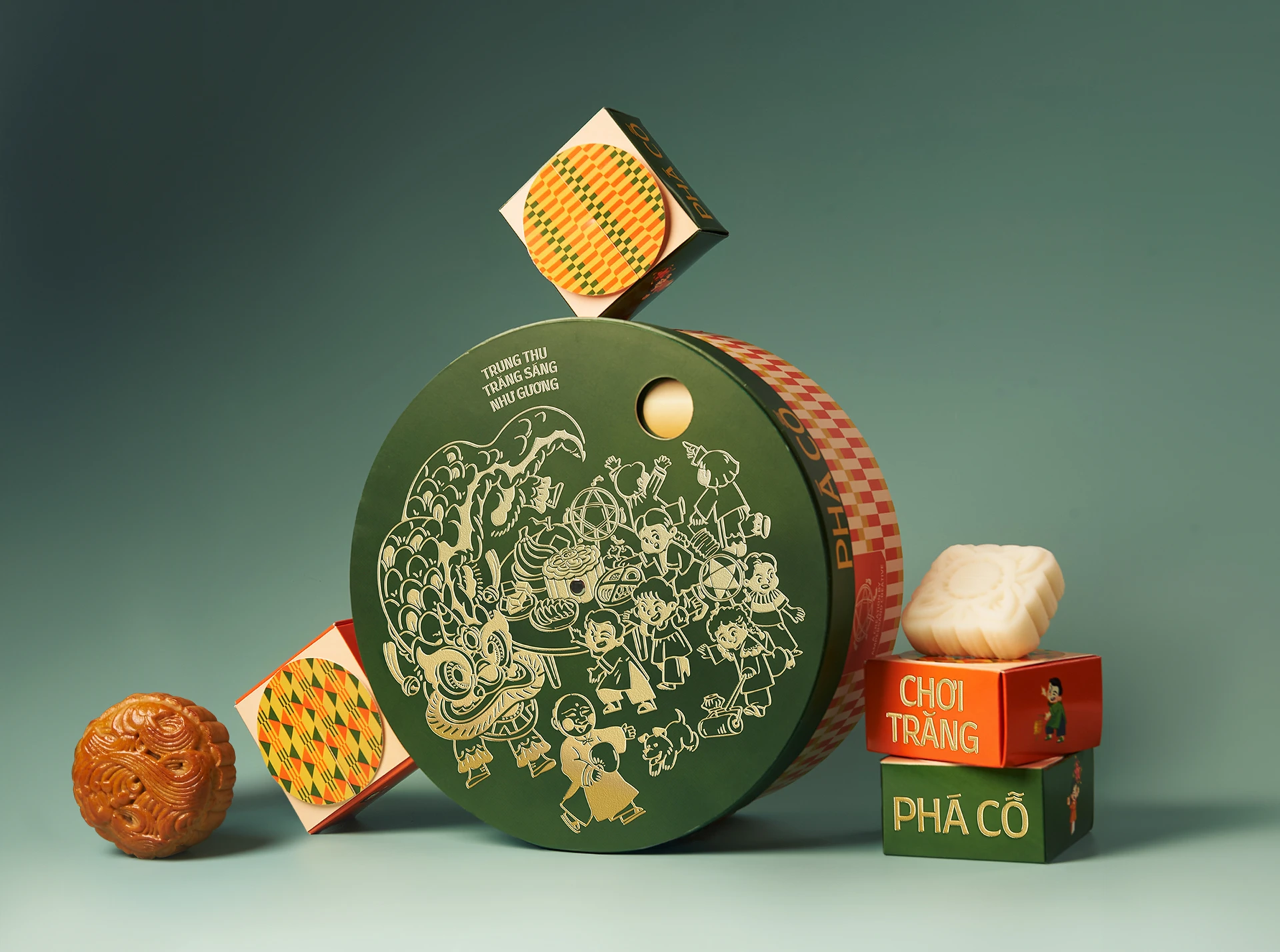
Dark green, orange tones and light details separate the illustration from the pattern. The lid contains a circular scene with characters and festive elements. Repeated shapes create a different rhythm around the box, and the small boxes continue that vocabulary inside the set.
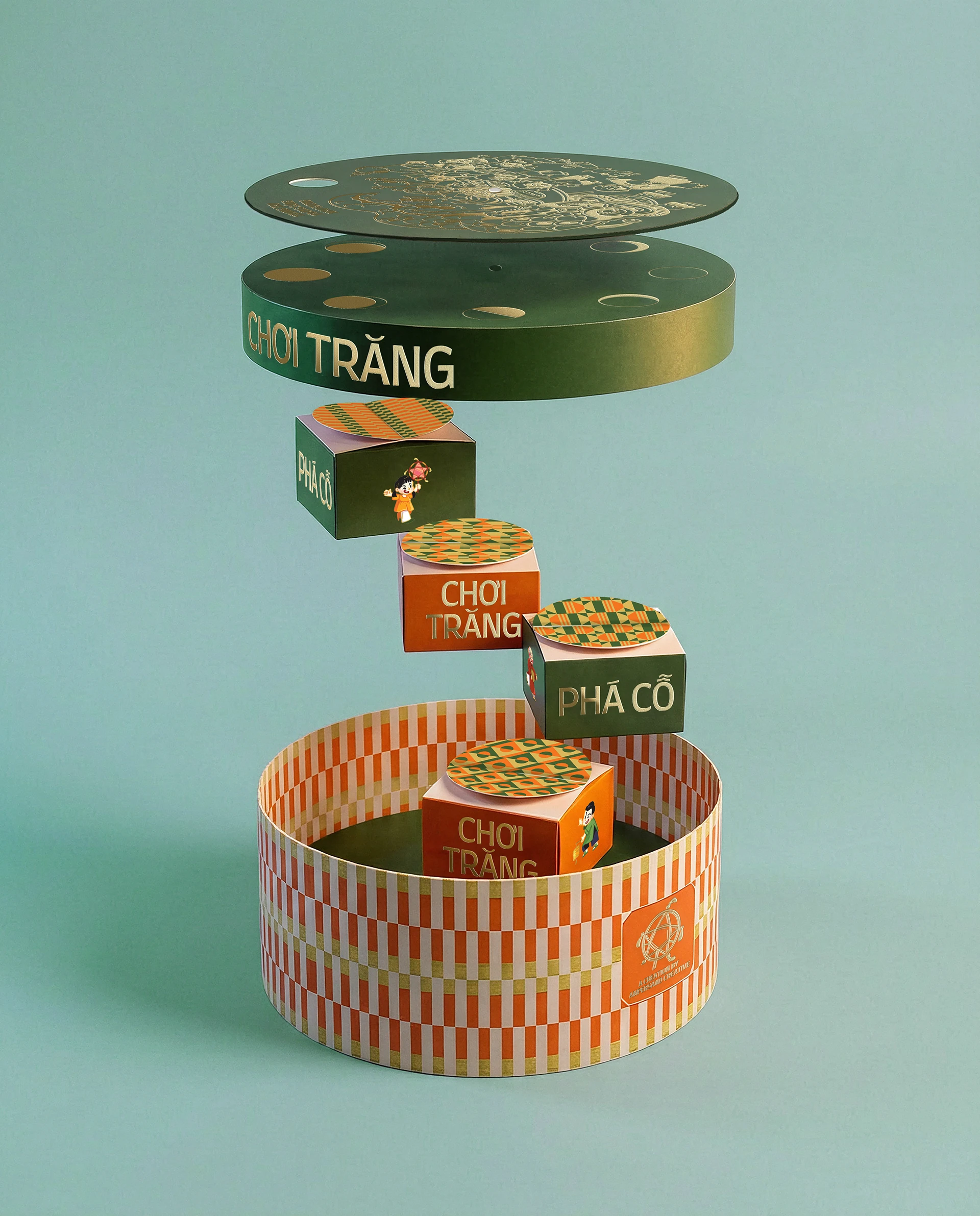
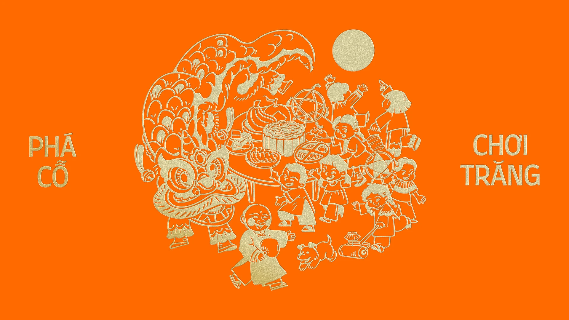
The project also includes a rotating lid connected to the lunar cycle. Opening and handling the box form part of the idea, alongside the individual containers inside. I like the link between the gesture and the celebration that inspires the packaging. Packaging can make us want to touch it before we read the accompanying story; here, the concept finds a place in that interaction.
This is what interests me most for packaging of my own: how it is used, how it opens and what happens when people share it. Design can accompany those actions with structure, colour and drawing. Before commissioning an eye-catching box, I would make a mock-up to check sizes, access and handling. The art direction can then give the experience character. Here, form and graphics have a common premise; both are worth looking at with equal interest.
10 Slanted opens a laboratory for lettering
Experimental Type 4.0, published by Slanted in 2026, brings together new typographic explorations in collaboration with students from Dortmund, under the direction of Lars Harmsen and Andreas Ruhe. The publication presents approaches working with systems, accidents, imprecision and different technologies, including experimental, variable and generative fonts. The book also places that diversity within an editorial structure.
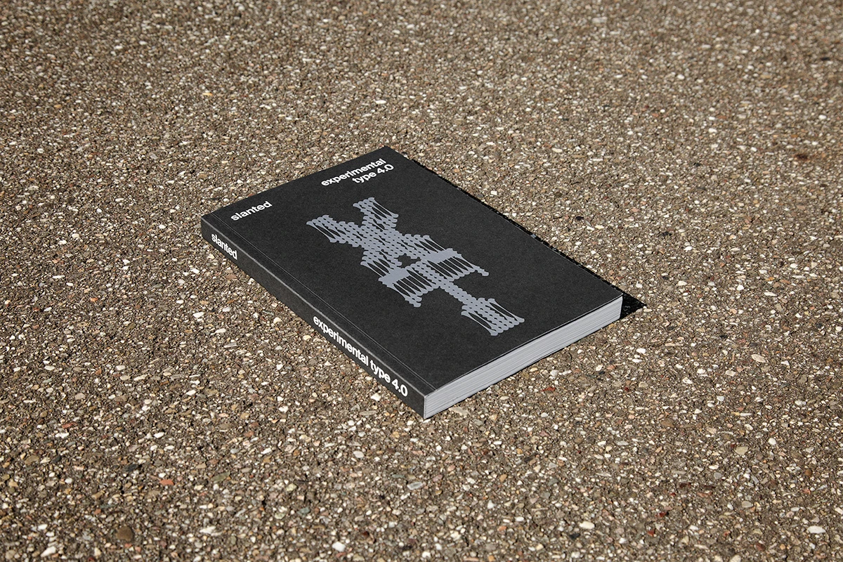
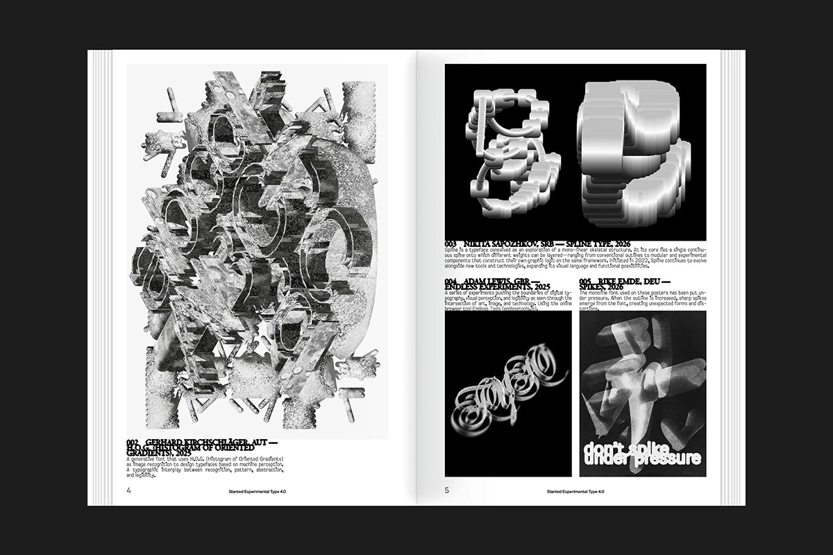
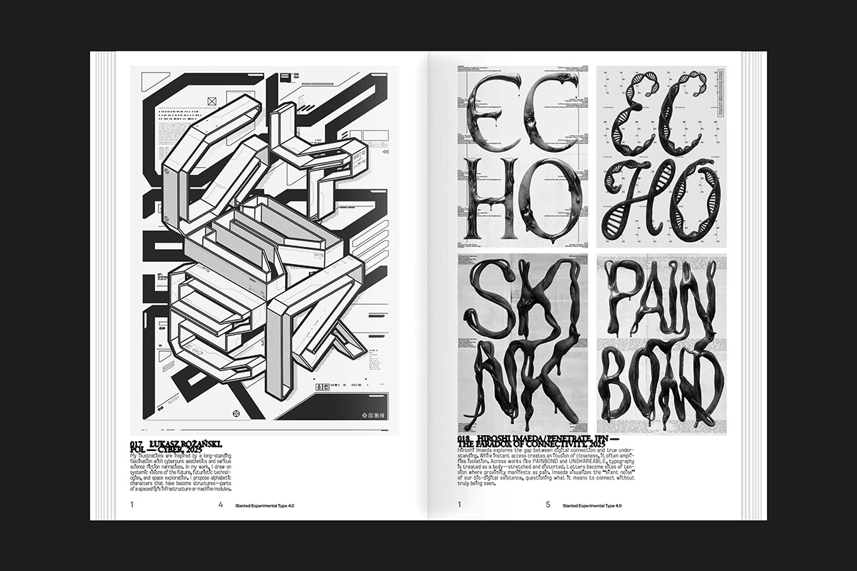
The pages show letters that stack, stretch, acquire volume or approach drawing. Black and white allow structures to be compared with great clarity. Margins and small texts leave reading space around pieces that can be graphically very dense.
It is a good reference for separating experimentation from editing. The typographic piece can take risks; the page has to decide how to show it, accompany it and relate it to others. That second task is editorial design and deserves equal attention. A good collection of images still needs a sequence to become a book people want to consult.
For a business project, I would take the curiosity and the testing method. Not all these letters will work in a paragraph or on a product page. Some could open a campaign, form a title or become an image. Define where you want intensity and where you need sustained reading. With that distribution clear, experimentation finds somewhere to contribute something distinctive.
How to look at the best graphic designs with a critical eye
A collection works better when it helps you observe decisions. You can leave here with a folder of references, but the useful part begins when you explain what you saw in them. The Designfully cover and Heytea symbol have different strengths. Figlio and Haze serve different businesses. That variety lets you choose a specific question for your project.
Find the idea that connects the applications
In Figlio, the relationship with inscriptions and materials reaches the space and the packaging. In Haze, shapes, lettering and categories build a family. Try to express that relationship in a sentence of your own. If all you can say is “red and modern”, there is more observing to do. Look at what the resources do and why they make sense together.
When developing a corporate identity for a shop, I would run that test with its bag, a product label, a social post and an invoice header. Each piece calls for a different amount of information. The first can express; the label needs to guide; the invoice requires order. Checking them together reveals which resource holds the brand together as size, content and occasion change.
Check the lettering at more than one size
A giant word can work as an image. An address, date or description needs different reading conditions. Observe the projects’ changes of scale and decide what job each typeface will have in yours. The choice of family matters, as do width, spacing, line length and the relationship with the medium.
If the main requirement is logo design, test the full name and small versions before falling in love with a large presentation. A symbol that looks excellent on a cover may need adjustments when reduced to a label or a digital signature.
Bring the medium into the conversation
Tulipo Nero’s silver bag changes with the light. The mooncake box has an opening and an interior. The Neubad poster coexists with other images. Each medium introduces conditions the design needs to understand. That makes an application or mock-up worth seeing alongside a clean composition on a neutral background.
For print projects, review dimensions, materials and colour proofs with the people who will produce the pieces. On a website, check how the same language works across different screens and content. The selection of the best web designs for 2027 takes the tour into interfaces and motion.
Choose what to update first
Gather ten pieces you actually use and identify the problem you see in each. For example: the catalogue shows products, but comparing sizes is difficult; the photographs change lighting between collections; the lettering on labels is too small. Those observations turn an abstract refresh into tasks you can prioritise. You can then choose between a new identity and better applications of the one you already have.
In my graphic design work in Barcelona, that conversation gives the brief a direction. References help us discuss possibilities; we then need to develop a language that serves your business. Another project’s personality is a source of learning. Yours needs work of its own.
Frequently asked questions about the best graphic designs for 2027
Were these projects created in 2027?
This is the 2027 edition of the selection, prepared to inspire new work. The examples were published on Behance in 2025 and 2026. HEYTEA identifies its project as work from 2025, and Figlio as work from 2024–2025; the credits distinguish those dates from publication. The title does not change the projects’ history.
Why are branding posters and books in the same list?
Because graphic design has very different applications and comparison is useful. An identity lets us study continuity; a poster, hierarchy and presence; a book, sequence and reading; packaging, the relationship between object and communication. The series brings these disciplines together to broaden the references we can take into a new brief.
What earns a design a place in this selection?
I am interested in the relationship between idea, composition, typography, imagery and applications. The presentation also needs to let us see what I am discussing. The choice is editorial and reflects the variety of the whole. A platform’s view counts or ratings do not replace that analysis or establish commercial results.
Can a simple design be as powerful as a very expressive one?
Yes. HEYTEA offers a reference for symbol and continuity; Neubad uses only black and white to build an intense presence. Strength depends on the decisions and the context in which we encounter them. A restrained composition can be highly recognisable when form, space and use have a good relationship.
How do I use these references when speaking to a designer?
Choose a few and explain what interests you: the sequence of a package, the tone of the photography or the relationship between typography and materials. Add examples of the pieces you need to produce and the content they will contain. That combination allows a discussion about direction and the actual conditions of your project.
Should the identity include the website and social media?
If they are important channels for your business, test the system there. You will need small versions, vertical formats, images and resources for changing content. A brand can retain its personality through adaptations planned from the start. Designing for those uses keeps every post from looking like a separate project.
How can I plan my project with Jordi Ensenyat?
We can start by reviewing what you need to communicate, which pieces you use and where your priorities lie. The website and brand diagnostic helps organise those decisions before defining the scope. If you already have a brief in mind, tell me about it and we can see how to approach it with a direction of its own.
To compare directions shared by these projects, continue with graphic design trends for 2027. If you are particularly interested in building a signature, the selection of architecture logos for 2027 examines lettering, symbols and their applications in documents and on screens.
Selection and editorial commentary by Jordi Ensenyat Disseny. Images and animation belong to the named projects, brands and creators. They are presented as design references with links to their sources and credits; undocumented commercial results are not attributed to them.