The best architecture logos in this selection for 2027 offer more possibilities than drawing a house above the studio’s name. There are letters that change rhythm, shapes that read as volumes, monograms that open up to materials and signatures that coexist with hand-drawn sketches. Architecture has plenty to say. Its visual identity can have a voice of its own, too.
I am returning to the tour we began with the previous architecture logo examples, bringing eight projects documented by their designers. I am interested in the names and symbols as much as their behaviour on cards, presentation documents, signage and screens. A logo gains another dimension when it leaves the opening slide and starts relating to the studio’s work.
2027 is the edition year of this collection, intended to inspire new identities. The projects were published in 2025 and 2026, and each is accompanied by its source. The selection and order are mine. The tour brings together expressive signatures and more restrained ones, with applications their creators present as part of the visual system. I want to see what each direction could contribute to a studio with projects and needs of its own.
1 HAOS turns its name into geometry
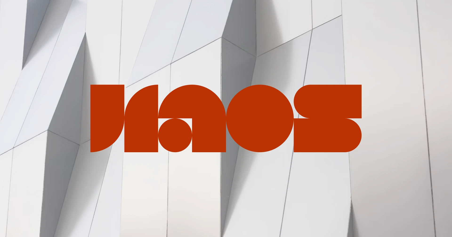
HAOS opens the selection with letters that look assembled from components. Published in January 2026, Margarita Timofeeva’s work develops branding and web design for an architecture studio. The designer explains that the concept shows part of the process usually hidden behind the final result. In the applications, the grid remains visible and geometric shapes construct the letters.
HAOS Branding and Web Design. Margarita Timofeeva. Published on 10 January 2026. The header image and applications in this section belong to her presentation. Complete identity and designer.

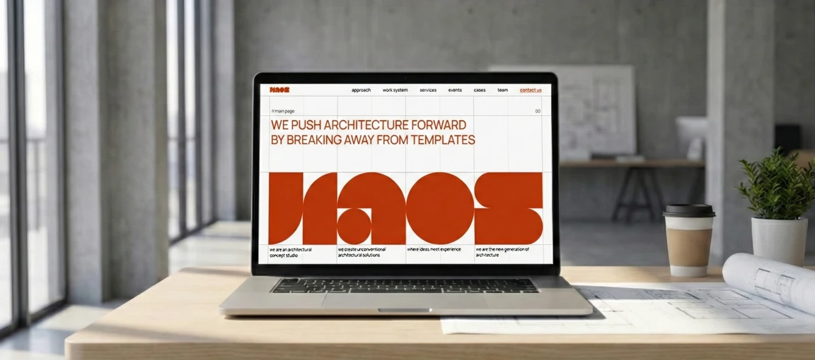
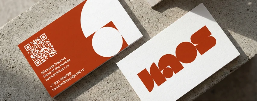
The O is almost a circular mass and the S links two broad curves; between them, small gaps put the eye to work. The name feels constructed, with a welcome touch of playfulness in this field. The designer connects the red accent to brick, a reference chosen by the founder. When the remaining information appears, simpler headlines and the visible grid change scale: the big gesture finds a structure to inhabit.
I like the way the name’s idea continues through the applications. The grid, lines and background shapes relate to the signature. That lets a page keep its personality even when the logo takes up little space. It is an interesting quality for a studio showing very different projects: the identity can supply continuity without requiring all the images to look alike.
What I would study for another project: the balance between character and reading. A transformed letter needs to remain identifiable to someone seeing the name for the first time. I would test the signature small, send it in an actual proposal and check its one-colour version. I would also review how it reads over a photograph. Geometry can make plenty of visual noise; keep some quiet areas for explaining the project.
2 FORM A combines precision and drawing
FORM A, Studio Otwarte’s project published in October 2025, presents a different direction. This Austrian-Polish studio’s identity combines a signature with tall letters, expressive drawings, icons and an underline stroke. The documentation explains that resources were also delivered as digital brushes so the team could continue creating within the same language.
FORM A. Studio Otwarte. Published on 21 October 2025. This is a different project from Forma Architects, included later in the selection. Redesign and visual system.
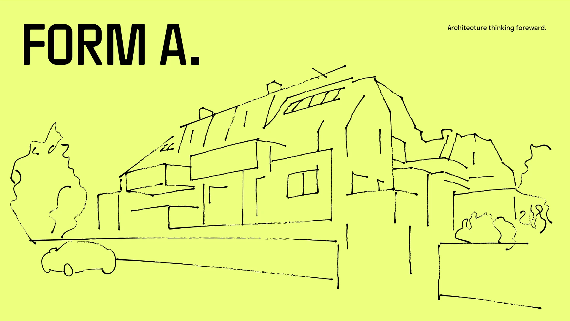
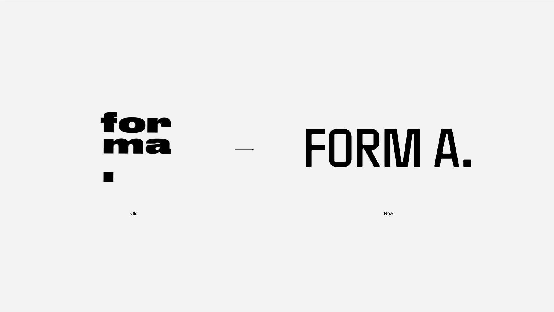
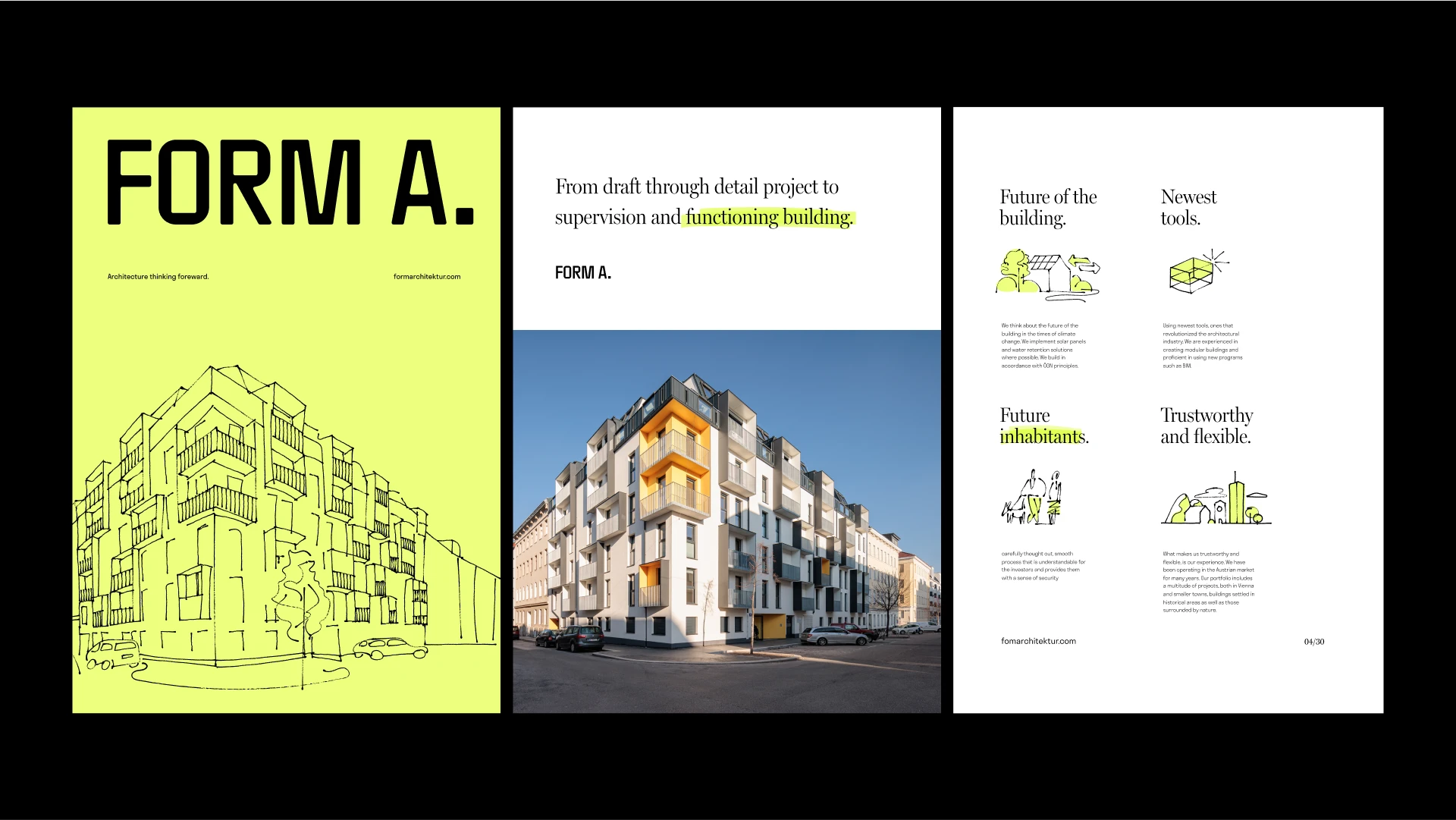
The space before the A and the full stop introduce a small decision that changes how the name feels. The letters have a direct presence, and drawing supplies another rhythm. Sketches, people and graphic gestures allow the identity to open up other subjects alongside photographs of buildings.
This resource particularly interests me for studios wanting to show their way of thinking. A drawing can discuss a hypothesis, process or use of space. A photograph of a completed project serves another purpose. The system lets both coexist and gives the identity material to communicate before, during and after construction.
The delivery of digital brushes is one of the project’s most interesting details. It allows drawing to continue after the identity commission ends. For a studio publishing processes, that tool could have specific uses: marking circulation on a plan, highlighting a decision in a photograph or sketching a hypothesis still open for discussion. I would test it with a piece created by someone on the team. That will show whether the language is comfortable to use and retains its character.
What I would study for another project: the relationship between the stable signature and expressive resources. I would make a proposal with long text, a cover with photography and another with drawing. If all three read as a family, the identity has room to grow. Yellow can be a powerful colour signature, but I would check contrast and use before applying it to every surface.
3 L+D Archatelier works with layers
L+D Archatelier is an identity published in September 2025 by the vonk team. The name brings together the initials of Leonid and Daria, the studio’s founders. The signature combines square and circular figures and has a shorter symbol available. The presentation develops contrast between forms and uses open areas to incorporate images and materials.
L+D Archatelier. Naming and concept by Viktor Ostrowsky and Vad Bunkoff; identity and development by Viktor Ostrowsky; guidelines by Viktor Ostrowsky and Tatyana Ponomarenko. Published on 3 September 2025. Project and complete team.
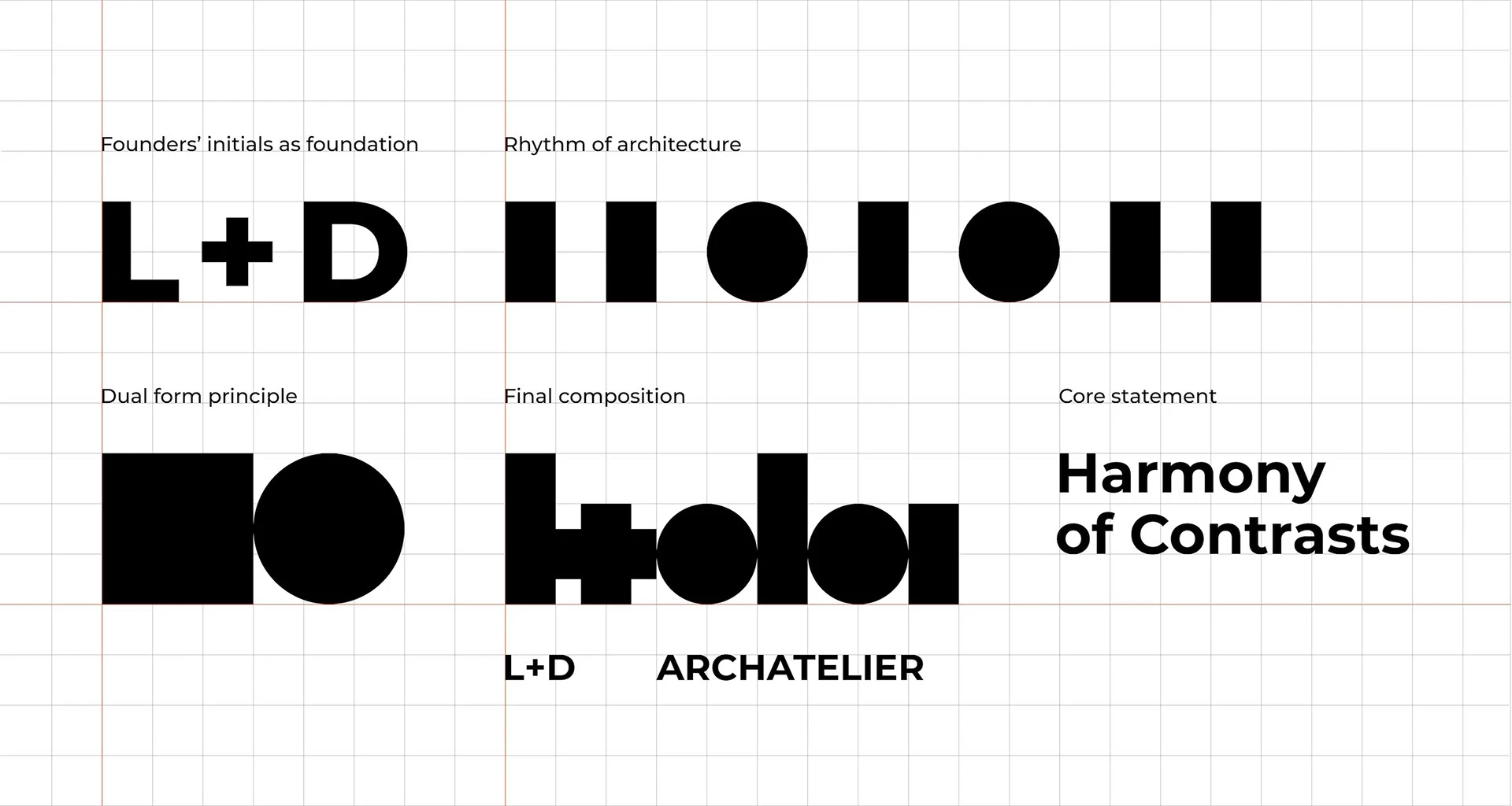
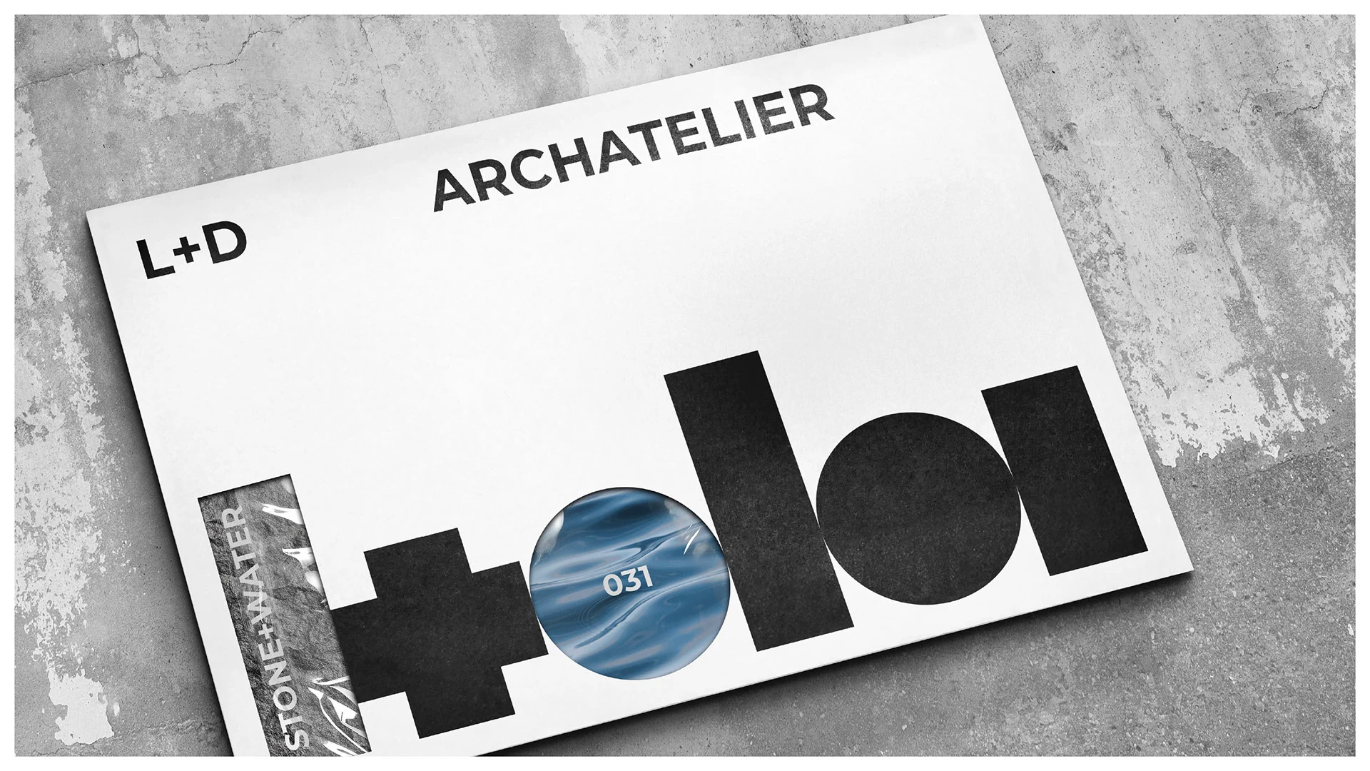
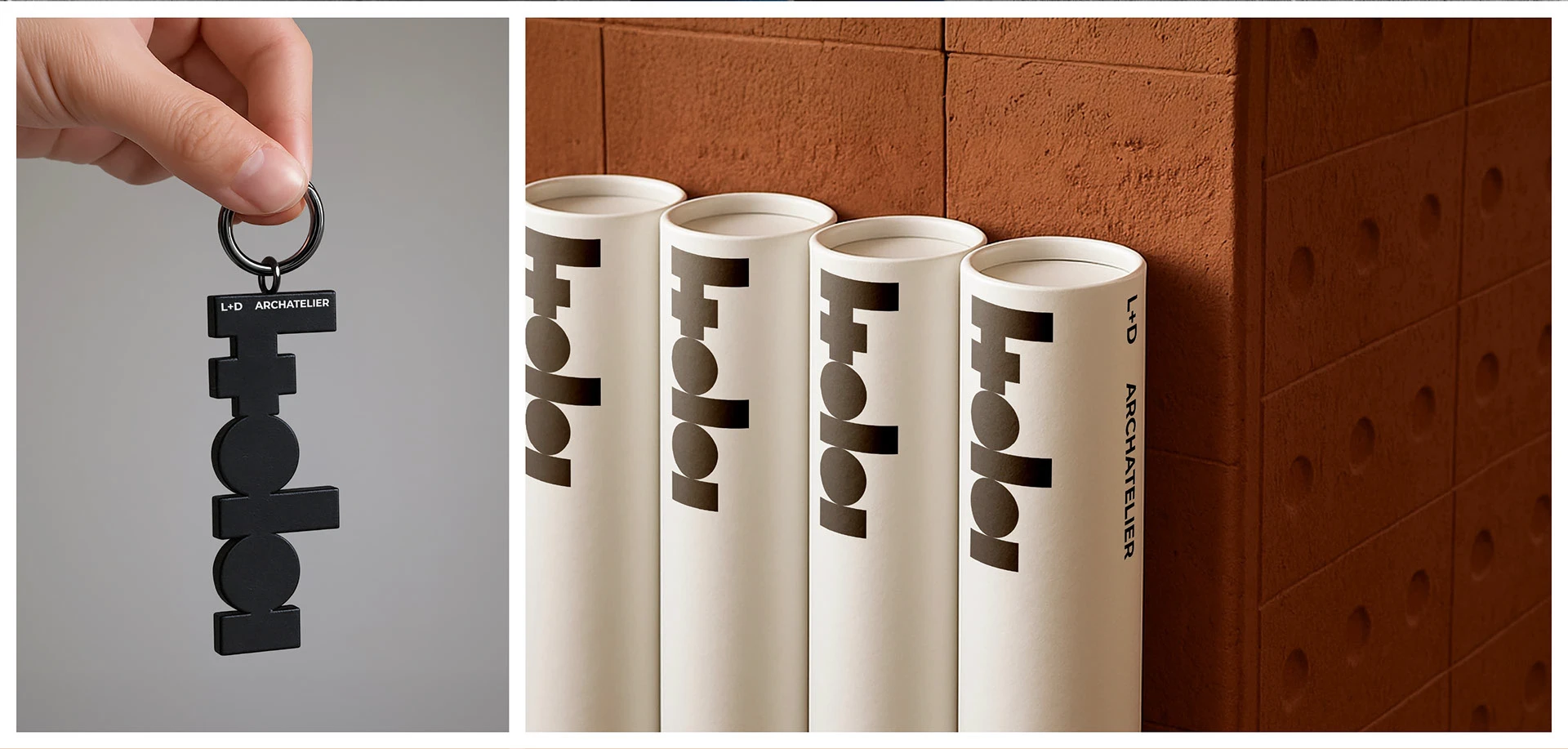
The whole has a very compact silhouette, almost a sequence of volumes. The figures generate a rhythm that can continue in patterns and compositions. When an image enters one of the gaps, the identity gains another layer without changing the entire structure. The shape remains the reference point.
The document cover uses the gaps to let the project image in. The signature sits in front, with the context behind it. In the binder series, small fragments of colour distinguish projects within a common structure. That relationship feels particularly architectural: bringing different projects together without forcing them to look alike. The creators extend the idea to a case with samples selected alongside the client; the process also finds a physical form in which to be preserved.
The abbreviated version deserves attention too. An avatar, label or pencil can hold less information than a cover. Preparing a short mark helps resolve that difference, provided it retains a connection to the full name. On a first encounter with a studio, the complete signature remains important for identifying it.
What I would study for another project: the limit of variation. I would test the open areas with a light photograph, a dark one and a highly detailed texture. Then check a completely flat version. If the identity keeps its shape under those conditions, the variable layer can be used more freely. Small parts need to remain reproducible on everyday materials.
4 ALTO connects symbol and direction
ALTO project bureau, by Hardy Branding, Nikita Zhbanov and Daria Frolova, presents a 2025 identity for an architecture, design, engineering and planning team. According to the creators, its symbol represents a shift in spatial perspective and an ascending surface. The shape accompanies the name and extends into applications through curves, light and colour areas.
ALTO project bureau. Hardy Branding, Nikita Zhbanov and Daria Frolova. 2025 project; published on 27 June. Identity and applications.
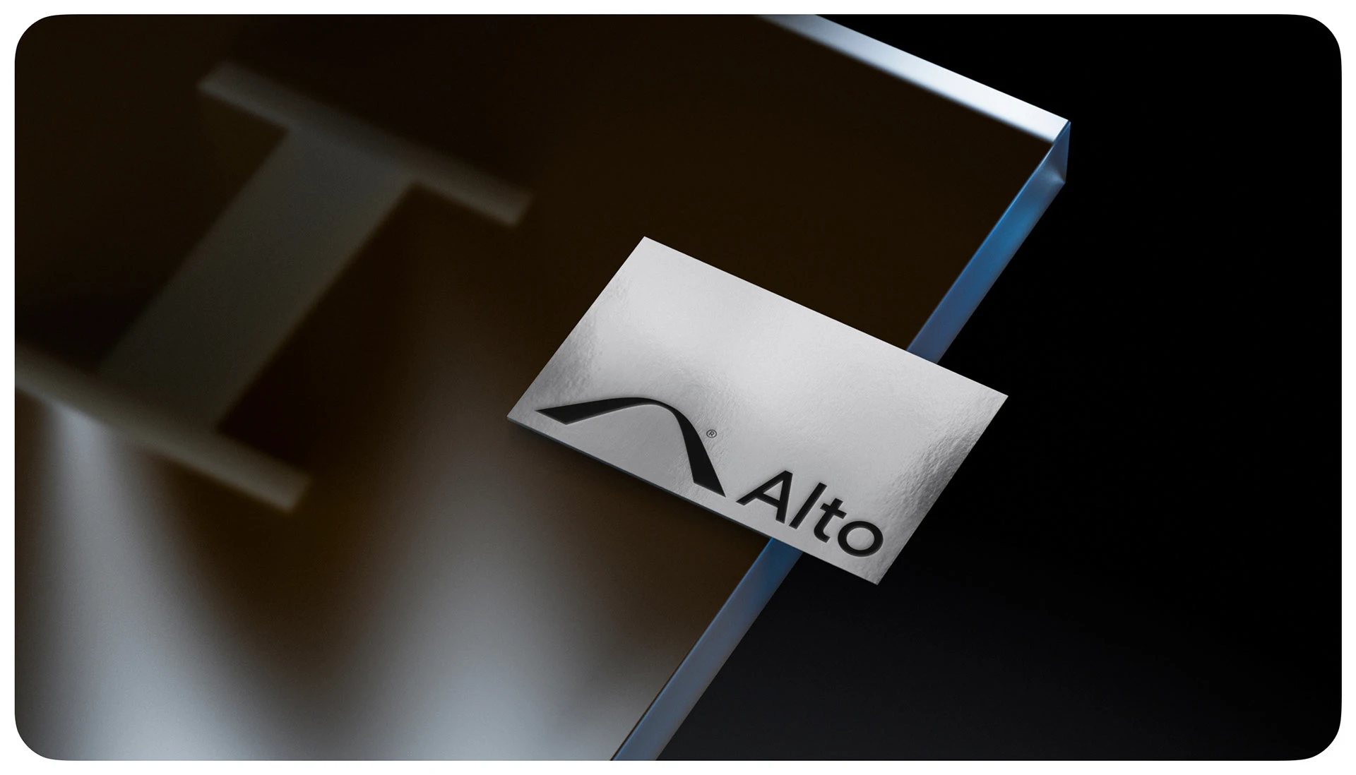
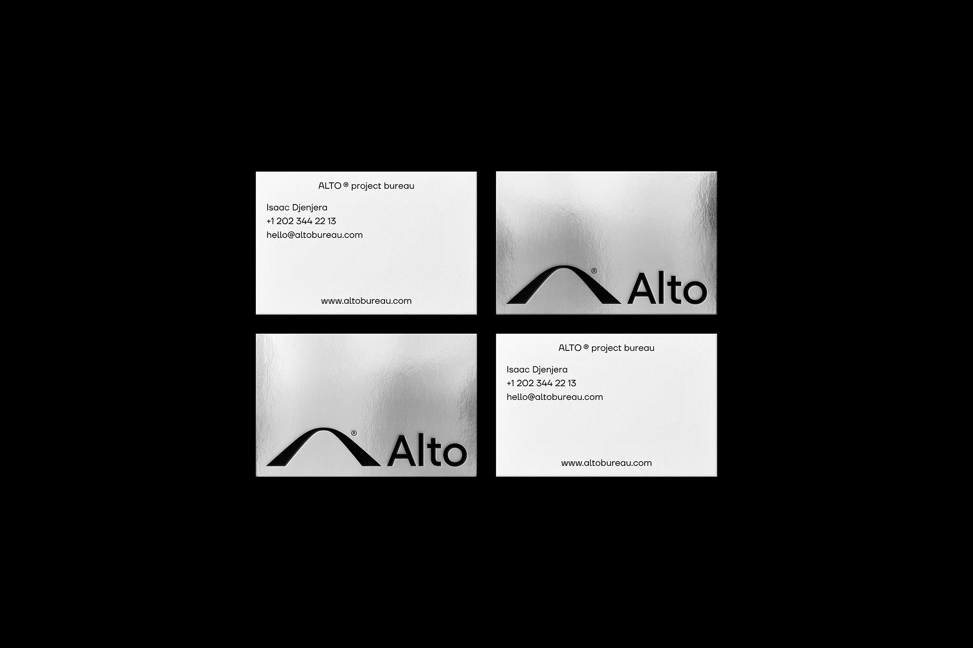
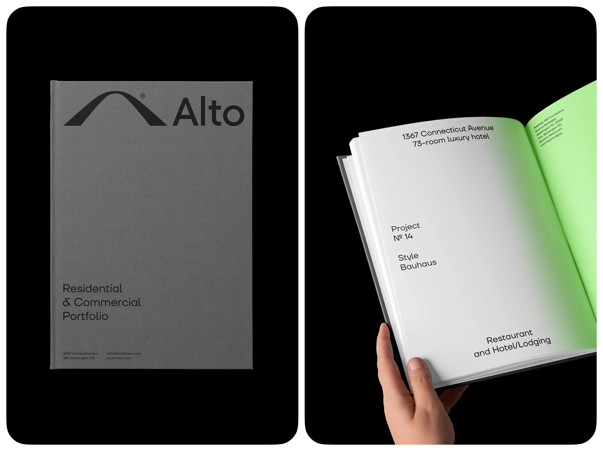
In ALTO, a compact curve can be the symbol beside the name and grow to fill an entire surface. Luminous waves in the applications give it depth, while the cards leave more room for a flat version. That change in intensity interests me: the main image can carry plenty of atmosphere, while everyday identification stays brief. Green connects the two encounters without requiring every piece to use the same effect.
I am interested in when the complete signature appears and when the shape can work more independently. A sign needs to identify the studio. On a cover, the symbol can have more space and become an image. Preparing those uses keeps each application from having to invent a fresh proportion.
The reference also invites thought about communication for a multidisciplinary team. An identity can express a common idea without drawing a separate icon for every service. The symbol needs to stand on its form and the consistency of its applications; an explanation of the concept may enrich it, but the piece should work before that explanation is read.
What I would study for another project: how the symbol reads at small sizes, the distance between shape and name and one-colour reproduction. I would also review how the studio is identified on a cover with few elements. Simplification can have real strength when proportion and spacing are well resolved.
5 Caché Atelier connects name and material
Caché Atelier also appears in the graphic design trends for 2027, where I focus on materials and applications. Here, the relationship between signature and monogram deserves attention. FourPlus Studio documents an identity that brings architecture and interiors under one brand, using compact geometry and a system of lines and patterns.
Caché Atelier. FourPlus Studio; creative direction by Ivaylo Nedkov; design and art direction by Tsvetislava Koleva; strategy by Desislava Gerasimova. Photography by FourPlus Studio and Caché Atelier. Published on 23 March 2026. Identity and credits.
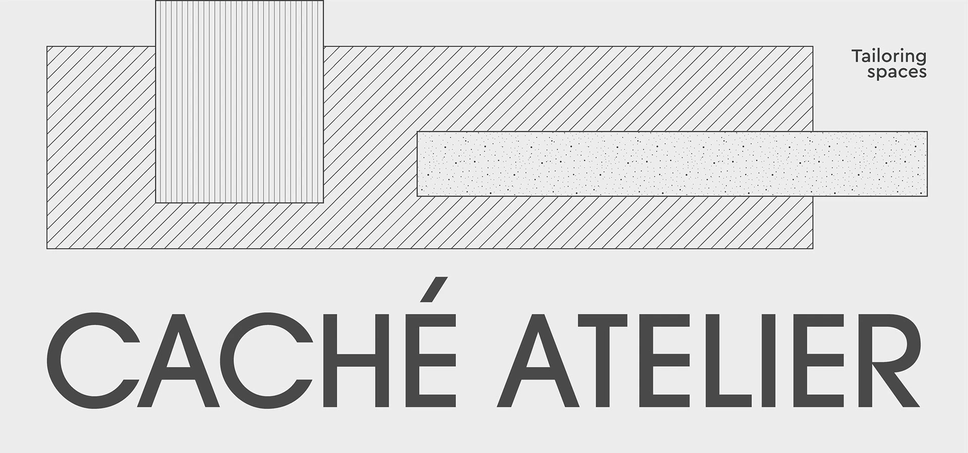
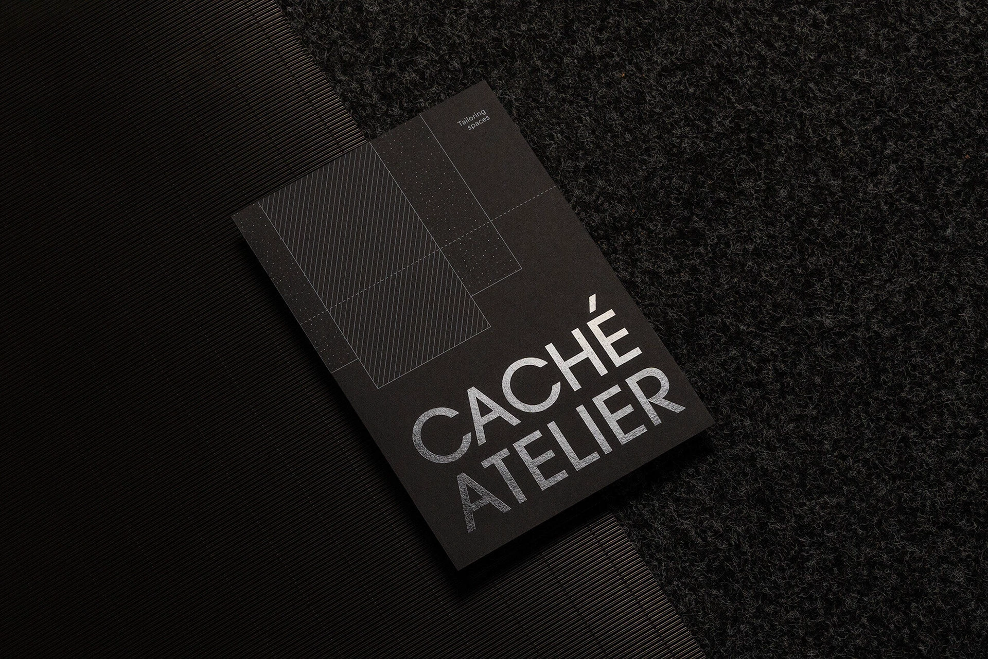
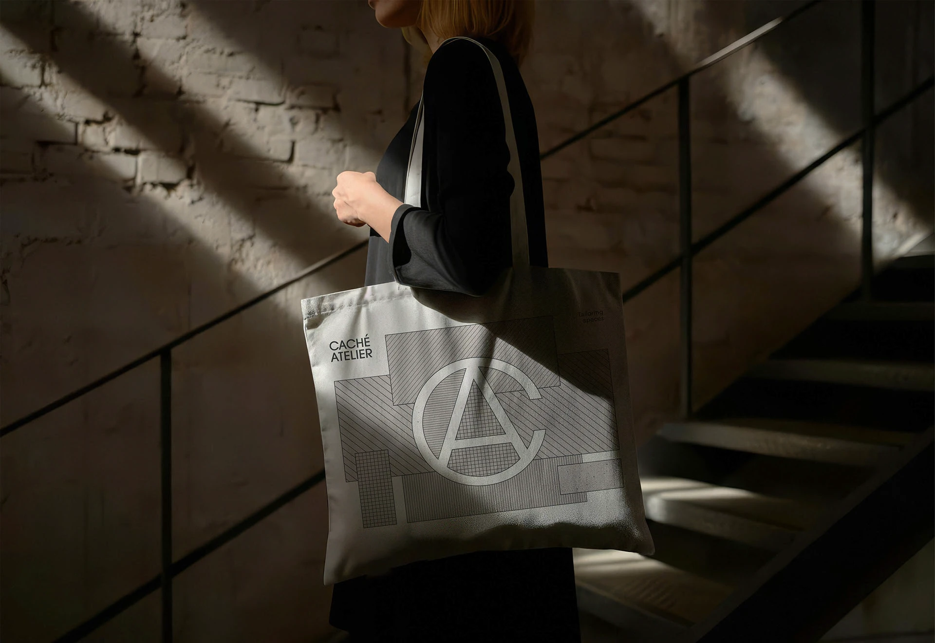
The documentation identifies ITC Avant Garde Gothic as the basis for developing the logo. I am interested in how the letters’ weight and geometry relate to the system’s finer lines. The signature can occupy little space and remain clear; patterns add detail to the accompanying composition.
The monogram offers another scale of communication. The initials integrate into a figure that accommodates shorter applications. On the bag, for example, it has a different presence from the name on a card. That variety gives the identity resources for different formats without changing its character.
FourPlus explains that Caché arrived with the idea of creating another brand for private projects. The analysis led to that line and the corporate commissions being brought under one identity. That context explains the system better: lettering and patterns can accompany different interiors, while photographs show whom each space serves. Before splitting a brand in two, review whether the issue lies in the identity or the projects we choose to show.
What I would study for another project: how the name and monogram coexist in presentation documents, on the website and in a small application. I would request printed proofs of the finest lines and verify screen contrast. An identity can rely on delicate details if a simple version is also available for less favourable situations.
6 Forma Architects organises the space between words
Forma Architects, presented by Electric Brand Consultants and Irina Skabelkina in November 2025, resolves its signature with two offset words. The identity uses a typographic composition and a structure that continue on cards and posters. The images let us study how much character a positioning decision can contribute, even with restrained-looking letters.
Forma Architects. Electric Brand Consultants and Irina Skabelkina. Published on 17 November 2025. Identity and communication system.
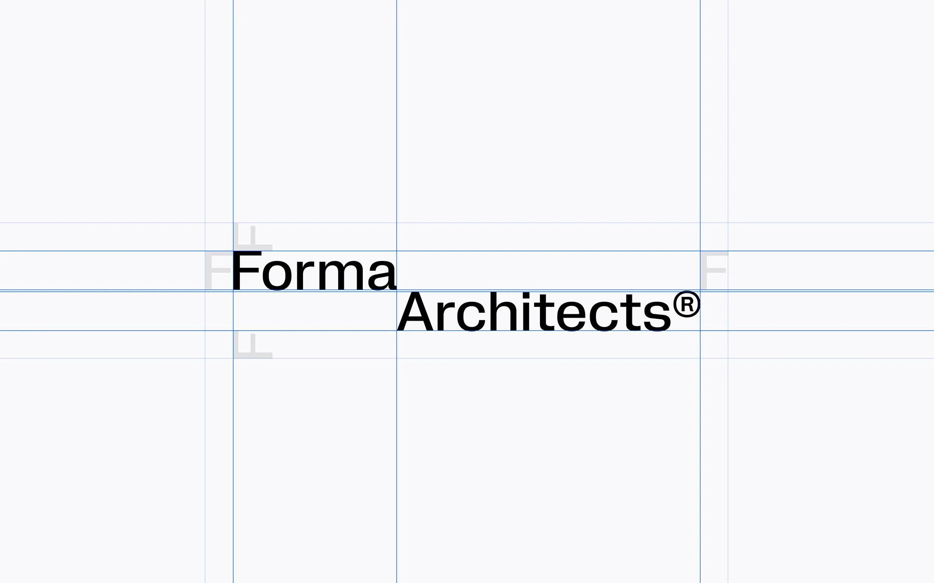
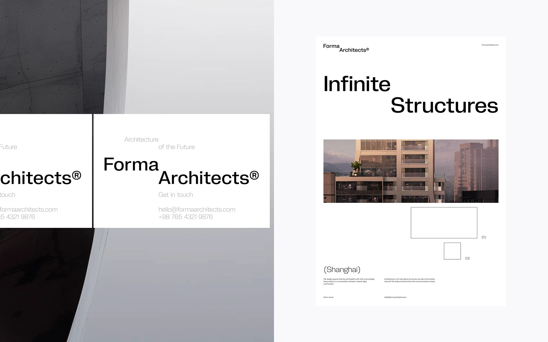
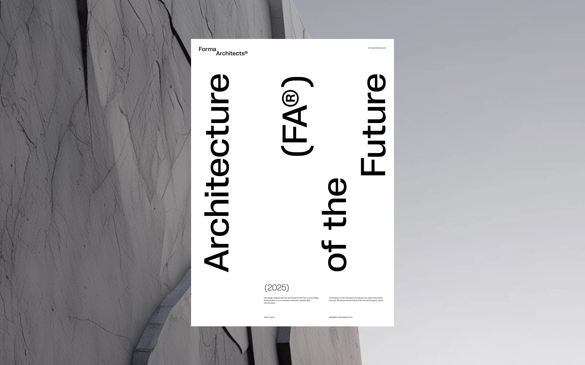
The space between the words is part of the logo. Forma sits on the first line, while Architects starts further across, creating a small visual step. The presentation’s guides make that relationship visible. On the vertical poster, headline words use different axes and generate a play of solid and empty areas. There are few elements and plenty of decision in where each begins. The name has a graphic architecture of its own.
The choice demands careful thought about logo use. A two-line, offset signature may need a wider area than a horizontal name. On a website header, card or document cover, that space needs reserving during design. Dropping it into an improvised gap afterwards tends to weaken the idea.
Also review the relationship between the name’s size and the information accompanying it. In the reference applications, headlines take on a role of their own while the signature keeps an identifying position. That hierarchy allows the studio’s content to take the lead.
What I would study for another project: how much the identity depends on that arrangement. I would test a cover, card, document footer and mobile header. If a secondary version is needed, I would develop it with the same relationships of weight and space. A typographic signature can be highly expressive when its proportions serve actual uses.
7 Dacol finds its gesture in the letters
Dacol is an identity exploration by Albano Sbardellati, published in March 2026. The presentation places the logo at the centre of the system and explains a typographic construction related to architectural structures. Cuts and segments give the name its particular character; it is combined with an abbreviated version and digital communication pieces.
Dacol architecture Visual Identity. Albano Sbardellati. Concept and identity presentation published on 14 March 2026, according to the date displayed by Behance during this review. Construction and system.
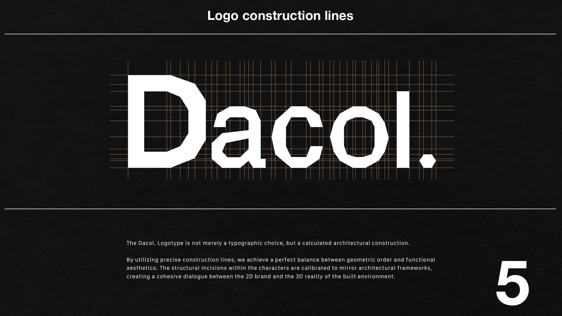
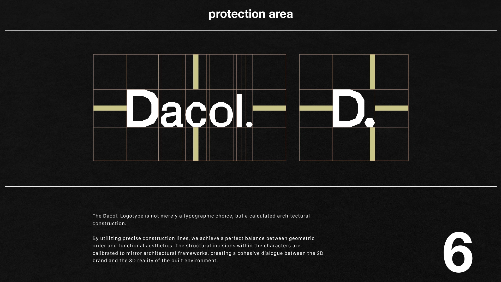
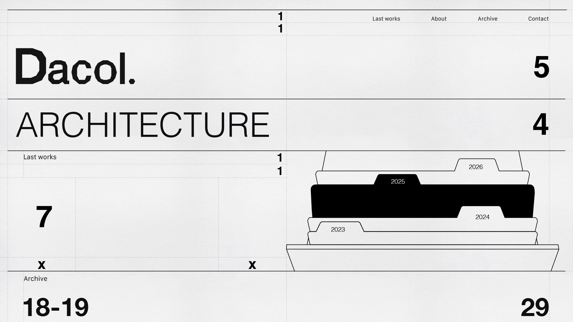
The short word concentrates its gesture where the segments meet. The D and curves have cuts that suggest construction from components; the full stop closes the signature. The designer relates those changes to trusses and structures and documents a system combining Helvetica Bold and Galvji Regular. Modifications are reserved for the name, while the texts have another job. The special lettering can carry the character without asking all the information to perform the same acrobatics.
Modified letters require careful review. A cut that looks good at a large size may disappear when reduced. A change in a character’s structure may make someone read it differently. Check those details through tests and with people who do not already know the name.
I like the inclusion of a shorter version in the presentation. The initial can resolve small applications and coexist with the name elsewhere in the system. Its use should follow clear criteria: when a studio is introduced for the first time, the complete word makes identification easier.
What I would study for another project: reading the name at a distance, its one-colour version and the relationship between cut size and medium. Then I would prepare a page with actual text. Signature modifications can contribute character while the remaining typography keeps services, project pages and proposals comfortable to read.
8 Formade builds a recognisable silhouette
Raphaël Renoncourt’s presentation Minimal Fonctionnal Architecture Brand Identity, published in April 2025, shows an identity under the name Formade. The symbol combines several geometric shapes connected to volumes and spaces. The reference includes proposals for stationery, publications, signage and digital communication. The interest lies in how an abstract figure can bring continuity to all those pieces.
Formade, in Minimal Fonctionnal Architecture Brand Identity. Raphaël Renoncourt. Published on 6 April 2025. The images present the designer’s visual system. Symbol and applications.

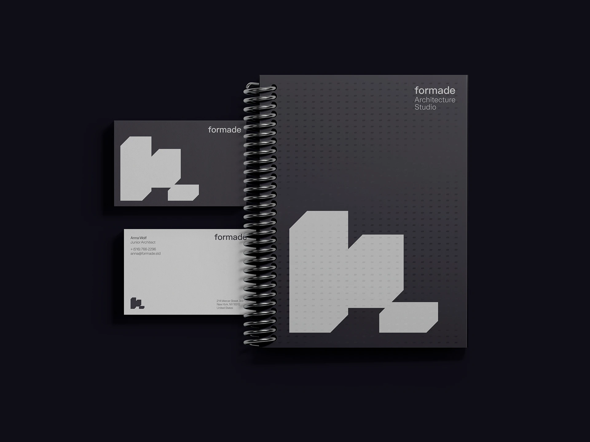
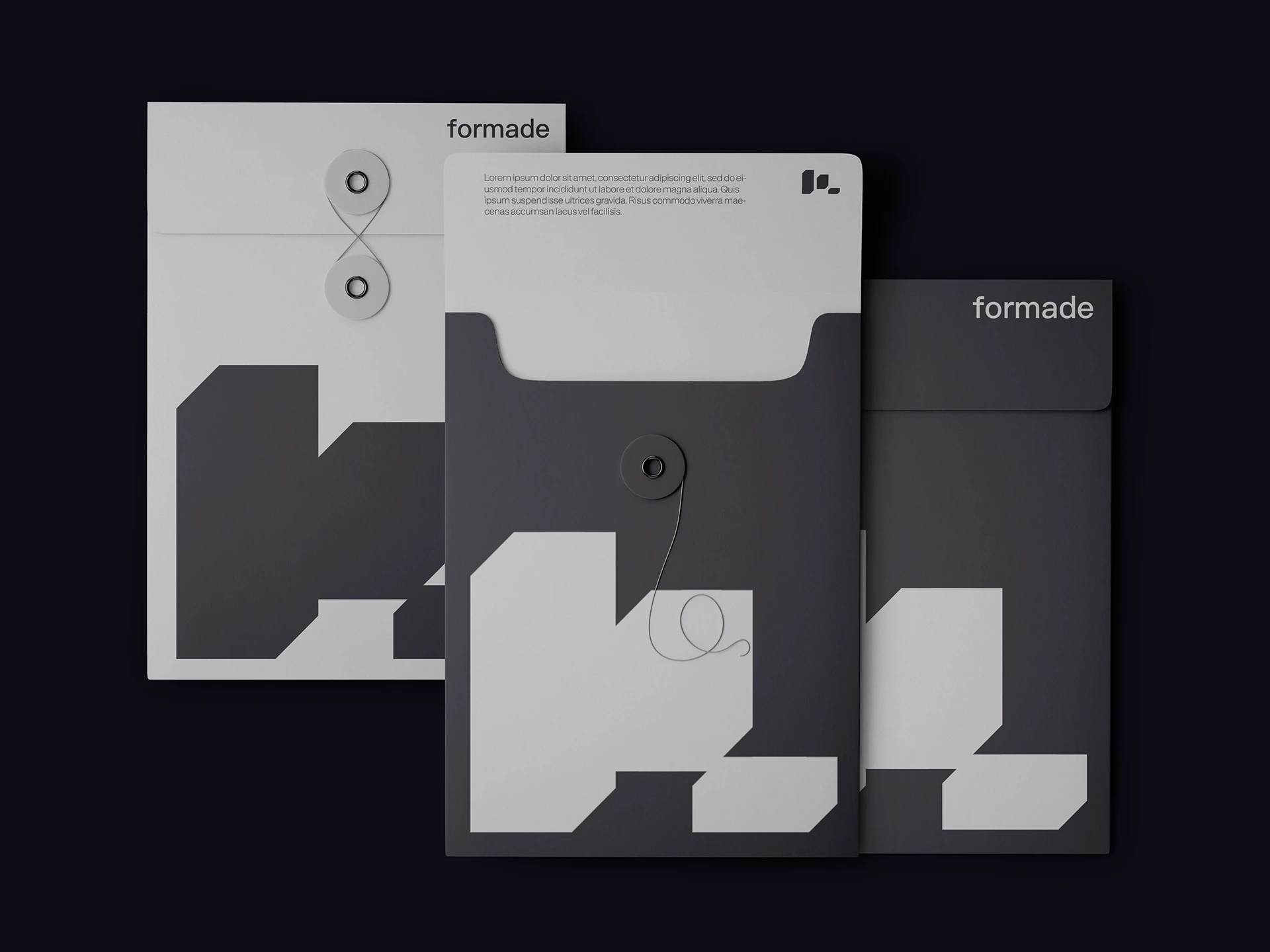
The symbol consists of three masses that fit together and leave gaps between them. On folders and documents, the figure is enlarged or cropped; on inner pages, it can stay small and leave space for the project. Mineral tones vary little, making the relationship between presence and void easier to appreciate. I like how such a compact shape can step outside the page as an identifier and return as part of its composition.
The contrast between symbol and lettering deserves attention. The drawing concentrates the most specific gesture, while the name remains straightforward to read. That distribution lets the system use a powerful figure without complicating all the information. It is an option for studios wanting a graphic mark with some independence.
An abstract figure also raises a question about distinctiveness. Many identities are built from volumes and geometry. The result needs a particular proportion, silhouette or relationship to differentiate it within that territory. Consistent applications help establish its association with the studio.
What I would study for another project: the small version of the symbol, the clarity of its gaps and its behaviour beside the name. I would also test a cover with a lot of information. The figure needs to coexist with projects and explanations as well as work when it has the whole page to itself.
How to choose an architecture studio logo for 2027
These references show resources that can be studied separately: HAOS’s geometry, the relationship between signature and drawing in FORM A, L+D’s layers or Forma Architects’ typographic offset. The choice for your studio starts with its name, projects and way of working. An identity should connect that whole and make it easier to present.
Imagine a two-partner studio preparing its first shared presentation document. I would put a home, a commercial space and a project still at the drawing stage on the table. I would design the cover and a spread for each, alongside the website header and email signature. The home needs photography; the open project needs decisions explained. That variety forces us to check what unites the studio before we have a collection of perfect images.
Then I would define which part of the identity should carry most character. It could be the name, a symbol, a headline typeface or an image language. Each part does not need equal prominence. If the portfolio contains very expressive photographs, a signature that accompanies them clearly may be appropriate. If the studio needs to communicate processes, drawing or a grid can broaden its resources.
Next, I would compare the complete signature with the short version in those documents. On the cover, we want the name to be learnt; in page footers, a small mark can provide continuity. I would leave examples prepared with long titles, credits and actual locations. Guidelines start being useful when they resolve the next proposal as well as present the logo versions.
Tests I would run before finalising the design
First, a small one-colour printout. It reveals whether internal spaces and fine lines survive. Next, a mobile header with the actual menu. Proportion problems appear there that a large slide may conceal. I would add a document cover with photography and a project page with plenty of information.
Finally, I would show the name to someone unfamiliar with it and ask them to read it. That is a simple check for ambiguous letters. With portfolio images, I would test a light photograph, a dark one and a highly detailed composition. The logo versions should resolve those conditions using shared criteria.
If the logo moves, I would prepare a strong static version and a sequence that preserves its identity. If it uses special materials or finishes, I would request samples. A vector file matters for producing large applications and keeping precision, but the quality of the result also depends on those checks in context.
Does an architecture logo have to be minimalist
Simplification can help identify a studio and coexist with its projects. That leaves room for different directions: expressive typography, illustration, colour or an abstract figure. Choose resources for what they contribute to the brand and check how they work on the main formats.
Is a symbol better than using just the name
It depends on the name, applications and character the studio wants. A typographic signature can hold the entire identity. A symbol can offer a shorter version and a resource for compositions. I would prepare tests of both routes before deciding what the system actually needs.
What should an identity for architects include
Alongside logo versions, I would define typography, colour, composition, image use and essential applications. Presentation documents, proposals, paperwork and the website deserve examples with real content. You can explore physical applications further with the business cards for architects from the earlier series.
When should you redesign the studio’s identity
When the current system makes reading difficult, does not suit the projects you present or lacks resources for the formats you use. First review which elements retain value. The work may involve organising and extending the identity, or developing a different direction where needed.
If you are planning a new brand or reviewing your studio’s, I can help with architecture logo design and its development into an identity. The digital presence can continue with a website for the studio; the best web designs for 2027 offer further references for that part. Tell me what you want to communicate and we can see how to give it a form of its own.
If the identity work forms part of a new practice website, prepare the next step with the guides to architecture website budgets for 2027 and photography, drawings and architecture project pages.