The best pharmaceutical web designs in this selection for 2027 help businesses with a great deal of science, many products or several audiences find their own way of presenting themselves. There are plants in motion, typography with an editorial feel, diagrams that organise information and catalogues that connect with everyday life. The tour brings together solutions for laboratories, pharmaceutical companies and biotechnology businesses with different goals. The white coat can stay. The grey, characterless website might have had its day.
After the tour of the best web designs for 2027, I am focusing here on laboratories, pharmaceutical companies and biotechnology. They share some communication needs, although their businesses and visitors differ. A company seeking research partners needs a different website from a brand helping people explore its catalogue. That variety is precisely what makes the tour interesting.
2027 is the edition year of this collection, intended to inspire new projects. The documented references date from 2022, 2024, 2025 and 2026. I have retained their credits and dates. There are four projects by other studios and four of my own, identified in each section. This is a selection with editorial commentary, without an official ranking: I am considering design, structure and the way information is presented.
You can explore each design through its original images and demonstrations. For archived examples, I discuss the documented version, which may differ from the current website. The tour focuses on design decisions: how an activity is presented, what receives more space and which routes the interface provides for further reading. The references serve different audiences and needs; that variety is part of what makes comparison worthwhile.
1 Bright Biotech turns science into a visual story
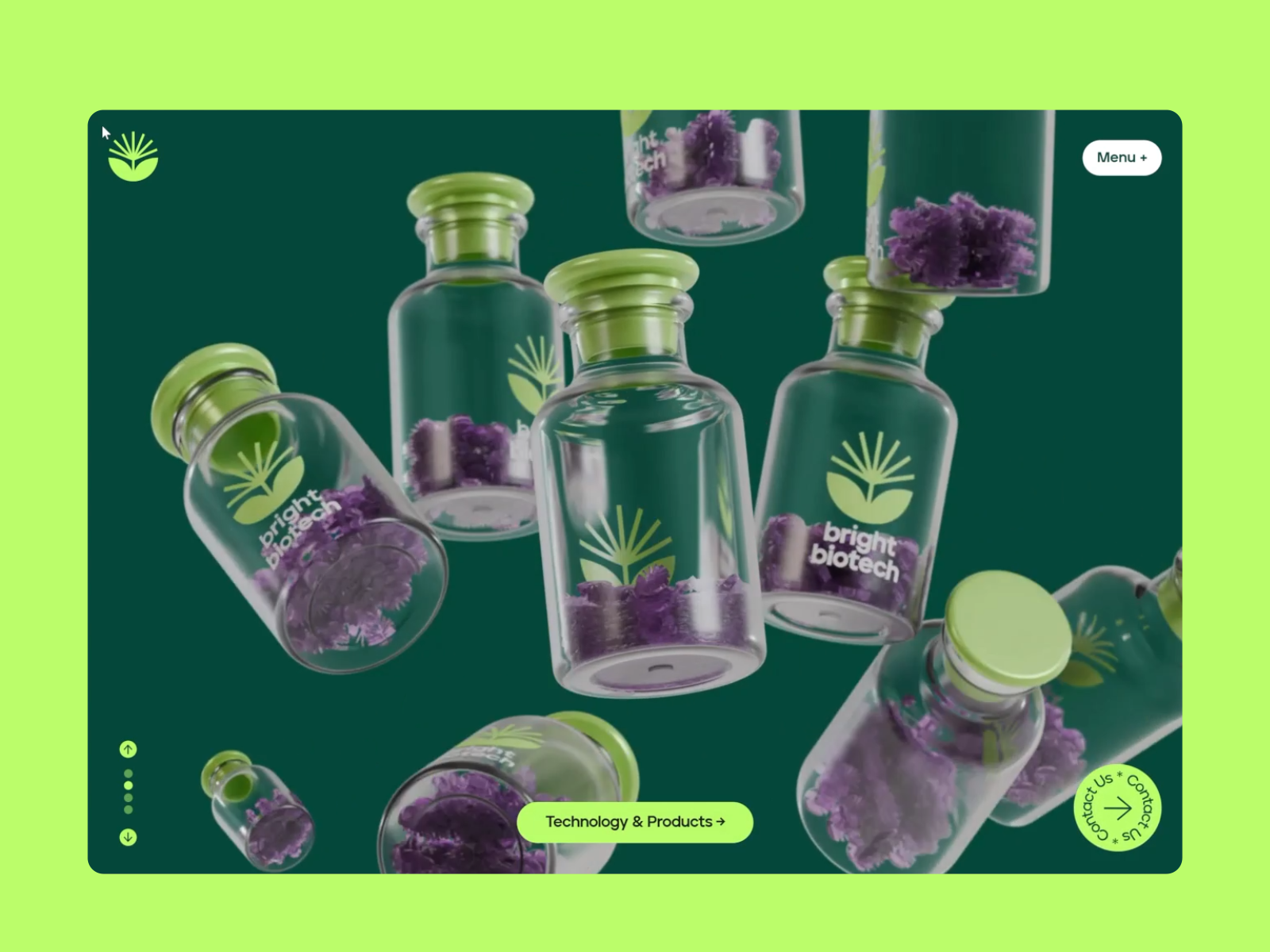
Bright Biotech opens the tour with a plant, a distinctive green palette and headlines that fill the screen without asking permission. Lyon & Lyon built an experience connecting scrolling movement with the presentation of technology, products, mission and team. The Awwwards listing records its Site of the Day recognition on 18 July 2025.
Bright Biotech. Lyon & Lyon. Design documented in 2025. This article’s header comes from its presentation. Listing, creators and elements on Awwwards. Visit the website.
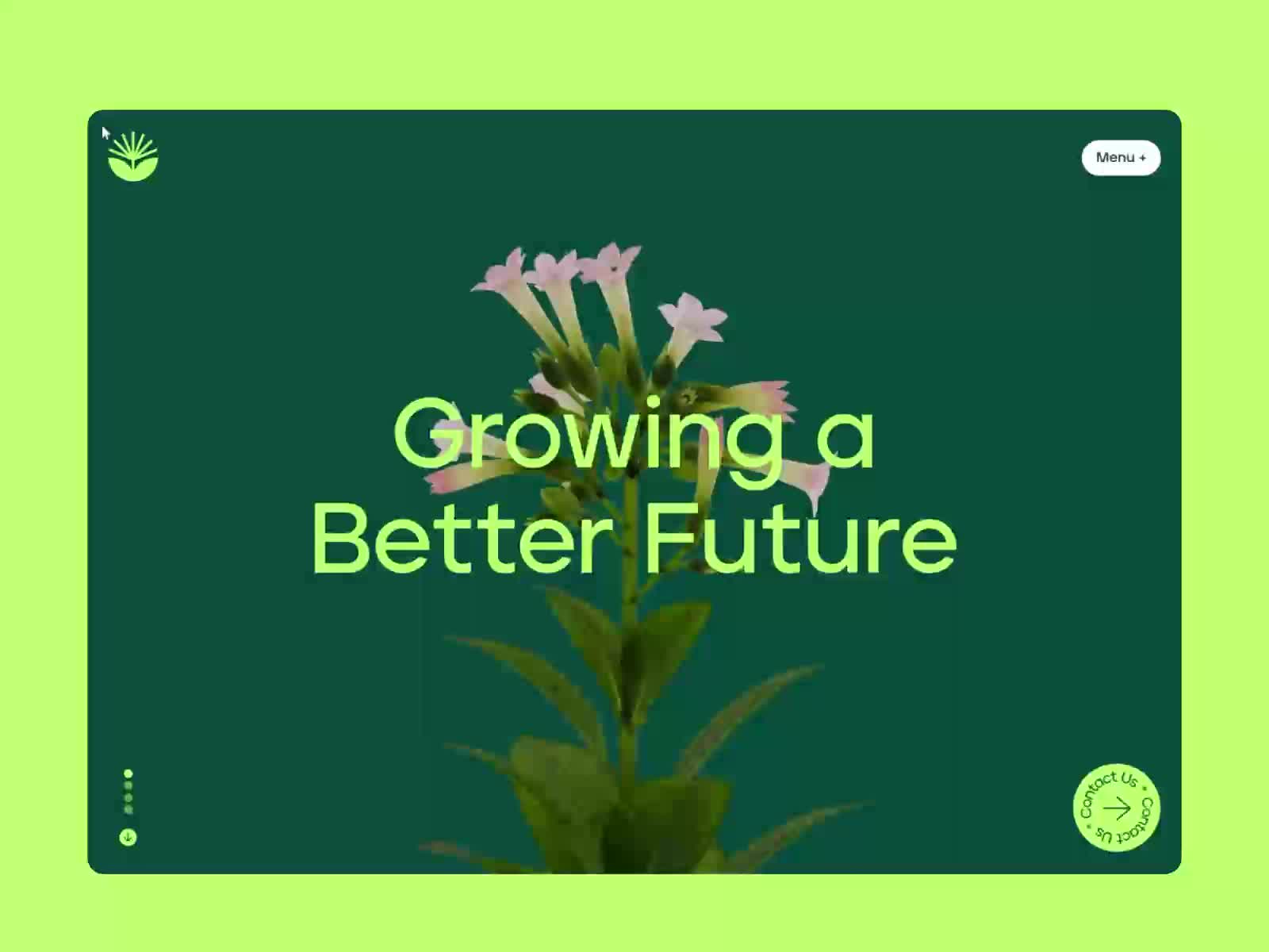
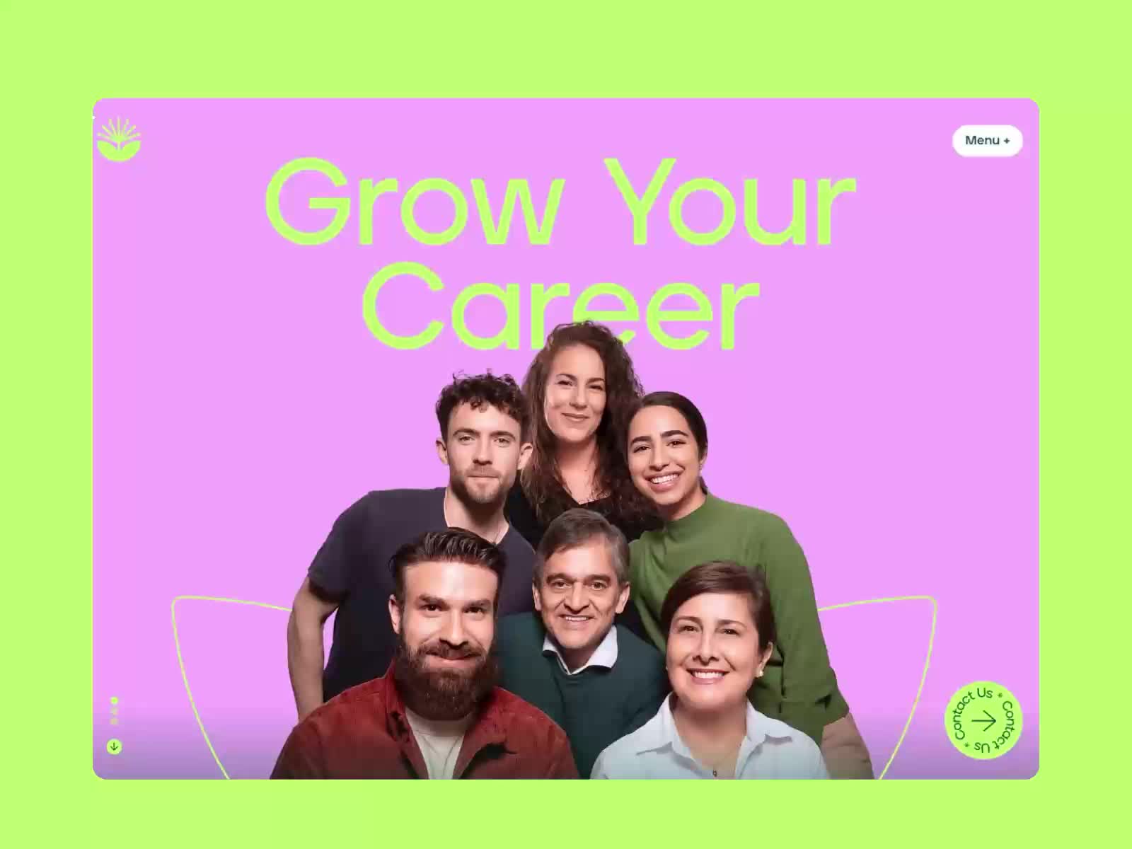
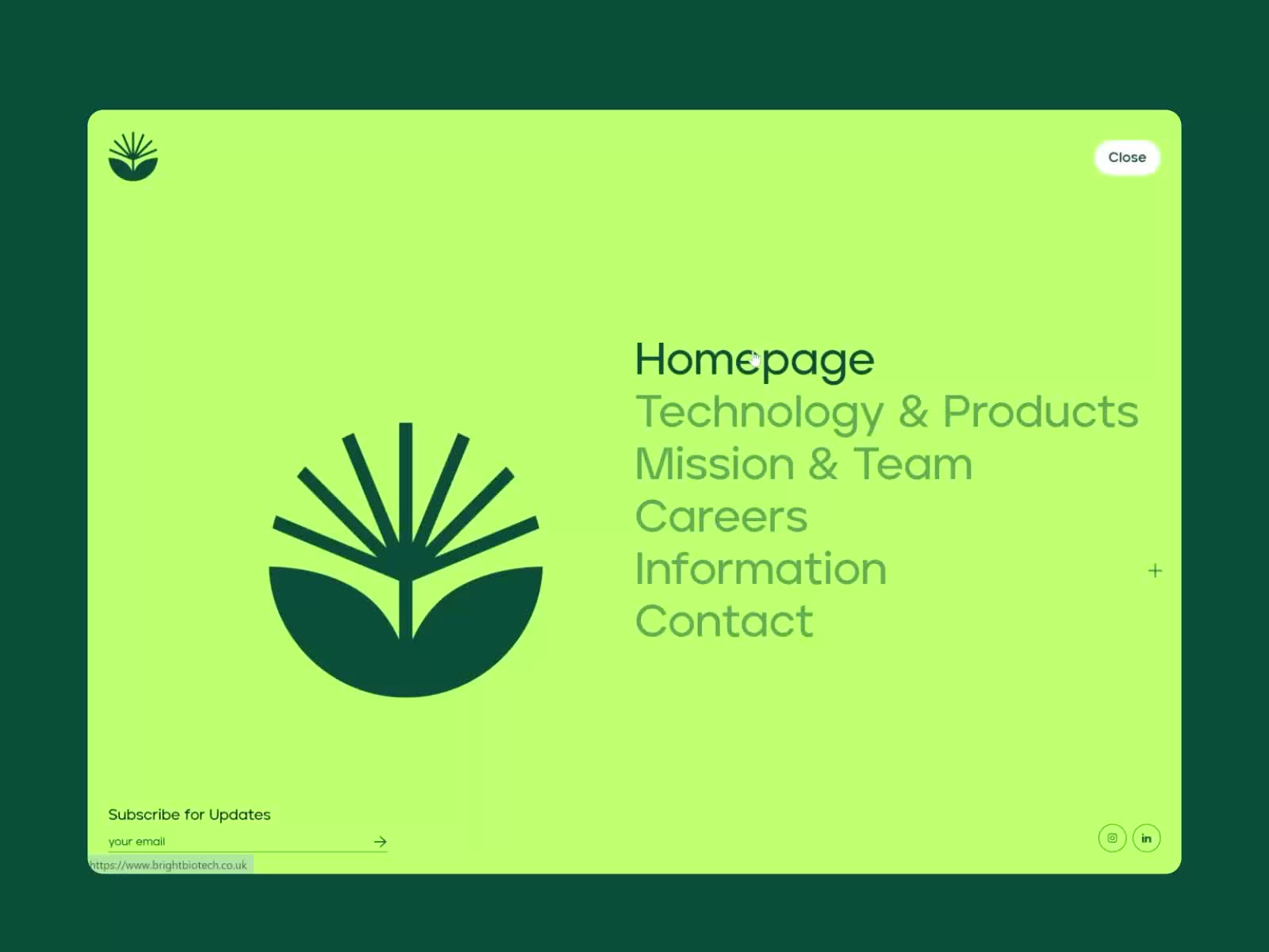
The plant and vials connect the visual language to the company’s activity. In the sequence, the headline, object and route to technology change roles without leaving the same world. The team screen adds a surprise: cut-out portraits on a pink background inside the green frame. People receive as much presence as objects. That colour change gives the journey another rhythm and shows that a clearly defined identity can still open a new scene.
Short words and large screens keep the focus during movement. Clear routes to technology, team and contact remain available. That combination is interesting: someone can follow the presentation or decide they already know what they want to consult. It is a useful question for any animated website: can I follow the story and also go straight to the content?
What I would take into another pharmaceutical website: choose a central image related to the company’s activity and develop a small system around it. It could be an illustration, photographic sequence or object. Then decide where motion helps explain and where reading needs to be calm. A technical data sheet, contact page or long document calls for another rhythm.
Before adopting an experience like this, I would review the mobile journey and the alternative when someone reduces animations. A headline that works on an enormous screen needs another composition in the hand. Design becomes stronger when the same idea survives those changes. Copying the amount of movement would take only the example’s most superficial part.
2 1910 Genetics gives typography space
The 1910 Genetics design, by FIFTYSEVEN and Petar Stojakovic, introduces a more editorial direction. A white surface overlays large-scale images; serif headlines, fine lines and small labels organise the composition. Awwwards documents this version with an Honorable Mention on 13 March 2024. The visit linked from its listing leads to a version hosted on the studio’s domain.
1910 Genetics. FIFTYSEVEN and Petar Stojakovic. Version documented in 2024. Presentation and original elements. View the studio’s version.
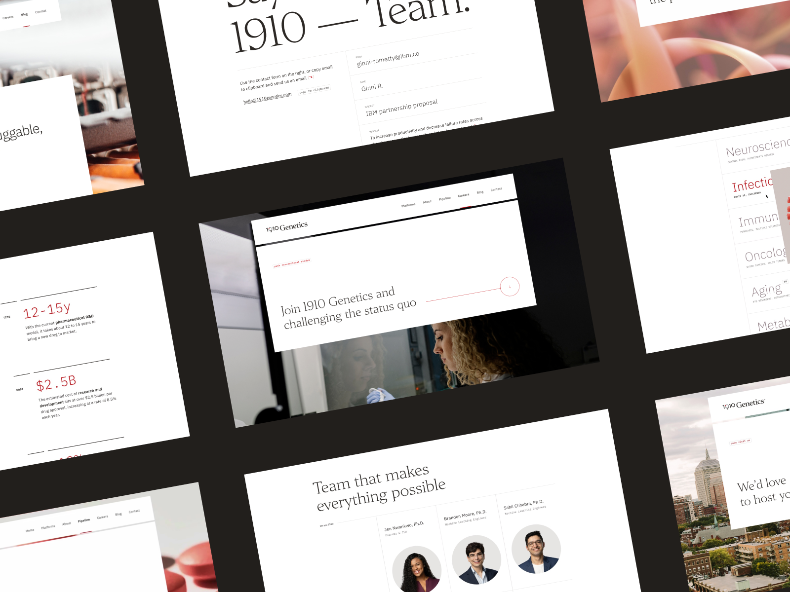
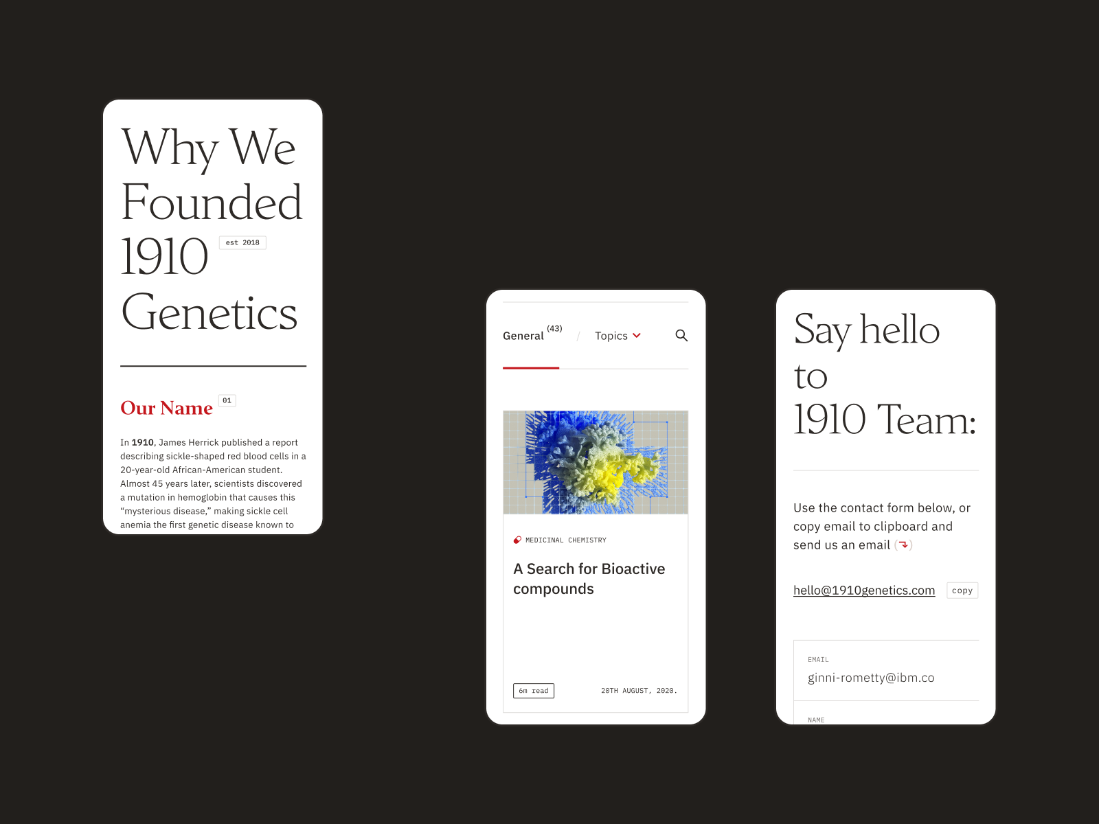
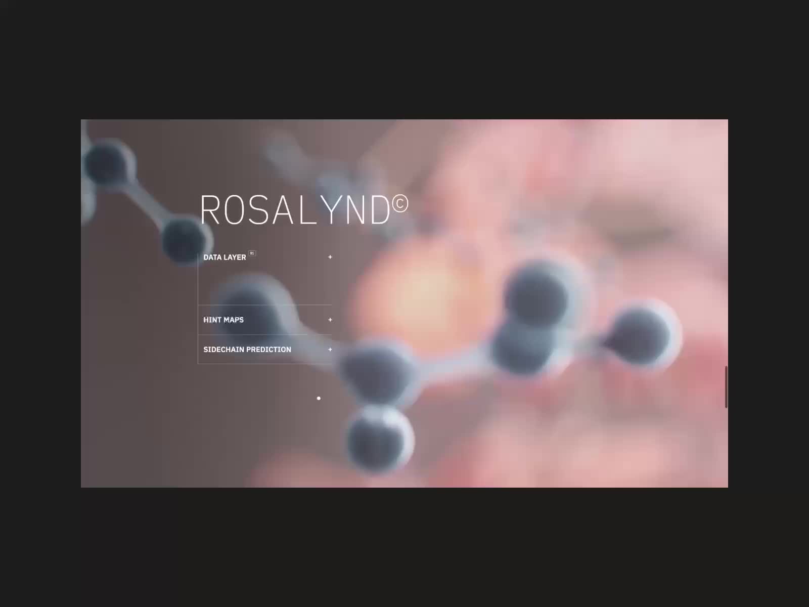
The tension between image and text is carefully judged. In the platform and team compositions, the scene can occupy the background while a white panel protects reading. Serif lettering introduces another voice; small labels and lines provide structure. In the mobile examples, the same family accommodates an article, search and contact. That continuity interests me: personality can live in typography and its spaces, even when the large homepage background disappears.
I particularly like the family of resources available for longer content. The project documents a timeline, platforms, team, careers and contact. That lets us study how design changes when information changes. A good homepage impresses for a few seconds. A coherent page system starts resolving the real work.
What I would study for a laboratory: a typographic hierarchy with personality and enough levels to explain complex subjects. I would test an actual headline, long paragraph, quotation, link and table. If everything depends on a short slogan, the test is incomplete. Design should accompany reviewed text without forcing necessary information out to make it fit.
I would also reserve abstract scenes for places where they have a clear purpose. A visualisation can create context and curiosity. When describing a process, its elements should relate to the explanation. That distinction helps prevent visitors from reading an evocative image as an exact technical representation.
The lesson here lies in contrast and order, which can work at different budgets. A simpler website can do excellent work with typography, photography and content structure. The sense of quality often starts there, long before a major audiovisual production is added.
3 BioAge organises information through diagrams
BioAge, in Zajno’s version documented by Awwwards in December 2022, combines violet, a portrait constructed from dots and diagrams about the company’s activity. It is the oldest reference in the selection. I include it for the way it organises visual information: good solutions deserve revisiting even after several seasons. The images correspond to that archived design.
BioAge. Zajno. Honorable Mention on 26 December 2022. Design and screens documented on Awwwards. The current website may have different content or journeys.
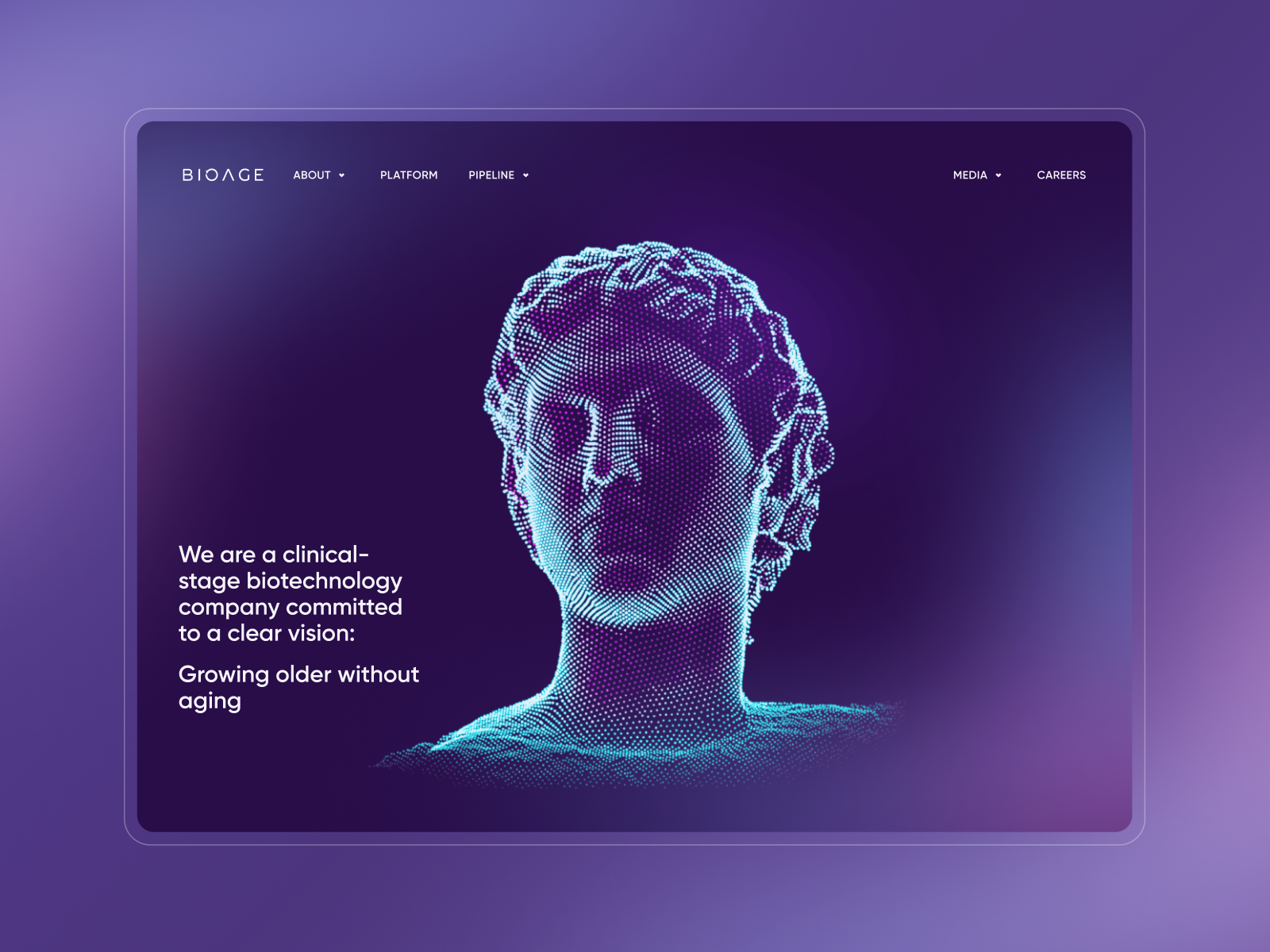
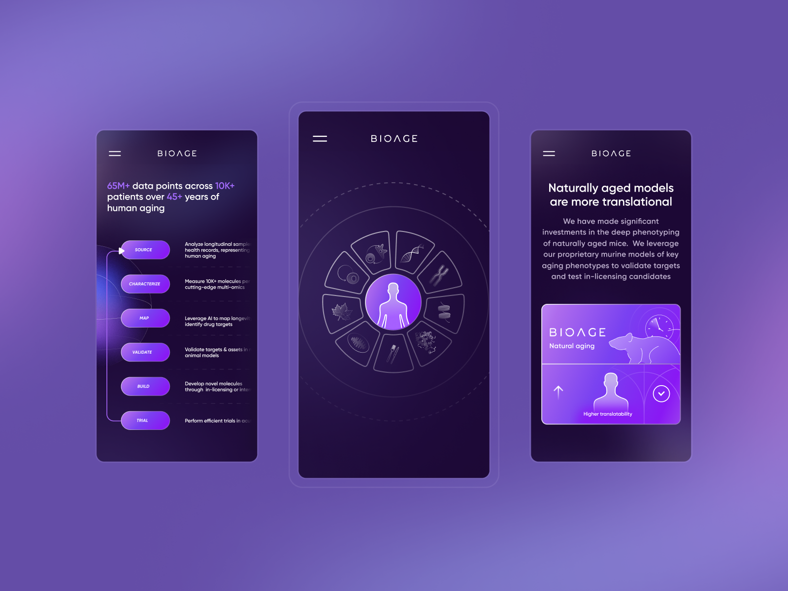
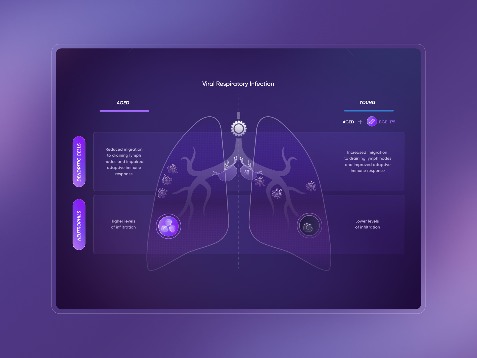
The dotted figure has plenty of presence, but the subsequent graphic offers something else to examine: a lung diagram, highlighted areas and labels arranged on both sides. The central image connects the parts of the explanation. On mobile, another graphic uses a radial arrangement and retains a human figure as a reference. These are different composition decisions for different content. The example prompts us to ask which relationship the visitor needs to see before choosing the diagram’s shape.
A diagram requires editorial work. First decide which relationship to explain and in how much detail. Arrows, labels, colours and composition follow. Starting with the drawing can easily produce an attractive image visitors do not know how to interpret. Here, I would look at reading order and the introduction of each concept before moving into detail.
What I would use on another website: turn an important explanation into a visual resource with a nearby text version. It could show the company’s working process, how a service is organised or relationships between research areas. The illustration should serve that explanation. Its labels need to remain legible, and relevant differences should be understandable without depending on colour alone.
The mobile presentation offers another useful clue. A wide graphic may need dividing into stages, summarising or rearranging vertically. Shrinking the whole image until it fits the screen tends to produce tiny lettering. Design the second version from the beginning, with the same content and another arrangement.
BioAge contributes an idea that remains valuable for 2027: design also makes relationships visible. Animations, photographs and typography attract attention. A good diagram can give visitors an explanation they remember after closing the tab.
4 Skye Bioscience combines atmosphere and updates
Very Polite Agency created the Skye Bioscience website and identity listed on Awwwards as a nominee on 13 June 2025. The homepage uses large-scale blue images and restrained navigation. Subsequent screens make room for the company, pipeline, news, investors and contact. The example shows how expressive imagery coexists with information that needs updating.
Skye Bioscience. Very Polite Agency. Nominee documented in 2025. Screens and project credit. Company website.
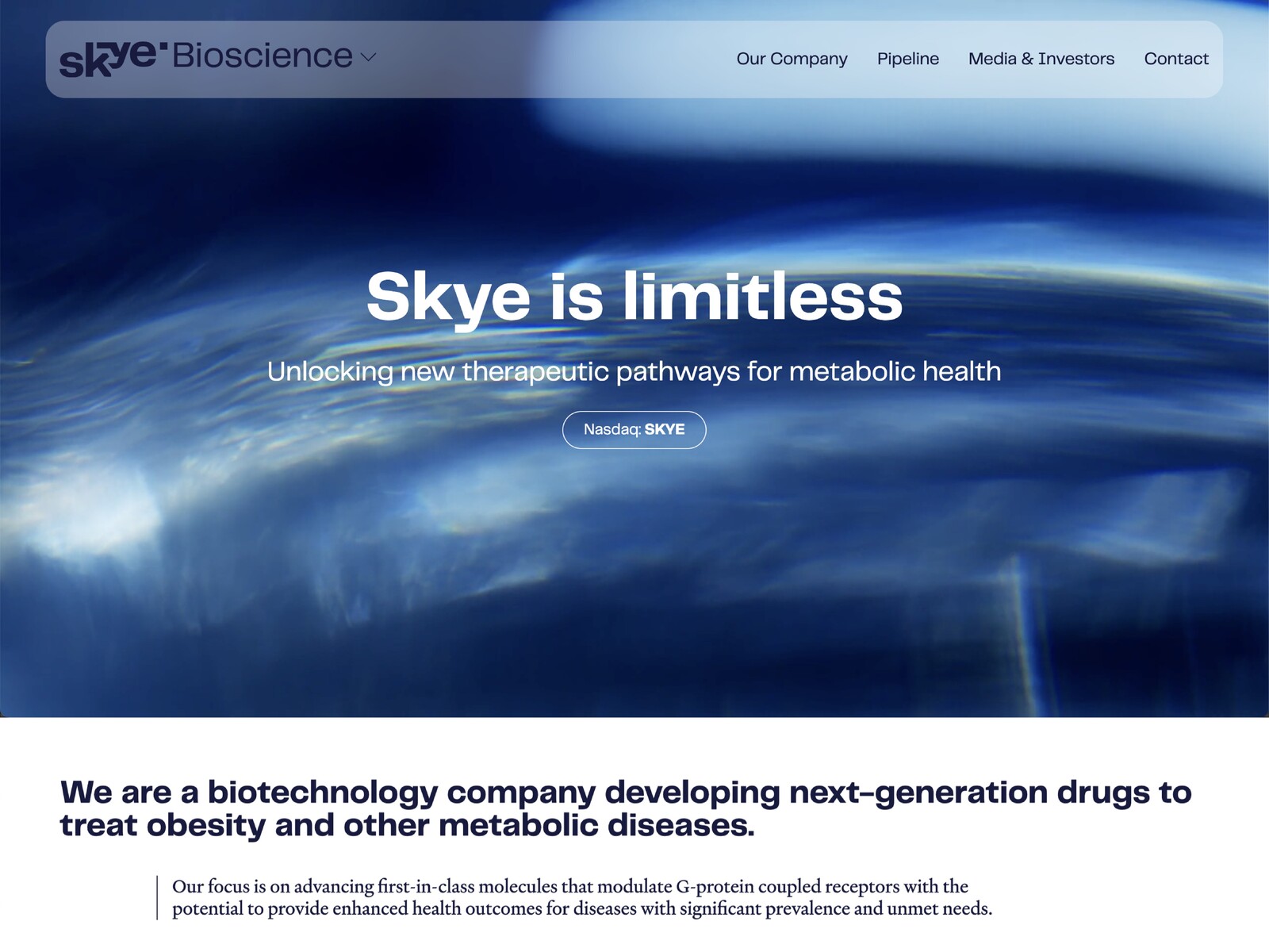
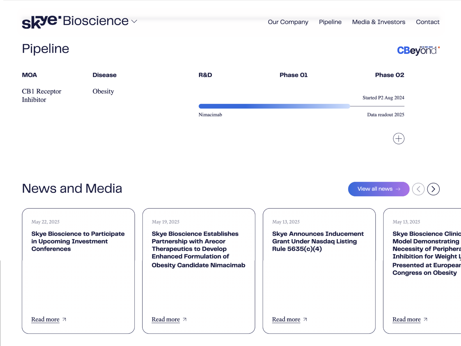
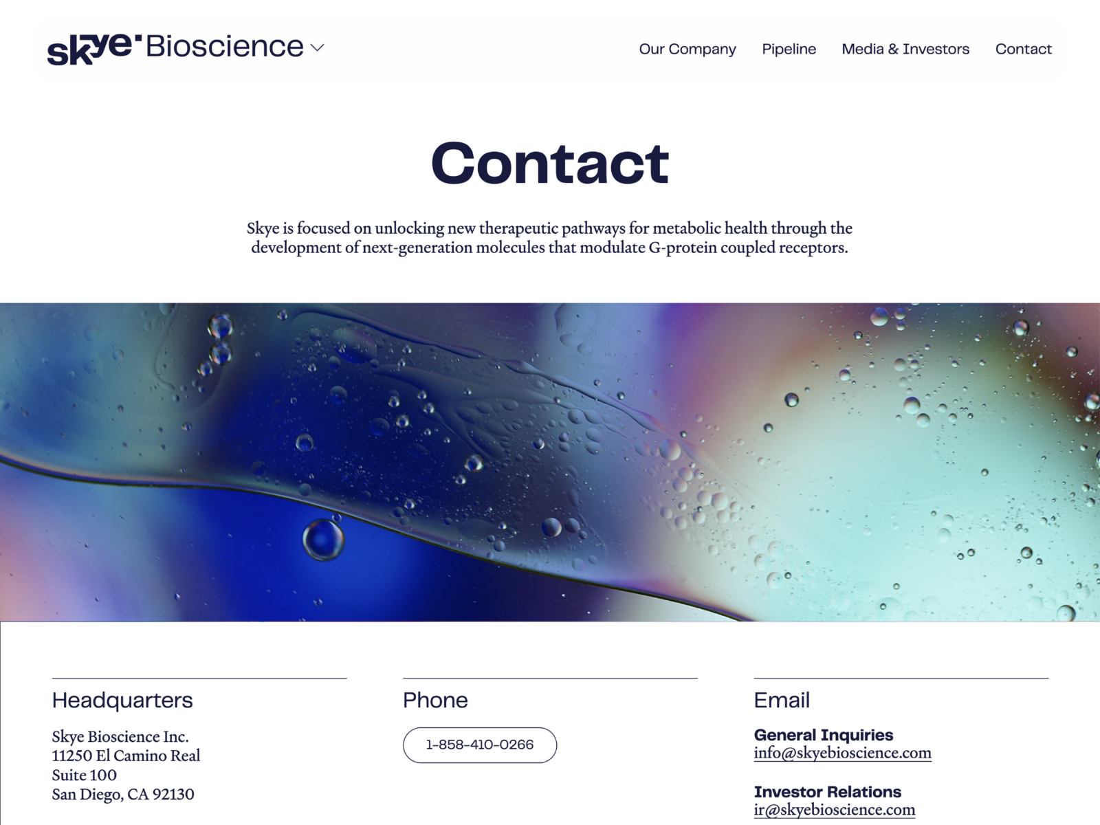
The homepage concentrates atmosphere in a blue surface, while pipeline and news move onto a white background. The journey changes pace. In the news, dates appear before headlines and cards keep a common structure. Contact brings the image back in a strip and leaves the different channels underneath. I am interested in that distribution: the brand can make a powerful impression and offer quieter places to consult information.
In a research company, content changes and some pages need highly visible dates. A recognisable news structure separates an update from a stable explanation of the company. Visitors should be able to tell what they are reading and find the complete source when a summary catches their interest.
What I would examine for another company: the relationship between permanent content and content that becomes outdated. I would prepare different templates for an institutional page, news item and document, then review how they link together. A news block on the homepage needs decisions about how many pieces it shows, which details it presents and what happens when the headline is long.
Contact deserves design too. Separating general enquiries, investor relations or other channels can shorten journeys and give a message context. Those options need names people understand. A beautiful form loses usefulness if nobody knows which category to choose or receives a clear indication after finishing.
For me, Skye represents an important quality of a modern pharmaceutical website: building a recognisable atmosphere while retaining space for everyday information. The project needs to work on presentation day and keep accommodating new content months later. That second part belongs in the brief from the start.
5 Actúa Pharma connects catalogue and point of sale
Actúa Pharma changes the conversation. Here, the catalogue, product search and connection to the pharmacy take a central role. This is one of my own web design and development projects, documented in the portfolio in 2026. The homepage combines an everyday scene with geometric shapes in several colours. Search and product access appear as recognisable actions from the beginning.
Actúa Pharma. My own project, Jordi Ensenyat Disseny / CodeBarcelona. 2026 portfolio. View the case and demonstrations.
The Actúa scene puts the message in an everyday situation, with geometric shapes occupying the composition’s edge. Search sits in the header, and the product button offers another direct route. There are three functions on one screen: expressing the tone, enabling a specific enquiry and opening catalogue exploration. For a brand with several product families, that distribution deserves designing from the start, because each visitor may recognise a different entrance.
When a company has several product lines, visitors may arrive with very different knowledge. Some know an exact name; others need to explore a category. Catalogue design should accommodate both journeys. That affects the menu, search, filters and the way each group is named. The work starts with those words before it reaches the colour of a card.
What to learn from this case: consider the whole enquiry journey. The user enters, identifies a family, opens a product page and finds a next action related to what they have read. In this project, the pharmacy finder belongs to that journey. Design can connect content and distribution without requiring every visit to end in a sales form.
Imagine two visits to the catalogue: one person types a name they know; another starts with a category. Both should reach a page that identifies the product and makes its sections findable without having to learn the page again. In a similar project, I would test one entry with little information and another with several formats or documents. That comparison identifies shared fields and necessary exceptions. Product pages stop being an ideal layout when the less convenient catalogue cases arrive.
The more cheerful visual tone also calls for care with text. A brand can speak warmly and keep its explanations precise. If a phrase is repeated throughout the site without adding information, it starts to weigh things down. I would reserve the most distinctive headlines for section openings and use direct language in search, product pages and contact.
6 Laboratorios Rubió organises an international company
Laboratorios Rubió is another of my own projects, documented in the portfolio as work from 2024. Its corporate website brings together the company presentation, products, international activity and contact channels. The homepage uses laboratory photography, highly visible blue navigation and the identity’s yellow. This is a more institutional direction than Actúa’s, with a different organisational need.
Laboratorios Rubió. My own project, Jordi Ensenyat Disseny / CodeBarcelona. 2024 portfolio. Case and original journey.
The Rubió homepage uses several recognisable layers: a blue navigation band, the yellow symbol at the top and a wide photograph presenting the activity. The headline sits over that scene, while menu entries keep their space. The structure supports more institutional communication than Actúa’s. Comparing them interests me because two companies in the same sector can need different tones and hierarchies.
An international company may bring together several languages, audiences and business areas. The menu should not become a copy of the organisational chart. Decide what someone discovering the company wants and what someone with an existing relationship needs. These are different questions that may call for different routes within one architecture.
What I would apply to another laboratory: map the journeys before designing the homepage. Choose specific tasks: locating a product line, consulting company information, finding a contact or changing language. Then check how many decisions each task needs and how the page’s context is communicated.
On a multilingual website, identity can remain stable even when text length changes. Buttons, headings and menus need room for that variation. Designing with very short sample phrases can hide problems that emerge when actual content arrives. Test navigation with the final names and review the densest pages.
Photography also benefits from shared criteria. Laboratory work, portraits and company scenes can have different framings but should find a visual relationship. That lets the website grow without every update looking as though it comes from another company. Consistency is built through repeatable decisions the team can maintain.
7 Allergy Therapeutics separates audiences and resources
Allergy Therapeutics Ibérica, one of my own projects presented in the portfolio in 2026, contributes an essential structural question: one company can speak to patients and professionals through different journeys. The documented navigation has identified areas for both audiences, alongside company, content and contact. The design uses a light foundation and colour accents to organise its elements.
Allergy Therapeutics Ibérica. My own project, Jordi Ensenyat Disseny / CodeBarcelona. 2026 portfolio. Design and development case.
The example interests me because it shows that navigation has an editorial purpose. Naming an entrance changes expectations about what we will find inside. Someone entering a professional area expects a different type of information and level of detail. Design should support that expectation through headings, context and recognisable resources.
The documented homepage gives prominence to the Boletín Bibliográfico BBI, with large initials and its own entrance. Below, the corporate welcome moves to another level. That order puts a reference resource ahead of the general company presentation. For another website with recurring publications, I would test the homepage with the current edition and the archive page. We need to recognise the resource and retrieve an earlier edition when we arrive with a specific reference.
What I would take into another company: organise resources around the visitor’s task and clearly indicate their intended audience. Then review access from a search, direct link or news item. The homepage is not always the first page a person sees. Each piece of content needs enough context to work as an entry point.
Files and documents deserve similar attention. A link should explain what it opens, which subject it covers and, where relevant, its date or edition. That information prevents blind downloads and helps compare similar resources. A coherent system also makes it easier for the team to publish the next piece without inventing a new structure.
The result I would seek is an organised experience where content finds its audience. Design, writing and review need coordinating. The designer can clarify the journey, while the people responsible for content validate which information belongs in each space. Both tasks need a place in the schedule.
8 Rubió ID puts company culture first
Rubió ID closes the examples with another role for a pharmaceutical website: communicating culture, purpose and the employee proposition. This project of my own, documented in 2026, is different from the Laboratorios Rubió corporate website included earlier. Its structure brings together values, internal life, benefits, ethics and the working environment. The company identity remains present, but the content changes the conversation’s focus.
Rubió ID. My own project, Jordi Ensenyat Disseny / CodeBarcelona. 2026 portfolio. View the company culture website.
On the documented Rubió ID homepage, a scene of people together fills the background and a large headline introduces company culture. The top bar provides access to philosophy, life at Rubió, benefits, ethics and the environment. Yellow keeps the connection to the corporate brand. The content changes the reason for visiting and receives its own navigation; that is the decision I would study when comparing this project with the general Laboratorios Rubió website.
Separating this need from product communication seems particularly useful to me. Someone interested in working at a company seeks different answers: how it is organised, what it values, what it offers and what daily activity is like. Reusing the commercial homepage with a different headline rarely develops all those questions.
What I would use in another project: build a structure around specific subjects the team can explain with examples. An abstract value needs context to feel credible. A benefits page requires an understandable description and a way to keep it current. Design can organise that material and provide continuity, supported by content the company can sustain.
Images should follow the same criteria. A good photographic selection can bring the working environment closer, show collaboration and give facilities a sense of scale. Repeated generic images eventually create distance from the page’s story. Before commissioning a shoot, I would prepare a scene list connected to each subject and the actual spaces.
This case broadens what we understand by pharmaceutical web design. The company also needs to communicate internally and attract people with different profiles. That content can have its own voice, connected to the wider brand. Planning it as a project with goals and owners gives it more depth than a small section added at the end.
How to take these references into a pharmaceutical website for 2027
After eight designs, the temptation is to choose the most striking homepage and start imagining colours. I would begin a little earlier. Write down what someone should understand on arrival and what they should be able to do next. That may be learning about a technology, exploring products, finding documentation, locating a contact or considering a job. This decision changes almost everything that follows.
Define one main task for each journey
For a laboratory seeking partners and new professional talent, I would begin with two journeys. One enters through a technology page and needs an explanation and a contact. The other examines the team, way of working and available opportunities. I would prepare the pages each route requires and mark where they share content. Then design a homepage that presents them with a clear hierarchy. Structure starts making sense when we can describe who arrives and what they are trying to resolve.
The earlier examples let us compare solutions. Bright Biotech uses a visual story to introduce its activity; Actúa foregrounds catalogue and search; Rubió ID develops company culture. Those differences help formulate the brief. Simply asking for a modern website leaves too many decisions open that need a specific answer.
Design with content that will actually be published
The prototype of that technology page should include a final title, reviewed explanation and an image we can use. I would add a document with its real name and date and the contact intended for that enquiry. On the careers page, include one long vacancy and one short one. These cases force checks of reading, length and organisation before considering the design resolved. If content remains under review, we need to know which version we are using and what may change.
I would also define who maintains each section and how often. A document archive, product list and news block have different needs. The publishing interface should make the work easier and preserve the visual approach. Editability has little value if every update requires rebuilding the page.
Use visual impact to explain more clearly
Motion, colour and scale can supply plenty of personality. Each resource should relate to content and have an appropriate place. A large scene works as an entrance; a table needs clarity; a search needs a quick answer. Alternating those rhythms lets visitors enjoy the presentation and find what they came to consult.
For further identity references, the collection of graphic design trends for 2027 helps you study typography, imagery and visual systems. Those ideas then need turning into pages with content of your own. An attractive identity provides a foundation; web design decides how it is used during reading and navigation.
Check the most-used pages
I would review mobile use through specific tasks on several pages, alongside the homepage. Finding a product, opening a document, changing language and sending an enquiry are good starting points. Check reading, sizes, error states, keyboard navigation and image and video behaviour. A review gains value when it reproduces something a person needs to do.
To make those pages findable through search engines, I would use names that explain their content and relevant links between technology, company, resources and contact. Every page needs a clear purpose and enough information of its own. Titles and metadata should match what people find when they open it. In a collection like this, the year organises the edition; on a laboratory website, authority also comes from identifiable content, sources and updates the team can maintain.
Choose a system your team can maintain
The website published today should accommodate the next product, news item or language. Identify repeating components and exceptions that need another template. That preparation preserves the visual direction’s strength as the website grows. A small, well-defined system tested with real content may be more useful than a long collection of effects that are difficult to reuse.
For a pharmaceutical web design project, the starting point is bringing communication, content and operations into a clear brief. We can then decide what deserves a powerful image, what needs a visual explanation and what should be resolved through straightforward navigation. Every company has a different mix.
These eight references leave plenty of room to work in 2027. There is space for distinctive typography, a less predictable palette, well-directed photography and resources that help people understand. If your laboratory or pharmaceutical company is preparing its next website, tell me about the project. We will start with audiences, pages and content, then give it all a form that makes sense and wants to be seen.
Before requesting a proposal, explore pharmaceutical company website costs for 2027 and how to write a pharmaceutical website brief. They help define scope, content and responsibilities before commissioning the work.