The best freelance developers for 2027 can help turn an art direction into a website with character. This selection brings together orange mountains, enormous typography, curved galleries and small systems that respond to the people exploring them. We will look at real projects and consider the development decisions behind their screens. Code can have quite a personality too.
I have brought together four references that show different approaches to creative web development. Rogier de Boevé connects a portfolio with game scenes; Martin Laxenaire uses animation and interactive graphics in his own presentation; Aristide Benoist develops an editorial experience for cinema; Dennis Snellenberg coordinates components and states within a distinctive identity. Their professional pages and original project credits identify the contribution each person made.
“Best” describes an editorial selection intended to inspire projects and help prepare collaborations. Each case keeps its actual date in the credits. The projects come from several years because some decisions still deserve a proper look when we plan our next website. The year 2027 identifies this edition of the series. These references also give us practical questions about content, navigation, interaction and delivery.
If you have a website in mind, you can start with my freelance web developer service and use these examples to explain the experience you want. To compare the visual decisions first, the selection of best freelance designers 2027 completes the journey. Here we will focus on how a graphic proposal becomes an organised website that moves and responds to its visitors.
Rogier de Boevé and a portfolio that takes flight
Rogier de Boevé takes Glenn Catteeuw’s portfolio into a landscape of mountains, orange lava and enormous project names. The list fills one side while the scenery has room to change colour and perspective. It makes a memorable entrance to the selected work. There is another surprise waiting: Glenn himself ends up flying through the canyons of a game. The development has plenty to contribute to this website’s personality.
The GC 2026 case identifies Glenn Catteeuw as the client and credits Rogier with full stack development, with 2026 as the case year. On his professional page, the Belgian developer introduces himself as an independent freelancer specialising in creative development and digital design. We will examine the material published in that case: two images and two videos documenting different parts of the portfolio. They let us consider how navigation, content presentation and three dimensional scenes relate to each other.
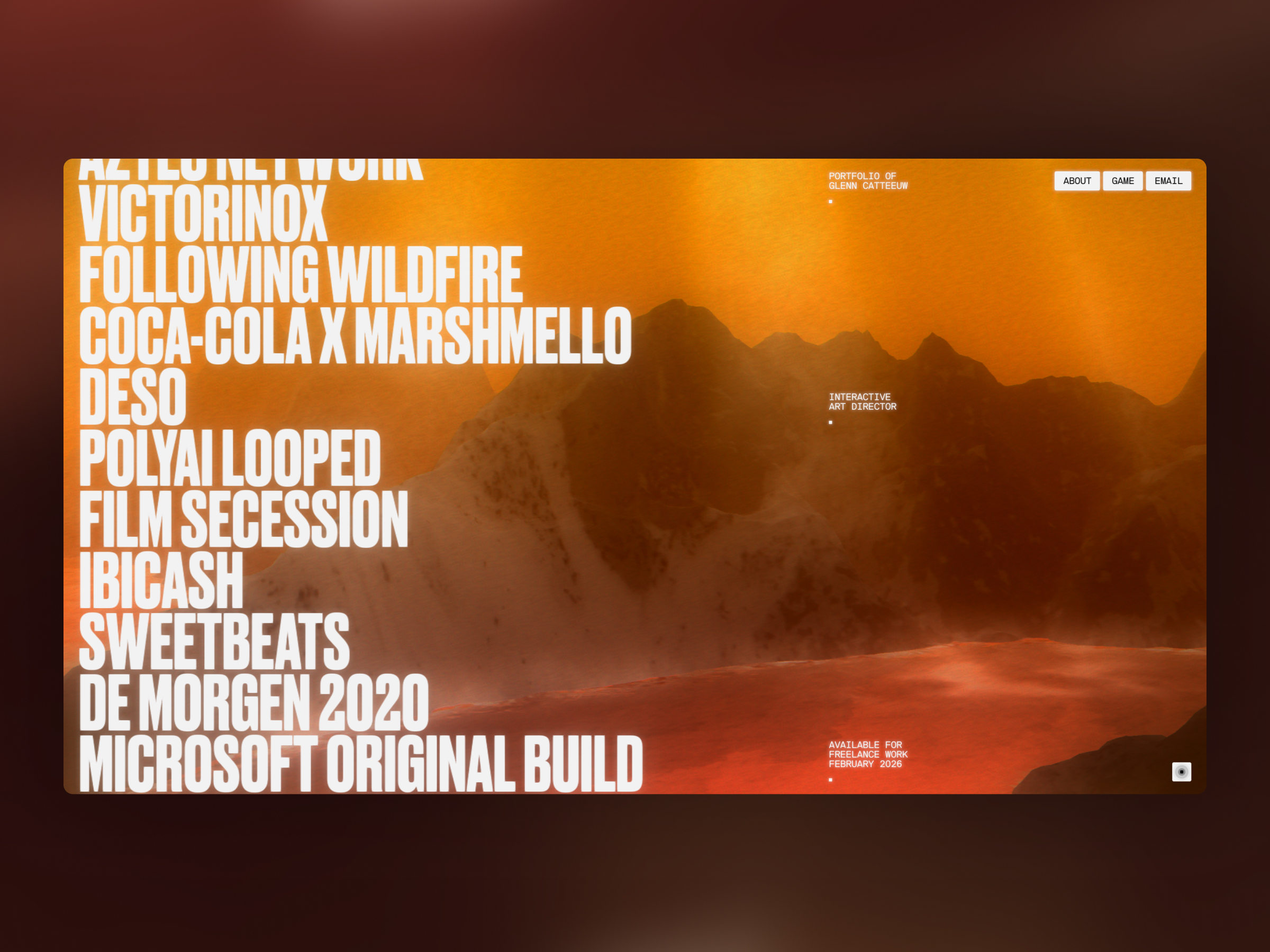
The first image places the homepage inside a rounded rectangular frame. On the left, names are stacked in very narrow, tall white sans serif type. The right side holds the portfolio’s signature, professional description and About, Game and Email controls. Orange mountains and a luminous surface fill the background. The difference in scale is substantial: the list carries the graphic voice and the small labels provide identifiable places for finding your way.
When assessing a freelance developer, this screen suggests a fairly specific brief. A long list, its selection states and a scenery with a strong presence need to work together in the same space. It is also worth deciding what remains visible while the content is explored. The small controls on the right provide that sort of reference in the composition. The image helps us discuss those needs in detail and prepare a prototype that connects them.
The first video begins on white, with Glenn’s name and speciality separated into two typographic groups. A vertical window onto the landscape then appears alongside the entry options. As the recording progresses, the scene expands and we reach the list of work. It shows the passage from a contained introduction to a surface filling the screen. The narrow typography connects the two moments, even as their proportions and the importance of the background change.
Later in the video, the list moves and small project previews appear beside the names. One highlighted entry uses slanted lettering; the landscape passes through orange, pink, purple and yellow across the recorded states. These relationships deserve attention in a selection of creative development: text, supporting imagery and atmosphere find ways to respond within the same composition. The author’s material documents those states over a long enough sequence to compare their roles and visual balance.
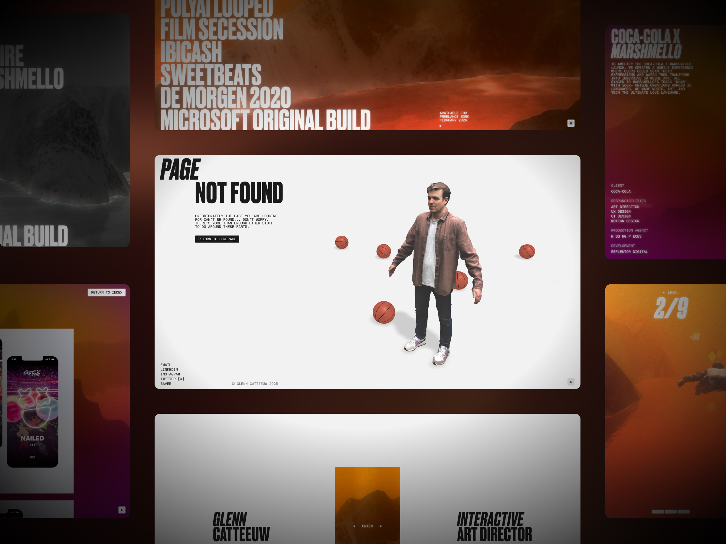
The second image combines several screens and puts an error page at the centre. “Page not found” appears in black on white beside Glenn’s figure and basketballs. A control leads back to the homepage, with contact links underneath. Around this central panel we see portions of the index, a project description and the game. The collage helps explain how the personality extends to an unsuccessful navigation. Even the error has its own cast.
I like examining this kind of screen when preparing a bespoke project. Recovering from a missing route needs a message and a clear destination; here those elements share the page with the author’s visual treatment. The project description on the side adds another content type: name, explanation, client and responsibilities. These are different pieces a developer needs to integrate into the journey. Asking for them at the beginning helps define the states included in the eventual delivery.
The second video brings its own dose of play. It first presents the error page, with Glenn’s figure and basketballs appearing around him. Then it moves into a flight through canyons: the character travels across an orange landscape, passes yellow shapes and shares the screen with a score, level and exit control. The sequence shows an unlocked portal and a move into a darker setting. The typography maintains a family resemblance to the portfolio while the activity changes considerably.
As a reference for commissioning development, the clip lets us discuss scenes, states and controls with images in front of us. A game needs to explain how to enter, what can be done, how progress is recognised and how to return to the content. The presentation documents some of those elements. For another commission, I would turn them into a list of functions and screens for the prototype. That preparation makes a conversation about a three dimensional experience considerably more concrete.
I would consider Rogier for a collaboration where the art direction needs to work with navigation, scenes and small interactive systems. GC 2026 presents a complete portfolio with several content types and a game layer. If you are preparing something similar, my freelance web developer service can help define the scope your project needs. To explore the designer’s decisions too, the selection of best freelance designers 2027 extends the conversation. Those mountains have already given us a few ideas.
GC 2026, Glenn Catteeuw’s portfolio. Client: Glenn Catteeuw. Full stack development: Rogier de Boevé, according to the original 2026 case. Images and videos from that presentation. Independent freelance practice checked on 13 October 2026 on his professional page.
Martin Laxenaire turns his portfolio into a playground
Some portfolios ask for a little attention, and others arrive ready to play. Martin Laxenaire’s belongs to the second group. An enormous white outline headline crosses a background of wavy bands. Colours stretch out from a centre and seem to push the composition towards the edges. A small control sits below, ready to begin. The homepage has a very clear voice: movement will be part of the work we are about to discover.
On his website, Martin introduces himself as a developer specialising in animation, WebGPU, WebGL, Canvas and SVG. His professional OKAYDEV profile identifies his freelance practice. This selection looks at his personal portfolio from 2025, a reference that remains interesting when preparing projects for 2027. The author explains that it uses Nuxt 3, Sanity and WebGPU through gpu-curtains. Those technologies belong to this particular case; his work also includes projects using other architectures.
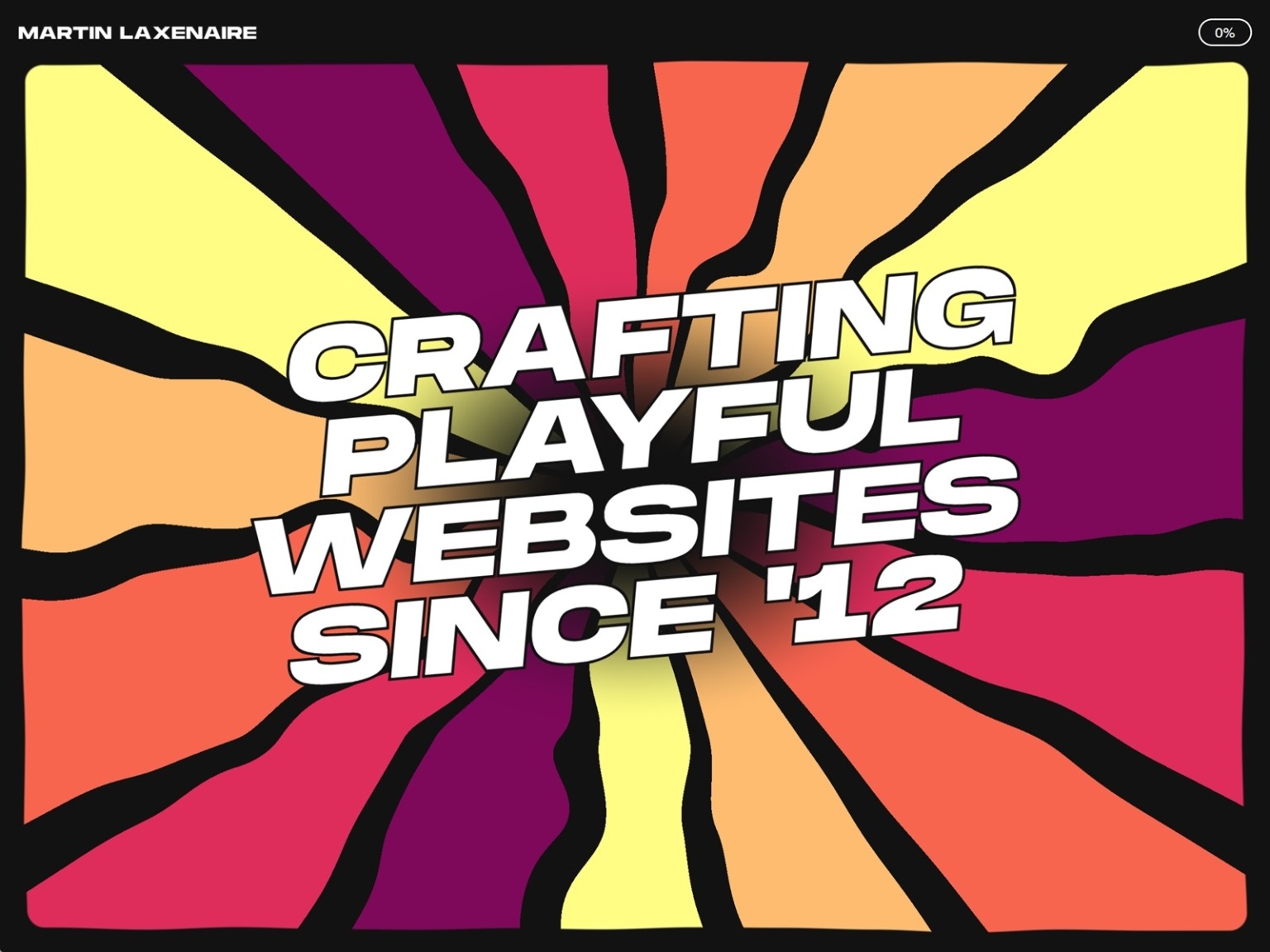
The homepage combines two extreme scales. His name and the upper controls fit into a fairly small line, while the main message occupies almost the entire surface. In the image, black gives the outline letters breathing room as yellow, coral and magenta fill the gaps. The result resembles a concert graphic that has found a way to move. That contrast is useful for examining how an interface retains discreet reference points within a composition full of energy.
The entrance video shows a different colour combination, with green, yellow and cyan. The phrase appears over the shapes and the lower control eventually finds its place. We can observe the complete sequence in a few seconds. The static image explains the arrangement; the video adds the timing relationship between its elements. When a proposal depends on movement, both deserve attention. A beautiful screenshot still leaves questions about the entrance and the point when a visitor can begin navigating.
The work gallery plays with large white years and panels that appear to rotate around a cylinder. We see 2022, 2023, 2024 and 2025 pass by alongside small project fragments. Screens bend and change position, while the year retains an organising role. It is a very physical way of presenting a career: the archive has depth and its movement takes a recognisable form. It makes you want to keep exploring to find out what arrives with the next turn.
This resource invites a discussion about the gallery’s behaviour before its technology. How is the selected item identified? What happens at the edge? How does a video screen fit into the collection? What journey will someone using a keyboard or a small phone have? These are decisions a creative development commission needs to define in the prototype. The recording offers a precise visual reference for that conversation while the individual client projects retain their own authorship and credits.
Another scene fills a black room with red and gold spheres, with a green grid describing the space. Groups gather, separate and follow the luminous point crossing the screen. Their surfaces shine while the background lines help us perceive depth. Watching such a dense cloud respond as a group is delightfully playful. The graphic detail on the spheres also gives them an identity within the scene, beyond their shared circular shape.
The scene demonstrates response and spatial organisation. When commissioning this kind of development, I would ask to review which actions affect the objects, how the initial state is restored and what alternative the content has when a graphic capability is unavailable. I would also reserve part of the commission for representative devices and movement preferences. The video shows the author’s presentation; validating a new project requires its own tests and acceptance criteria, agreed with the team responsible for delivery.
The open source area exchanges spheres for a stream of small magenta, red and yellow pieces against black. A white line appears across the composition, revealing two treatments on either side: elongated fragments and a texture of small squares. The gesture introduces a comparison we can understand visually. The scene retains the upper controls and a progress indicator. Even as the imagery gets fairly wild, there are still reference points around its edges.
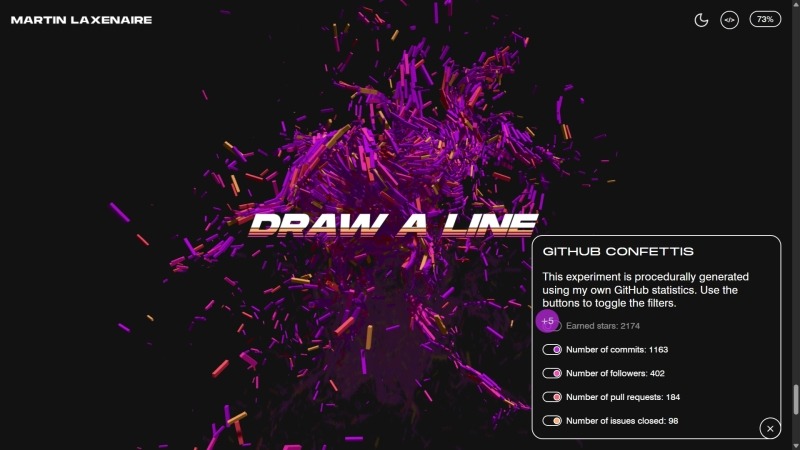
The filters image adds a small panel over that same energy of particles. It identifies categories of GitHub activity, with switches and figures from the 2025 presentation. It suggests a useful development conversation: a visualisation needs to decide which data it represents and how the visitor can explore them. The panel and the scene share a space while working at different scales. That distinction gives the controls a discreet presence and lets the visual response take centre stage.
I would look at Martin’s work when a project calls for animation, interactive graphics and a distinctive visual voice. His portfolio helps discuss a collaboration with examples in front of us, from a typographic entrance to a gallery or particle scene. If you need to turn an art direction into a website, my freelance web developer service is a starting point for defining content, states and delivery. The play can be ambitious; the brief can be carefully explained too.
Martin Laxenaire’s personal portfolio, 2025 version. Images and videos from his original Codrops presentation published on 6 October 2025. Practice and specialities checked on 13 October 2026 on his website and professional profile. The assets document the author’s presentation.
Aristide Benoist opens a door into cinema
A gold key crosses the words House of Gucci while black and white portraits surround the title. White gives the whole cast generous breathing room. The homepage concentrates the film’s personality into very few elements: names, faces and an object inviting us inside. Within this selection of freelance developers, Aristide Benoist brings an editorial presentation where the opening of the journey and the passage between its pieces matter a great deal.
His case credits full stack development and motion for MGM Studios–Watson DG, with February 2022 as its completion date. It is an earlier project we continue to examine for its interface decisions. Aristide’s professional page introduces him as an independent developer specialising in motion and interaction. The House of Gucci commission has a clear direction: exploring material from the production, characters and film team. That collection needs a structure capable of accommodating different images, texts and chapters.
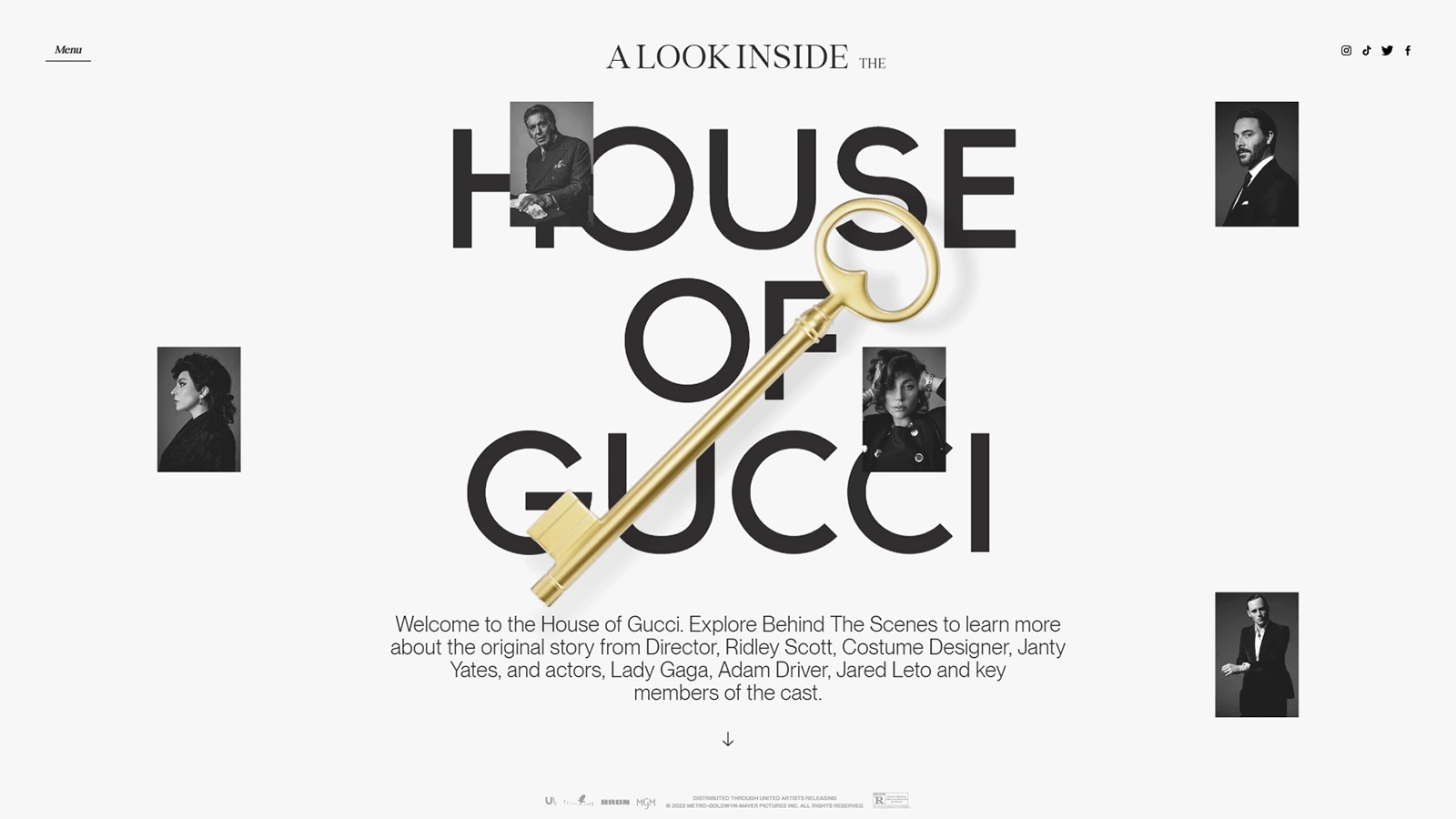
On the homepage, the upper phrase uses a finer treatment than the large central title. Portraits sit at different heights and the key draws a diagonal across the three lines. A small paragraph below explains the invitation, and an arrow points towards the next part. The mix of scales interests me: the title provides the visual entrance, the object gives the composition a direction and the explanation adds context. Everything finds a place around a fairly recognisable centre.
When preparing development for a campaign, a homepage like this helps define priorities. The project can begin with a strong composition and then offer access to much more detailed material. It is useful to agree where the introduction ends, which action opens the next stage and how a visitor returns to the index. The key can carry the graphic gesture; destinations and their states also need clear definition in the commission. That preparation gives the art direction a useful journey.
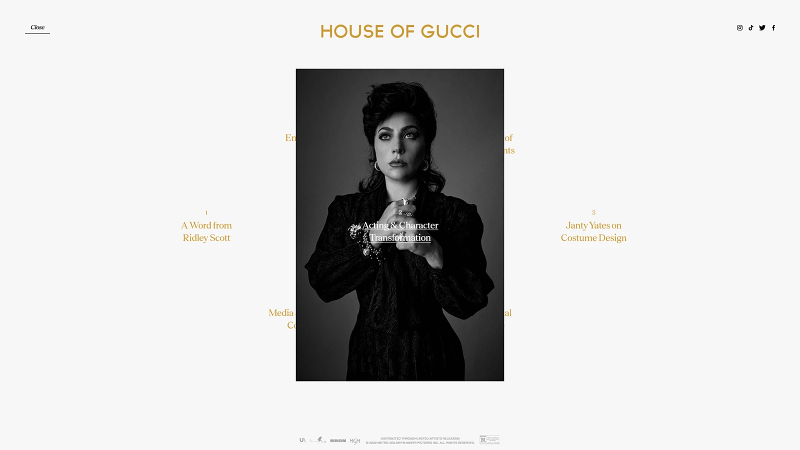
The second screen puts a portrait of Lady Gaga in the centre and arranges the names of different chapters around it in gold. The header retains the film title and the links at the edges are discreet. Photography takes the lead, with entries on both sides inviting exploration. The image occupies a defined central area. White margins and the arrangement of options let us read the screen as an opening for a section.
The website linked by Aristide groups four chapters: Ridley Scott’s perspective, character transformation, costumes and media content. That organisation lets us identify a recognisable development need. Several content families share a visual direction, while each requires its own text, imagery and entry point. For a similar project, I would prepare a representative sample of every chapter before finalising the system. The structure can then be reviewed with real content from the prototype stage onwards.
Another useful conversation concerns the passage between the index and a section. The title, active selection and closing controls help identify the change in context. A client commissioning an editorial experience can request those states as part of the delivery and review them with the team. It is also useful to check the reading experience when titles change length or language. The screen we are examining relies on a carefully measured composition; adapting it requires attention to those variations.
I would consider Aristide for campaigns, portfolios and digital publications where transitions have an important responsibility in presentation. House of Gucci offers clear examples for discussing a homepage, index and content, while identifying the development and motion work. If you need a manageable editorial structure, explore my bespoke WordPress service and decide which part of the project needs its own content system. Good staging also benefits from a clearly defined delivery.
House of Gucci. Full stack development and motion: Aristide Benoist. Credited client: MGM Studios–Watson DG. Completion: February 2022, according to his original case. Original website screens from that presentation; film material and rights belong to their respective holders. Editorial organisation checked on the project website on 13 October 2026. Included for its presentation and navigation decisions.
Dennis Snellenberg coordinates a website full of states
FABRIC combines a black homepage, large white lettering, red curves and a grid of fine lines. It has visual force and also presents a varied collection of content: companies, articles, principles and community. Dennis Snellenberg credits web design and development in the 2023 case; Ché Heijnen created the branding. When examining a freelance developer’s work, this case is interesting for the different ways one identity becomes organised throughout the website.
Dennis introduces himself in his portfolio as a freelance designer and developer based in the Netherlands. This section pays particular attention to the states documented in FABRIC’s original videos. The homepage, principles block, articles and menu present different interface challenges. When preparing a collaboration, that variety helps assess how a professional develops a visual direction with continuity between screens, even when the amount and type of information change.
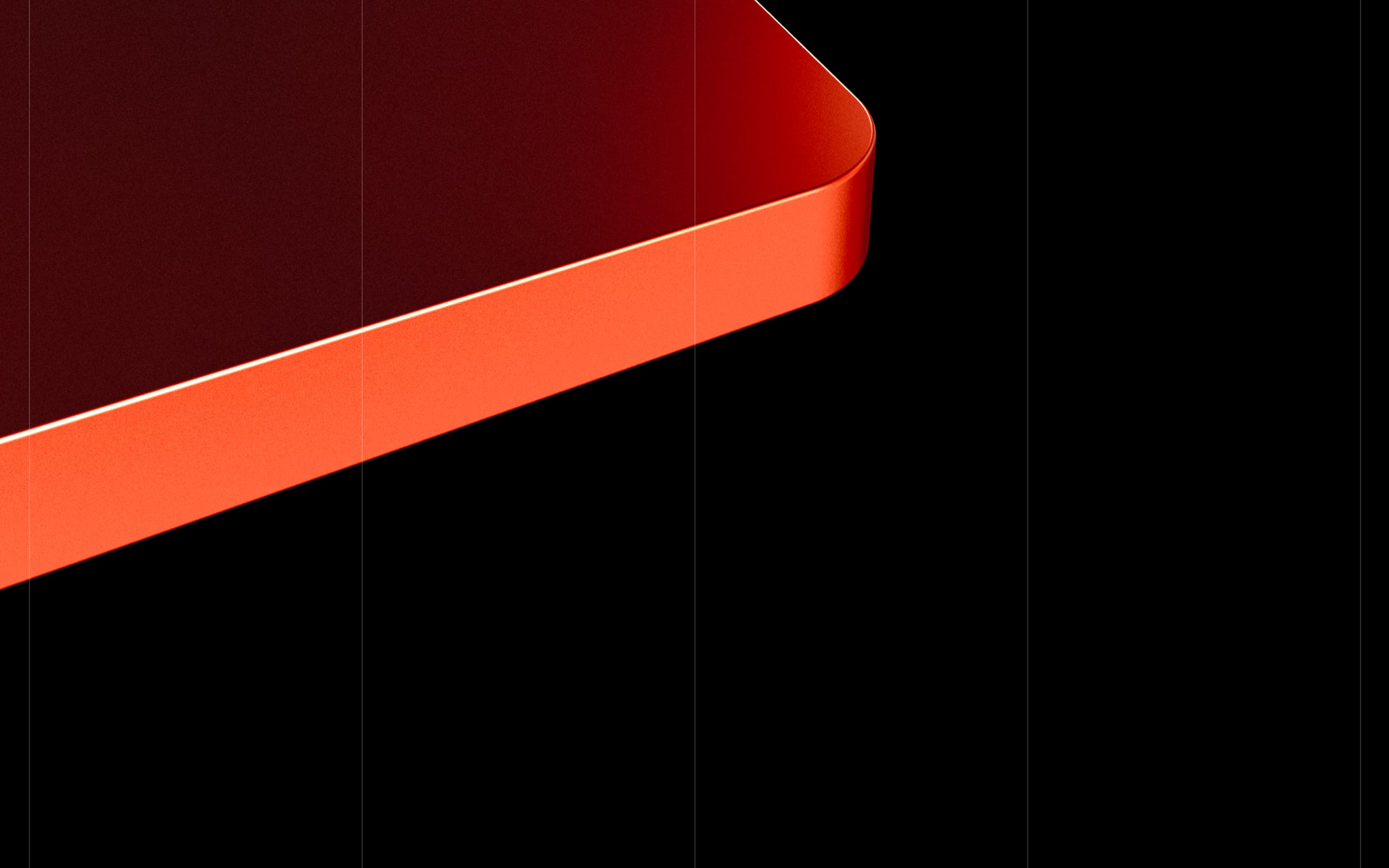
The red curve rests against black divided by vertical lines. Its luminous edge adds volume and occupies a broad diagonal. That graphic layer has considerable presence even before content appears. In a new project, it would be useful to decide which part of the homepage should respond, which information takes priority and how the composition carries across other sizes. The original image gives us a clear reference for talking about distribution and contrast.
The opening recording moves through the homepage, with FABRIC in very large white letters, and continues towards a company list. Light cards contain logos and small details such as location, year and category. The transition changes the density of information: the name occupies an enormous surface and details gather into modules further along. The grid helps relate those sizes. There is room for impact and for consulting the content within the same visual system.
This part of the case encourages representative content during development. A card with a wide logo, another with a long name and another with several categories reveal different needs. I would review those variants before finalising the component, along with its link state and mobile behaviour. A company catalogue can grow, change order and gain new entries. The delivery should explain how to add that content while preserving the visual system agreed for the project.

The circular symbol made of four pieces suggests another opportunity for interaction. Each quadrant can be recognised separately and the empty centre keeps the whole form legible. In the FABRIC presentation, we also see it beside a principles block. That relationship between a brand shape and several categories opens an interesting conversation: which part changes, which text accompanies the state and what indication the visitor receives while exploring it. Ché Heijnen’s branding supplies the shape; development needs to coordinate its responses.
The principles video shows labels, text and quadrants whose illumination changes. A red sector stands out within the white symbol while the text retains a stable space alongside it. The composition lets us compare states without rearranging the entire screen for each change. For a similar commission, I would review the relationship between selection and content, keyboard access and the legibility of the active state. The clip documents the author’s presentation; a new implementation has its own QA process and checks.
In Writing, three light columns bring together titles, dates and categories. One card turns grey while a message identifies its destination on Medium. The treatment makes a navigation decision visible: editorial content carries its own information and may also lead to another platform. When developing a section like this, it helps to agree where the link opens and how the destination is presented on devices without a cursor. The change in background can identify the selection, while the link text keeps a clear task of its own.
The final video presents Community and opens a white panel in the upper right corner. The background dims and navigation entries appear. The panel then closes and we return to the page. They are brief states, but important when assessing an interface: entering the menu, identifying options and returning to the content. Including this journey in a prototype helps settle details that a collection of static screens can leave open for interpretation.
I would look at Dennis when a project needs to combine a strong visual direction with a coherent family of components and states. FABRIC offers references for a homepage, catalogue, editorial content and navigation within the same language. My freelance UX UI design service can help decide which choices to establish before development. The large letters attract attention; the small states help the journey continue to make sense.
FABRIC, 2023 case. Web design and development: Dennis Snellenberg. Branding: Ché Heijnen. Images and four original videos from the FABRIC case. Freelance practice checked on his portfolio on 13 October 2026. This section examines the development and interface states documented in that presentation.
How to choose a freelance developer for your 2027 website
The most useful reference is one you can relate to a need in your project. If you want a portfolio with a particular journey, observe how its index is presented and how each piece of work is reached. If you need editorial content, examine the page families that appear. If the proposal includes an interactive scene, define its actions and the information that should remain available. A good visual example helps explain the commission with considerably more precision.
I would prepare a first conversation with three things: representative content, annotated references and a function list. Then I would agree what the prototype will show and what should be checked before delivery. That includes screen sizes, keyboard navigation, movement preferences, forms and the states required by the content. When those points are written down, it is easier to review progress and identify which matters belong to a design decision and which require an implementation fix.
It is also useful to define who will edit the website and what they can change. A campaign landing page, portfolio and multilingual publication have different management needs. If your project requires a content editor, look at my freelance WordPress web design service and decide which structure you need to maintain. Bespoke development can incorporate movement and personality within a system your team knows how to use.
These four references leave us with concrete ideas: an index can share a setting with a game, an archive can have depth, a campaign can be organised into chapters and an identity can shape many states. The next step is choosing what adds value to the content you want to publish. The selection of best web designs 2027 offers more examples for exploring possibilities. There is plenty to enjoy and plenty to help prepare a better commission.
Frequently asked questions about freelance developers
How did we choose these freelance developers for 2027?
I selected four professionals with documented independent practices and cases showing creative development, motion and content organisation. Images and videos come from their original presentations, with credits for each project. The selection helps inspire and compare approaches when preparing a website. Each reference retains its actual year; 2027 identifies this editorial edition.
What is the difference between a freelance designer and developer?
Design defines presentation, visual structure and experience decisions. Development implements behaviour, components and the relationship with content. Some professionals work in both fields, as their credits show. When commissioning work, specify which tasks the collaboration includes and who handles each part, from the initial proposal through testing and delivery.
Can a WordPress website have this kind of design and interaction?
A bespoke WordPress project can have its own visual direction and interactions adapted to its content. The choice depends on scope, who will edit the website and maintenance requirements. Before choosing the architecture, I would prepare sample content and a prototype of the main functions. Each case in this selection uses its own solutions; technical credits should be checked project by project.
What should I prepare before hiring a freelance web developer?
Gather available content, an explanation of your objective, annotated references and the functions you need. Add the languages, tools to connect and the people who will maintain the content. It helps to identify essential functions and those that can be added later. With that information, the professional can propose a scope, prototype and delivery you can assess against clear criteria.
How should a website with many animations be tested before publication?
The review should cover representative devices, screen sizes, navigation, forms and content states. Also check keyboard access, movement preferences and the behaviours planned when a graphic capability is unavailable. Portfolio videos show their author’s presentation; your commissioned project needs its own tests. Define from the start what will be reviewed and how issues will be resolved before publication.