The best WordPress designs for 2027 can feature enormous shapes, letters that take over the screen and photographs that make you hungry. We have gathered five real references to enjoy the design and consider how an identity becomes a website you can keep publishing. There are buildings, urban art, cinema, restaurants and a graphic design studio. The content manager shares a table with them all; each project’s personality brings its own tableware.
This is an editorial selection of examples to inspire projects for 2027. Each reference retains its date and credits. Four come from presentations published by WordPress Showcase in September 2023, which document WordPress in those versions. The fifth has a developer’s technical credit and material published by the studio itself. The edition date places this selection in context; it does not turn earlier examples into launches for the coming year.
We will examine specific decisions: how a graphic shape shares space with architecture, where enormous typography can live, how an audiovisual archive is organised and what happens to photographs when their proportions change. The originals let us study those decisions closely. We also distinguish interface screenshots from presentation images and portfolio content. Each serves a different conversation when we begin preparing a website.
If you need help turning an identity into an editable project, start with my bespoke WordPress service. The selection of best web designs 2027 extends the visual references, and best freelance developers 2027 helps examine states and interactions. Here our thread will be the relationship between distinctive design, content and a structure the team can maintain.
5YN3RGY brings colour up to building size
5YN3RGY makes its entrance with intense orange, pink and enormous shapes framing an image of a glazed façade. The composition fills practically the whole screen. The name sits at the top left, Menu at the top right and Get in touch below. There are very few elements, each in an identifiable position. The scale of the shapes turns an architectural presentation into a homepage with a powerful graphic voice. Colour has become quite ambitious here, and it has room to enjoy itself.
The reference is an architectural development concept in Düsseldorf, featured by WordPress Showcase. Its entry documents WordPress and was published in September 2023. We examine the two screenshots it offers: desktop and mobile. They let us compare the arrangement of one visual direction in very different proportions. The date belongs to the Showcase presentation; this 2027 selection gathers examples that continue to offer useful ideas when designing a website.
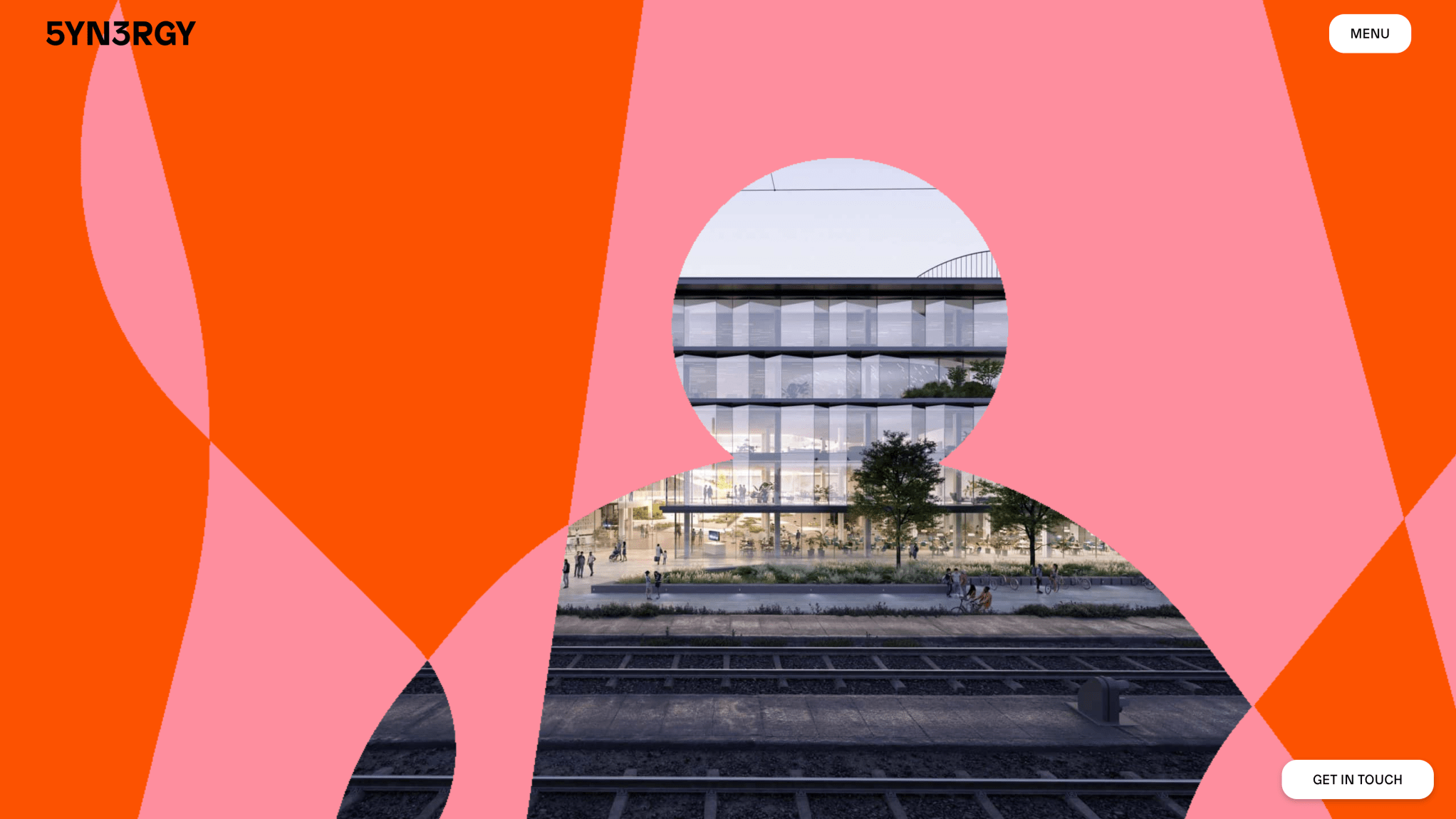
On desktop, pink and orange curves extend over the building image. An opening in the centre reveals windows, people and part of the tracks crossing the lower area. The architectural representation is detailed, while the shape framing it is much larger and simpler. The difference lets us recognise two layers at a glance: a scene establishing the project and graphics giving it personality. The black name keeps its presence in the upper corner.
The controls use a different language. Menu sits inside a white pill with black text, and the contact control repeats that treatment in the lower corner. They are small, relatively stable shapes beside a huge surface of colour. Examining the screenshot, I am interested in how they retain their space while everything else takes on an exaggerated scale. The hierarchy is clear: the composition arrives first, then we can identify entries offering a next step.
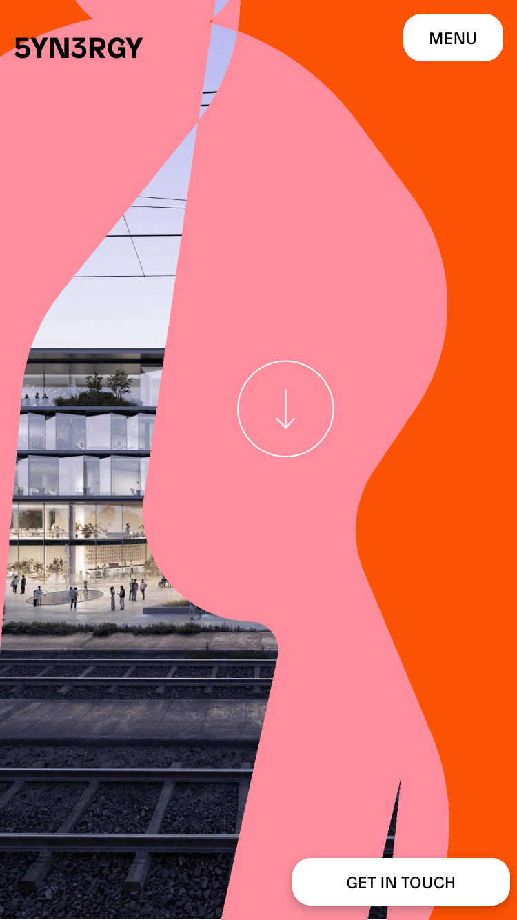
The mobile screenshot changes the arrangement considerably. The building image occupies a strip towards the left and the curves fill almost the entire height. The name and menu retain the upper corners, while contact sits at the bottom right. A fine arrow appears inside a white circle in the centre. The homepage keeps its colours and character within a composition adapted to a narrow space. Less of the façade is visible, but the relationship between architecture and graphics remains recognisable.
This comparison is useful when designing bespoke WordPress. The content we want to manage can retain its function while the presentation finds a different arrangement on mobile. In a similar project, I would define which image represents each section, which area must remain visible when cropped and where the calls to action belong. Those decisions can be reviewed with real content before implementation is finalised. The two screenshots help us discuss the arrangement with considerable precision.
I would take away the freedom of scale and the contrast between detailed imagery and simple graphics. To bring such a direction to another brand, choose a palette and shape system of its own, alongside a content structure that can grow. My bespoke WordPress service can help prepare that relationship between design and editing. 5YN3RGY leaves a clear idea: a homepage can gain plenty of character from a few carefully placed ingredients.
5YN3RGY. Desktop and mobile screenshots published by WordPress Showcase, in an entry dated September 2023 documenting WordPress. Original images linked by that entry, reviewed for this selection on 13 October 2026. The analysis concerns the version shown in the presentation.
PichiAvo mixes enormous letters with an urge to paint
PichiAvo’s homepage fills the screen with an art gallery and crosses it with enormous white letters. The slanted serif has long curves and allows itself to extend beyond the edges. Blue, pink and yellow marks appear over the scene, including a crown and small drawings. It feels partly like an exhibition and partly like a notebook someone has drawn over. The scale is substantial: we first receive an image full of character, then find the small elements that help us navigate.
PichiAvo is an artist duo from Valencia. Its WordPress Showcase entry documents a website built with WordPress and was published in September 2023. We use its desktop and mobile screenshots to examine that proposal. The current portfolio retains recent content, including a Fallas 2026 project. Each reference has its own context; here we focus on the visual presentation shown by these two images.
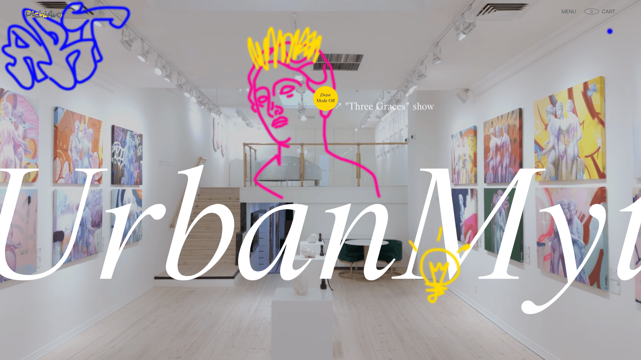
The desktop screenshot combines a bright room, works placed on both sides and a large title crossing the lower area. The gallery space offers depth at the centre; the letters operate on another scale, almost like a foreground. PichiAvo’s signature, Menu and Cart sit above. A yellow circle near the centre reads Draw Mode Off. There are many visual details, but the navigation references keep small, reasonably identifiable positions.
The coloured drawings add another texture to the scene. Blue occupies one corner, pink builds a figure over the background and yellow introduces a crown and a small lower motif. The photograph of the space remains clear while the lines seem to intervene on its surface. That coexistence interests me: the artwork has presence, typography sustains an editorial voice and the marks add a gesture connected to the artists’ visual world.
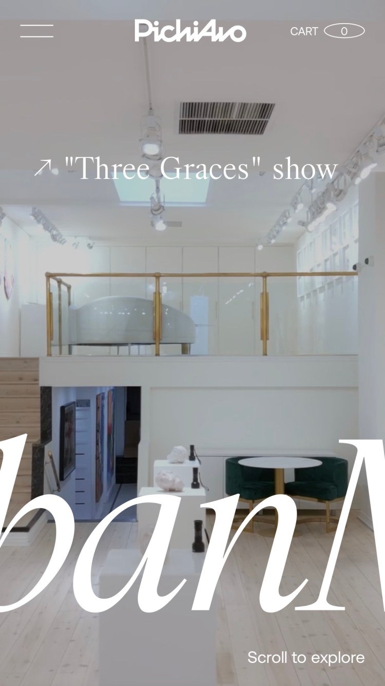
In the mobile screenshot, the room uses a different crop and the letters remain enormous. We see only part of the title, which crosses the width and continues outside the screen. The signature moves to the centre of the header, the menu is identifiable on the left and the cart remains on the right. The exhibition entry retains a place near the top; Scroll to explore appears below. The composition keeps its energy in a much narrower format.
These two views help distinguish typography’s functions. A large title can provide atmosphere and rhythm, while small access points need clear reading. When designing an art website with WordPress, agree which text fulfils each function and how it relates to the images. I would also review crops with actual artwork, because a room photograph and a detail of a piece need different framing. That work helps content keep its prominence as the screen changes.
I would take away the combination of a bright presentation and graphics willing to intervene in it. The website establishes a relationship with the artists’ work without filling the interface with explanations. For a new proposal, I would choose a distinctive typographic system and image guidelines the team can maintain when publishing works, exhibitions or editions. My freelance WordPress web design service can help define that relationship between visual direction and editable content. There is room for a healthy dose of play in a website that needs to keep growing.
PichiAvo. Original desktop and mobile screenshots linked by WordPress Showcase, in a September 2023 entry documenting WordPress. Artistic context and recent content checked on PichiAvo’s website on 13 October 2026. The analysis concerns the visual version presented in the screenshots; artwork rights belong to their holders.
Landia lets cinema occupy the whole screen
Landia presents its work through images running from edge to edge. In the desktop screenshot, a scene with cold and red tones occupies the upper area; another, with gold and dark blue, appears below. White titles are centred over both. The brand sits in one corner and the menu in the other. The composition has few elements around the visual material and gives each project a generous scale. It makes you want to keep moving down to discover the next scene.
The production company appears in WordPress Showcase through a September 2023 entry documenting WordPress. We use its two official screenshots to examine that website version. They show how several audiovisual pieces are organised and what information remains beside each one. The reference contributes another way of designing a portfolio: a sequence of projects with large images, titles and brand names that identify the content.
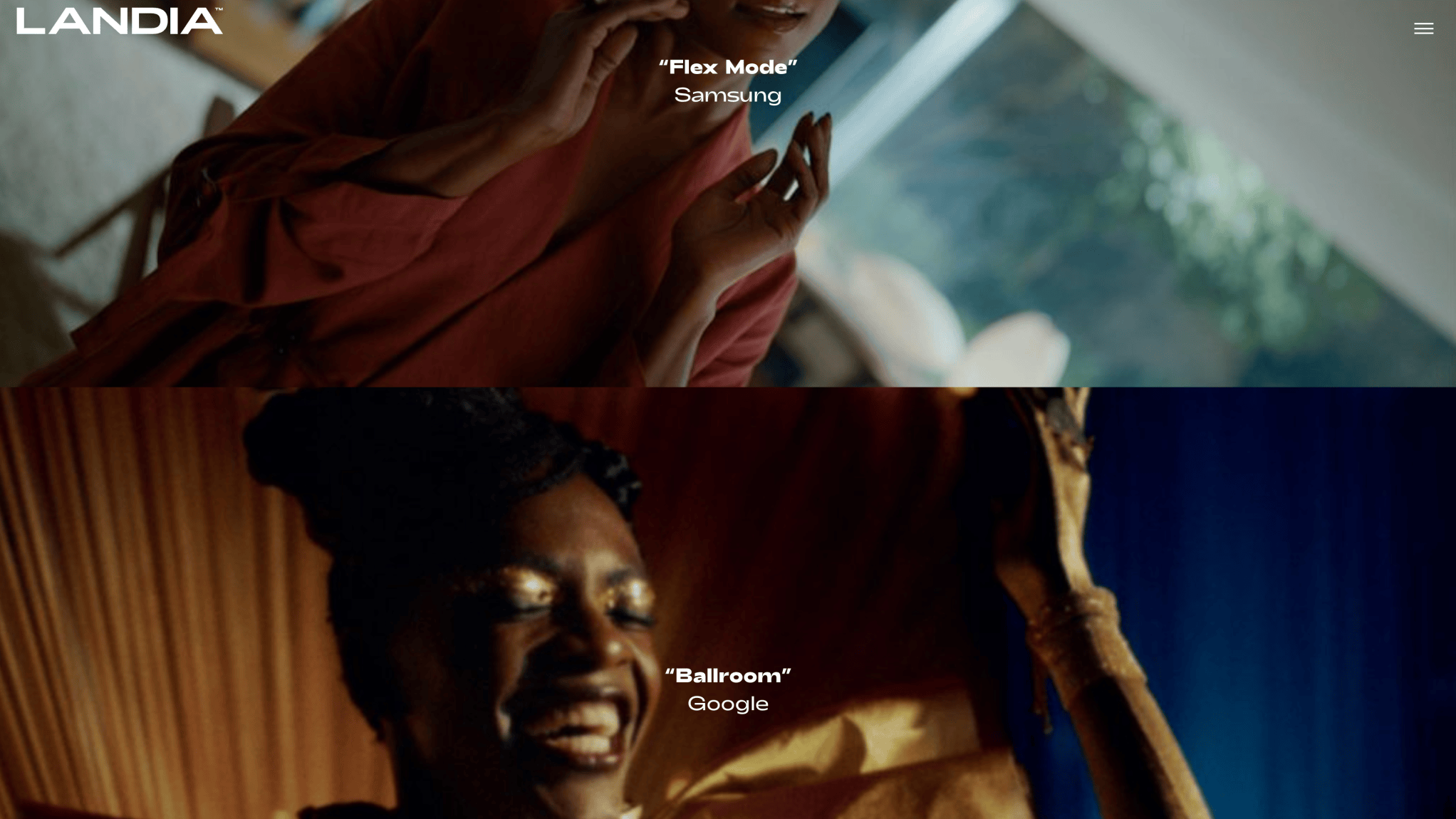
The desktop image presents Flex Mode and Samsung in the first piece, with Ballroom and Google in the second. Their labels share a position, colour and difference in weight between title and brand. The visual material changes atmosphere considerably, but its identification remains consistent. Each project can contribute its own colours while the interface retains a pattern. The broad white Landia name remains visible in the header.
I am interested in the relationship between imagery and small amounts of text. An audiovisual portfolio needs each piece to be recognisable, even when the first impact comes from a scene. Here the two typographic groups provide that identification without filling the surface with information. For another production company, I would review title, client and credit variants using actual examples. A short name and one running over several lines may need different adjustments to remain readable over varied material.
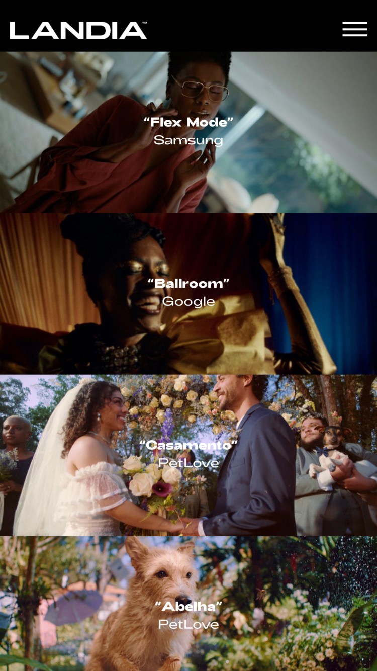
The mobile screenshot gathers four pieces in one column. Flex Mode and Ballroom appear above; Casamento and Abelha follow, with PetLove as the brand. The header becomes a black strip with the name on the left and the menu on the right. Each image retains white labels in a central area. The journey has a recognisable structure, while scenes change in colour, framing and atmosphere from one block to the next.
This view lets us study how audiovisual content can organise a page without a grid of small cards. Pieces follow each other and visitors find the same kinds of information in each. In bespoke WordPress design, define how a project is added and which fields identify it. I would also prepare presentation images suitable for each format, so scenes keep useful framing when displayed on a narrow surface.
Selecting those images deserves attention of its own. One piece may have a magnificent shot whose main subject disappears when cropped; another may need a shorter title on the homepage. Those decisions form part of the portfolio’s visual direction. I would review them alongside the project page structure and the relationship between the index and each project. My WordPress web design in Barcelona service can help prepare that system with distinctive graphics and content the team can publish.
I would take away the prominence Landia gives its work and the continuity of labels between very different scenes. It is useful for portfolios of video, photography or campaigns with a strong image direction. Content establishes the rhythm and the interface supplies the references needed to explore it. In a new website, that balance can create a journey with substantial visual presence and a clear editing system.
Landia. Original desktop and mobile screenshots linked by WordPress Showcase, in a September 2023 entry documenting WordPress. The analysis concerns that presentation; visible projects and brands retain their respective rights and credits. No specific web design credit unidentified by the source is attributed to the production company.
Fabbrica serves two images and joins them with a phrase
Fabbrica divides its homepage between a restaurant interior and a dish photographed from above. On the left there is brick, wood, a bench and a prepared table. On the right, a stone surface and green, red and white colours surround the dish. Bello. & Buono. appears in a white serif at the centre. The arrangement is simple and atmospheric. Food and place both find space within the same first impression.
The restaurant group appears in WordPress Showcase through a September 2023 entry documenting WordPress. We examine the desktop and mobile screenshots published there. The current website retains the phrase on its homepage and links to Index Studio in its credits. This is useful for a hospitality brand that needs to combine imagery, identity and access to information about its establishments.
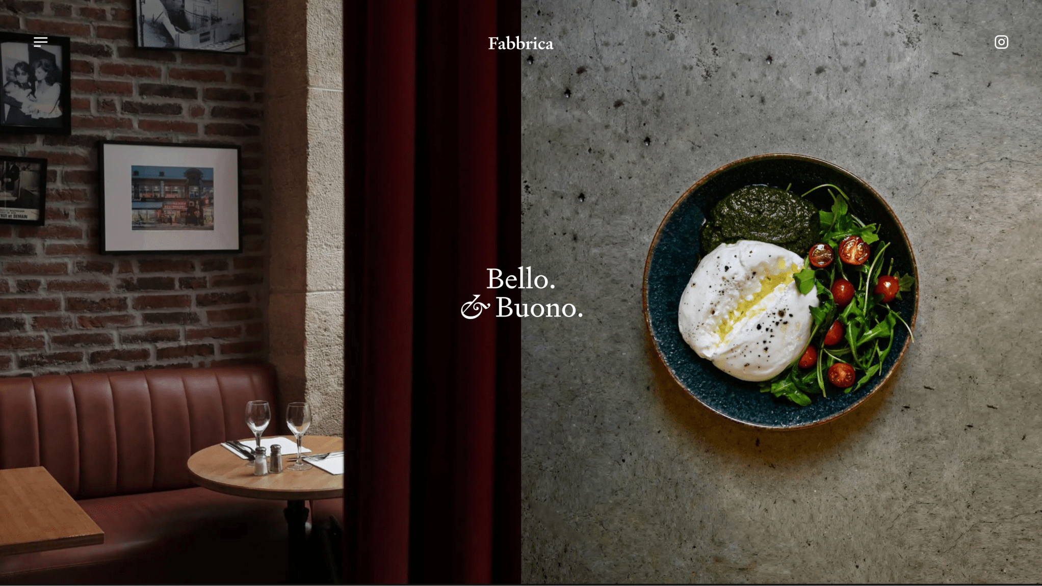
The desktop screenshot divides the image into two vertical areas. The dark curtain at the centre supplies a zone where white text can keep its presence. The Fabbrica name sits above, also centred, with controls in the corners: menu on the left and Instagram on the right. The arrangement of photographs and the position typography finds have a carefully considered relationship. The composition allows us to look at the setting and the food before entering further detail.
The interior contributes warm textures and small objects; the dish has a cleaner view, surrounded by a surface. These are two types of imagery with different tasks. One helps imagine the restaurant atmosphere and the other brings its food closer. When designing a similar website, I would choose photographs that can share a homepage through a clear relationship in framing, light and colour. Content selection carries considerable responsibility in the result here.
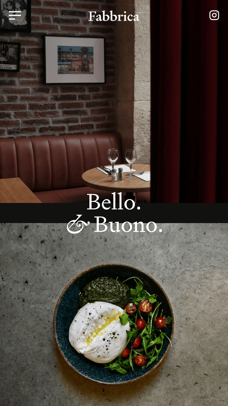
On mobile, the photographs move into a vertical composition. The interior occupies the upper part and the dish appears below. The phrase crosses their meeting point, supported by a black strip contrasting with the letters. The signature remains centred at the top, with menu and Instagram on either side. The adaptation retains the same pair of images while finding another place for the principal phrase. The visual direction remains recognisable in both proportions.
This comparison helps prepare an editable WordPress homepage. Define what the team can change and how each new pair of images will be reviewed. A brighter photograph might need another text position; a tighter crop might require more margin. I would prepare representative variants before finalising the composition, using content the restaurant actually plans to publish. That review turns the visual proposal into guidelines that can be maintained afterwards.
I would also organise each establishment’s pages around information people need to consult. The homepage can establish the brand atmosphere and the rest of the journey supply details, menus, contact and access points. In a bespoke WordPress website, that structure can be prepared alongside image and typography decisions. A brand with several establishments needs a common presentation and space to explain each location’s particular features.
I would take away the way Fabbrica joins two photographs through one phrase and a shared central position. It is a simple idea relying on thoughtful content selection and carefully reviewed proportions. For hospitality, accommodation or a product website, it opens an interesting discussion about which scenes represent the brand. The result has personality through a few elements and lets visual content carry much of the story.
Fabbrica. Original desktop and mobile screenshots linked by WordPress Showcase, in a September 2023 entry documenting WordPress. Fabbrica’s website links to Index Studio in its credits, checked on 13 October 2026. The analysis concerns the screenshots’ visual presentation without inferring specific responsibilities for each collaborator.
Studio Tumulte lets graphic identity set the pace
Studio Tumulte places a small tower of colour at the centre of its presentation image. Red, pink, orange, blue and green rectangles turn slightly over a cream background. The black name sits above, with graphic creation and art direction accompanying the sides. It is a very studio-like entrance: a few pieces, a recognisable composition and plenty of cheer. The material already gives us a starting point for a website that takes its visual identity seriously.
This reference has a particularly useful technical credit. Martin Laxenaire lists Studio Tumulte among his projects and identifies WordPress alongside WebGL and curtains.js. The studio’s website credits him as developer in the footer. This is a different project from his personal 2025 portfolio, discussed in the developers selection. Here we examine Tumulte’s published presentation and a work image appearing on its current website, with the provenance indicated for each figure.
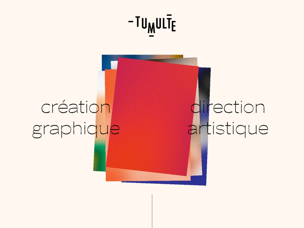
The presentation image combines relatively simple geometry with precisely placed elements. The tower turns just enough to break the rigidity; the side texts hold the composition without competing with the name. The background gives the colours room to read as one family. I like it as a reference for a creative studio homepage: identity finds a gesture of its own before trying to show all the production at once.
Read this figure according to its actual function. It is the presentation image the website supplies for sharing, rather than a screenshot of its entire current interface. It lets us study graphic language, the relationship between signature and colour, and one way of introducing a studio. A new website would then need its journey, navigation and project states developed. A good identity supplies the starting point; the commission needs to define the organisation of the content following it.
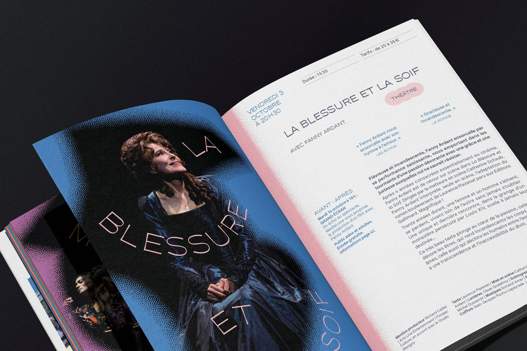
The second image comes from the L’atrium 2025–2026 project included on the website. It shows an open publication at a diagonal over a dark background. One page combines blue, photography and pink lettering; the other organises small text, white areas and blue and pink accents. It is a portfolio content piece, rather than a navigation screen. It matters here because it explains the variety of material a design website needs to present clearly: broad images, editorial details and relationships between text and composition.
The contrast between these figures helps prepare a project system. The brand uses geometric pieces and space; the editorial case offers a dense surface full of scales and details. I would define several image types so both kinds of material can be published with their proportions intact. A gallery may need panoramic images, vertical views and details visitors can examine closely. The content manager’s structure should accommodate that diversity because it is part of the way the studio explains its work.
When preparing freelance WordPress web design, I would use a brief project and a longer one as samples. I would review their accompanying information, collaboration credits and the return to the archive. I would also agree which elements remain fixed and which the studio can edit. Visual direction can then survive the next project, with another palette, more images or a considerably longer title.
I choose Tumulte for the relationship between a simple graphic signature and the richness of what it needs to show. The manager has an editorial responsibility here: give each project space and maintain a recognisable family of pages. For a studio, artist or independent professional’s website, it is a useful reference when discussing content and personality. The tower of colour opens the door; behind it, leave room for a good collection of work.
Studio Tumulte. Presentation image and photograph of the L’atrium 2025–2026 publication from original resources linked by the studio website, checked on 13 October 2026. The page credits development to Martin Laxenaire; his portfolio documents WordPress, WebGL and curtains.js for Studio Tumulte. The figures show an image for sharing the website and a portfolio content piece respectively. They are not presented as screenshots of the current interface or projects launched in 2027.
How to bring these references into your WordPress design for 2027
After examining five different projects, one decision keeps appearing: choosing what needs prominence. In 5YN3RGY, a combination of shapes and architecture provides it; in PichiAvo, the scale of letters and space for the work. Landia makes room for audiovisual projects. Fabbrica brings atmosphere and food together. Tumulte introduces a graphic language and then needs space for varied material. For your website, I would start by identifying that priority with real content in front of us.
I would prepare a small representative collection before designing every page. A horizontal image and a vertical one, a short title and a long one, a detailed project page and a simpler entry. If the website will have several languages, include samples of each. Those differences affect composition and the journey. Testing them early helps the design find solutions covering the variety the team will publish over the following months.
The next step is turning references into commissioning decisions. Note what interests you in each example: a scale, an image treatment, a colour contrast or the organisation of a gallery. Add the function it should fulfil in your project. A homepage can introduce a brand, show selected work or lead to a reservation. Explaining that purpose helps assess the proposal developed for you. It also gives the conversation a relationship with content beyond a collection of beautiful screens.
In the content manager, agree what the team can edit and which rules sustain the composition. Project types, featured images, credits and links need a comprehensible structure. For a hospitality website, separating establishments may be useful; for a studio, organise work through categories and collaborations. Editorial freedom benefits from practical guidance on proportions, text lengths and fields. A delivery explaining those decisions makes it easier for the next update to retain the visual direction.
I would review the prototype on desktop and mobile using those materials, including menus, links and component states. A phrase over a photograph deserves testing with different crops. A project list needs to show how its selected entry is identified. If there is movement, reserve a review for controls, reading and animation preferences. These are checks I would apply to the new commission. Reference images help explain a design; the project we publish must pass its own tests.
Maintenance is also part of the decision. Establish who can change content, how backups will be kept and who reviews website updates. Choosing a visual direction the team understands makes publishing new work more confident. Design can be adventurous and the organisation of the work clear. That combination matters particularly when a website will grow in projects, pages or languages after launch.
If you want to prepare that journey with me, my WordPress web design in Barcelona service offers a starting point for defining scope and content. The selection of best freelance designers 2027 provides more references for identity and composition. Bring the examples that gave you ideas and an initial sample of what you need to publish. We can start turning that enthusiasm into a distinctive design, an editable structure and a delivery reviewed against specific criteria.
Frequently asked questions about WordPress design
How did we choose these WordPress designs for 2027?
The selection combines five references exploring different decisions in identity, imagery, typography and content organisation. Four versions are documented in WordPress Showcase; Studio Tumulte has the developer’s technical credit. Sources and dates appear in each case. Best expresses an editorial judgement intended to inspire projects, while 2027 identifies this edition of the series.
Can a WordPress website have a completely distinctive design?
A bespoke WordPress project can define its composition, page types and components according to the content it needs to publish. Before choosing the specific solution, gather samples and agree what the team can edit. These references help explain visual decisions; your website’s design should relate them to its objectives, materials and maintenance arrangements.
Were all these projects launched in 2027?
This is an editorial edition for preparing projects in 2027, bringing together references from different years. The four WordPress Showcase entries were published in September 2023; that does not establish each website’s precise launch date. Studio Tumulte provides material from its own page. Credits distinguish the provenance and function of images so each example can be consulted with context.
What should I prepare before commissioning WordPress web design?
Gather an explanation of the objective, available content, necessary functions and annotated references. Add the languages and who will publish content afterwards. Sample titles, project pages and images in different proportions allow the prototype to be reviewed with real situations. That information helps agree scope, editing guidelines and the checks included in delivery.
How do you check that the design works before publication?
I would review representative pages, links, menus, forms and content states on desktop and mobile. I would also check reading, keyboard navigation and the alternatives planned for movement. Translations need their actual texts and equivalent destinations reviewed. Tests are agreed for the new project; a reference screenshot or video does not demonstrate how another implementation works.